If you’re not familiar with Tumblr, the platform can seem intimidating at first, primarily filled with an abundance of memes, gifs, jokes, and other types of humorous content. But the truth is, this image-driven blogging platform can be an extremely useful marketing tool for your brand.
Since it’s launch in 2007, Tumblr has become one of the world’s 50 most popular websites, with over 550 million users and more than 280 million blogs.
With such a massive user base, understanding who they are and Tumblr’s advertising options give you the best chance to engage and persuade them to convert on your offer. To do that, you’ll need a Tumblr post-click landing page.
What is a Tumblr post-click landing page?
A Tumblr post-click landing page is a standalone web page that uses persuasive elements like testimonials, benefit-oriented copy, and videos to convince its visitors to convert on an offer. Visitors land on the page after clicking a promotional link in Tumblr.
What you should know about Tumblr
Before we get into Tumblr advertising and how brands can utilize the platform with post-click landing pages, let’s take a look at some key user statistics and demographics.
Tumblr statistics and user demographics
- The platform is now populated with more than 145 billion posts, over 44 million per day. These posts make up the nearly 334 million Tumblr blogs on the site.
- Tumblr users are split nearly 50/50 between males and females.
- With over 550 million users (one-third the size of Facebook) it’s a third larger than Instagram, 70% larger than Twitter, and 5x larger than Pinterest.
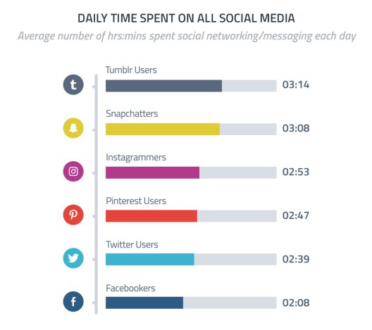
- Tumblr users spend an average of 3 ¼ hours on social media every day. That is more than the time spent on any of the other most common platforms:
- The majority of Tumblr users earn more than $30,000 per year with 35% of users earning over $50,000 per year.
- Tumblr has one of the youngest active user bases of any major social network. Two-thirds of its users are under 35 years old, almost 40% are younger than 25 years old, and only 1 in 8 are in the 45 and above age group. All of these make the platform perfect for reaching Millennials and Generation Z.
Tumblr users encompass a wide variety of backgrounds and personalities who are often described as artistic, creative, and entertainment-focused. They are also typically interested in collaborating with others, seeing humorous posts, and forming friendships via online engagement (likes, dislikes, etc.).
Forbes describes the Tumblr generation as “young, bright and tech-savvy group of international users who seek what might seem counterintuitive: Genuine online connection bolstered, not hindered, by anonymity.”
If your target audience sounds anything like this, Tumblr may be another advertising platform worth looking into.
Tumblr advertising
With Tumblr being such an image-driven site, your brand should have visual content to share — photos, videos, gifs, etc. Once you have a good library of visual content to share, Tumblr offers many advantages to marketers:
- It’s the leading personal blogging and publishing site, making it perfect for PR and branding purposes.
- It’s simpler and a less expensive alternative to WordPress. Bloggers often say that Tumblr is easier to set up than WordPress, offers almost as much functionality, and includes an entire social network behind it.
- Tumblr is the #1 platform for developing brand fandom, which makes it ideal for film promotion and PR.
- Since a vast majority of the content on Tumblr is visual, it’s extremely shareable among Tumblr and other social networks. Tumblr posts can even feed directly into Twitter and Reddit, which helps marketers spread their content to an even wider audience.
Now that we’ve covered why brands should advertise on the platform let’s take a look at the various Tumblr advertising methods.
Sponsored Posts
Sponsored Posts are similar to normal Tumblr posts except they’re exposed to a wider audience across the platform, giving brands a huge head start on engagement. They’re also targetable by gender, location, and interest, which make it easier for the right person to see the post:
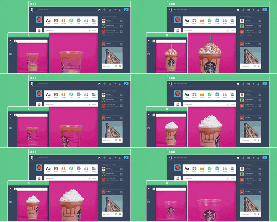 Previously, Tumblr required that a brand must have its own Tumblr blog to be able to run Sponsored Posts. March 2016 marked the end of that requirement and began allowing “Blogless” Sponsored Posts, meaning all brands can run Sponsored Posts in user feeds and dashboards. Plus, they’re also able to integrate a call-to-action into these ads that aren’t available in regular Tumblr posts.
Sponsored Posts can also be syndicated to Yahoo for added reach. The catch here is that the only engagement available is a click through to the Tumblr post’s permalink. Native engagements such as Like, Follow, and Reblog are not available through Yahoo.
Sponsored Video Posts
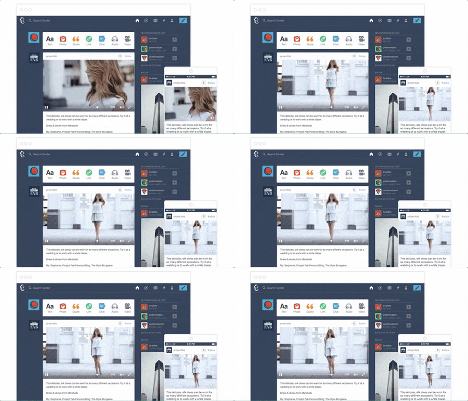
Sponsored Video Posts are very similar to regular Sponsored Posts regarding reach and targeting. The difference is that sponsored video posts contain video and provide additional analytics, allowing you to see stats on views, engagement, and looping. The videos in Sponsored Video Posts play automatically and loop continuously. Also, the video player pops out so that people can continue scrolling through their feed as they watch.
Sponsored Day
Tumblr’s Sponsored Day option gives brands an entire 24 hours to advertise their content across the platform. It pins the brand’s logo and tagline in a custom banner to the top of the dashboard and links to an exclusive tab in the Explore page (one of the most trafficked and engaging pages on Tumblr) that brands fill with whatever content they wish — their own Tumblr posts, reblogs, etc.
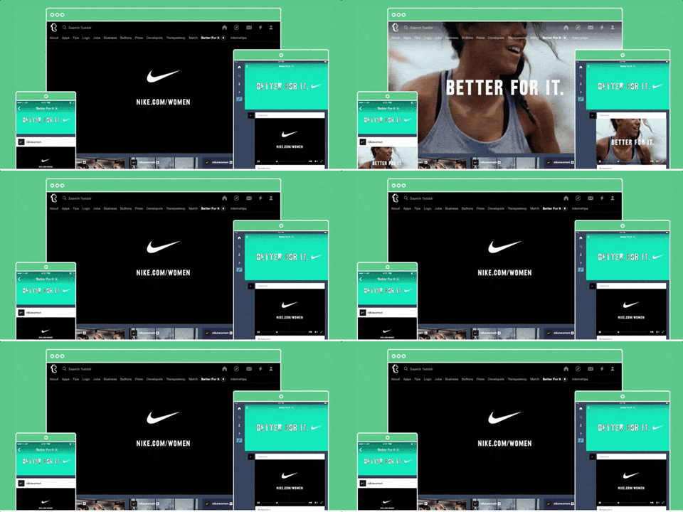 Each of the above methods can be great for growing brand awareness, but how can brands use the different methods to drive traffic, increase leads, and profit? post-click landing pages, of course.
How brands use Tumblr post-click landing pages
Finally, let’s look at a few brands advertising on Tumblr and driving traffic with Tumblr post-click landing pages.
Keep in mind, for shorter post-click landing pages, we’ve shown the entire page. However, for longer pages, we only displayed above the fold. You may need to click through to each post-click landing page to see some of the points we discuss. Also, some of the brands listed may be A/B testing their page with an alternate version than the one displayed below.
TurboTax
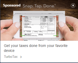
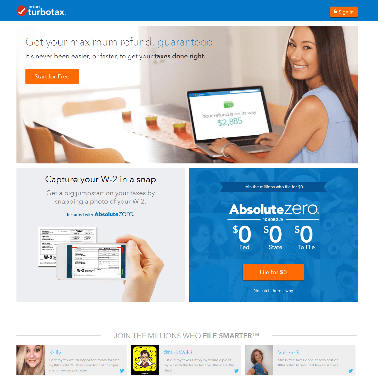
This is a Sponsored Post from TurboTax that, when clicked on, leads to the following post-click landing page:
What the post-click landing page does well:
- The headline and the subheadline are extremely benefit-oriented, which is exactly what people want to see on these pages.
- The image of the woman using TurboTax to file her taxes (with a refund on its way) helps prospects envision what it’s like to reap the benefits of using TurboTax.
- Multiple cooperative CTAs give the prospect a number of chances to convert. Also, each CTA contrasts nicely on the page and includes simple, persuasive copy.
- The two sections below the woman provide two of the major benefits of filing with TurboTax. The image in the “Capture your W-2 in a snap” section also shows prospects how easy it is to use your smart phone.
- The tweets about TurboTax act as social proof, which helps convince visitors that TurboTax delivers on its promise and a trustworthy service to file your taxes.
- Security badges show prospects that their information is safe from other outside parties accessing it.
What could be changed and A/B tested:
- The page is filled with exit points. The company logo, the Twitter profile links, the security badges, the footer links, etc. All of these provide visitors with a way off the page before converting.
- More white space could be added to let the headline, image, and CTA all breathe more.
Car.com
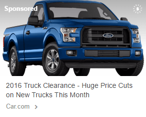
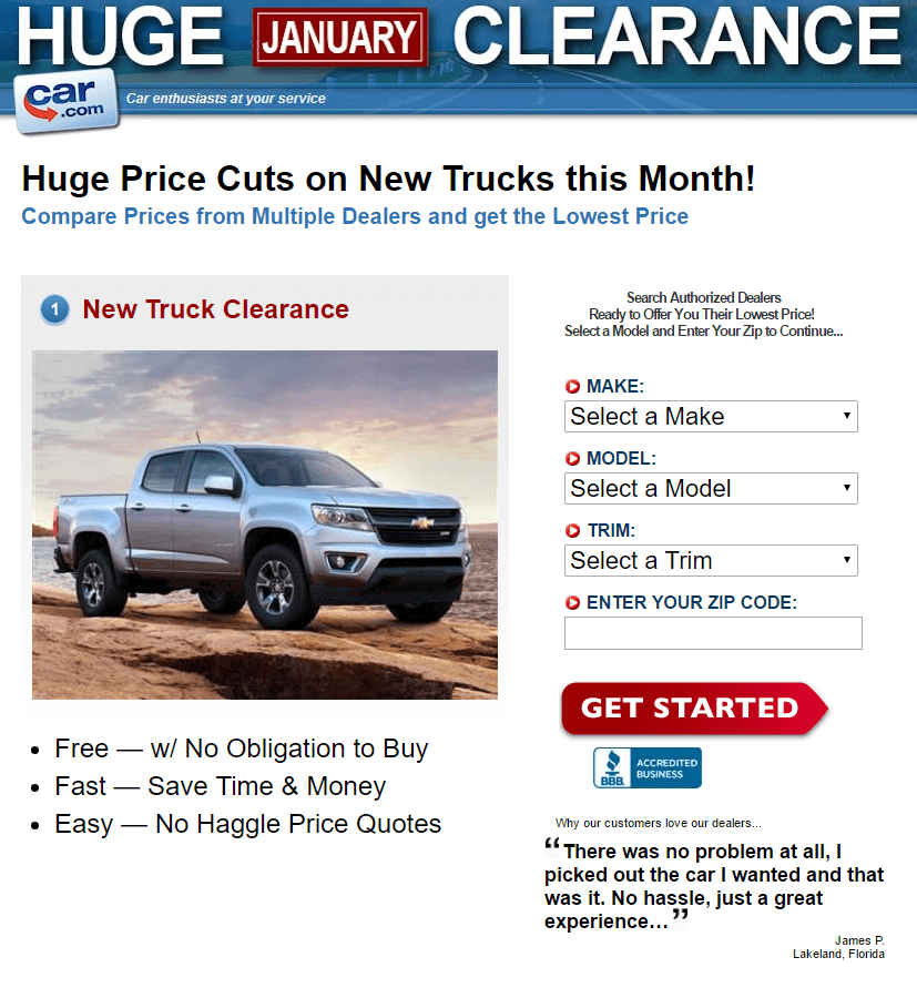
This is a Sponsored Post from Car.com, advertising their huge truck clearance event. The ad led to the post-click landing page below:
What the post-click landing page does well:
- The headline and subheadline are specific and benefit-oriented, convincing visitors that they will get the lowest price on new trucks by filling out the form.
- The bulleted list of benefits is a great addition because who doesn’t love free, fast, and easy?
- The arrow-shaped CTA button subtly implies that visitors should complete the form and click the button to “Get Started.”
- The image of the truck is pointed directly at the form, influencing visitors to enter their desired information and click the CTA button.
- The BBB badge acts as a trust signal, making prospects feel more comfortable with the idea of converting.
What could be changed and A/B tested:
- The “1” before “New Truck Clearance” is a bit confusing because it makes it seem as if there are steps to complete on the page. That’s not the case because there aren’t any other numbers on the page.
- The CTA button copy could be improved. “Get started” is boring and vague. Maybe something more personal and benefit-oriented like, “Show Me the Lowest Prices!” could produce better results.
- The CTA color doesn’t contrast with the page as much as it could. Designing the button in a different color would help it draw more attention since red is already used elsewhere on the page.
- The testimonial on this page is questionable. Normally, customer testimonials are considered a best practice, but in this case, visitors may question whether or not “James P.” is even a real person. Including his headshot would make it more believable.
- The overall page structure could be improved. The font styles and sizes are way too varied, the headline and the subheadline aren’t centered, there is insufficient white space in between sections, etc.
- Each vehicle image at the bottom of the page links to a new page, likely decreasing conversion rates on this page. Instead of including those images/links here, each vehicle should have it’s own post-click landing page, not linked to any other pages.
Discover
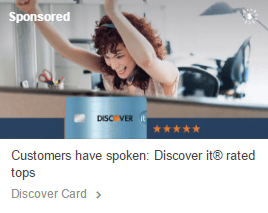
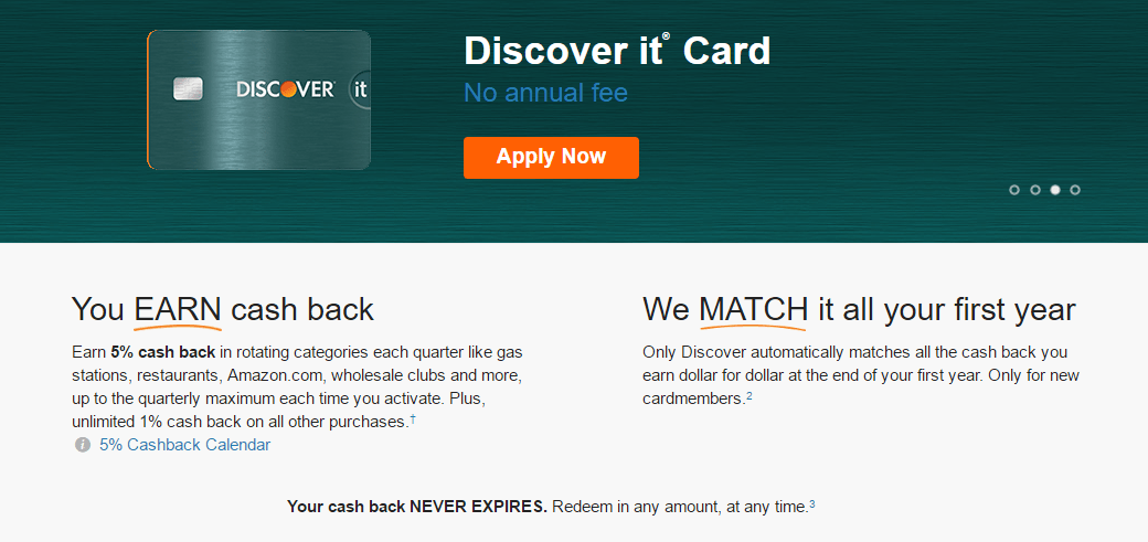
Discover’s Sponsored Post below was created to drive traffic to the company’s click-through page to promote their Discover it Card:
What the post-click landing page does well:
- The credit card image shows exactly what visitors will get when they apply for the Discover it credit card in a particular color (click on the dots to see the color variations).
- No annual fee is displayed immediately on the page. The only way to make this stand out more is to change the font color, so the blue doesn’t hide as much in the dark header.
- Multiple “no annual fee” links on the page send visitors below the fold which provides more detailed information.
- The comparison of different company’s credit cards shows prospects why Discover is superior to other credit card companies.
- The CTA button color is the same as the orange check marks below the fold. Normally, this would be something to change. But in this case, the button plays off those check marks in that if the visitor applies for the credit card, he or she will enjoy all of those benefits.
- Matching the cash back for the first year is a great point to highlight, especially since Discover is the only credit card company that offers this.
What could be changed and A/B tested:
- Multiple links in the fine print serve as links off the page and away from the conversion goal.
- The four buckets of information below the comparison chart could be moved above the fold — before the chart. That way, visitors can learn more specifics about the Discover it card before going in depth with the chart.
Get started with Tumblr post-click landing pages
With the right niche, content, and audience, Tumblr can be a very effective channel to advertise your brand. The platform can help to grow brand awareness, increase engagement, drive leads, and profit.
Inc. echoes this, stating, “If you’re not using Tumblr as part of your marketing efforts, you’re missing a very large boat.”
That may be true for your brand, but advertising on Tumblr is only half of the equation. Creating a Tumblr post-click landing page is just as important to your marketing success because they’re specifically designed to convert traffic from your Tumblr posts.
Get started today creating your professional post-click landing page, sign up for an Instapage Enterprise demo today.

See the Instapage Enterprise Plan in Action.
Demo includes AdMap™, Personalization, AMP,
Global Blocks, heatmaps & more.
