It’s New York City, 1914. A sold-out crowd at Hammerstein’s Roof Garden sits, eyes transfixed on a magician who would soon become known as “the man who walks through walls.”
Two assistants enter the stage from opposite ends, each pushing a screen to opposite sides of the nine foot tall, ten-foot wide brick wall positioned perpendicular to the audience. The illusionist, Harry Houdini, is concealed — but only briefly.
Moments later, when the screens are removed, the magician still stands. The only thing is…
Now he’s on the other side of the wall.
“The audience sat spellbound for fully two minutes after this feat was accomplished,” the press noted. “They were too dumbfounded to applaud.”
But how did he do it?
It couldn’t have been accomplished with the help of a trap door — the solid construction of the wall, along with the rug underneath it made sure of that.
So what happened behind those screens?
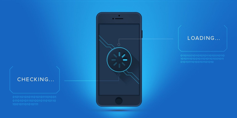
His audience had no idea; and neither will yours when you use a screen of a different kind: a splash screen. Allow us to explain…(and reveal the secret to Houdini’s trick)
What is a splash screen?
According to Computer Hope:
“Alternatively referred to as a boot screen, boot skin, or welcome screen, the splash screen is an introduction page that is displayed as a program or computer is loading or booting.
Typically the splash screen can include a logo or other image, as well as a company name, and sometimes the company’s slogan.”
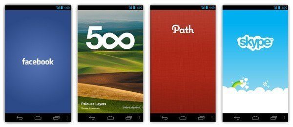
Basically, the splash screen was invented for software users with low attention spans, and marketers obsessed with branding. You probably know it better as the screen you see between the time you tap to open your favorite app, and the moment it fully loads. Here are a few examples from some popular apps:
Houdini’s screens concealed the technique he used to perform the illusion: The rug he claimed prevented the use of a trap door actually facilitated it. While hidden, a section of the floor beneath the wall opened, creating a hammock-like passage that he used to scurry across to the other side.
In a similar way, splash screens conceal the loading processes that software perform before they’re fully ready to be used. As sophisticated as our devices are, sometimes they need a few seconds to prepare themselves to perform miracles of modern-day technology. To make that process look smoother, occasionally developers use a splash screen.
What a splash screen is not
A splash screen is not to be confused with a “splash page,” which is used by designers to make announcements and display promotions to visitors before they reach a website. Here’s a splash page that allows a user to choose between the English or Spanish version of a website:

These splash pages can perform different functions. Splash screens do not. They are purely cosmetic in nature.
As such, a splash screen is also not a post-click landing page. While it’s a standalone page, it’s not designed for conversion. There are no CTAs or lead capture forms on these. Splash screens are strictly meant to satisfy impatient software users while they wait for a program to fully load.
But are they necessary?
Society’s dwindling patience
Instant gratification is nothing new. Over the last several years we’ve seen the rise of on-demand streaming services like Netflix and Hulu, same-day shipping from Amazon, and an Uber for, well, practically anything.
So in an age when most things are just a tap of a button away, how long are we willing to wait for them?
In a massive 2012 study, researchers at UMass Amherst examined the viewing habits of 6.7 million internet users. What they found was that people would wait a full two seconds for a video to load. But after that?
“After that they started abandoning,” said researcher Ramesh Sitaraman. “After five seconds, the abandonment rate is 25 percent. When you get to 10 seconds, half are gone.”
These trends hold true in other areas of the web as well. Just a few years ago, engineers at Google discovered that even a 400-millisecond delay in load time caused users to search less.
For reference, 400 milliseconds is exactly the amount of time it takes for us to blink.
Another resource put together by Kissmetrics claims that 47% of people expect your website to load in two seconds or less. After three seconds, 40% will abandon it.
So can splash screens buy your software a little extra time? Or will that additional second or two cost you users?
The experts weigh in… Should you use a splash screen?
Many popular apps greet their users with splash screens, which would make you think that the answer to this question would be pretty straightforward. However, today’s development community seems to be divided on the issue.
Marketers say “Yes, it’s good branding.”
Software developers say “No, in the majority of cases they’re unneeded.”
UX designers say “Sometimes.”
In a blog post titled “Splash screens are evil, don’t use them” (tell us how you really feel), Android developer Cyril Mottier explains why he thinks splash screens are unnecessary:
“A splash screen can be used to make resources available before an application starts. Personally I think it is not necessary in 98% of the cases. It may be useful for applications actively relying on heavy resources such as Google Earth, Sky Map, or games but this is not applicable to simple utility applications such as feed readers, social network apps, news readers, etc.”
Software engineer Jason Schock agrees, saying “Splash screens still suck,” and recalls their popularity in the early days of the web:
“These attempts at whiz-bang appeal were simply time wasters; they only kept you from what you were trying to do. And rightly so, they became a design faux pas.”
But those who are more marketing minded disagree. They say splash screens are necessary for branding — and they have a point. After all, would you know Rovio if you hadn’t landed on a splash screen before playing their popular game, Angry Birds?
Consistent, repetitive branding is what’s made Coca-Cola and Nike some of the most recognized organizations in the world. It’s also a major influencer of purchases for 63% of people, one study shows.
Of those respondents, 34% claim they spend more on a brand that’s highly consistent with its messaging while 39% say they spend less on inconsistent ones.
Afraid they won’t be recognized the next time a user visits the app store, some developers have even imposed a 1-2 second delay in the time it takes for their app to load — just to display their logo.
And that’s where things become counterproductive, argue UX designers.
According to usability guru Jakob Nielsen, there are ten general principles of interaction design, which he calls “heuristics,” because they’re broadly applicable and not specific usability guidelines.
One of those principles, visibility of system status, is especially relevant here. It states: “The system should always keep users informed about what is going on, through appropriate feedback within reasonable time.”
In usability studies, Nielsen, along with others, found that device feedback in the form of a progress bar or loading indicator can make waiting more bearable.
A study conducted at the University of Nebraska-Lincoln aimed to find out just how long people would wait for a website to load. Its participants were separated into two groups:
- Group one: saw a continuous progress bar animated on a loop.
- Group two: was not shown any type of progress bar.
In both instances, the website never loaded, but group one waited on average three times longer than group two.
Most of us, like Taylor Martin, who have ever opened an app without getting any visual feedback from our device, can relate to group two:
“If I try to launch an application and it doesn’t load or I press the back button on my Nexus and I don’t see a visual response from the system, I instantly freak out and start tap-tap-tapping at icons or the other soft buttons.”
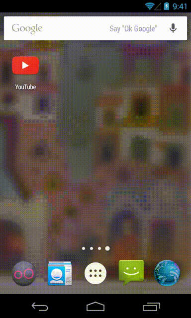
The important takeaway here is: the moment a user initiates an action is the moment their wait begins. UX designers are of the belief that if a splash screen serves to make a user’s experience better (in this case by keeping them entertained with an indicator while their software loads like the one below), it’s worth using.
In this case, even Android recommends developers use a splash screen.

Ultimately, what kind of splash screen you choose to use, if at all, will likely depend on who you are.
The dos and don’ts of creating a splash screen
If you do choose to show your users a splash screen upon startup, Microsoft offers a few best practices that are worth adhering to:
(It should be noted that some of these best practices may be specific to Windows, but many are broadly applicable.)
Do:
- Customize the splash screen to differentiate your app with branded colors and inviting images
- Use an image that clearly identifies your app
- Use a transparent PNG for best visual results.
- Create an extended splash screen identical to the original to buy yourself more time by adding an “indeterminate ring”
Don’t:
- Use your splash screen to display advertisements
- Don’t use your extended splash screen as an opportunity to show multiple, different splash screen images. This defeats the purpose of using an extended splash screen, which is to provide a smooth onboarding experience for your users.
- For Windows, create a splash screen image that is sized for all three scale factors: 620 x 300 pixels, for when the device uses 1x scaling, and additional splash screen images for 1.4x and 1.8x scaling.
Find more tips here.
Where do you stand on splash screens?
The keys to creating a great splash screen are much like the keys to performing a great magic trick: It’s all about the show, and whether the illusion is worth the wait.
Always connect all your ads to personalized post-click landing pages to lower your cost per customer acquisition. Start creating your dedicated post-click pages by signing up for an Instapage Enterprise demo today.

See the Instapage Enterprise Plan in Action.
Demo includes AdMap™, Personalization, AMP,
Global Blocks, heatmaps & more.
