After what felt like a decade of staring at combinations of letters and symbols that might as well have been Greek, at 2 AM, I finally admitted defeat. I failed — hard.
Maybe you can relate.
Basic hypertext markup language (HTML) and cascading style sheets (CSS) were relatively easy for me to learn, but their more intimidating relatives like JavaScript and Python demanded extra patience and attention that I didn’t have.
It was in the early hours of a Sunday morning that I finally realized, “Maybe I should have someone build this website for me.”
If this is something you’ve been through, I can sympathize.
Today you’ll be happy to know that you don’t need to know complex coding languages or even their more basic foundations like HTML and CSS to build a website. You can copy and paste text, add or remove pages, and altogether create websites in less than an hour.
How?
With something called a content management system (CMS).
What is a content management system?
A content management system is a software used to upload, manage, and edit all types of content on a website. From images to navigation menus, from buttons to post-click landing pages, CMS’s help you arrange and change it all without extensive coding knowledge.
There’s no question they make content management easier, so the only question becomes: Which is right for you?
There are dozens of free and open source options out there, but three in particular are the choice of 86% of all people who use content management systems.
WordPress vs. Drupal vs. Joomla
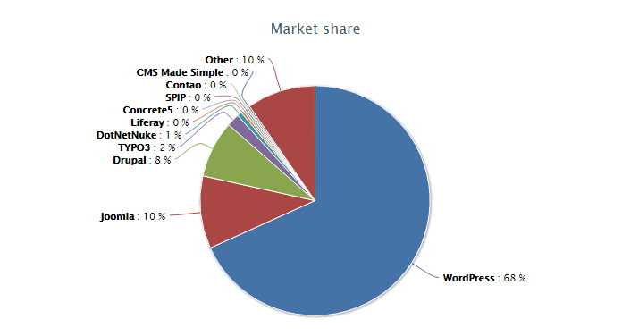
Together, these three CMS titans power nearly 30% of the entire internet, dwarfing all their other competitors.
WordPress is the clear favorite, hogging 68% of the market, while Joomla and Drupal duke it out for second place:
But this isn’t a popularity contest.
When choosing a CMS for your website, there are other things to take into account: ease of use, scalability, support, etc.
While WordPress is the most widely used CMS, and Joomla claims the second biggest piece of the CMS market pie, Drupal is no slouch.
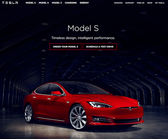
In fact, even though it’s used by fewer websites, Drupal is the choice of more highly trafficked enterprises like The White House, Harvard, Tesla, and NBC.
When designers set out to build a simple blog or corporate website, they turn to WordPress. When they’re looking for something a little more versatile that’s still relatively easy to set up, they choose Joomla.
But if they’re looking for something more robust — something scalable and more secure — they manage their content with Drupal.
Some more big names who use Drupal to maintain their websites:
- Lady Gaga
- Johnson & Johnson
- World Economic Forum
- The Economist
- New England Patriots
- Georgetown University
- Museum of Fine Arts
- Whole Foods
- National Basketball Association
And when the marketing teams from the websites listed above run social media, pay-per-click, and other forms of paid promotions, they turn to a Drupal post-click landing page to drive user action.
What is a Drupal post-click landing page?
Whether they learned it through trial and error, or some Google research, web designers and marketers know that navigation links kill conversions.
Your homepage is a great starting point for potential customers, but if they’ve clicked through from a Facebook post or a Google ad, something called “intent” comes into play.
“Intent” refers to the reason your prospect clicked your link in the first place. If your link reads: “Economist.com – Save 87% On The Economist,” when clicked, users expect to be taken to a page where they can learn more about saving 87% on a subscription to The Economist, like this one:
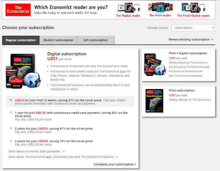
That’s one example of a Drupal post-click landing page.
Simple, right?
Not so much.
Businesses direct prospects to their homepage
Too many businesses simply direct prospects to their homepage — and there’s one major problem with that.
When that user finds themselves on your homepage, they’re confronted with all sorts of links, offers, banners, and other distracting stimuli that could potentially overwhelm them to the point that they forget your offer and leave.
Here’s what The Economist’s homepage looks like above the fold:
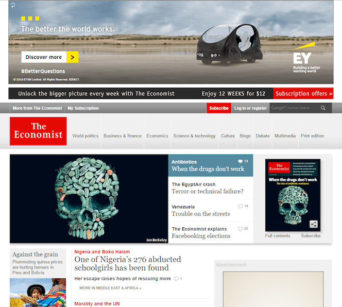
Holy content overload.
Imagine if you had been directed to this page instead of the one above it, which was tailored specifically to boosting magazine subscriptions. You’d have to hunt around visually, scanning every pixel on the homepage for the menu item that would most likely take you to the offer you were there to claim.
Maybe you’d see the little bar above the navigation menu that reads “Subscription offers,” but, then again, maybe you wouldn’t.
Maybe you’d get distracted by a breaking news story, click through to read it and never come back.
Or maybe you’d see an ad for a product you had considered purchasing, and click through to buy that instead.
The point is, every promotion needs its own page — one that’s free of navigation links and flashing banner ads. It should briefly describe the benefits of the offer that you advertised via social media, PPC, or email, and then compel its visitors to claim it.
That’s what a Drupal post-click landing page does. It has:
- No navigation, or outbound links to other web pages, even ones on your own site
- Only one goal: to convert your prospect on a specific offer
Now that we’ve nailed that definition down, let’s take a look at some examples from brands that have already incorporated Drupal post-click landing pages into their marketing strategy.
Drupal post-click landing page examples
(Keep in mind, for shorter pages, we’ve shown the entire page. However, for longer pages, we only displayed above the fold. You may need to click through to the page to see some of the points we discuss and some examples may be A/B testing their page with an alternate version than is displayed below.)
Taboola
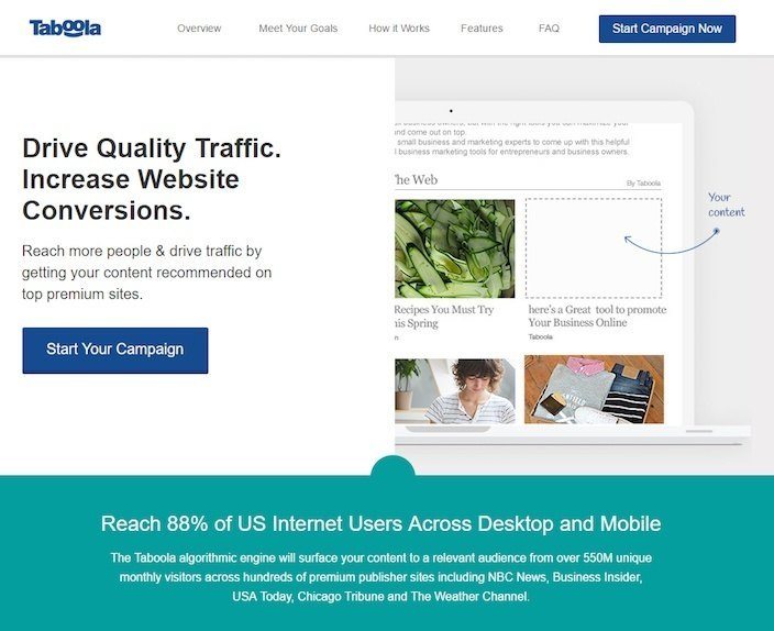
What they did well:
- The headline conveys two clear, related benefits.
- The image does a great job of helping visitors visualize what their service does.
- Text below the CTA touts the reach of Taboola’s service — 550 million unique visitors and 88% of internet users across desktop and mobile.
- Mentions of big brands like Business Insider, NBC, and USA Today align Taboola with authoritative organizations.
- Bulleted copy quickly explains the benefits of the offer.
- The words “You” and “Your” are used multiple times on the page. “You” is widely considered to be the most powerful word in copywriting.
- The FAQ section anticipates questions from visitors and answers them before they’re asked.
- Multiple CTA’s working together compel prospects to convert in more than one place.
What could be tested:
- Navigation links give visitors on this page a way to leave without converting.
- The CTA button color isn’t as attention-grabbing as it could be.
Box
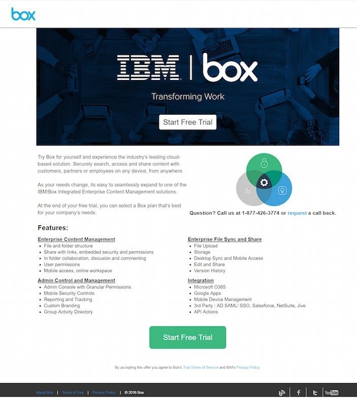
What they did well:
- Short paragraphs and benefit-centric bulleted copy make this post-click landing page easily digestible.
- The word “free” is used multiple times on the page, adding to the persuasiveness of the offer.
- Two cooperative CTA’s give the prospect more than one opportunity to convert
What could be improved:
- There’s no headline on this page. Without one, the benefit of the service isn’t immediately clear.
- The stock image of the three overlapping circles is worthless. What does that even mean? Why not use the space to show an example of the Box interface?
- A footer that includes a link to Box’s “About us” page and social media pages gives prospects way too many escape routes.
Olympus Medical
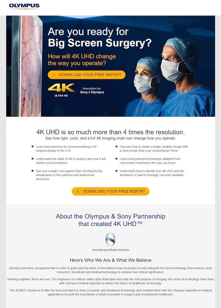
What they did well:
- The question headline containing the word “you” speaks directly to the visitor.
- Bulleted copy highlights the benefits of downloading the free report without making the prospect read too much.
- The call-to-action contains the word “Free,” a powerful driver of conversions.
- Two CTAs work together to convert the visitor on the same offer.
What could be tested:
- A logo linked to the homepage gives visitors the option of leaving without claiming their free report.
- The text on the bottom of the page, aligned center, is hard to read. Remember: breaking the left margin can make things difficult to read and subtly kill conversions.
WordStream
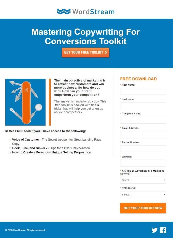
What they did well:
- The word “Free” is mentioned multiple times on the page, including in the top CTA.
- Bite-size copy quickly gives prospects an idea of the valuable info they’ll find in the ebook.
- The orange CTA button draws the attention of visitors.
- The words “you” and “your” address the reader directly.
What could be tested:
- Links to social media pages have the potential to drive users away.
- A long form that requires a lot of info from its visitors might have people thinking “is this ebook really worth the time and personal information I’m about to give up?”
- The page looks unbalanced with so much empty space on the bottom of the page. White space is great for post-click landing pages, but not when it looks so obvious like this.
Fast Company
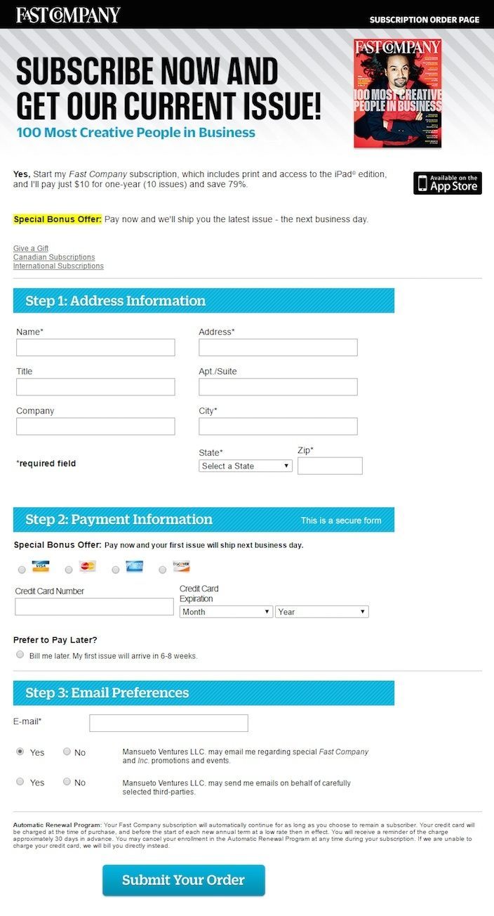
What they did well:
- An unlinked logo means prospects can’t use it to leave the post-click landing page they’re on.
- The image is an actual picture of the product that users will receive when they subscribe, not some useless stock photo.
- Copy below the headline is written in first person to give people an idea of the goodies they stand to receive if they convert.
What could be tested:
- The CTA button color is used multiple times on this page, making it less attention-grabbing than it could be.
- This headline, while communicating a benefit, probably isn’t focusing on the right one. Are people here because they want the latest issue of Fast Company? Or are they here because they want to join the nearly one million people who subscribe to the magazine to learn from the best minds in business, technology, and design? Likely the latter, wouldn’t you say?
How to design the ultimate Drupal landing page
None of these post-click landing pages are perfect, but we can pull bits and pieces from each to develop the ultimate Drupal post-click landing page. Here’s how:
1. Start with a benefit-oriented headline
Of all the headlines above, which would you say is the most compelling?
- Taboola: Drive quality traffic. Increase website conversions.
- Fast Company: Subscribe now and get our current issue
- Wordstream: Mastering copywriting and conversions toolkit
- Olympus: Are you ready for big screen surgery?
If you said Taboola, you’re right. The others do okay, but the only one that conveys a clear benefit belongs to the traffic-boosting service.
Remember advice from legendary ad man John Caples. To create the best headlines, combine two or more of the elements below:
- News: These headlines introduce a new solution, like “Finally, an easier way to do your taxes.”
- Self-interest: These headlines appeal to prospects’ inherent self-interest, like “The guaranteed way to get a fuller head of hair.”
- Quick & easy solution: These appeal to our desire for quick fixes, like “Drop weight fast with this miracle pill!”
- Curiosity: These headlines pique readers’ curiosity, making them want to read more. For example “I couldn’t believe how much money I made just a week after starting this work-from-home program.” Or, the headline that made Caples famous: “They Laughed When I Sat Down At The Piano, But When I Started To Play…”
2. Authority
Taboola takes this category, too. While in everyday conversations we roll our eyes at shameless name-droppers, the practice is totally acceptable on post-click landing pages.
In fact, it’s more than acceptable; it’s encouraged.
Taboola’s mention of brands it works with, like NBC News, Business Insider, USA Today, and Chicago Tribune, aligns it with reputable organizations that prospects will likely jump at the chance to publish their content on.
3. Use powerful words like “Free” and “You”
Two of the most persuasive words in the English language, “Free” and “You,” carry enormous power on post-click landing pages.
Why?
Because by using “You,” you directly involve the reader in the conversation.
The headline “How To Boost Your Conversion Rate In Three Easy Steps” adds an element of personalization that “How Marketers Can Boost Their Conversion Rates In Three Easy Steps” doesn’t.
Now, if we add the word “Free” to that headline, it becomes even more compelling. And the reason for that is pretty obvious, isn’t it?
As consumers who gobble up thousands of marketing messages daily, we’re often promised a benefit of countless products and services, which we anticipate will come at a cost (because more often than not they do).
However, if you clarify that yours doesn’t in the headline, it completely destroys that notion. In short, who doesn’t like free stuff?
“Get The Free Ebook: How To Boost Your Conversion Rate In Three Easy Steps” will likely always perform better than the former.
4. Bulleted, benefit-oriented copy
For the most part, we don’t like to read on the internet. That’s even truer on post-click landing pages, which we visit simply to determine what an offer is worth.
Because of that, keeping your text to a minimum is important. Breaking up long blocks into shorter, bite-size chunks using bullet points and icons will get your point across without overwhelming your visitors.
Olympus, IBM Box, Taboola, and WordStream all do a good job of breaking up text for internet scanners while communicating the benefits of their offers.
5. A compelling call-to-action
Your entire post-click landing page is built around your call-to-action. Using all the elements above and lazily using text like “Submit,” along with a random button color, will completely ruin your chances of soliciting a conversion.
For compelling CTA’s, we’re going to turn to WordStream and Fast Company’s Drupal post-click landing pages. Here’s why:
Studies have shown that writing in the first person, the way Fast Company did in this text:

… has the power to boost conversions.
Combined with an attention-grabbing button that features a customized call-to-action, like the one on WordStream’s page, these two practices can lead to quite a lift in conversion rate.
While the CTA “Get Your Toolkit Now” uses the most powerful word in copywriting, “Get MY Toolkit Now” has the potential to perform even better.
6. Social proof
If hundreds of thousands of people use your service, it must be really good, right? What about if some of those people are well-known in their industry?
That makes your offer look even more appealing.
Taboola’s section titled “Who uses Taboola?” does just that:
“Thousands of companies, small and large, looking to build a quality audience, generate leads or increase online sales. Get on board and get in on the action alongside Ben & Jerry’s, Disney, Walmart, Samsung, HP, GE and many more!”
Don’t you want to join successful businesses like Disney, Walmart, and HP? I would.
7. A minimalist footer and no navigation menu
On the rest of your site, your footer and navigation menu are where your prospects can go to find all of the publicly available information on your website.
On your post-click landing page, they’re simply holes that have the potential to lead them away from your offer.
Use a footer like Taboola’s, and a non-existent navigation along with an unlinked logo like on Fast Company’s post-click landing page.
This way, your prospects have no choice but to either hit the back button, exit the browser window, or convert on your offer.
How to publish a Drupal post-click landing page if you’re not a developer
Fortunately for those of us who don’t have the technical background needed to create our own functionally sound post-click landing pages with Drupal, hunting down a developer with years of experience using the CMS is no longer necessary.
Now you can just use Instapage.
Once you’ve finished adding all the elements above to your page, click the blue “Publish” button, and select “Drupal” when the pop-up appears.
Your turn
Which content management system do you prefer? Have you ever made a Drupal post-click landing page?
Create and publish your post-click landing page in minutes, sign up for an Instapage Enterprise demo today.

See the Instapage Enterprise Plan in Action.
Demo includes AdMap™, Personalization, AMP,
Global Blocks, heatmaps & more.
