As a native New Englander who grew up using sarcasm quite frequently, I got used to hearing the phrase:
“It’s not just what you say; it’s how you say it.”
But as we all know, in text, that saying doesn’t apply.
We can’t hear the tone of an author’s voice when we’re reading, we have to rely on the way an article, ebook, or post-click landing page is presented to fully grasp its intended message.
So in writing, the closest equivalent would be:
“It’s not just what you write; it’s how you format it.”
As content creators, we use visual aids like italics to indicate emphasis, larger type to convey greater importance, and bullet points to show that something is part of a list.
But there’s one such visual aid that many marketers overlook, and it’s affecting not only the way you comprehend this article right now but how you view the Instapage brand as a whole.
That’s right; we’re referring to typography.
As you’ll learn later, your font face, size, color, and spacing can have much more of an effect on your visitors than you think. But first…
What is typography?
Typography, as Neil Patel aptly describes, is “where art meets text.” Its origins can be traced back to the 15th century around the time movable type was invented.
Elements of typography help us add personality, branding, and a certain style of our writing; all of which help elicit particular feelings and thoughts in the minds of our readers.
A brief history of web typography
Twenty years ago, when the Internet was just a budding cyberscape, businesses weren’t able to choose which fonts were displayed on their web pages.
That’s because when HTML was first developed, font faces were controlled by individual web browsers; and those browsers restricted websites to using only styles that were commonly found on personal computers at the time.
As a result, the entire World Wide Web was filled with the same old boring fonts.
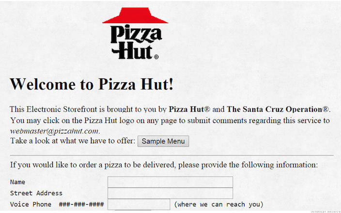
In case you’re not old enough to remember what that looked like, here’s Pizza Hut’s website in 1994:
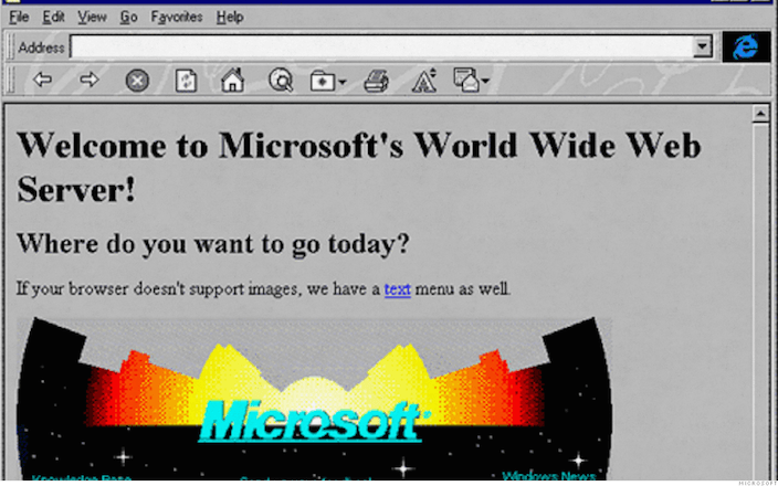
And here, software titan, Microsoft’s site:
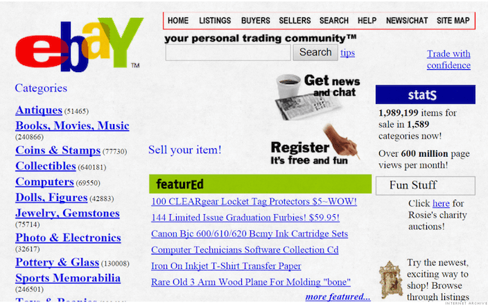
And this is what eBay’s website used to look like:
It wasn’t until 1996, when Cascading Style Sheets (CSS) were introduced, that web designers could finally begin matching the look and feel of their font to their respective brands.
Today, there’s no shortage of services that aim to help marketers display exactly the type of written content they want online — all the way down to the precise thickness and spacing of each letter.
Those services include the popular Adobe Typekit, among others, like Webtype and Fonts.com.
But those services can get a little pricey.
Realizing that, the team at Google introduced an entirely free and open-source solution.
Google Fonts
Google Fonts is an open source service that allows anyone to quickly add their favorite fonts to web pages and applications by following an easy three-step process:
1. Choose a font
At the time of this writing, there are 708 font families you can browse on Google Fonts. A “family” is a group of fonts that vary slightly in their style from the original they came from.
For example, Arial is a commonly used basic font. But there’s also Arial Black, Arial Rounded MT Bold, Arial Narrow, Arial Unicode MS, and several other iterations that I’m sure my Microsoft Word software doesn’t even have. So while there are 708 font families, there are far more than 708 fonts.
If you know the name of the font or family you’re looking for, Google provides a search bar that you can use to quickly find it.
If you’re the kind of person who will know which font they want when they see it, then you’ll want to try using a combination of filters and browsing to locate what you’re looking for.
On top of letting you sort fonts based on language, popularity, and date added, Google allows you to browse by category:
- Serif – fonts like Times New Roman that use serifs, or small lines, at the end of their characters.
- Sans Serif – These are fonts without serifs. Popular ones include Arial, Calibri, Helvetica, and Courier.Display – These are bigger, bolder, more legible fonts. They’re the type you see in headlines, on posters, and billboards.
- Display – These are bigger, bolder, more legible fonts. They’re the type you see in headlines, on posters, and billboards.
- Handwriting – This class of font is meant to mimic handwriting; and because of the variety of handwriting styles out there, fonts of this category vary greatly.
- Monospace – Also known as a fixed-pitch or fixed-width font, this is one whose letters and characters each occupy the same amount of horizontal space.
They also let you filter by font width, thickness, and slant using a nifty little sliding bar. Slide left for less thin, slanted, or wide, and right for more.
As far as comparing fonts goes, Google’s service lets you do so dynamically. What that means is, you can preview fonts based on size, wording, and format.
So if I know I’m looking for a new headline font for Instapage’s marketing collateral, I can tell Google Fonts to display type previews at a size of 28 pixels, with text that reads “Use Instapage To Build A High-Converting post-click landing page In Minutes!”
For example:
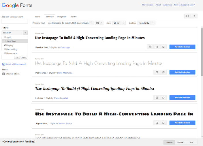
Or if I’m looking for text that will read well in body copy, I can compare it using the “paragraph” view, by clicking the tab to the right of “sentence:”
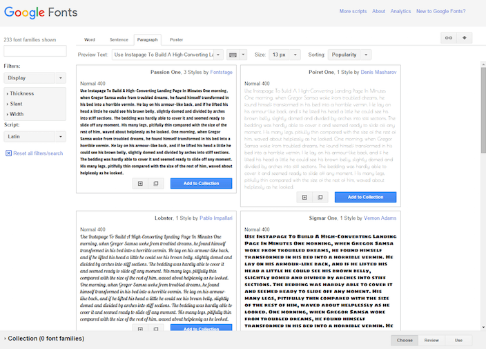
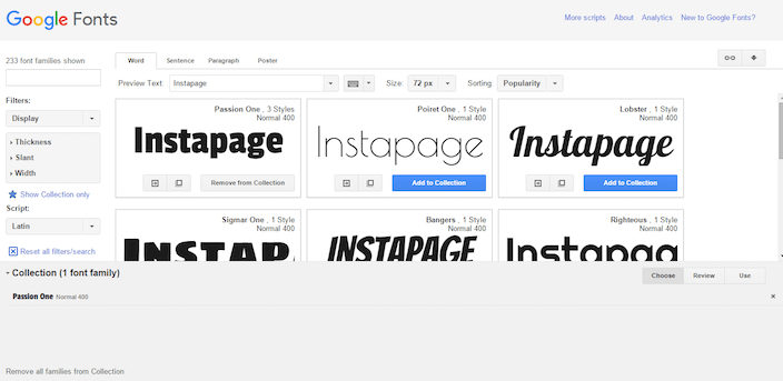
Google web fonts also allow you to preview just one word (perfect for deciding on logo font), and in a poster format (great for seeing lettering details up close and personal).
Once you’ve decided on a font, simply click the big blue button that reads “Add to Collection.” From there, you can review it before you determine whether or not you want to use it on your website:
2. Review
Now that you’ve selected your font, head over to the right of that bar on the bottom of the page and click “Review:”

This is your chance to examine the font even more closely.
From the tabs on the top of the page, you can read a description of your chosen font, see all the characters that it’s capable of producing, and even give it a test run if you want.
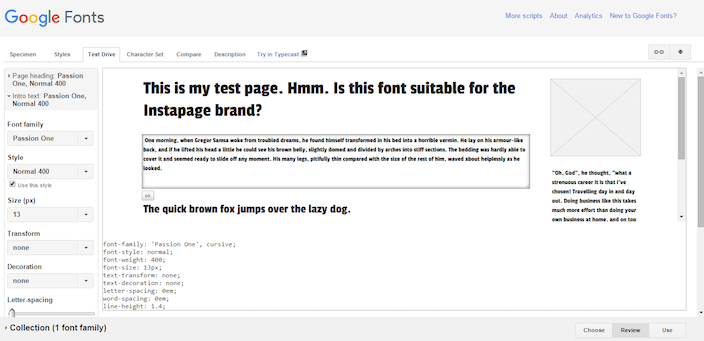
Click the “Test Drive” tab to open a mock web page where you can edit headlines, sub-headlines, and body copy to get a better idea of what a font will look like on your page:
And if you want to take it a step further, you can even use Google’s Typecast software to get a more comprehensive view of your selected font:
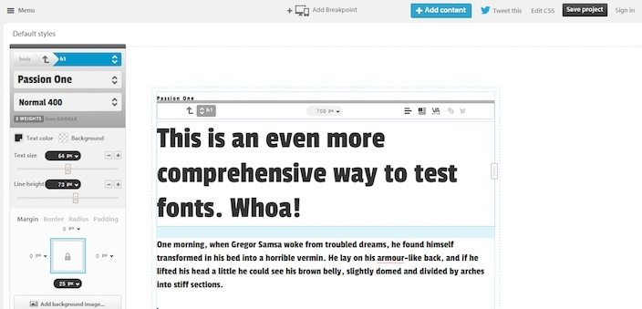
Once you’ve put your fonts through the ringer, and finally decided on which to use, select “Use” in the collection bar at the bottom of the page.

3. Use
Now you’re ready to grab the snippet of code that Google provides and inject it into your website to get started using your chosen font.
Click the “Use” button and you’ll be taken to a page that asks you which font in the family you want to use.
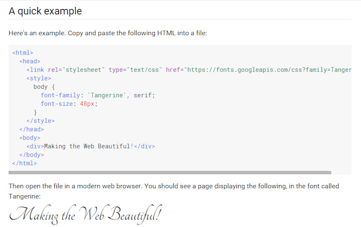
Once you’ve made your decision, scroll down and copy the snippet of code associated with your font, and then paste it as the first element in theof your HTML document.

With a little HTML knowledge and access to the back end of your website, this shouldn’t be that hard. Here’s an example of what it should look like when you’re done:
“Well now you’ve lost me,” you say.
We understand. The Internet is a fascinating and complicated place. If you don’t know what the heck a “head tag” is, contact your website’s administrator and ask them to help you complete this last step.
Or, if you operate one of the millions of websites running on WordPress, this Google web fonts plugin should take care of all of the tough stuff for you.
(And if you’re just trying to inject new fonts into your post-click landing pages, you won’t have to worry about any of that code jargon whatsoever because Instapage already integrates seamlessly with Google Fonts.)
Why would I want a customizable font for my post-click landing pages?
Typography is about more than just selecting a pretty font and slapping it on your web pages.
It’s about branding, readability, and the subconscious message you’re sending to your reader.
For example, when you see this font what movie series do you think of?

And what about this one? What beverage brand does this represent?

Right: Star Wars and Coca-Cola, respectively.
A unique font can help identify your brand, and differentiate you from your competitors.
But studies have shown it has the power to do a heck of a lot more.
Certain fonts can make you seem more trustworthy
Documentary filmmaker Errol Morris is a regular contributor to the New York Times “Opinionator” blog.
In one particular piece, he asked readers to look over a passage from “The Beginning of Infinity,” a book by David Deutsch, about the chances that Earth would be obliterated by an asteroid.
When they were through, he requested that they complete a short survey on whether or not they thought the statement was true, and how confident they were of their answer.
But Morris wasn’t really interested in whether or not they thought the content itself was true. He was interested in knowing how different fonts affected people’s view of content.
He sneakily partnered with animator Benjamin Berman to develop a way to alter the typeface of the passage so that it would appear in one of the six randomly assigned ones he chose: Computer Modern, Georgia, Helvetica, Trebuchet, Comic Sans, and Baskerville.
With the help of Cornell psychology professor David Dunning, he was able to design a test that did indeed indicate there was a significant effect on the way typography influences perceived trustworthiness.
For every 1,000 survey respondents, almost five more people agreed with the passage when it was written in Baskerville than when it was written in Helvetica. Even though that sounds small, Dunning promises that it’s statistically significant.
As it turns out, Baskerville = believable.
Why? No one is quite sure. But the study itself proves there’s more to font than meets the eye.
Typography can strongly impact your readers’ emotions
In a study conducted by psychologist Kevin Larson, ten men and ten women were separated into two groups and shown different versions of the New Yorker. One of those versions used a traditional font, layout, and image placement, and the other used non-traditional ones.
Researchers found that those reading the poorly designed version actually felt bad during the experiment; at times even displaying a prominent frown (the muscles responsible for forming a frown have been linked to the amygdala, an area of your brain that governs emotion).
Those who read the traditional layout of the New Yorker were found to have higher focus and better clarity. Not only that, but they even underestimated the time it took them to read the article, which indicated that when the piece was typographically well-arranged, subjects were more likely to be captivated by it.
Typography can make your articles easier to read
There are no “best” Google Fonts, because which ones you choose will depend on your brand and the goal of your content. However, when it comes to the best font size, Michael Bernard of Usability News may have found the answer.
He conducted a study that compared eight popular online typefaces in three different sizes: 10, 12, and 14-point.
What he ultimately found was:
- Participants preferred reading Verdana, Arial, and Comic Sans over the other five font types.
- Passages in Times New Roman and Arial were read the fastest.
- Arial and Courier were the most legible, and Comic Sans was the least legible.
- Tahoma was the most legible at 10-point, Courier was the most legible at 12-point, and Arial was the most legible at 14-point.
Other sources have claimed that 16-point font is the most legible for body copy.
Tommy Walker of CXL shares a number of expert opinions on the subject in a blog post titled “The Effect of Typography on User Experience and Conversions.”
According to the piece, the reason a bigger font should be used in all body copy is based on evidence from D Bnonn Tennant. He claims that 16-px type on our screens (below, left) is the most similar to printed text that we read in books (below, right):

While an eye-tracking study conducted by IBM and Google tested font size as it relates to reading speed, its results were not deemed statistically significant.
Turns out you’ll have to test this theory on your own.
How will you use Google Fonts?
Luckily for you, Instapage seamlessly integrates with Google Fonts, so you won’t have to worry about learning any code or contacting a website administrator to update the design of your website.
Will you use Google Fonts to make yourself more trustworthy? To differentiate yourself from your competitors? Maybe to make your content more readable?
Sign up for an Instapage Enterprise demo today.

See the Instapage Enterprise Plan in Action.
Demo includes AdMap™, Personalization, AMP,
Global Blocks, heatmaps & more.
