
Opting in for any financial service — whether it’s refinancing a mortgage loan, applying for a business loan, opening a new checking account — isn’t usually just an impulse decision. Since quite a bit of research and consideration is typically involved before taking the leap, personalized, compelling, persuasive financial post-click landing pages can’t be overlooked.
Fortunately, Wells Fargo understands this, which is why the company drives action, generates leads, and acquires new customers with the help of Wells Fargo post-click landing pages. We’ll analyze a few of them here; but first a brief refresher…
What is a Mortgage landing page?
A mortgage landing page is a standalone web page that uses persuasive elements — a compelling headline, engaging media, valuable social proof, and attention-grabbing CTA buttons — to convince visitors to take action on a specific offer. That action could be to sign up for a free trial, create an account, download a guide, register for a webinar, schedule a demo, and more.
For the company, these dedicated pages could also be referred to as Wells Fargo sales pages if the primary goal was to secure sales for a product. In this case, the conversion goal would be persuading visitors to convert into customers.
4 Wells Fargo post-click landing page examples
(For shorter post-click landing pages, we’ve displayed the entire page; but for longer pages, we’ve only shown above the fold. You may need to click through to the page to see some of the points we discuss. Also, keep in mind that some pages may be undergoing A/B testing with an alternate version than is displayed below.)
The first three post-click landing page examples are all very similar in design, and come from this Google search result for “Wells Fargo home loan:”

1. First-Time Homebuyer’s Guide
Prospects land on this page by clicking the first sitelink extension, “First Time Home Buyers:”
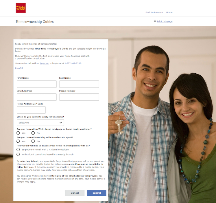
What the page does well:
- “Homeownership Guides” at the top of the page lets visitors know what the offer is immediately upon arriving.
- Encapsulating the form with a white background helps it stand out against the image behind it.
- The click-to-call phone number gives prospects a convenient way to contact customer service if needed.
What could be changed and A/B tested:
- An abundance of exit links — the Wells Fargo logo, header and footer navigations, and hyperlinked copy on and below the form — make it easy for visitors to leave the page without converting.
- The image of the people looks unrealistic and doesn’t say much about the offer or how it can benefit others.
- Adding a cover page image or key takeaways would likely help persuade visitors to download the guide. Currently, there is nothing on the page that provides any valuable info about the guide.
- 9 form fields is unnecessarily long for a guide offer in the consideration stage of the marketing funnel.
- The copy above the CTA button might deter people from clicking. Removing it and simply including it in the Privacy, Cookies, Security & Legal section might produce better conversion results.
- The option to cancel, positioned right next to the primary CTA button, is like telling prospects to second-guess their decision to download the guide.
- “Submit” on the CTA button is vague and doesn’t compel prospects to click.
2. Mortgage refinance request
Clicking on the “Refinance” extension takes prospects to this page:
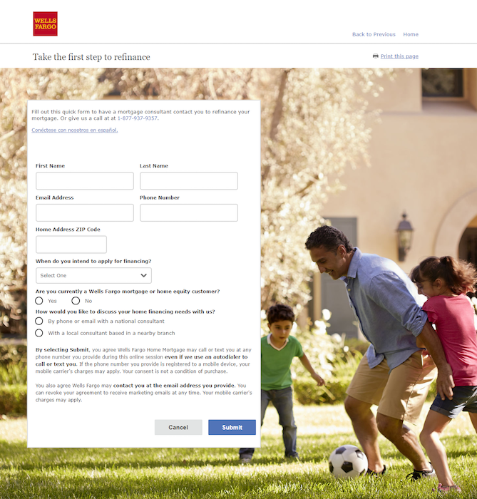
What the page does well:
- The image is realistic and engaging plus the family acts as a visual cue since they are looking toward the blue CTA button (although it still doesn’t say much about the offer).
- The white form “pops” against the busy background.
- Quick and easy contact can be made with the click-to-call phone number.
- The Spanish language change option makes it so more people can learn about the offer and request a consultation.
What could be changed and A/B tested:
- There’s no way to tell what the page offers without reading the small print at the top of the form. Neither the header or CTA button say anything about requesting contact with a mortgage consultant.
- Exit links throughout the page act as escape routes for visitors to leave without requesting a consultation.
- 8 form fields in the consideration stage of the marketing funnel might deter prospects from completing the form. Breaking it up with a multi-step form may generate more conversions.
- Replacing the copy above the CTA button with the benefits of refinancing a mortgage would likely produce better conversion results.
- The “Cancel” button enables prospects to leave right before submitting their information.
- Changing the CTA button color to a more contrasting one (like purple) could encourage more people to click.
- Personalizing the CTA button copy with something like, “I’d like a mortgage refinance consultation” would likely persuade more visitors to convert.
3. Mortgage prequalification
By clicking the “Get Prequalified” extension users see this post-click landing page:
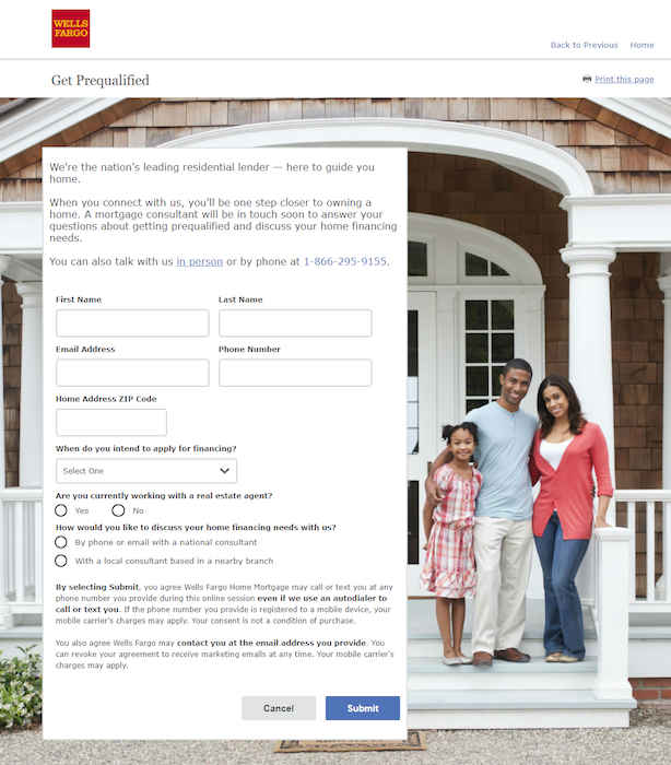
What the page does well:
- The “Get Prequalified” headline immediately lets visitors know what they’re doing on this page.
- Encapsulating the form helps it stand out against the background image.
- The click-to-call phone number allows visitors to quickly and easily make contact if needed.
What could be changed and A/B tested:
- The stock photo makes the page and offer less personalized and relatable.
- Adding a customer testimonial would let visitors know that others have benefited from a Wells Fargo mortgage loan.
- The form is daunting (8 fields) and could intimidate prospects from completing it.
- The two CTA buttons negate each other. “Submit” allows visitors to convert, but “Cancel” enables them to opt out at the last minute.
- Making the CTA button color more contrasting (like purple) and the copy to be more personalized (“See if I prequalify!”) might generate better conversion results.
- Including multiple exit links is like inviting visitors to prematurely leave the page.
4. New checking account post-click landing page
The following Wells Fargo post-click landing page example comes from this Bing ad:

Clicking the main ad headline takes search users to this page:
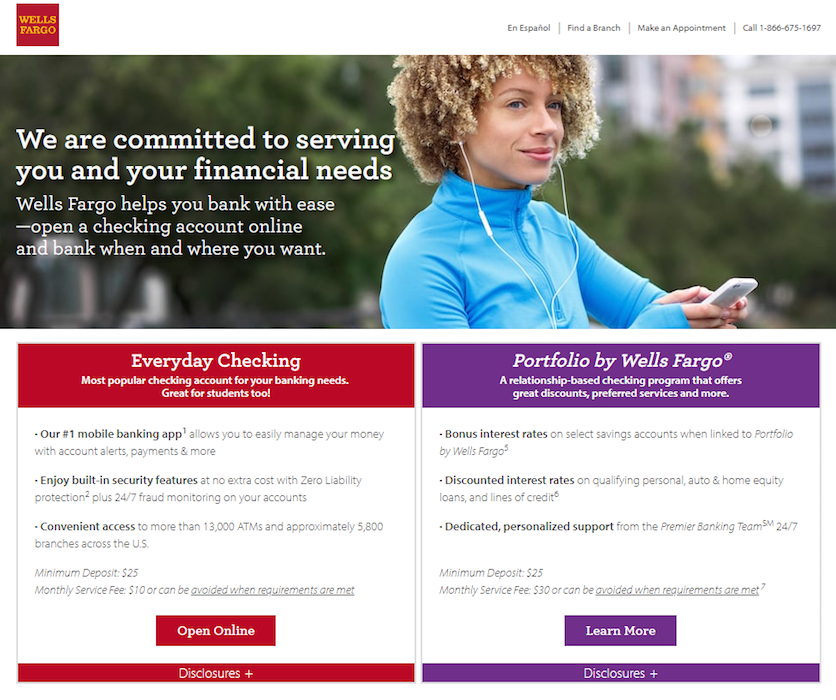
What the page does well:
- The headline uses personalized copy (“you” and “your”) to let visitors know that Wells Fargo is committed to helping them.
- The supplemental subheadline tells visitors how Wells Fargo can help.
- “Open Online” on the CTA button is enticing because it lets prospects know they don’t have to physically visit a branch to open an account.
- A click-through design removes the form from the page, which reduces post-click landing page friction.
- Expandable sections (“Disclosures” and “Show Account Details”) allow prospects to view more information without it cluttering the page from the start.
- Using iconography to help indicate the main Wells Fargo banking benefits likely captures skimming visitors’ attention more than text alone would.
What could be changed and A/B tested:
- Exit links — including the Wells Fargo logo, header navigation, “Click here to view all our checking accounts”, “Find a Branch”, “Explore Small Business Checking options”, and footer links — give visitors many opportunities to leave the page without converting.
- The image of the woman doesn’t relate to the offer at all.
- A second offer (to learn more about Portfolio by Wells Fargo) takes focus away from the main conversion goal of opening a checking account online.
- The primary offer (highlighted in red) doesn’t stand out as well as the secondary offer (highlighted in purple) because red is used abundantly on the page, and purple isn’t.
- Adding white space in between and around elements would make the page easier to navigate.
- Excessive fine print could intimidate visitors and deter them from signing up.
Take the good and leave the bad
There are plenty of positive qualities you can take from these Wells Fargo post-click landing pages, but also some areas for improvement. The key thing to remember is to create separate, unique post-click landing pages for every offer and always incorporating persuasive elements.
Ensure an optimal visitor experience every time and achieve higher conversion rates by building 100% customizable post-click landing pages with Instapage, sign up for an Instapage Enterprise demo today.

See the Instapage Enterprise Plan in Action.
Demo includes AdMap™, Personalization, AMP,
Global Blocks, heatmaps & more.
