Have you ever found yourself wondering what is more effective: creating a landing page to promote your offer, or doing all of your promotion directly on your website?
Although landing pages should be standalone pages from your website — because they are designed for conversions and websites provide more of a browsing experience — they don’t always no-questions-asked have to be standalone pages.
There are acceptable places to include your landing page link on your website if you know where to do it. Even if you do link to a anding page from your website, what you shouldn’t do is link back to your website from your landing page.
What is a website landing page?
A website landing page is simply a landing page (link) that can be found on a website. As with a typical landing page, a website landing page should still be designed with a focused objective for a single offer.
So where on your website can you put your landing page? Let’s take a look at some of the most common places to put your landing page link.
8 Places you can include your landing page link on your website
1. Footer
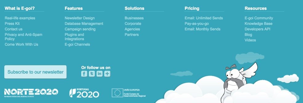
One of the most common places to find a landing page link is in the footer. Once a visitor is finished scrolling to the bottom of your website (and they’ve likely gotten all of the information they need) they can decide whether or not to redeem your offer.
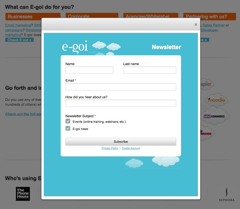
E-goi is one company that chose to include their opt-in location in the footer. They implement a two-step opt-in for people to join their newsletter. Once you click the button in the bottom left, the form appears:
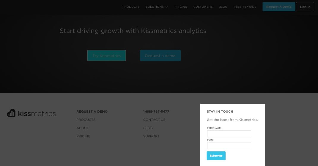
In the Kissmetrics example below, they offer an email newsletter opt-in in their footer and two different CTAs just above the footer: “Try Kissmetrics” and “Request a demo.” It’s obvious they’re placing a higher priority on the demo because not only do they link to it in the footer, but also the turquoise CTA button, and the sticky navigation menu:
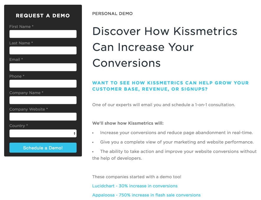
Once visitors click on “Request a demo,” they are taken to this landing page where they can schedule a demo:
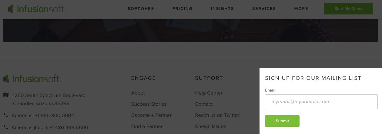
Infusionsoft is another brand who makes good use of their website footer to convert visitors, but they do it a little differently. Rather than send prospects to a separate landing page, the footer serves the same purpose as a landing page, meaning it has an opt-in form right for visitors to enter their email address:
2. Resource page or Product page
A lot of companies include a resource page or a product page on their website, usually found in the navigation or footer of the page. Since these pages typically include a whole list of products or services offered by the company, it makes them a great candidate for linking to landing pages.
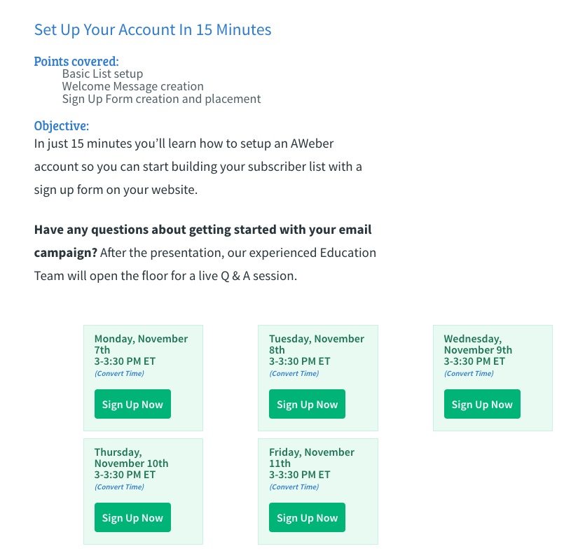
AWeber uses a number of different landing pages throughout their website. One way they link to their landing pages is by offering webinar signups in their “Resources Center.” When visitors click on “Menu” in the top right corner, and then “Webinars,” it takes you to their webinars page:
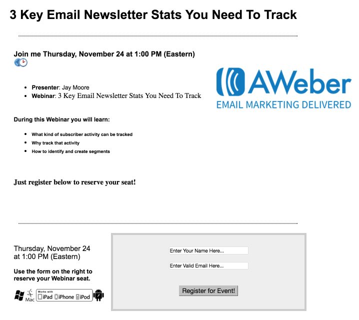
 Each of the “Sign Up Now” CTA buttons leads to a website post-click landing page where visitors can enter their name and email:
Salesforce, on the other hand, features a “Products” section in their website navigation. On this page, visitors will see several different CTA buttons, enticing prospects to “Watch Demos” for a variety of their products:

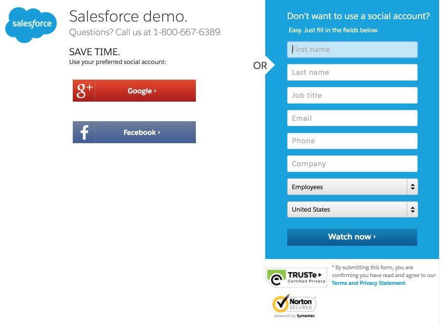
When users click on any of these CTAs, they are brought to a landing page inviting them to enter their information and watch the demo:
3. Sign Up page
The “Sign Up” link/button is another common way to promote your landing page on your website. In both the Mixpanel and Campaign Monitor examples below, the “Sign Up” link is located in the top right-hand corner of the page. To draw attention to each link, notice how Mixpanel used bold text while Campaign Monitor added a box around their button:
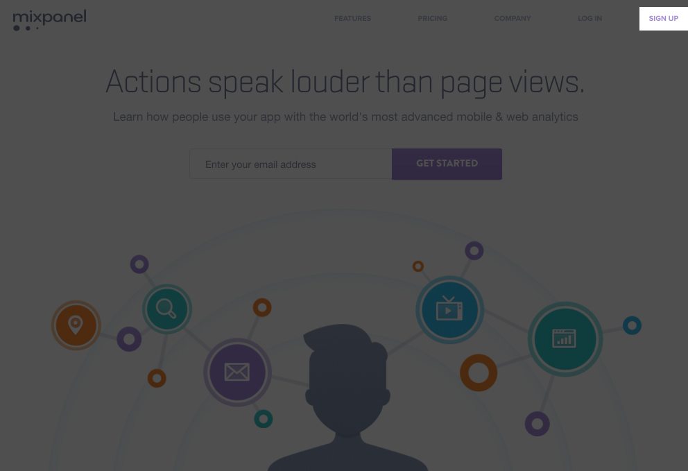
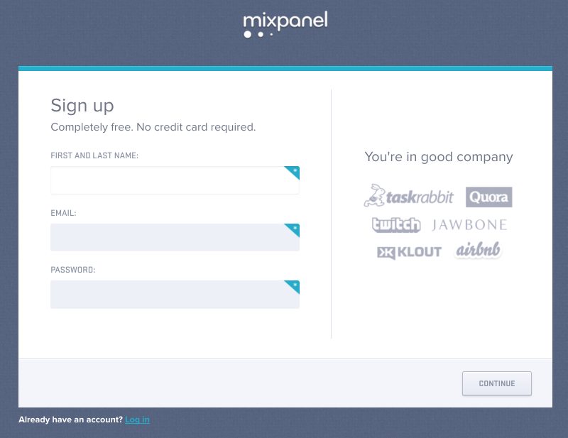
Upon clicking Mixpanel’s sign up link, you’re sent to this page:
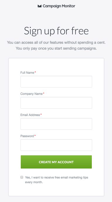
Upon seeing Campaign Monitor’s homepage and clicking their Sign Up button, you’re sent to the subsequent page:

4. Blogs
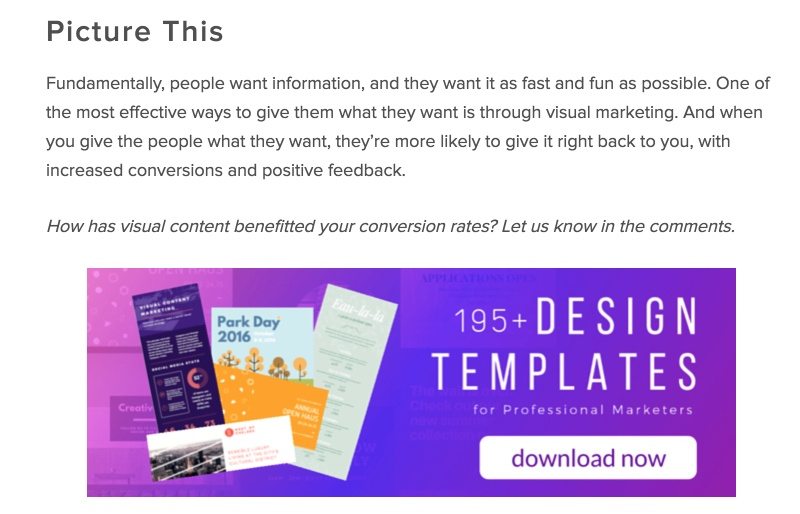
Blog articles are an ideal place on your website for a landing page link. That’s because CTAs are commonly found within the context of a blog post — like the bottom. To increase your chances of readers clicking your CTA and converting on your offer, make sure the CTA and its corresponding landing page are closely related to the blog article they just read.
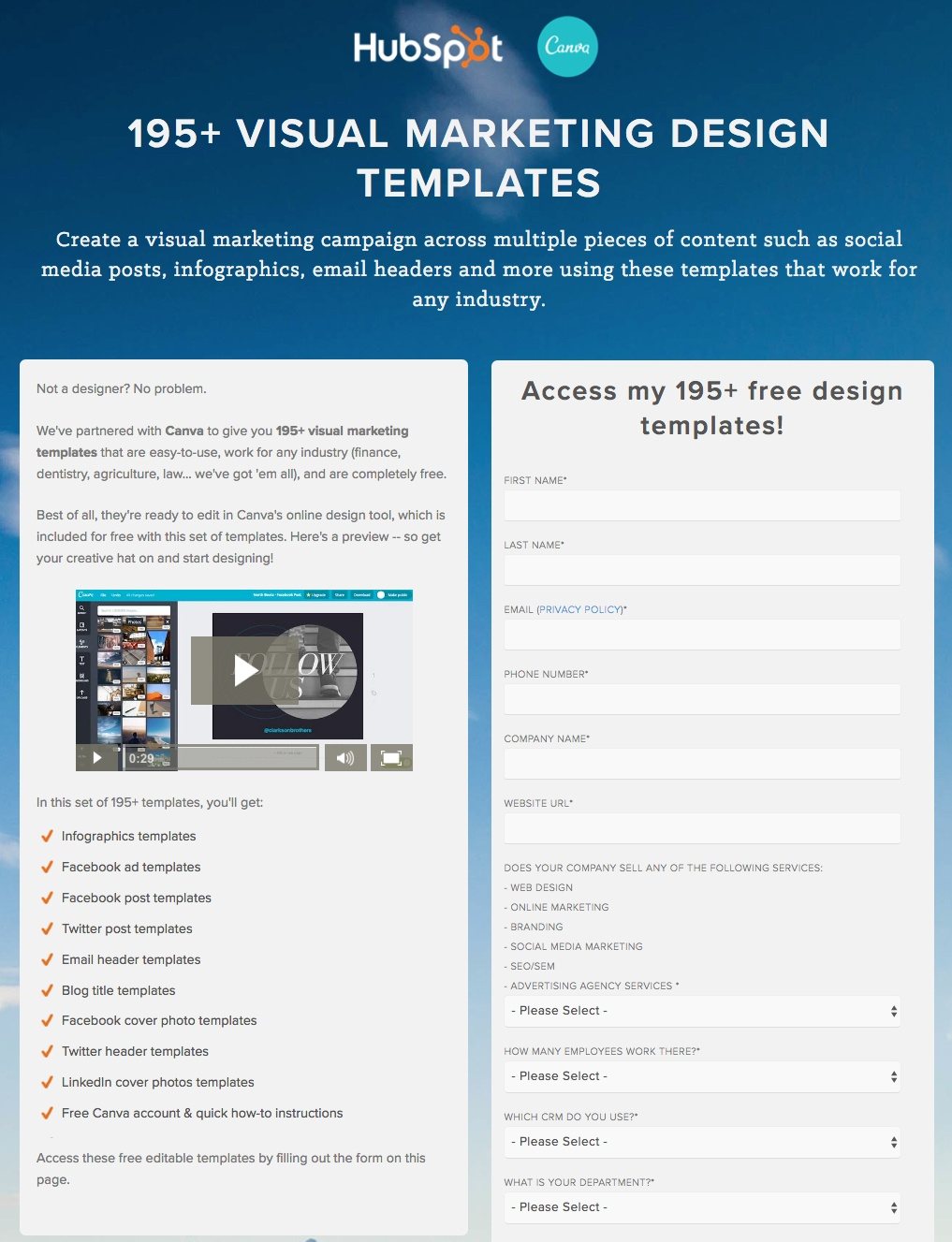
For example, this Hubspot article includes a CTA at the article’s conclusion (image #1), which links to a landing page that offers something closely related to the blog article — visual marketing design templates (image #2):
5. Banners
Banners are a great idea to place a landing page link because banners often have high visibility on homepages. They are often located at the top, bottom, or even the side of the page. But they can also be “sticky” in that they follow users as they scroll up and down the page.
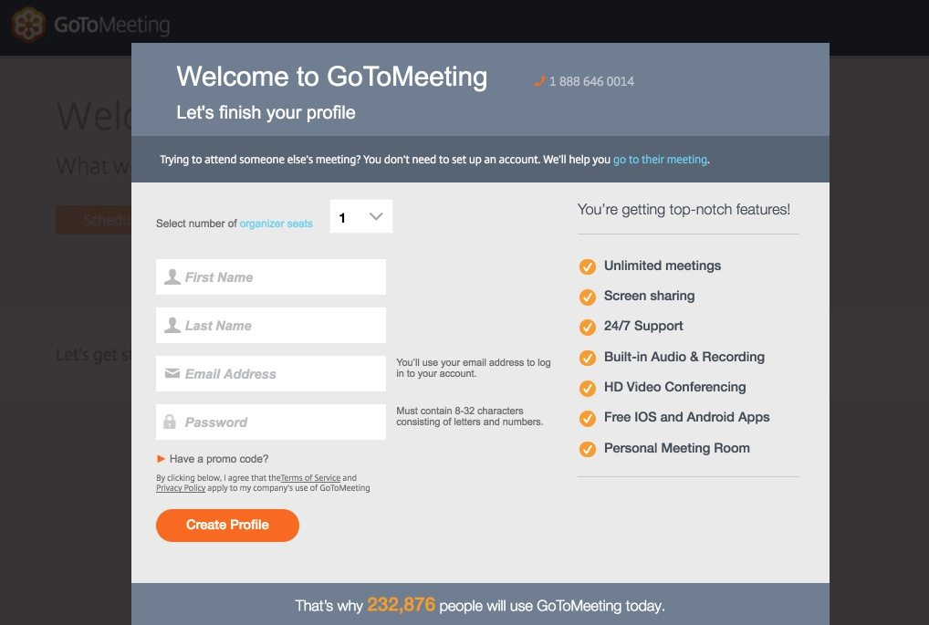
The GoToMeeting example below (image #1) demonstrates a sticky banner with free trial and “buy it now” CTA buttons. If the visitor clicks on the “Start My Free Trial” link, they are taken to the corresponding landing page (image #2), where they can enter their information to create a profile:

6. Pop ups
In this context, pop-ups are often referred to as exit intent pop-ups or delayed squeeze pages because the objective is to persuade the visitor into submitting their email address in exchange for an offer.
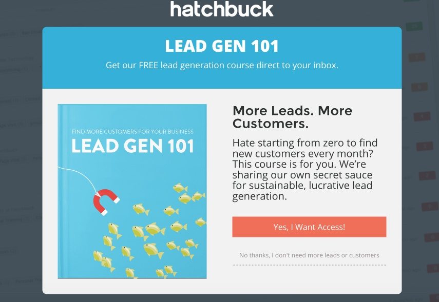
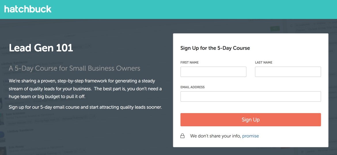
While navigating through Hatchbuck’s website, we see the exit intent pop up for their lead gen 101 course (image #1). After clicking the CTA button, you’re directed to the lead gen course landing page (image #2):
7. Contact link
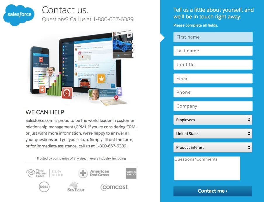
The “contact” link is a staple of most website navigation, and if you do it right, this is another viable option for a landing page link. When visitors click on Salesforce’s “Contact Us” link (image #1), they are sent to the landing page that follows (image #2):

8. Drop-down menu
Although not quite as common, some brands even choose to put their landing page links right in their drop-down menus from the navigation. Marketo is an example that makes great use of this method.
The first image below shows that when visitors hover their mouse over the “Products” heading, the landing page link, “Watch 4 minute demo,” is listed at the bottom of the drop-down menu. When the visitor clicks this link, they are brought to the demo landing page (image #2) where they can submit their information on the relatively short form:


Place your landing page link strategically
As the examples in this post demonstrate, landing pages don’t always have to be standalone pages from your website. As long as you know where to include your link suppose you are an author. You can include your author’s landing page link on your website. It can be an effective technique to generate landing page traffic.
Whether you opt to place your landing page link on your website or not, start building your own high-converting landing page with Instapage. Sign-up for an Enterprise demo today.
Try the world's most advanced landing page platform with a risk-free trial.
