
Creating an optimized post-click landing page is no piece of cake. It’s not as simple as using default form fields and slapping the form on the page to collect leads.
Marketers need to strike the right balance with every element of their post-click landing pages in order to capture leads. So, even though a post-click landing page is only a single page per se, there are many questions for you to consider when optimizing your form:
- How many fields should I have?
- What stage of the marketing funnel are my prospects?
- Is my goal to collect as many leads as possible right now so I can nurture them to a sale down the road?
- Should I qualify my prospects from the get-go by requesting a lot of information?
- How will my web forms look on mobile devices?
These are important questions to ask yourself, especially when you consider that your prospects only take 50 milliseconds to form an impression about your page.
This short time frame drives a lot of marketers to cram every page element they deem most important above the page fold.
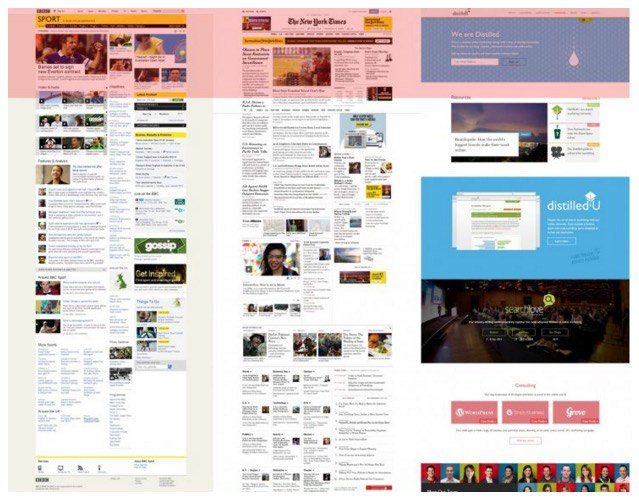
When this happens, marketers start producing cluttered post-click landing pages that look something like this:

Let’s see what elements we have on the page above the fold:
- Images
- Headline
- Lead capture form
- Trust seal
- Phone number
- Bullet points of the benefits
Would you want to fill out this form and click the CTA button? Can you even find the CTA button in this jumbled mess?
Jamming every element above the fold doesn’t create an optimized post-click landing page. To create a visually appealing, mobile responsive, and optimized page; get over the above the fold obsession and come to terms with the fact that:
Everybody scrolls.
Today we’re going to debunk the myth that every lead capture page element should go above the page fold, as well as learn the most optimal position for your post-click landing page web forms.
A reminder about the “fold”
The “fold” originates from the newspaper industry, where the positioning of an eye-catching graphic or a juicy story could increase the sale of a particular newspaper.
This is how they used to sell newspapers:

On a web page, the fold is the area of the page that’s visible to the visitor without having to scroll. The “fold” is not an absolute line because it varies with the size of the screen your visitor uses to view your page (and device, too). If your pixel screen resolution is 1366 X 768 the area highlighted would count as the fold:
Marketers scramble to put their lead capture forms above the fold because they don’t want to miss a conversion opportunity just because a visitor didn’t scroll.
However, placing a lead capture form too early on the page can cause conversion friction and makes the visitor second guess his or her decision to fill out the form. You can’t expect people to complete a form with their personal information before you give them all of the available information about your product or service.
In the end, just because the form is placed above the fold, doesn’t guarantee that it’s going to be filled out.
Everybody scrolls
So much focus on the “fold” debate has left most marketers and designers to undervalue and overlook the page from below the fold. Many marketers believe all they need to do is create a stellar page above the fold, because what happens below the fold doesn’t matter.
Various studies show that a vast majority of web users scroll on a given page and that a significant percentage of visitors begin scrolling on the page even before the page has finished loading.
According to Amy Schade of the Nielsen Norman Group:
“The fold still exists and still applies… But more than a measurement, the fold is a concept… Users do scroll, but only if what’s above the fold is promising enough…anything that’s hidden and that the user must uncover will only be seen if the user deems it worth the hassle.”
To encourage scrolling on your post-click landing page, convince your visitors that your page is worth scrolling down. This doesn’t happen by placing everything above the fold. It happens when you strategically optimize your page for lead generation and user behavior.
Tell a story with your post-click landing page first and request your visitors’ information later — when they have acknowledged that the story is applicable and beneficial to them.
Nobody can deny that your post-click landing pages get viewed more above the fold, but that doesn’t necessarily mean always viewable.
Google’s report, The Importance of Being Seen: Viewability Insights for Digital Marketers and Publishers shows that above the fold isn’t always viewable, while below the fold often is:
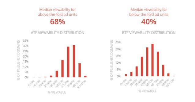
In fact, a Clicktale study shows that if a page has a scroll bar, it will be used by 76% of users to at least some extent while 22% users will scroll to the bottom of the page.
What does this mean for your web forms?
Your web forms collect user data and fulfill your post-click landing page goals — making them one of the most important elements on your post-click landing page. The form’s positioning is an important thing to consider when designing your post-click landing pages.
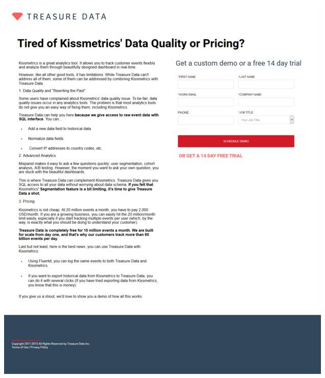
Should your web form go above the fold, like Treasure Data’s post-click landing page:
Or should you place it below the fold, like Quality Logic does:

Or, how about using a two-step opt-in process, like we do on the Instapage post-click landing page:

Where you place your forms depends on the type of post-click landing page you’re creating and your industry.
Are you selling insurance? Placing your form above the fold will be premature, explain what your company does first, go through your unique value proposition and then request your visitors to convert.
Do you want users to sign-up for a free trial? Here, you have a little leeway. Place your form either above or below the fold after you have acquainted your visitors with your product.
As a rule of thumb, remember that you’re better off placing your form below the fold if your product or service:
- Is expensive
- Is complex and needs more copy for explanation
- Requires a high commitment
post-click landing page web forms’ placement is crucial to capturing leads. Don’t let the fold dictate all your post-click landing page decisions.
Did you know, Instapage allows you to create two-step opt-in forms in just a few clicks. Sign up for an Instapage Enterprise demo today.

See the Instapage Enterprise Plan in Action.
Demo includes AdMap™, Personalization, AMP,
Global Blocks, heatmaps & more.
