
- Visual advertising techniques
- Images
- Show an after photo
- Show a before photo
- Easy to understand concept
- Show everything necessary
- Give stats more context
- Establish trust
- Video
- Prove what you claim
- Simplify your service
- Get clients to advertise for you
- Show examples of success
- Hero shots
- Text
- Build brand recognition
- Make reading easy
- Get personal
- Web design
- Be strategic with color
- Guide visitors to convert
- Conclusion (free guide)
Outside of radio shows and podcasts, the ads we consume are highly visual. For you, as an advertiser, it’s a double-edged sword:
You know people mostly consume visual ad campaigns, and this provides a great starting point.
At the same time, advertising is about standing out. With so much competition, how do you effectively use visuals in ads to earn click-throughs? And after that, how do you use them to convert on landing pages?
Visual advertising techniques and examples
Images, videos, text, and web design are part of the recipe for a great visual advertising campaign. But, there are times to use each, and places where one form may excel where another may fail. Here are some strategies and techniques, complete with examples, of how to use them in your visual ad campaigns.
Images
By far, images are the most used visuals in advertising. They’re easy to create, easy to consume, and with the right design and strategy, they can steal attention and communicate value propositions in a blink. Here are a few ways to use them in your visual ad campaign:
Show an after photo
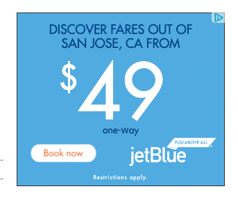
When it comes to conveying the benefit of your offer, it’s almost always more powerful to show than tell. That’s when hero images come into play.
Hero images are a specific class of image that you might consider an “after” photo. As in, what does the visitor’s life look like after claiming your offer?
If your product saves time, a hero shot might show them out doing something enjoyable with all the time they saved. If it improves their appearance, maybe through clothing or grooming service, an ad might depict a well-dressed, well-groomed, popular person at a social gathering.
Hero images help the consumer envision themselves as the benefittor of your product or service. They are the hero in their own story. They are Popeye, you are spinach. They are Clark Kent, you are a phone booth.
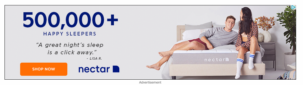
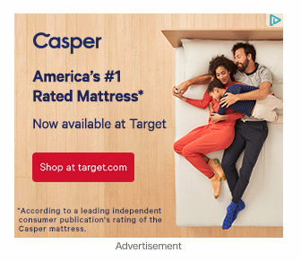
Alternatively, the hero shot can position the product as the hero. In this case, you would see the product more directly involved in saving the day. For example, you sell retractable awnings. The benefit of these is you can enjoy yourself outdoors on a hot day without baking in direct sun. In a hero shot like this, you might show a family enjoying the outdoors on a bright day under an awning, smiling, sipping lemonade. The heroic deed of the product is saving the family from the searing sun.
Both hero shots are highly effective, and a version can be used for all products and services. Here is another example from Casper:
Show a before photo
While emphasizing the benefits if your offer is always a good idea, sometimes it can be even more powerful to push your prospects’ pain points. Take collaboration software, for instance.
It might be effective to emphasize the long, back-and-forth email chains, useless meetings, annoying games of phone tag, to remind your prospect why they are considering your offer.
Again, while this isn’t recommended for every brand and offer, sometimes conjuring the hassle of life without your product can drive your prospect to action.
Make it easier to understand your concept
As opposed to a written representation of a concept, icons are graphic. In advertising, icons are especially useful for two reasons. The first is that people don’t like to read lengthy marketing content. Icons can break up long blocks of text to make it easier to consume. Here’s an example from Nectar:
![]()
The second reason is that people can consume images more easily than text. I can describe a square to you, or I can show you one. I can write “Mobile Navigation Menu,” or I can show you a hamburger icon. I can write “Search Bar,” or I can offer a button with a magnifying glass to represent it.
In all cases, the image is easier to consume.
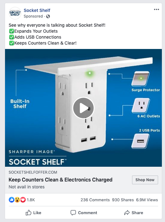
Show them everything they need to know
While most people do prefer browsing online, a large portion of consumers still prefer to purchase in-store. And there’s a pretty clear reason for this:
Shopping online, you don’t get to feel the product, try it on, test it out. And this puts digital advertisers at a great disadvantage. But product images can solve that problem.
Product images are actual images of the product that help viewers determine if it’s what they need. For furniture, this would mean images of all the angles of the piece, including people using them for points of reference.
Something similar works with clothing. Show people wearing the clothing from all angles. Show the clothing without someone in it. Show different colors.
This can even work for software, by showing an image of the interface to prove, say, robustness, or ease of use. Here, it works for Socket Shelf, a tool that charges electronics while maximizing counter space:
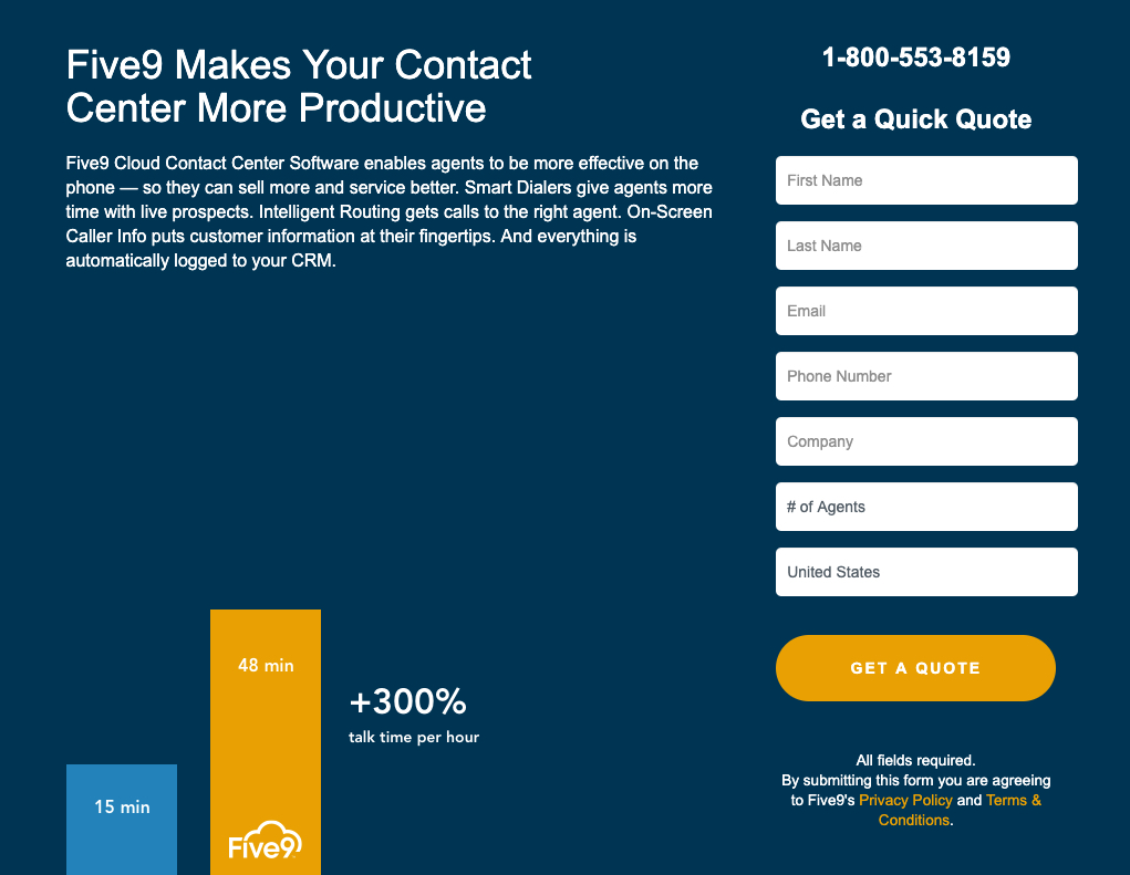
Give your statistics some context on the post-ad click page
Like benefits are better shown than told, the same goes for statistics. When you have powerful numbers on your side, infographics are great for displaying them.
Infographics take mundane statistics and put them in an easily digestible form, like a bar graph or a pie chart, for example, to make them easier to understand and more likely to be consumed.
They can also help frame your product or service in a way that proves how much more effective they are than the competition. Take this infographic from Five9:
Show them they can trust you
Many times, conversion has less to do with your product or service and much more to do with trust. Do your prospects trust you? With badges, you can increase the likelihood they do.
Badges are small, recognizable images that make the visitor more comfortable with converting. There are three different types:
- Security badges: Security badges are ones that convey your prospects’ site and money are safe. These can be as basic as small lock icons, conveying the site is secure, or they can be satisfaction guarantee badges, which let visitors know they can get their money back if they’re not satisfied with the product.
- Trust badges: Trust badges make a business seem more trustworthy through logos of recognizable brands like the Better Business Bureau, or Google’s Certified Partner program. These let visitors know that they have support from a reputable company.
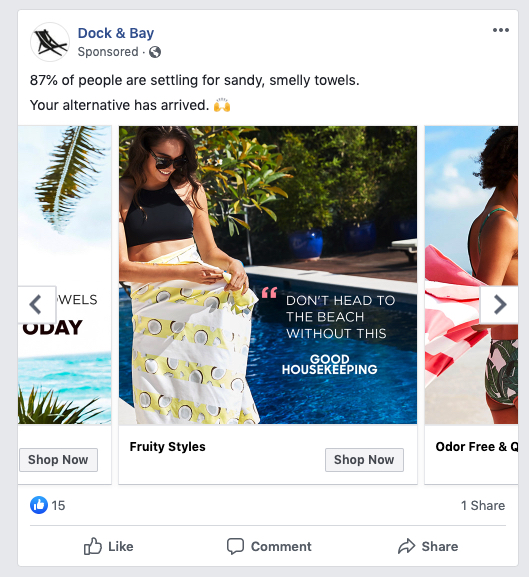
- Authority badges: Authority badges are similar to trust badges, in that they can be logos from reputable companies. However, they’re less like certifications from the BBB, and more like logos of clients served. Many people can become Google ad partners, but not as many can say they have provided a service to Google. That’s the difference. These badges can also be ones that say “Award-Winner” or “As seen in the New York Times.” They can even be infographics that tout particular statistics, like an advertising agency might tout revenue earned for clients, or clients served, or the number of years in business. These all add authority, and in turn, make the conversion more likely. Here’s an example from Dock & Bay.
Video
While images are great for grabbing attention and conveying information quickly, videos can do that and then some. Motion is perhaps the best way to snap a user out of scrolling, and even a short video can convey much more in-depth information. Here are a few ways to use it.
Prove that your service is what you claim
When your company is new, and especially when it relies on a figurehead, you need to be able to prove it can do what you claim. Think a writing course from a “World-Class Copywriter” you might get an ad for in your inbox. So, what makes this writer “World-Class”?
This is what an introductory video can help prove.
An introductory video is often longer than your standard advertising video because it involves some in-depth information, like why the company was founded, why it’s trustworthy, what
authority it has, etc. It usually features a high-ranking company employee, who will cover these topics one by one. When done well, these videos leave prospects feeling as though they can trust the brand behind them, despite their lack of recognition.
Simplify your service
A major problem suffered by new companies or whose services are highly complicated is the barrier to understanding how it all works, and how it translates to a benefit to the prospect.
To solve these problems with text, it would take pages. To solve them with images would be impractical. This is why explainer videos are so valuable.
You’ll see this visual advertising technique very often now, especially in the startup sphere where there are lots of new faces every day, and increasingly complex services that are firsts-of-their-kind.
These videos are often less than two minutes and explained so simply that anyone can understand them. To add to their simplicity, they also often contain cartoonish animations that carry out the script of the video.
The most famous explainer video comes from Dropbox, which raised $48,000,000 for the company after it came out.
Get your clients to advertise for you
As powerful as advertising can be, it’s not nearly as powerful as word of mouth. When it comes to making purchasing decisions, most people go to their friends and family. And that’s because they’re impartial in the matter. Every business will claim it’s the best for you, even if it’s not. Your friends and family, however, will tell you the truth.
This is the power video testimonials harness. These are short videos that focus on a particular customer and how you solved their problem, from the perspective of the customer, with an emphasis on results.
These are even more powerful than regular testimonials since they are much more believable than a simple stock-photo-looking image accompanied by a first name.
Offer examples of your success
Testimonials can work wonders, but many customers will want to know more than results. How did you accomplish what you did? What is your process like? What methods did you use to solve the problem?
This is what a video case study can solve. Video case studies are similar to video testimonials in that they focus on a particular customer and how you served them, but instead of a focus on results, this focuses on process. As such, these videos are usually longer because they go more in-depth, and involve more parties than just the customer — like teams from your business who worked with them.
Take your hero shot to another level
Hero shots can make the prospect or the product the hero, but they both suffer and benefit from their static nature. They can be more widely used in marketing collateral because they’re simple images. However, they are not as demonstrative as videos.
To take your hero shot to another level, you can create a product demo, which will show how your customers use your product, and how they benefit from it, too. These can be short for the pre-click stage, or longer for landing pages. Either way, they will show specific shots of your product in use. This can also double as a kind of explainer video coupled with a product shot that gives visitors all they need to know about using the product.
Text
When we think of visuals, we think of images and videos. However, the way text appears on a page greatly affects how we consume it. Here are a few ways to improve what you say with the way you say it.
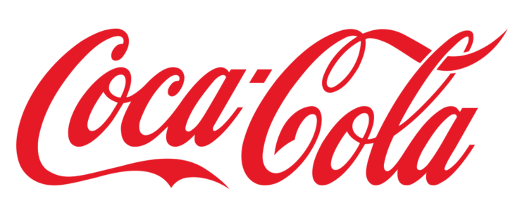
Build brand recognition
It’s likely that when you see something written in red Spencerian script, you will always think Coca-Cola:
The same can be said of the typeface used in Nike’s logo, or the Got Milk campaigns:
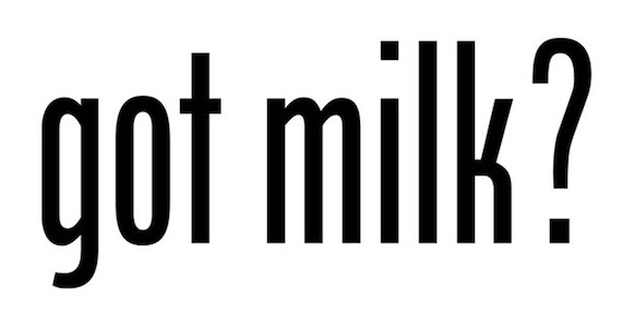
These are examples of what happens when brand recognition is built over years of repetition. We’ve seen them so many times, in so many high-visibility places, that these fonts seem to belong to the businesses they represent.
This is a win for the advertiser, as recognition is a powerful driver of brand equity. Decorative fonts like these are great for expressing creative individuality in logos and campaign headlines. So if you’re looking to make a lasting impression, or to stand out from the crowd, decorative font is the perfect choice for shorter copy.
Make reading easy
While decorative fonts can grab attention and bolster recall and individuality, they’re awful to read in body copy.
Imagine trying to read an entire web page or email written in Coca-Cola’s font. Pretty difficult, isn’t it?
In the pre-click stage, decorative fonts can grab attention. In the post-click stage, they can reinforce brand identity. But when it comes to any heavy reading, like you’d do in an email or on a landing page, decorative fonts should be out.
Instead, opt for clean and simple fonts with high readability. Use short sentences. Break up long paragraphs into small chunks, and use bullets when they’re appropriate. Here’s an example of what high readability looks like:
Get personal
Now that we’re constantly bombarded with advertising messages, it’s the personal ones that stand out. Sometimes you can add that personal touch with a handwriting font.
Handwriting fonts are exactly what they sound like: They appear to be handwriting. Most are easier to read than actual handwriting, but you’re not going to be using them to write anything long-form.
Mostly, handwriting fonts can be good for signatures, so long as they look realistic. They’re valuable at the end of an email or direct mail, even landing page copy, to give the impression that the signer stands behind the message of the ad. This can boost trust when your typical consumer feels like they’re getting messages from bots and salesmen all the time.
Web design
Visual advertising isn’t just about visuals on ads and landing pages; it’s also about how those pages look together, visually, as a whole. Especially after a user clicks through an ad, the right colors and arrangement can guide them toward conversion.
Be strategic with color
Color is one of your most valuable allies when it comes to grabbing attention in the pre-click stage. Bright, bold colors that contrast surroundings can keep your prospects from scrolling.
When most pages are white, it’s easy to pick a dominant color, like yellow or red, that will likely pop on the publisher’s page. If you know where your ad will be running, like on Facebook, for example, then you can create an ad that will contrast a blue and white environment.
Unlike in the pre-click stage, however, in the post-click stage, bright and bold colors shouldn’t be used so liberally.
Studies have shown that simpler is better when it comes to picking a conversion-centered color scheme. Three hues are an ideal number for guiding visitors toward your call-to-action button. Use the 60-30-10 rule to pick those colors:
- Dedicate 10% of one color on your page to the accent. This is the color you want to grab people’s attention. This is what you’ll color your CTA buttons in.
- Dedicate 30% of another color to the base. The color of this base will be determined by your accent color. What color does your accent stand out on the best?
- Dedicate 60% of another color on your page to the background. This should be something soft that won’t clash with your brand colors. For many, the best choice is white.
Using your brand colors or accent color as a starting point, you can create all kinds of effective schemes with monochromatic, complementary, and analogous colors. Together, they will help draw your visitor to the CTA button. Here’s an example of an ad that uses a bright color very different from the rest of the ad, to make the CTA button stand out:
Subtly guide visitors to conversion on the landing page
Like text on a web page is visual, so are all the elements around that text. And how those elements are arranged have a big impact on the way the viewer consumes the page.
For example: What if you came across a web page that aligned its text center? Or, what if you came across a form button like this one:
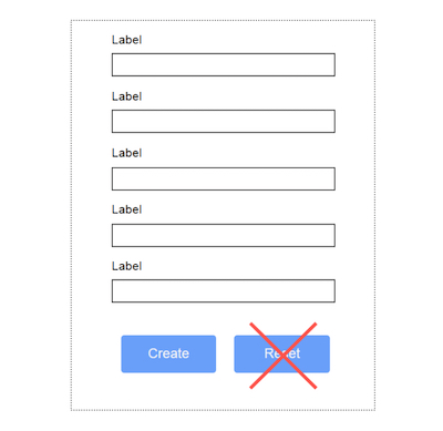
Most likely, you’d enter your information and accidentally hit “Reset” at the bottom, because you’re used to there being a “Submit” button there on all other websites.
While “Reset” buttons were more common in the web’s infancy, we’ve outgrown them, realizing that the risk of using them outweigh the rewards (hardly anyone will need to reset all form fields).
Similarly, centered text works for headlines, but not body copy. Longer reading needs to start at the left margin.
We take these conventions for granted because they’re primarily followed by most web designers. Good design is hardly noticed, but it’s always easy to consume.
This brings us to maybe the most valuable (and often overlooked) visual advertising convention for designers of landing pages: the visual hierarchy.
Visual hierarchy refers to the arrangement of elements on a web page in such a way that it subtly directs attention, guiding your visitors toward the page’s goal. On a landing page, that goal is conversion.
To accomplish that goal, you have to get your visitors from your headline to the CTA button. Here are some design principles you should know to be able to do it.
- Size: Bigger = more important. Smaller = less important.
- Weight: Darker = more important. Lighter = less important.
- Color: More contrast = more important. Less contrast = less important.
- Density: Several elements packed together = more attention. Spread out elements = less attention. (This doesn’t mean you should pack all your elements into one small space).
- White space: Positive space = more important. White space = less important.
Together, you can use these to design a page that subtly guides your visitor to conversion. Here are a few examples:
- Size: Headlines should be bigger, forms should take up space, important images should also be bigger.
- Weight: Headlines and subheaders can be bold (do not have to be), important body copy, like benefits, should be darker than surrounding body copy.
- Color: Background should be lighter, secondary elements like forms and logos should be brighter or darker to create contrast, and there should be most contrast between the call-to-action button and the rest of the elements to make it the most attention-grabbing element.
- Density: Bullets can pull benefits out of densely packed body copy, CTA buttons should have no other content around them to draw attention to that one element.
- White space: Your page shouldn’t be all white space, but it should offer enough white space for visitors to read comfortably and consume each element independently of the others without confusion.
Get more about visual advertising
The prevalence of visual advertising is only growing, and that’s true of the platforms you can execute it on, too. Marketers have their hands full when it comes to running visual ad campaigns. With these techniques, create a more effective campaign faster. To speed things up even more, learn the ad specs of every platform’s formats with the Instapage Digital Advertising Reference Guide.

Try the world's most advanced landing page platform with a risk-free trial.
