“I was once told that I draw like a person who can’t draw,” says illustrator June Chanpoomidole.
Imagine hearing that feedback from a client. If they weren’t the reason your marketing agency is entering 2017 comfortably in the black, you’d happily tell them to go pound sand.
But, for better or worse, they are. So, if you want to keep your relationship strong and your agency financially stable, you probably shouldn’t respond with the first few words, or hand gestures, that come to mind.
Instead, it’s a better idea to take a breath and do your best to translate their feedback into something more helpful to you and your team.
Though, that’s easier said than done when many of your clients’ comments can come across as useless, and in some cases even insulting.
So how do you first recognize bad client feedback, and second, how do you translate it into something meaningful that you can use to deliver a better product?
The difference between bad and negative feedback
There’s bad feedback, and then there’s negative feedback. They may sound similar, but we assure you, at a closer look they’re very different.
When a client responds to a blog draft or a web page design with something like, “This isn’t good — change it,” you’re getting bad feedback. All that statement tells you is what you’ve put together isn’t up to their standards. It provides no direction or next steps for improvement.
On the other hand, a better version of that statement might be, “This is a good start, but we’re looking for something that focuses more on the effects of color on conversion. Can you add a section to the blog post about that please?”
See the difference? You’re still being told what you produced missed the mark, but at least now you know what you need to do to improve that blog post. It’s negative feedback, but it’s good feedback.
Positive feedback can be bad, too. Praise like “This is great. We love it, thanks,” doesn’t help you understand why exactly your design, infographic, or blog post is good. Knowing the “why” is essential to meeting your clients’ expectations on a regular basis.
Here’s a great chart from Elizabeth Saloka at Brain Traffic to help you identify the different types of feedback:
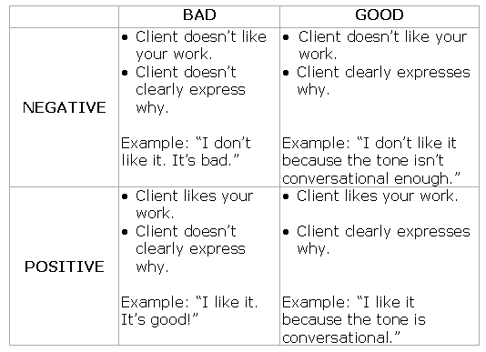
If most of your clients’ comments fit into that first column, you’ll need to do the extra work involved in decoding them. We’ve gathered some real-life examples of bad feedback from the creative community to give you an idea of how.
7 examples of bad client feedback, and how to translate them
1. Client feedback not based on facts
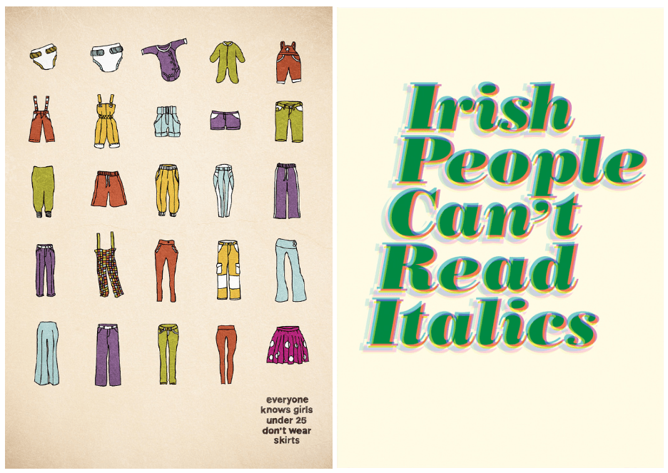
Who doesn’t know that girls under 25 don’t wear skirts? That’s common knowledge, right?
Sweeping generalizations like these aren’t based in fact. Do you know any Irish people who can’t read Italics? We don’t either.
When you get bad feedback like this, it’s important you question your clients about their sources. If their comments are based on anything other than reputable research or company data, warn them that it could affect the outcome of your project.
Let’s say, for example, you’re creating a Facebook ad campaign for a clothing retailer that’s released a new line of skirts. What happens if you exclude women under the ages of 25 in your targeting based on the client’s statement, and they actually turn out to be one of the line’s biggest supporters?
Making business decisions based on anything other than fact can harm your client’s ROI, and your reputation as a marketing agency.
2. Comments that fly in the face of common sense

Red and green are to Christmas as a globe and passport are to travel. That, unlike 24-year-olds who don’t wear skirts and Irish who can’t read italics, is commonly understood. So, when your client tells you it’s not, it’s in your best interest to show them examples of big brands who get it.
Screenshot successful holiday post-click landing pages that use the colors red and green, and show them logos of reputable travel companies that incorporate a globe or passport.
Remember, in some ways dealing with a client can be like dealing with your own child: What they want isn’t always what’s best for them.
Unlike with a child, though, it’s your job to keep clients happy. Try to figure out why they feel the way they do and convince them that their feedback could potentially harm the campaign.
If they still want to use orange on their Christmas post-click landing page after you’ve made your case, it’s your job to appease them, even if you don’t recommend it.
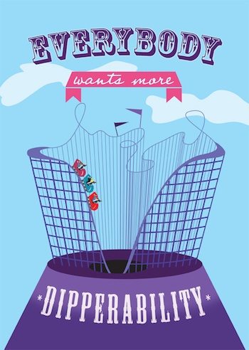
If there’s one thing everybody could use a little more of, it’s dipperability. Before we can give it to them, though, we need to figure out what on Earth it is.
“Dipperability” is an example of jargon likely coined by a particular business. More widely used buzzwords like “innovative” and “thought leadership” are two you’ll probably hear more often.
The problem with words like these is that their meaning isn’t always clear or universally understood. If jargon like “dipperability” finds its way into your client’s feedback, don’t be embarrassed to ask for clarification: “What do you mean by dipperability?” “How do you think I could display more thought leadership in this blog post?”
The result will be a project they’re happier with than if you try to decipher their comments on your own.
3. Vague client feedback
An anonymous contributor to Clients From Hell writes:
“The client I was working with gave me a rough design concept that I worked on for two weeks. He didn’t give me much in the way of feedback but signed off on every iteration over two weeks. I had a nearly finished version ready in time for a final round of revisions before going to print but hadn’t heard anything for days.
One day before the print deadline, the client sent me an email:
Client: Make it more visual.
He then went to a meeting for the rest of the day and took the weekend off.
I’m still not sure what he meant.”
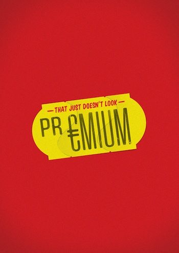
Comments like “This just doesn’t look premium,” and “Make it more visual” are too vague to help you make any improvements to the project. When you hear them, don’t agree to deliver an updated version without an explanation from your client.
“When you say ‘more visual,’ could you elaborate?”
“When you say ‘this doesn’t look premium,’ could you give me a better idea of what you mean?”
Make them address specific details of the project that need fixing. Without clear direction, you can’t be certain the updates you’re making are the ones your clients are looking for.
4. Nonsensical client feedback

This might be the most obnoxious type of feedback. Every once in awhile you’ll get clients who bestow upon you what they consider to be advertising poetry, which you, as a creative, should be able to bring to life.
“The sandwich needs to be more playful.”
“The flyer should feel like a warm handshake.”
Once you’ve rolled your eyes back into the forward position, it’s important to ask your clients to show you what these things look like. Comments like “Make it more visual” or “Make it more premium” can be clarified rather quickly in text. But feedback like this is more easily understood with examples.
“What does a playful sandwich look like?”
“Can you show me an example of a flyer that feels like a warm handshake?”
Don’t let them off the hook until you have something to work from.
5. Client feedback that contradicts best practices
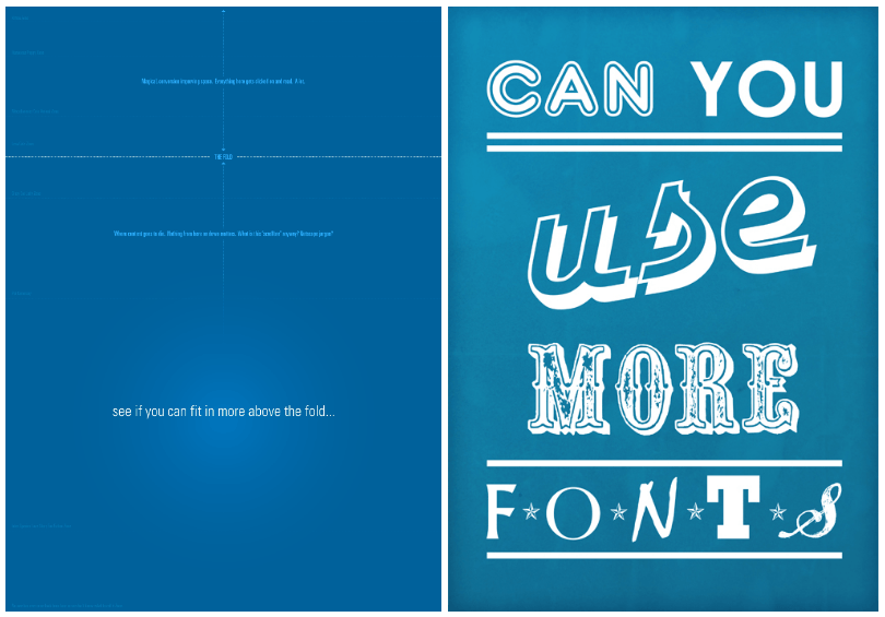
Most creative agencies are probably painfully familiar with these two examples. “Can you use more fonts?” “See if you can fit in more above the fold.”
Good designers know that using a wide range of fonts will make a brand look like it’s having an identity crisis. And seasoned conversion optimizers will tell you that there’s nothing magic about the fold.
You know this because you’ve been in the industry for years. But your client, having skimmed a few blog posts on digital marketing, thinks they know it better.
Unfortunately, this is another time you’ll need to work a little harder for your money by letting your client know they’re misinformed. Shoot them links to a few authoritative sources that prove your point, and do your best to spare their feelings.
“I can understand why you’d want to use a range of fonts — they’re definitely eye-catching. However, studies have shown that title fonts like that are harder for people to read in smaller sizes, and using too many can actually dilute the power of your brand.”
Remember, they’re hiring you not only for your writing ability or design expertise, but also for your knowledge. It’s your job to advise them, too.
6. Broad feedback
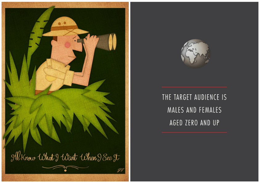
At first, feedback like “Do whatever you want,” seems like a blessing. Here’s real-life proof it’s not, from a professional in the field:
“A friend of a friend wants me to do a logo for his new company for free.
Me: Do you have any ideas on how you want the logo to be?
Client: The ball is in your court, do however you want to. Preferably inspired by the company name.
I work for an hour and come up with a few sketches.
I present said sketches over a Skype call.
Client: Yeah, this is not what I had in mind, you’re gonna have to come up with something else.
Me: What do you have in mind then?
Client: I don’t know.
I hang up Skype call.”
Don’t put yourself in a frustrating situation. When your clients give you loose guidance like this, let them know that to serve them better, you’ll need more specifics.
Imagine a similar conversation with any other professional services business:
Client: “I’d like to renovate my office.”
Contractor: “Sure, what would you like done?”
Client: “I’ll know it when I see it.”
Client: “I’d like you to hire some all-star copywriters for my team.”
Recruiter: “Sure, what are you looking for in your employees?”
Client: “Just do whatever you want.”
We say “imagine” because feedback like this would never be given elsewhere. So why would your client think it’s okay to give to you?
7. Unconstructive client feedback
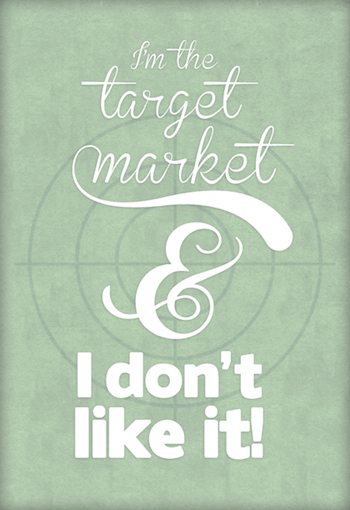
This has to be the worst kind of feedback. Not only does is it negative and unconstructive, but it’s insulting, too.
You spent hours designing ten different versions of that new logo; you followed your client’s guidelines to the letter; and you pulled inspiration from history, psychology, literature, and some of the world’s most successful brands and advertising minds.
You shoot it over to your client and ten minutes later get a four-word response: “I don’t like it.”
We won’t rehash why this is bad feedback, but we will remind you to take a deep breath before you respond to it. It’s easy to get defensive over something you poured hours of your life and gallons of creativity into, especially when the feedback has no value to you as a designer.
But, instead of letting your blood boil to the point you rage-respond with something in all caps, remember that your client may not appreciate what you’ve put together because the subtleties are lost on them.
Try to explain why you picked the image or the font or the color that you did, or why you used slang in their tagline. If they’re still unsatisfied, ask them what they’d like to see in the next iteration. And make sure they give you specifics.
Don’t ignore the post-click stage, provide every prospect with a personalized experience from start to finish. Sign up for an Instapage Enterprise Demo today.

See the Instapage Enterprise Plan in Action.
Demo includes AdMap™, Personalization, AMP,
Global Blocks, heatmaps & more.
