Subscription box landing pages are seen everywhere nowadays. Sign up and get a box delivered to your door. For customers, subscription boxes are easy. Advertising them, though, isn’t as simple. As both a product and service that’s high commitment, subscription box landing pages need to feature elements like:
- Highly detailed photos and/or videos of a box’s contents
- Highly descriptive subscription terms
- A clear value proposition that rises above the competition
- Social proof that reinforces the product’s worth
- Copy that overcomes the many objections about committing to a regular payment
The best subscription box landing pages have these and more. Today, we look at six designs to see what they do well, and what they could do better, to get visitors to convert on their offer.
6 subscription box landing page critiques
1. FabFitFun’s subscription box landing page
The headline and CTA button
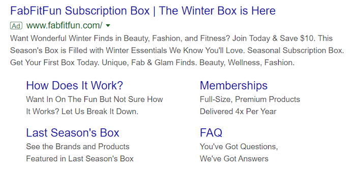
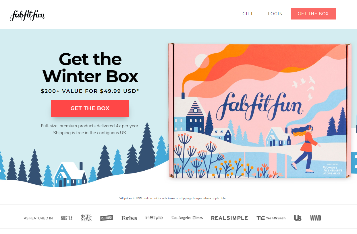
Above the fold, this landing page from FabFitFun wastes no space with excessive copy. The headline “Get the Winter Box” (which nearly matches the headline of the ad) is accompanied by a bright and contrasting CTA and an image of the winter subscription box to the right, along with a sentence about the product below. But where do your eyes go?
Since reading goes left to right, and rules of visual hierarchy state that things which are bigger and brighter draw the eye, it wouldn’t be surprising if the viewer of this page saw the headline and then looked to the box design, and skipped right over some very valuable information: the CTA, (which should be the most attention-grabbing element on a page) and the very light copy below it, which advertises premium products, the frequency of mailing, and free shipping (things that you can’t afford to miss).
On top of all that, why show the image of a brightly colored box if it’s what’s in the box that users care about?
Below that, logos of widely recognized brands align FabFitFun with trustworthy names, which adds to their perceived value.
How to section
Scroll lower and you’ll see a “How To” section that explains what customers can expect after they subscribe, complete with icons, which both break up the text nicely and improve comprehension:
![]()
The four images under that section elaborate on the benefits of the offer. Members get access to exclusive sales, FabFitFun TV, a community, and unparalleled customer service.
Next, a cooperative CTA gives users another place to click to convert, and it’s surrounded by copy that advertises both free shipping the value of the subscription box: $200+ value for only $49.99 per season. This gets users thinking they’ll get a lot for a little:

However, the question still remains: what will they get for that value? The most important part of the box is what’s in the box. Not how the box looks, or even the price. If the contents of the box are valuable, there will be someone who pays what they’re worth.
What’s inside the box?
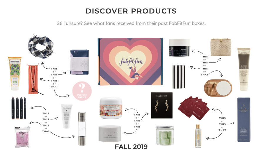
Partly answering that question is a slider below, which showcases products from previous seasonal boxes. However, there are two issues with it: First, sliders that slide automatically frustrate people because they’re not always finished consuming the image or the text on it before the next slide progresses. Second, the product images are far too small. You can’t read labels or product names. All you can see is the shapes of containers. For some products, like handbags or sunglasses, this might not be too big an issue. But for others, you don’t have the slightest idea of what you’re getting:
The last element you’ll see when you scroll to the bottom of the page is a big, scary form complete with credit card field. Forms with credit card fields are the highest friction element there is, and with two other CTAs on the page, it may make more sense to put this on a following page. Then again, the team at FabFitFun may have data to show otherwise. (Remember: popular practices aren’t always best practices.)
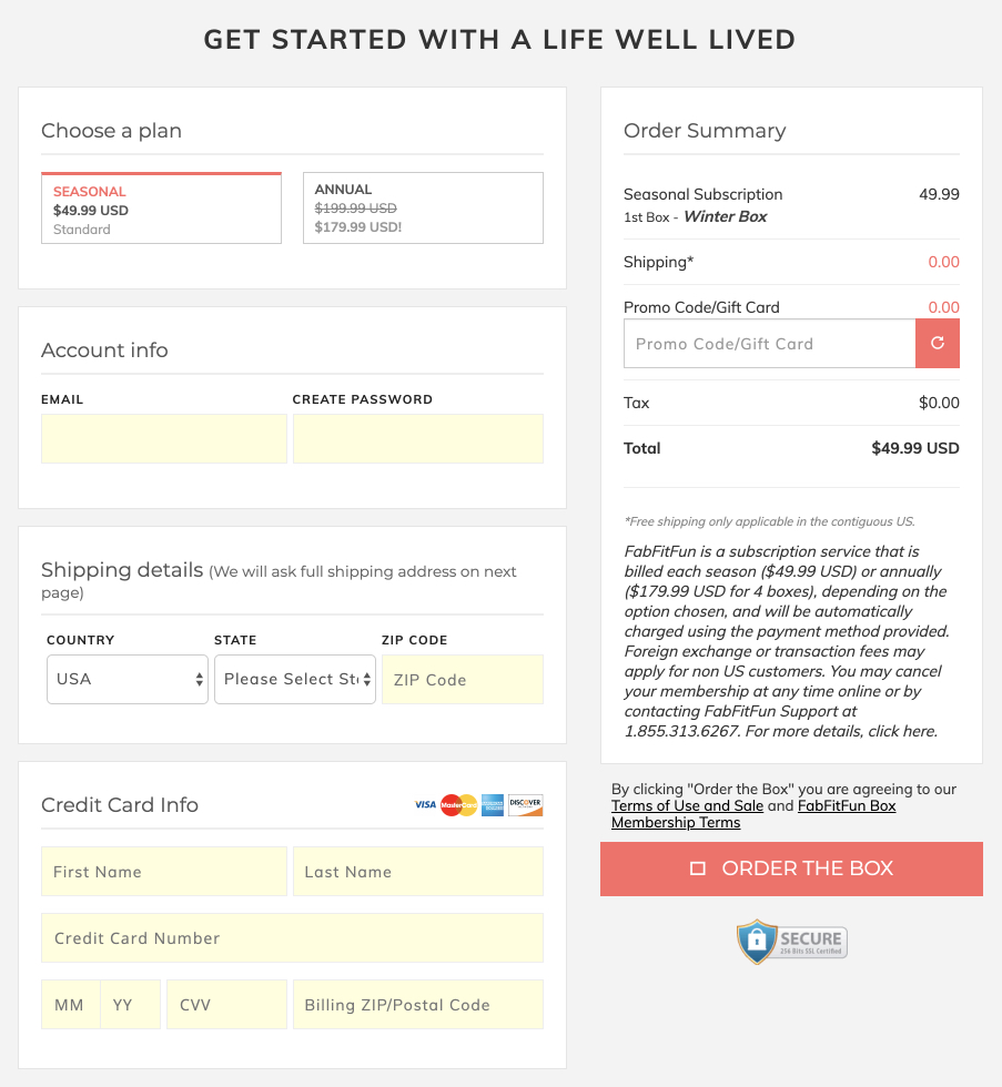
One popular practice that is worth following: remove outbound links from the header and footer of your subscription box landing page. FabFitFun did a great job in the header, but through links in the footer, visitors to this page will be able to escape easily.
2. Dollar Shave Club’s


With 647 reviews resulting in a 4.9 rating, Dollar Shave Club has a Google ad with some powerfully persuasive social proof. While the message match isn’t perfect here between the ad and the subscription box landing page, the brand uses a big, high-quality image to let visitors know they’re on the page of a shaving subscription box. Still, the message match between the ad and headline should be closer.
The headline
Outside of that, the headline does an okay job of conveying benefits to the prospect. Not only will you look, feel, and smell your best with Dollar Shave Club, but you’ll do so easily, too.
More than simply assisting with message match, the images do a great job of showcasing the product in great detail.
The FAQ section
To the right, a “Help” button makes contacting an agent easy if you have questions, and clicking it will reveal a list of FAQ’s. If you still can’t find an answer, you can simply type your question into the chat box for assistance:

Scroll to reveal three different trial set options, which copy shows will ship for free. Each has its own dedicated CTA, which are bright and contrasting, and each product listing details precisely what’s in it (down to the size in ounces of each product).
Copy below that highlights three big persuasive points: cancel anytime, free shipping, and 30-day money-back guarantee — which is good, but they could be more attention-grabbing in bigger or bolder type.
The “How it works” section
Even lower, a “How It Works” section lets the prospect know exactly how the process of subscribing and receiving the product works in a short, step-by-step set of icons that make the text easy to read:
![]()
Lastly, a set of FAQ’s can be found at the bottom of the page (spoken in the prospects’ language, too: “so what’s the catch?”) which overcome common objections from the average buyer. One final image and cooperative CTA gives visitors another chance to convert. However, a few outbound links in the footer could ruin that chance by giving them somewhere to escape.
3. Birchbox’s
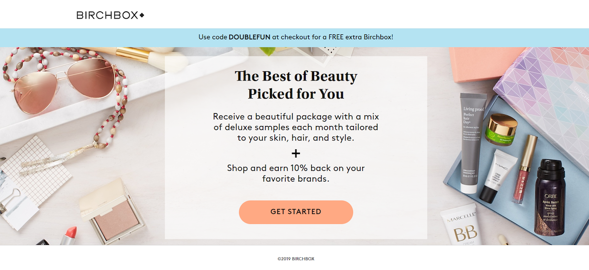
There’s not much to Birchbox’s subscription box landing page(the image above is the whole page), but that’s not necessarily a bad thing. Prospects are busy. They want to evaluate your product and get on with their lives. A minimalistic design is exactly what you’re after.
However, minimal isn’t easy to do on a landing page. The reason is you need to include all the required information to make a decision about clicking the CTA and no less. Does this page do that? Let’s find out:
First, the navigation is non-existent, and so are links in the footer. That keeps the conversion ratio at 1:1, which is what it should be for subscription box landing pages.
The headline
Below, the headline reads: “The Best of Beauty Picked for You,” which is great because it uses the word “you” and with the phrase “picked for you,” it implies care and customization. It’s not great, however, to use the word “best” in a headline. “Best” is like good, great, awesome, or fantastic. It doesn’t say anything about the product, and it’s as trustworthy as a sign in a local diner reading “world’s best cup of coffee.”
Not to mention, it seems like the blue bar between the header and the headline hides one of the most persuasive elements of this offer: Get a free Birch Box when you complete your order. Why not put it front and center?
![]()
The copy
Below this headline is copy that elaborates on the offer: the word “tailored” is good because it reinforces care and customization, “deluxe” is good because it combats the perception that “samples” are inherently small. These are not small samples. They’re deluxe. Then “skin, hair, and style” tell you exactly what the products can be used for, and “each month” details when you’ll get them.
However, the word “beautiful” before “package” is likely to come across as describing the outside of the package. Who cares if it’s beautiful? Prospects care about what’s in the box. Not so much how it looks on the outside. More persuasive might be “a package stuffed with…” or “packed with,” or “loaded with,” or “full of…”
Below that, a contrasting CTA button draws attention, but the CTA “Get Started” implies steps. How many steps? It could be one, it could be 10. Your prospect doesn’t know. And they may not be willing to commit.
All this is displayed over a colorful image that showcases what we can assume to be the contents of the box. You can see some brands on the labels of these products, but only if you squint. This is a main selling point for potential buyers of a subscription box. If you’re claiming to offer the “Best of Beauty,” you have to back it up. Logos of brands that come in the box could go a long way here. Or, make the image bigger so that we can see some of the products more clearly.
4. Home Chef

Right away, we know the brand and its value proposition: Home Chef makes it easy to prepare fresh food. The green font attempts to reinforce freshness. However, surrounding images counteract its efforts. Pictures speak louder than words, especially with a product like food. And all throughout the page, these images aren’t saying “fresh.” They seem to be out-of-focus, or low-quality files, which in turn make the food look low-quality. As a subscription service for food, you already have to combat the perception that pre-packaged ingredients aren’t as fresh as what you can get at the local market. These photos might be high-quality enough for a clothing brand, but for a product you’re going to consume, they leave something to be desired.
The headline
Below, the headline “Our Easiest. Meal Plan. Ever.” doesn’t help things either, because it conveys that easy is the unique selling proposition. If anything, your visitors already know a subscription food box is easy. What they likely don’t believe is that it’s fresh. If you’re calling your product “Fresh and Easy,” more emphasis should be placed on proving the freshness of the ingredients.
The copy
Scroll lower, and there’s even more confusion. Three images and some bite-sized paragraphs make the copy easy to read. When you read it, though, you find some contradictory statements about fresh ingredients in grill-safe bags, oven-safe trays, and one that says, “Fresh veggies and proteins come pre-cooked and pre-portioned…”

Fresh? Pre-cooked? Does that mean that they were fresh when they were cooked? How long between they’re cooked and when they’re sent? If we’re confused, we’re likely not the only ones.
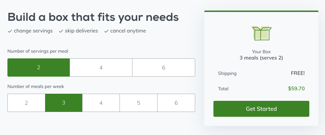
Below this, Home Chef does a great job of giving visitors the opportunity to customize their subscription with a headline: Build a box that fits your needs, and below it, options for 2, 4, or 6 servings per meal, and 2 through 6 deliveries per week. To the right, a form displays your choices based on what you click and handily produces a price for your box. At the bottom of that form, a cooperative CTA gives visitors another opportunity to convert. Copy also makes visitors more comfortable with subscribing with phrases like “cancel anytime,” “change servings,” “skip deliveries,” so they know that whatever they choose, it’s not permanent:
Below that, a video showcases the food quality much better than the photos, though we don’t learn much from it that we haven’t already learned from what we’ve consumed so far.
Scroll a little more, and one last headline, subheadline, and CTA combo attempt to earn the conversion. The question headline engages the reader, and below it, the subheadline offers a big discount on the product:

5. Winc’s subscription box landing page

Like Dollar Shave Club’s search ad, this Winc search ad comes with some powerful social proof. A 4.7 rating out of 5 from a total of 400 reviewers. The copy advertises customization based on your taste, a free wine profile, free shipping, satisfaction guaranteed, and affordable bottles. In the headline, bold and clear: Get 35% off your first order. All great reasons to click through.
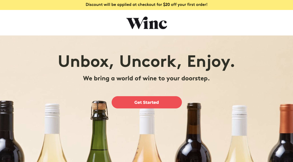
When you do, though, you could very easily miss the boldest statement from the search headline about the 35% discount. It’s hiding above the logo in the yellow bar. If it’s in your search headline, it should be in your landing page headline.
The headline
Instead, the headline is one of the shortest you’ll see: Unbox, Uncork, Enjoy. The message here is simplicity. Two steps to enjoying your wine. No hassle. The subheadline keeps things simple, too, but without making the product itself seem simple. The words “a world of wine…” conjure images of varieties of wine from all over the globe and the varieties of ways to enjoy them.
The images
The background image complements the message well by showcasing a few different types of wine, the necks of which point like arrows to the CTA button, a great visual cue. The CTA button itself stands out like red on a yellow background, and, while “Get Started” doesn’t work everywhere, this could very well work because part of the product is about creating your own flavor profile. And that could be an enjoyable experience for the visitor, building anticipation for the product.
Below this, three images with small chunks of text make reading easy, and highlight benefits of the offer:
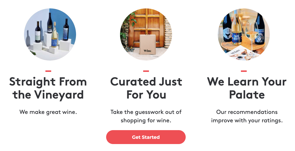
However, “curated just for you” and “we learn your palate” seem a little redundant, considering learning your palate is how Winc curates wine just for you. Still, they both highlight personalization, which is a powerfully persuasive aspect of the product.
Additionally, the “we make great wine” reads a little arrogant, and business-centric instead of customer-centric. It’s also like the Birchbox headline that uses the word “best.” Great wine? Why is it great? Tell us.
Below these headlines and subheadlines is a cooperative CTA, which gives visitors another opportunity to convert.
Even lower is a testimonial in a yellow box from Forbes, reading: “The proof is in the bottle.” It’s short and to-the-point, like the rest of this landing page. The brand it comes from is powerful, and that boosts perceived value, but it’s not exactly a glowing review. Something with a more positive sentiment, as long as it’s from an equally authoritative source, would likely work better here.
6. Sun Basket

The ad for this food subscription box, Sun Basket, advertises a few appealing things to searchers. Chief among them is healthy ingredients for several diets: organic, non-GMO, fresh, clean produce for paleo and gluten-free consumers. And within those categories are even more options: Choose from 14+ recipes, get 18 weekly. Their first order is $35 off, and they can feel comfortable knowing they can skip orders or cancel anytime:
The headline
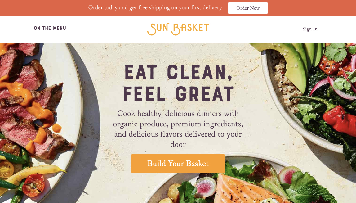
When searchers click through the ad, they’ll see a headline that doesn’t exactly match the headline of the referring ad. The mention of the $35 discount is wedged into that red bar. That said, it’s close. Close enough to let users know they’re in the right place, and with images that convey the freshness and healthiness of the recipes referred to in the ad.
Eat Clean, Feel Great. It’s not a headline that hypes up ease or accessibility. It dedicates itself to health: the feeling you get when you can eat healthy with the help of “organic produce” and “premium ingredients” “delivered to your door,” as the subheadline says.
The images
The background images complement the message well, looking natural, not staged in a studio or photoshopped. Among their bright colors, the CTA button could certainly be more noticeable, and CTA itself, “Build Your Basket,” sounds a lot like work. Instead, it might get a persuasive boost by highlighting the benefit of claiming the offer (something related to health).
Scroll and you’ll find the three biggest benefits of claiming the offer, separated by icons, with minimal accompanying text: convenient, quality, and meal prep made easy:

One of those icons, the USDA organic logo, aligns the company with an organization dedicated to freshness and health. The text underneath it, “certified organic handler,” boosts that authority even more.
The infographic
Below this, an infographic introduced by the headline “paleo, vegetarian, and everything in between” showcases the options for potential buyers with all types of dietary needs. And even farther down, images continue to reinforce the freshness of the food with a “What’s on the menu this week” section, where visitors get to see examples of actual recipes. It’s a slider, but they can control it themselves, so there’s never an issue with the image changing before they’re ready. If they click on any image, they’ll get a detailed list of the ingredients for the recipe, as well as how to cook it, and a maximized image of the finished meal:

A cooperative call-to-action gives visitors another chance to convert, and if they don’t take it, they’re met with more images on a slider with another CTA button below. Finally, testimonials detail the reasons why visitors love Sun Basket. Though they’re attributed to only first-name last-initial customers, and visitors might wonder if they come from real people or if they were invented by the brand.
Create personalized subscription box landing pages
Without a doubt, the two biggest selling points of subscription boxes are how easily they’re obtained, and how personalized they are. Customers get a box specifically for them, delivered to their door.
And so, the marketing for these products should provide the same experience. Each audience should have a page designed for them, delivered to them on whatever device they happen to be using when they request it.
For this, landing pgae automation is the only answer. Find out how you can create a landing page for each ad sign up for an Instapage 14-day free trial today.
Try the world's most advanced landing page platform with a risk-free trial.
