
As a marketer, you probably like to think you understand your prospects well — who they are, how they behave, etc. So if one of them visited your website or signup page, what do you think they’d do next?
Probably register for your service, right?
That’s not always the case, as one brand found out. For them, something between that CTA and their “thank you” page was causing the business to lose nearly a quarter of its potential customers.
There was a problem with their sign-up page.
What is a signup page?
Signup pages, also known as “registration pages,” aren’t all the same. Some are PPC post-click landing pages; others are linked to the homepage via navigation – some even are the homepage. Despite their differences, they all share the same goal: generate sign-ups for a service.
In many cases, the signup page is the last step in a business’s conversion funnel. It’s where prospects navigate after they’ve evaluated a brand and decided its service offers what they need.
Because of that, signup pages focus less on persuading the prospect to convert and more on minimizing the friction involved in doing it. That focus on usability means other traditional post-click landing page elements like social proof, testimonials, and attention-grabbing media take a backseat.
Just look at Shopify’s signup page below, which pops up over the homepage once you click “get started.”
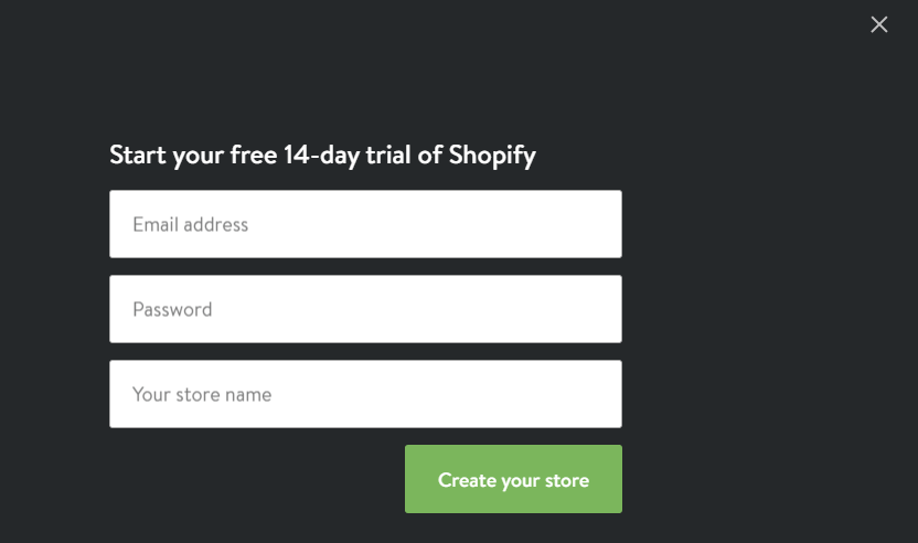
It’s really just a short form. And, as you’ll see a little later, most signup pages are built the same way, featuring nothing more than a headline, a few form fields, and a call-to-action.
But just because many are designed that way doesn’t mean it’s the right way. Creating a successful signup page is about more than eliminating distractions and reducing form fields. The task is two-fold.
To generate maximum signups, you have to minimize the steps involved in registering, and at the same time, make the most of the few elements you do use. Here are some tips and insights from the experts.
1. Use a benefit-oriented headline
By the time a prospect arrives at your signup page, in most cases, they’ve already evaluated your service and determined it suits their needs. But, does that mean you shouldn’t remind them why they’re there?
Below, Copyblogger uses a social-proof-stuffed headline to convince users to sign up, and above, Shopify reminds prospects their trial is free for 14 days.
Simple is good, but if you have the room to reinforce your USP with a headline, do it. Chances are it’ll have a more positive impact on conversions than negative.
2. Make all your fields required
This tip is less about requiring your visitors to complete your form and more about making sure you’ve picked the right fields. By that we mean, if you’ve determined a form field is optional, you don’t need that piece of information to sign the prospect up.
For example, a service like Groupon needs to know your location at signup to offer you relevant deals and coupons. But, location isn’t a crucial piece of information for Instapage to know about its customers, which is why we don’t ask for it during registration.
If you don’t really need to know your prospect’s company, their position, or how many employees they have, then don’t ask. The less work they need to do, the better.
Form fields to consider
Some form fields to consider consolidating/getting rid of:
- Username: Do your users really need a username to sign up? Or can you just ask for their email, and then let them determine their username once they’ve logged in?
- Confirm password: This field is outdated and only necessary because of password masking, another impractical technique.
Password masking is the technology that makes every letter look like an identical bullet point when it’s entered into a form. It gives the impression of extra security, but the only thing it really protects from is people peeking over your shoulder.
Ask yourself: are my prospects really creating their passwords in a crowded public setting? Not likely.
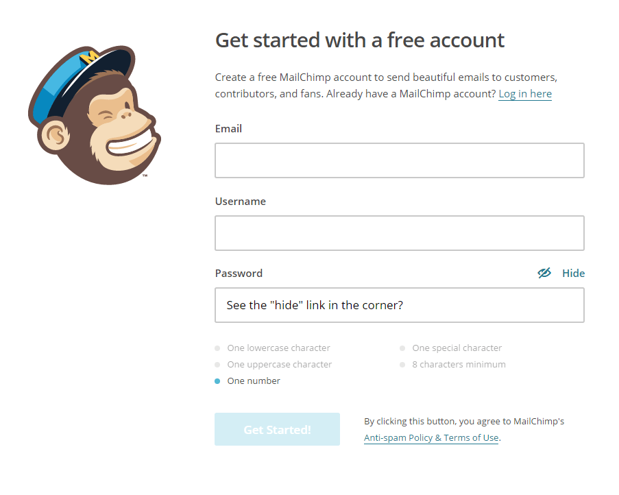
Instead of using a “confirm password” field, allow users to see what they’re typing by unmasking the original “password” field, or using a “show/hide” feature, the way MailChimp does on their signup page:
- First and last name: Consider consolidating first name and last name into one “full name” field. Or, just ask for first name. Heck, maybe even think about getting rid of it altogether.
In several examples below (Buffer, Asana, Crazy Egg), signup pages don’t ask for name immediately, but let their converted customers input details once they’ve logged into the platform.
- User agreement: Instead of making your users click a checkbox stating they agree to your user terms, consider including a message above your CTA the way LinkedIn does below. It states that by converting, the user automatically consents.
3. If you absolutely need all that information, ask for it in steps
Look, sometimes you really do need a lot of information to register a new user. Signups that require on-the-spot payment necessitate long forms to capture sensitive information like billing address and credit card number. When that happens, consider breaking the registration process down into multiple steps.
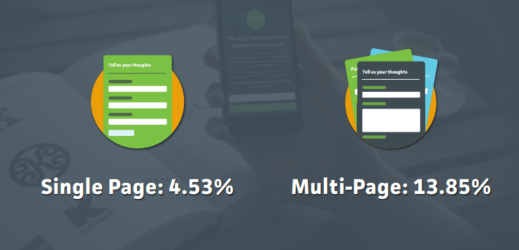
A report from Formstack shows that last year, multi-page registration forms outperformed single-page ones by more than 9%:
Why?
Multi-page forms make converting less overwhelming by separating the process into several short steps. More pages mean more space for bigger fonts, longer fields, and descriptive labels that might not fit in a shorter form. Additionally, multi-page signups usually come with a convenient progress bar that lets users know how far along they are in registration.
Remember: if you can shorten your form by eliminating a few fields, shorten it. If you can’t, don’t try to make it appear shorter by cramming everything into a small amount of space. You’ll only clutter your page and overwhelm your prospect.
4. Consider using a modal window
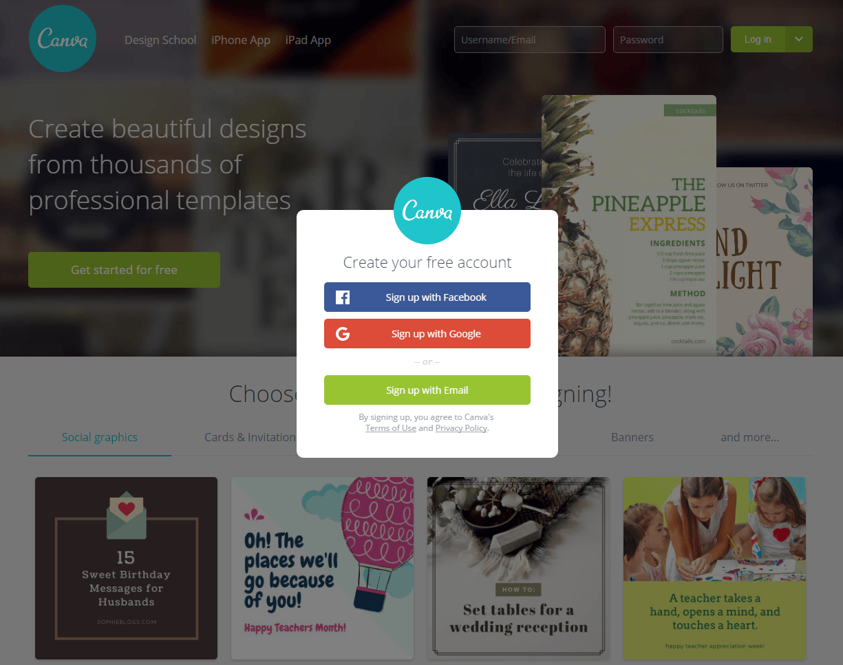
For those with a quick sign-up process, like Canva, a modal window offers a few benefits.
Designer, Joshua Johnson, explains why:
They overlay current content instead of taking you to a different page. Somehow that’s just less unsettling than being whisked away to somewhere new, which feels like an interruption. By dimming the homepage graphics and bringing up a modal sign registration form, you get the sense that the process will be quick and painless and that you’ll be back to browsing in no time.
At a time when internet users are more impatient than ever, giving them the impression they’ll be back to browsing in an instant is a great practice.
5. Enable social autofill
In nearly every signup page example below, you’ll notice social autofill buttons. These allow users to bypass your form with a single click by importing relevant personal information they’ve already submitted to social networks.
Formstack found that by including this feature, users were able to generate 189% higher form conversions. Additionally, 86% of people say that creating new user accounts on different websites is inconvenient. When your goal is to make converting as easy as possible, leveraging social autofill is a no-brainer.
6. Ditch the placeholder text
To convert, visitors need to know how to fill out your form. But, using placeholder text isn’t the best way to show them.
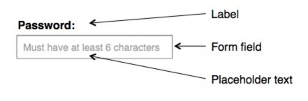
According to the Nielsen Norman Group, adding light gray text to your form fields has the potential to:
- Strain users’ short-term memory. When they start typing and the gray text disappears, they think to themselves, “How many characters does my password need to have again?”
- Make your form fields invisible. Empty form fields are actually more noticeable by prospects than ones with placeholders.
- Irritate users tabbing through the form. Those quickly completing your form using the “tab” button won’t have time to read explanational placeholder text before it disappears.
- Confuse visitors. They might mistake placeholder text for information that was automatically filled in.
To avoid any confusion, include a label above each field that tells visitors exactly what they need to include in it. Placeholder text will only create more friction on your registration page.
How the pros build signup pages
Now that you know what to include on your signup page, let’s take a look at how the pros build theirs.
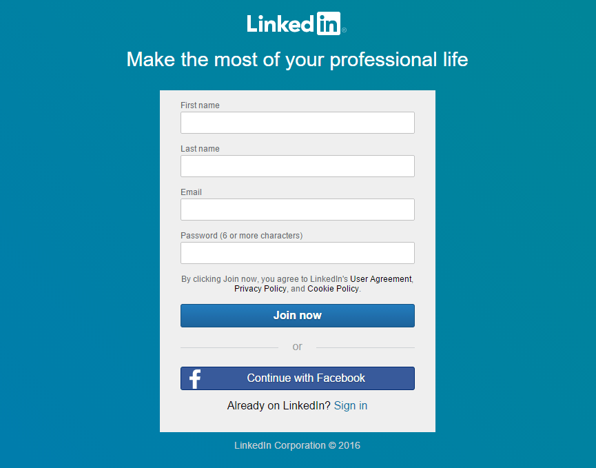
This LinkedIn signup page is of the post-click landing page variety. It’s standalone, meaning it’s not connected to the company’s website via navigation — not even in the logo.
Above the form, the headline could convey a stronger benefit. On it, four fields keep friction low. Though, by combining first and last names into one “full name” field, that friction could be made even lower.
Over each text box, gray lettering lets prospects know what they’re supposed to type, and above the “password” field, that label is even more specific. Though, that “password” field doesn’t follow best practices by displaying identical bullets for each letter the prospect types.
Additional gray lettering underneath the last form field lets visitors know that by clicking “Join Now,” they agree to LinkedIn’s user agreement, privacy policy, and cookie policy. That saves the prospect the extra step of having to click an opt-in box to consent.
In the call-to-action, the word “now” emphasizes that once the user clicks the CTA button, they’re immediately part of the network. As far as the button itself goes, it could pop a little more, don’t you think? A different background or button color might draw more attention to where the user needs to click to join.
Below that, a “Continue with Facebook” button streamlines the entire process. If you have a profile on the world’s biggest social network, click that button to let autofill complete the form for you using data you’ve already shared with Facebook.
Copyblogger
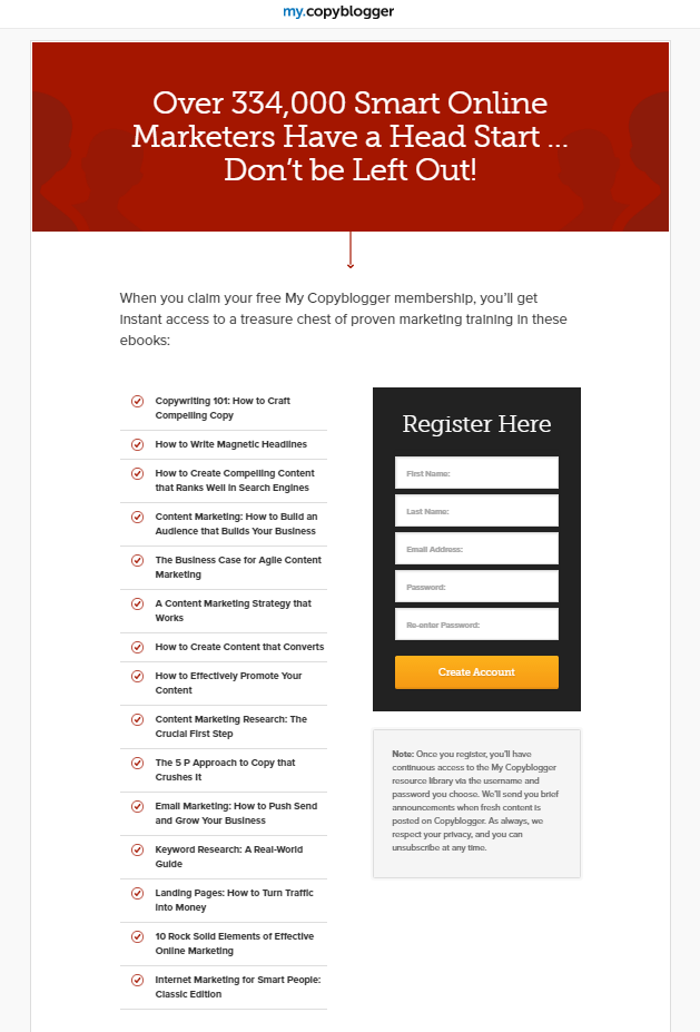
Here’s a signup page that’s more than just a form. The first thing prospects are likely to notice is that giant, social-proof-filled headline. Translated, it says, “if we’re good enough for 334,000 marketers, we’re good enough for you too.”
It also takes advantage of a phenomenon commonly known as “FOMO,” meaning “fear of missing out.” No one wants to miss out on getting the head start that 334,000 of their industry peers have.
Underneath that, a preview of all the free valuable content that prospects get after registering tempts them to fill out that form. The form itself, though, could be better designed.
By eliminating the “re-enter password” field and condensing first and last name into “full name,” Copyblogger could reduce the number of text boxes from 5 to 3, and, in turn, the amount of friction involved in signing up. In place of that “re-enter password” field, a show/hide option can be used to ensure accuracy when entering a password.
To reduce friction even further, labels within each field should be positioned above instead. Right now, that gray lettering disappears when prospects click into the text box, making it easy for them to forget what they were typing.
Overall, while a few deficiencies in the form and a couple of outbound links might hurt conversions on this signup page, Copyblogger’s free content is too valuable to pass up.
Crazy Egg
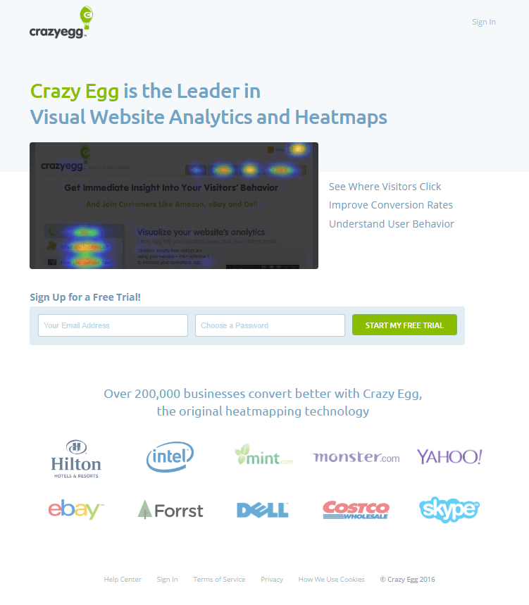
First off, a business calling itself “the Leader” in its industry is like a cafè calling its coffee the world’s best. There are many who say it, but few who can prove it. Instead of calling yourself the best, back up your claim with a statistic or by quoting a well-known client who believes you are.
Underneath that headline is an image that previews the insight you gain when you use Crazy Egg, and to the right of the image, three lines of copy explain what that insight is along with what you can do with it.
On this super-short form, friction is minimal. The headline emphasizes that the trial is free, the button pops on the white background, and the call-to-action is written in the first person. Right now, the only thing keeping this form from being pain-free is the distracting gray placeholder text in each field.
Below that, social proof in the form of recognizable client logos and the text “Over 200,000 businesses convert better with Crazy Egg” boosts this signup page's persuasiveness.
Altogether, this page makes converting a breeze for visitors.
Buffer
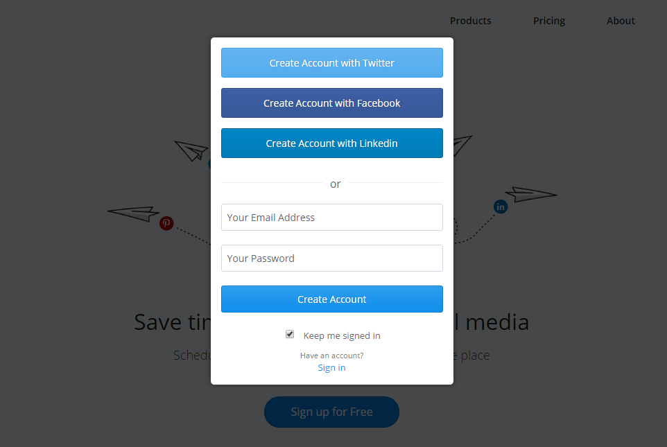
When you click the “sign up for free” call-to-action on Buffer.com, the homepage transforms into a signup page by deploying a short pop-up form and darkening surrounding content.
On that pop-up, the conversion process is simple — click one of three social login buttons to bypass the form, or enter an email address and password. Either way, friction is minimal. The only way this form could be easier to complete? Get rid of that distracting placeholder text.
Asana
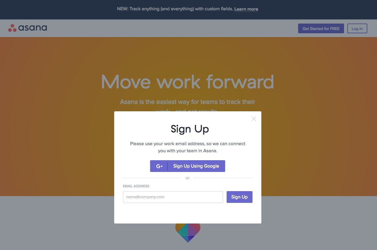
At most, signing up on this page from Asana takes two clicks. With a Google login feature, it could take as little as one.
A sentence above the form tells you how to complete the form, even down to which email you should sign up with.
Directly below that, though, a form field filled with gray placeholder text distracts the user. But will it deter people from signing up? Not likely. This form is nearly frictionless and easy to complete.
Begin creating an optimized signup page with Instapage, request an Instapage 14-day free trial today.

Try the world's most advanced landing page platform with a risk-free trial.
