When you create post-click landing pages, sometimes you’re forced to make some tough calls — deciding on the type of headline, all the way down to the colors on the page, and CTA button copy.
Every single decision has a significant impact on your conversion rate. Of course, this puts added pressure on you to get all the elements perfect before you publish the page.
The data you collect with A/B testing puts a lot of the CRO questions to bed, but the thing with testing is that it’s not an immediate solution. You can’t rely on A/B testing data as soon as you publish your page.
This is where CRO best practices come into play.
We’re going to make a case for both types of pages and argue why one should take precedence over the other. Then, we’ll give you a list of factors that will help you decide the length of your pages once and for all.
Let the debate begin.
(Keep in mind, for some examples in this article we’ve shown the entire page. However, for longer pages, we only displayed above the fold. You may need to click through to the page to see some of the points we discuss and some examples may be A/B testing their page with an alternate version than is displayed below.)
The case for short pages
The human attention span is shrinking, and mobile marketing has played a big part in its deterioration.
Where we could boast 12 seconds of coherent thought in the past, the number has now slid down to a mere 8 seconds, all thanks to our multi-screen lifestyles. Getting visitors to focus on your offer long enough to click the call-to-action button is becoming more challenging with every passing day.
The average session duration for desktop users is 150 seconds, for mobile the duration falls to 72 seconds. Visitors don’t have the time to shuffle through a lengthy page — they want to know the offer’s value, and they want to know it fast. This is why post-click landing page copy is presented in bullet points and numbered lists because visitors don’t have the time to read through large blocks of copy.
Short form post-click landing pages tell a simple story, and they do so quickly, so the visitor gets his or her questions answered speedily. The added benefit is that visitors don’t have to spend a lot of time engaging with it, they understand the value of the offer right away and click on your call to action button more readily.
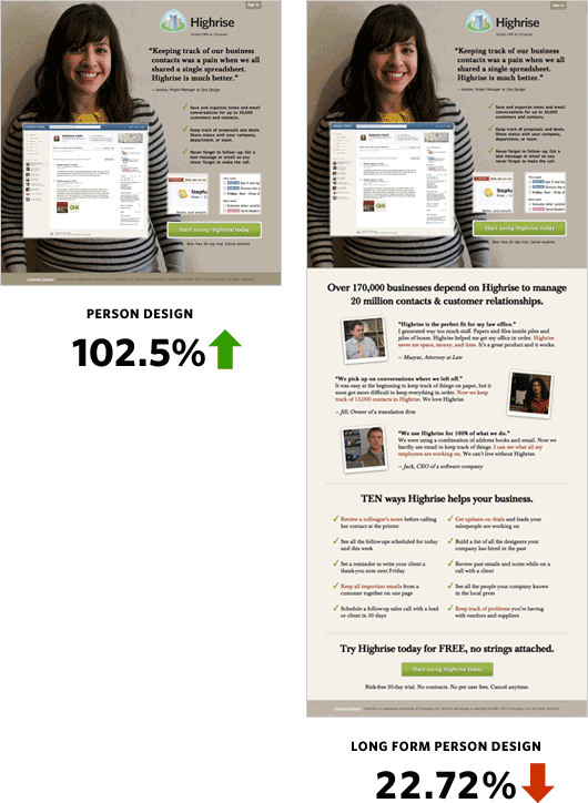
For example, 37 Signals tested a short form post-click landing page against a long form page and found that the shorter page experienced a 102.5% increase in conversions:
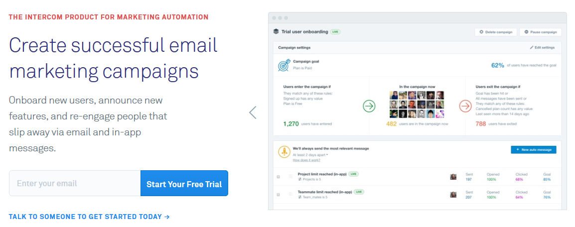
The Intercom post-click landing page below is a short form post-click landing page, but it explains the offer well, lists the product features, has customer badges, and a glowing testimonial:
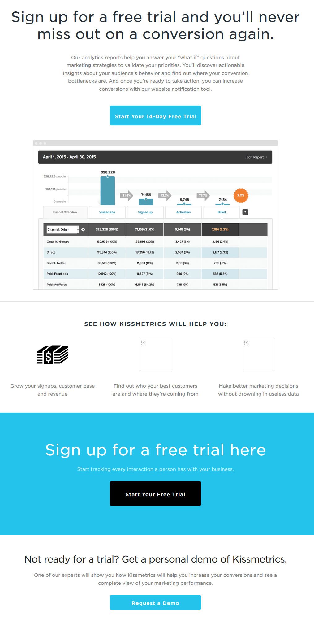
The Kissmetrics page is another short form page that does a great job explaining the offer:
Why should you spend more energy (and risk losing conversions) by creating a longer post-click landing page when a shorter variation can get the job done?
The case for long pages
Long form post-click landing pages are comprehensive pages. Sure the pages take up more real estate, but they help reassure visitors they are making the right choice. Long form pages don’t shy away from explaining everything so visitors can make an informed decision.
Visitors who are readers prefer long form pages. These are methodical buyers who require a sizable amount of information before deciding to click the CTA button (and who long pages are typically designed for).
post-click landing page copy is the primary element on long pages. It’s the copy that takes up the most room and explains the offer in detail before asking visitors to complete a form — so that there are no unanswered questions in their mind.
Conversion Rate Experts tested Crazy Egg’s short form post-click landing page with a long form challenger and the longer variation increased their conversion rate by 363%:
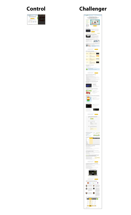
The variation was about 20 times longer than the control page. The page generated more conversions because it explained in detail how Crazy Egg works and what heat maps entail.
Another example is Revolution Golf’s long form post-click landing page in which they generated over 13,500 sales:

The trick with long form pages is good structure. If the page formatting is off, then visitors won’t consider reading your page in the first place.
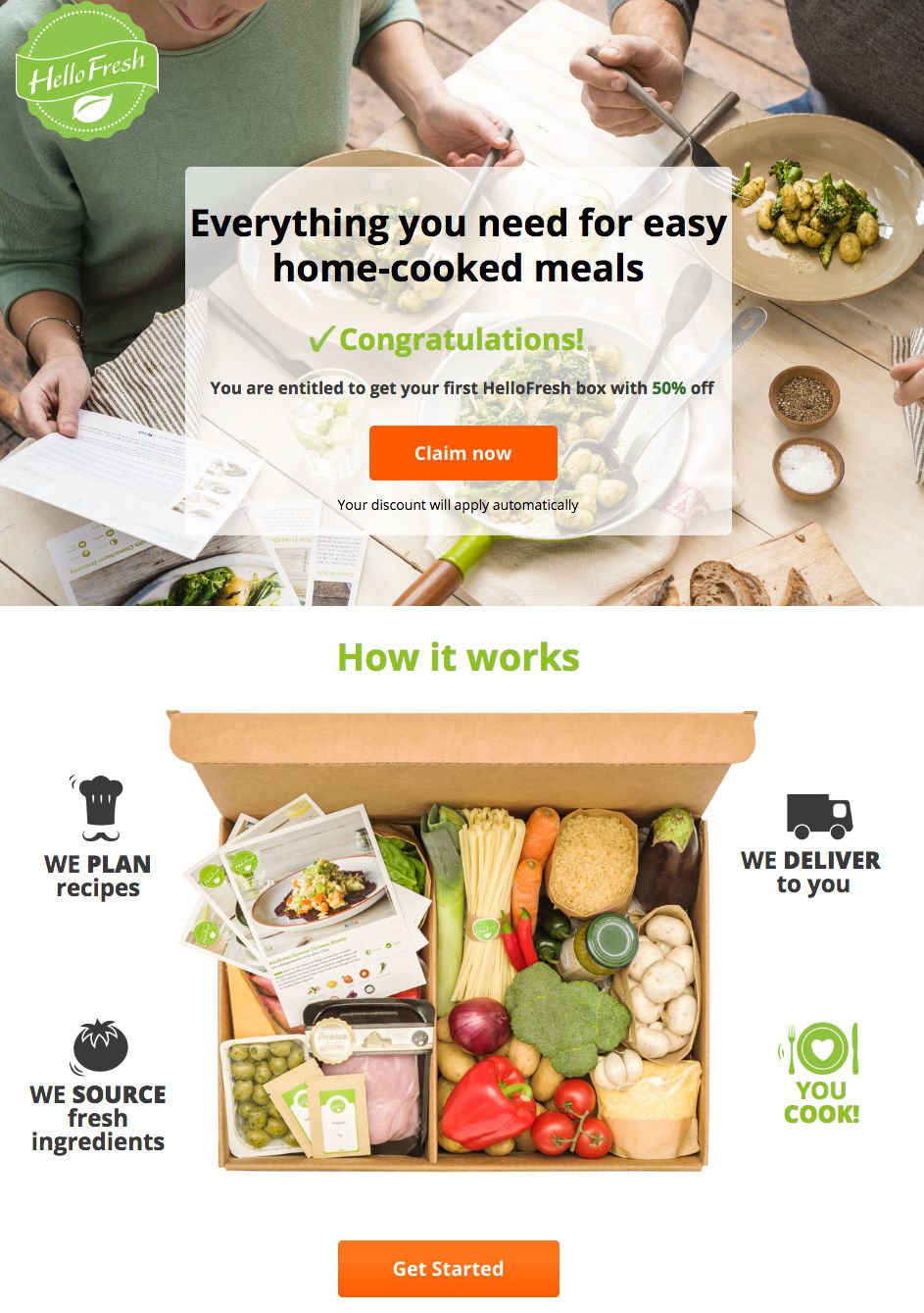
To demonstrate, the HelloFresh page is a perfect example of a long form page that doesn’t overwhelm visitors. It has a CTA above the fold, relevant images, bulleted copy, and even an FAQ section:
Clearly, both long form and short form pages have their own merits. The thing you need to decide is which type of page fits your offer best. To do that, consider the following factors when designing the length of your post-click landing page.
Price
The price of your offer is directly proportional to the length of the post-click landing page. The more expensive the offer, the more copy you need to explain why visitors should convert.
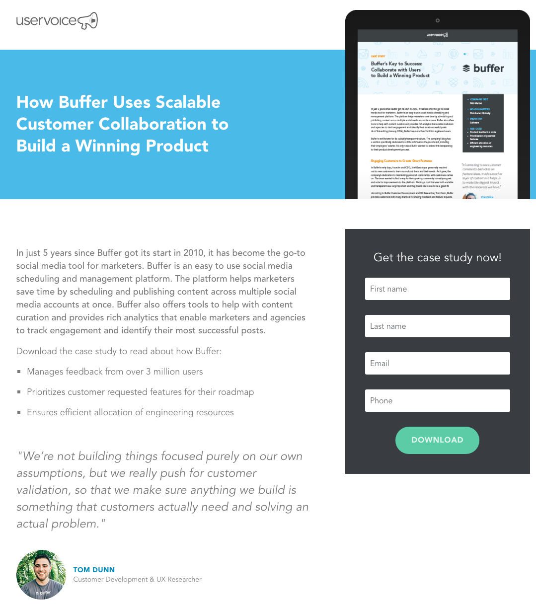
If what you’re offering is a free case study, go with a short form post-click landing page, like UserVoice does:
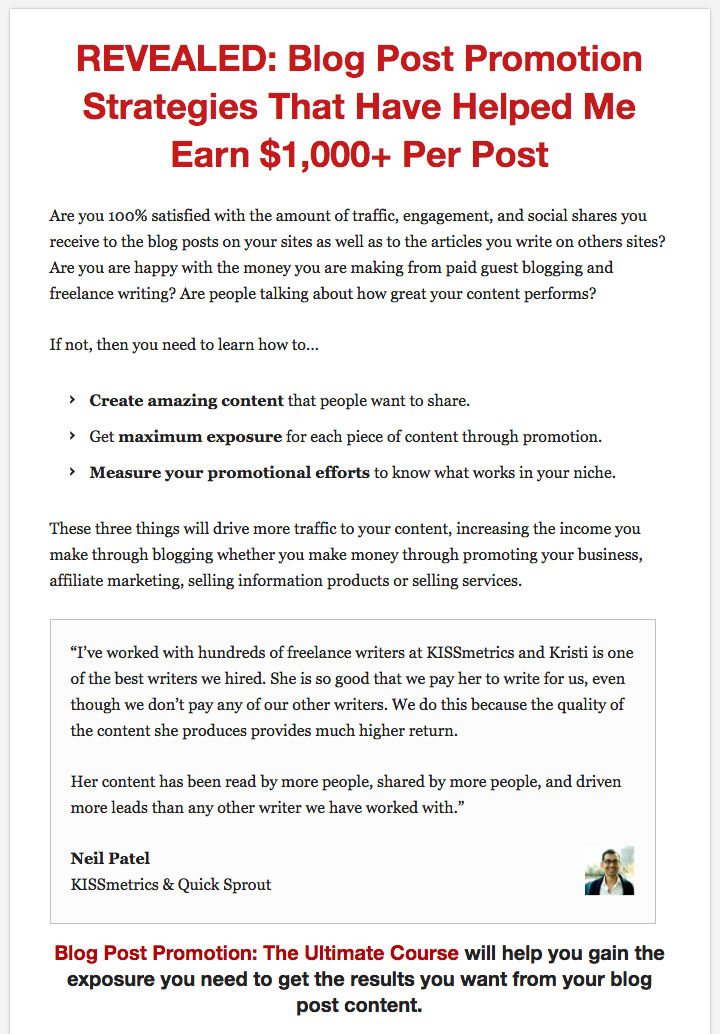
In contrast, Kristi Hines’ Blog Post Promotion course is available for $300. Therefore, she uses a long form page to promote the course:
Level of awareness and product explanation
If your business is relatively new and you have a complex product/service, then a long form page is in order. The opposite is true for a straightforward offer, such as our Top 10 A/B Testing Tips.
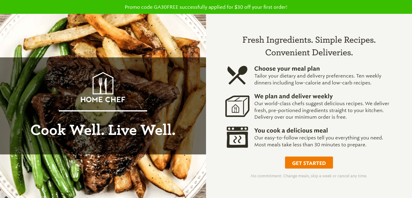
The Home Chef has a short form post-click landing page because the name itself explains what the service is all about:
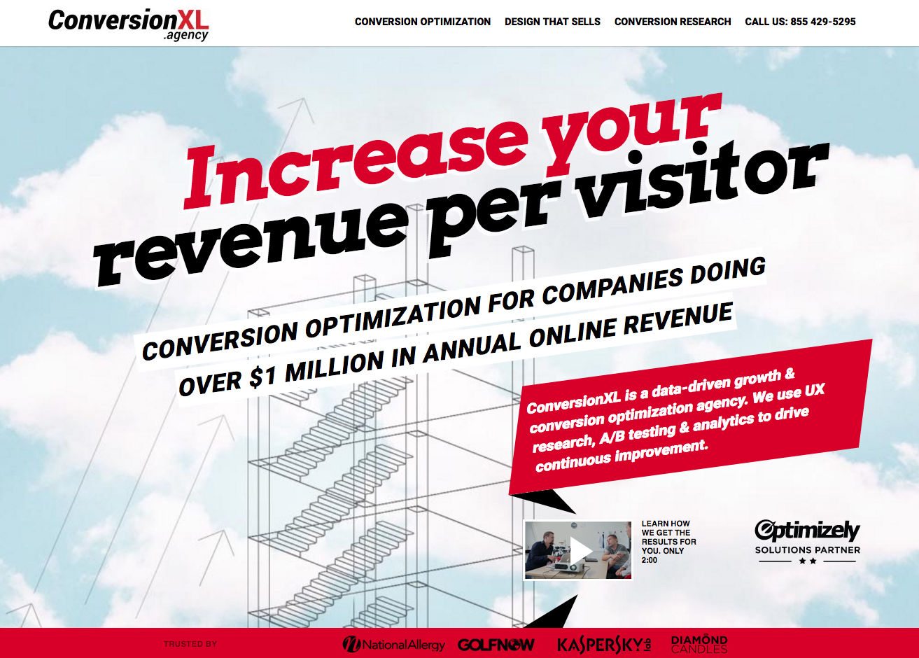
On the other hand, ConversionXL agency uses a long-form post-click landing page to fully explain their services to visitors:
A/B testing helps you get to the bottom of things
After you’ve created a long form or short form post-click landing page based on how your offer fares. A/B test the page to see what impact a length variation has on your conversion rates.
Every offer is different, A/B testing gives us data-driven answers as to which page length converts the best.
Start by creating a fully customizable post-click landing page, request an Instapage Enterprise demo today.

See the Instapage Enterprise Plan in Action.
Demo includes AdMap™, Personalization, AMP,
Global Blocks, heatmaps & more.
