In the 1970s, experimenter Stephen Worchel and his colleagues wanted to evaluate scarcity’s effect on people. So, they asked 200 undergraduate students to rate cookies from two different jars.
By the end of the experiment, it was clear that students preferred the contents of the second jar. What they didn’t know is that both jars contained identical cookies. The only difference was that the first jar held 10 cookies and the second only had two.
After analyzing the results of their study, Worchel and his colleagues presented proof of the power of scarcity. Today, we cover its value to marketers, explain why it works, and offer some scarcity examples from real-life landing pages.
What is scarcity?
In marketing, scarcity refers to an offer’s limited availability. That can be physical availability, like a limited product run or number of seats in a webinar, or time availability, like a one-time offer or a weekend sale. Time scarcity is also known as urgency.
Why does scarcity work?
An economic premise known as commodity theory explains why scarcity works. According to the APA Dictionary of Psychology, commodity theory is:
“a theory proposing that the value of a product or service is related to its availability. In general, a product that is in short supply is perceived as having greater value than one that is readily available. However, a product’s value is also related to the demand for it. It may be scarce, but if no one wants it, it will not have a high value.”
Basically, customers will perceive a product with limited availability as more valuable. Flash sales, limited product runs, and exclusive memberships are all examples of scarce offers.
As for why we equate limited availability with higher value, Michael Lynn summarizes a few reasons from past research in a paper titled “Scarcity Effects on Desirability: Mediated By Assumed Expensiveness?”:
1. People value scarcity because it makes them feel unique. When you get something that’s hard to acquire, it makes you part of an exclusive group. Having this item makes you unique, compared to the majority of people who do not. According to Lynn, two studies support this theory, in which people with low need for uniqueness don’t value scarcity as much as ones with high need for uniqueness.
2. Scarcity bestows higher status. People perceive scarce products to be more expensive. The more costly the item, the more luxurious it seems. If you own a luxury product, you can clearly afford its high price, and that conveys success and high status.
3. Scarce things seem to be higher quality. For the same reason that people perceive scarce products to be high status, they perceive them to have a higher quality. Expensiveness is a common benchmark for quality. So the more expensive it is, the better quality people perceive it to be. Lynn summarizes scarcity’s effect on perceived value as Scarcity → Assumed Expensiveness → Desirability.
But these aren’t the only reasons we tend to act faster if a product is scarce. Another powerful motivator is loss aversion.
Loss aversion is more casually known as FOMO, or “fear of missing out.” Daniel Kahneman’s research on loss aversion has proved highly valuable to marketers. He found that people tend to avoid pain more than they seek pleasure. Specifically, the negative feeling of loss can be twice as powerful as the positive one from gain.
In marketing, that means people really don’t want to miss out on limited products or one-time offers. That’s why countdown timers and deadlines can be so effective. The same is true for words and phrases like “Hurry,” “Act now,” and “Save your spot.”
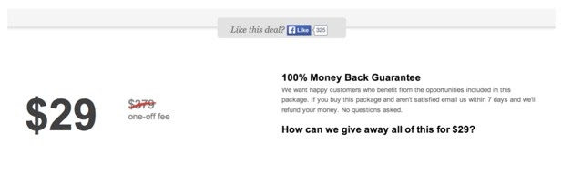
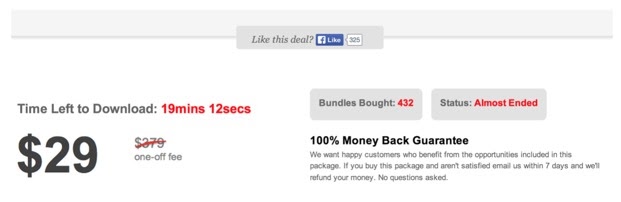
In this example, creating a sense of urgency contributed to a 322% boost in conversions. Here’s the original product listing:
The new listing featured a countdown timer that told users how much time remained to claim the offer, along with a “Bundles Bought” module, and a “Status” notifier that reads “Almost Ended” when the time runs down.
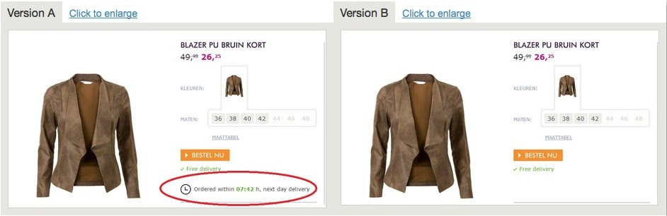
In this example, adding scarcity boosted sales by 226%:
Let’s look at some scarcity examples from real-world landing pages.
The UC Davis Graduate School of Management
This landing page from the UC Davis Graduate School of Management promotes an online MBA program.
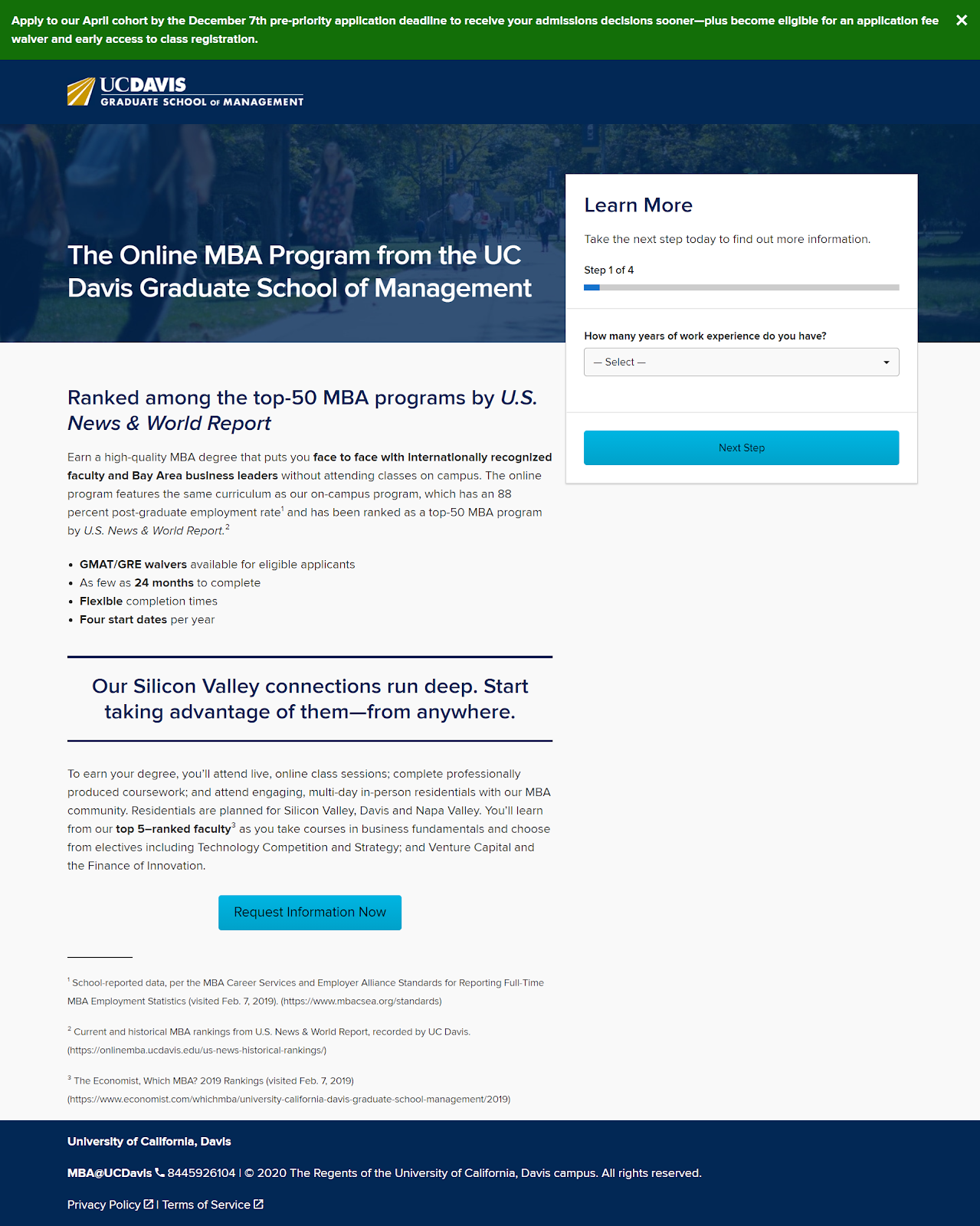
It uses social proof to get visitors to download the offer with a subheadline about a top-50 ranking from U.S. News & World Report. It also uses bulleted copy and bolded words to highlight benefits and features of the offer. A short multi-step form makes converting frictionless, and a contrasting button color to draw attention to the CTA.
In the green bar at the top of the page, you’ll notice that UC Davis has injected time scarcity in their content. Apply by Dec. 7, the copy says, and you’ll get your decision sooner, be eligible for a fee waiver, and be able to register for classes sooner than your peers.
MasterClass
This landing page from MasterClass offers visitors a buy-one, give-one deal, where they can purchase a membership and gift one for free.
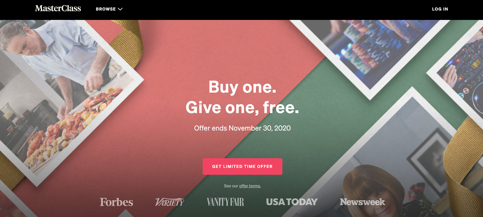
The headline clearly describes the offer, and the page uses social proof in the form of logos of publications that have featured MasterClass. It also contains bulleted benefits, a “how-it-works” section that concisely describes the offer, and 24 photos of celebrities whose courses you can take.
Throughout the page, you’ll see a few different examples of scarcity. First, the “Offer ends” text below the headline, which forces visitors to make a decision before Nov. 30; next, the button which reads “Get limited-time offer;” and finally, the subheadline that says “Stream exclusive lessons from the world’s best.” Deadlines and limited-time offers make the offer seem more valuable, and exclusive memberships make us feel high-status and unique.
Men’s Wearhouse
This Men’s Wearhouse product category page doubles as a landing page for their Black Friday email promotion.
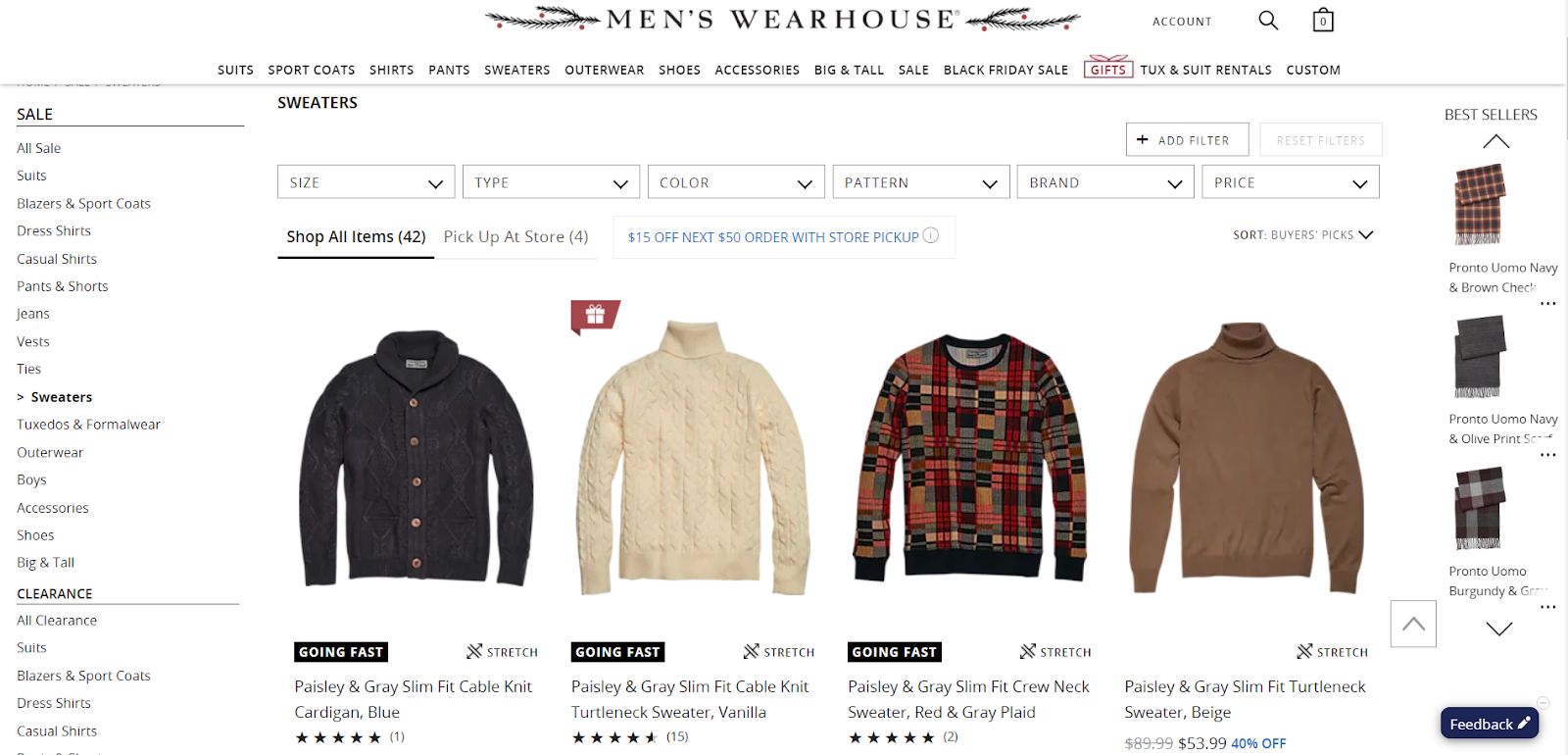
Product pages are generally better for people browsing, but if you’re trying to get them to convert on a particular offer, like Black Friday sale items, you need a more focused page. Still, you’ll see some excellent persuasive elements, like reviews and high-quality product photos.
Scarcity is all over this page in the form of labels on product photos that read “Going fast.” Visitors can’t be sure whether these items genuinely are in short supply, but these labels make the product appear to be more scarce, which raises their perceived value.
Brooklinen
This Brooklinen homepage serves as a landing page for a Black Friday email promotion.
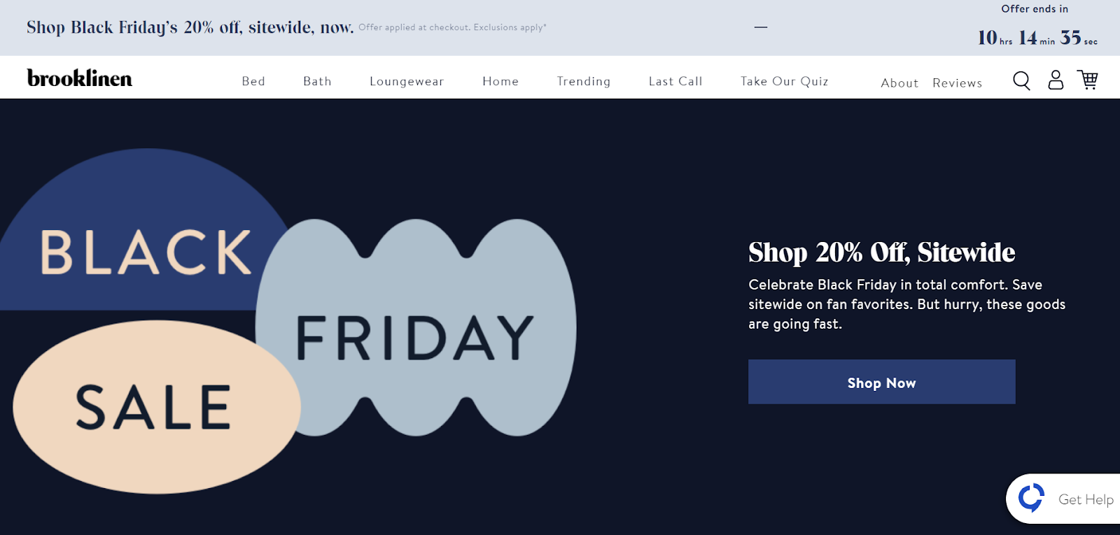
This setup creates friction by adding an extra step for the user. If they’ve clicked on the email to shop, the link should take them directly to where they can do so. Instead, they must click on “Shop Now” to get to category pages where they can browse Black Friday offers. Not only that, but this page has far too many distractions to effectively convert visitors.
Still, there are some effective elements here. The headline clearly states the offer, high-quality images showcase the product, testimonials prove the product is valuable, and icons highlight the benefits of choosing Brooklinen.
You’ll see two clear-cut examples of scarcity above the fold. The first is in the blue bar at the top of the page, which features a timer to the right that counts down to the offer’s expiration. The second is in the copy above the CTA button: “Save sitewide on fan favorites. But hurry, these goods are going fast.”
Adobe Creative Cloud
This plans and pricing page from Adobe features multiple offers for creative cloud apps.
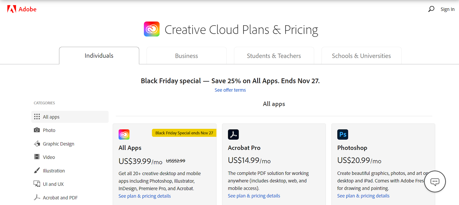
Though it doesn’t feature an optimized conversion ratio, this page has some elements that work effectively to persuade the user to claim the offer. It has no footer and no navigation, it uses contrasting CTAs to draw user attention, its categories are user-friendly, and its bundle pricing is a deal that’s hard to pass up no matter what app you’re after.
It also uses scarcity twice. The first example is at the top of the page in the text “Black Friday special — Save 25% on All Apps. Ends Nov. 27.” The second is in the “All Apps” offer below with a bright yellow bar that reinforces its limited-time availability.
Audible
This landing page from Audible offers its users a membership and a $10 Amazon credit.
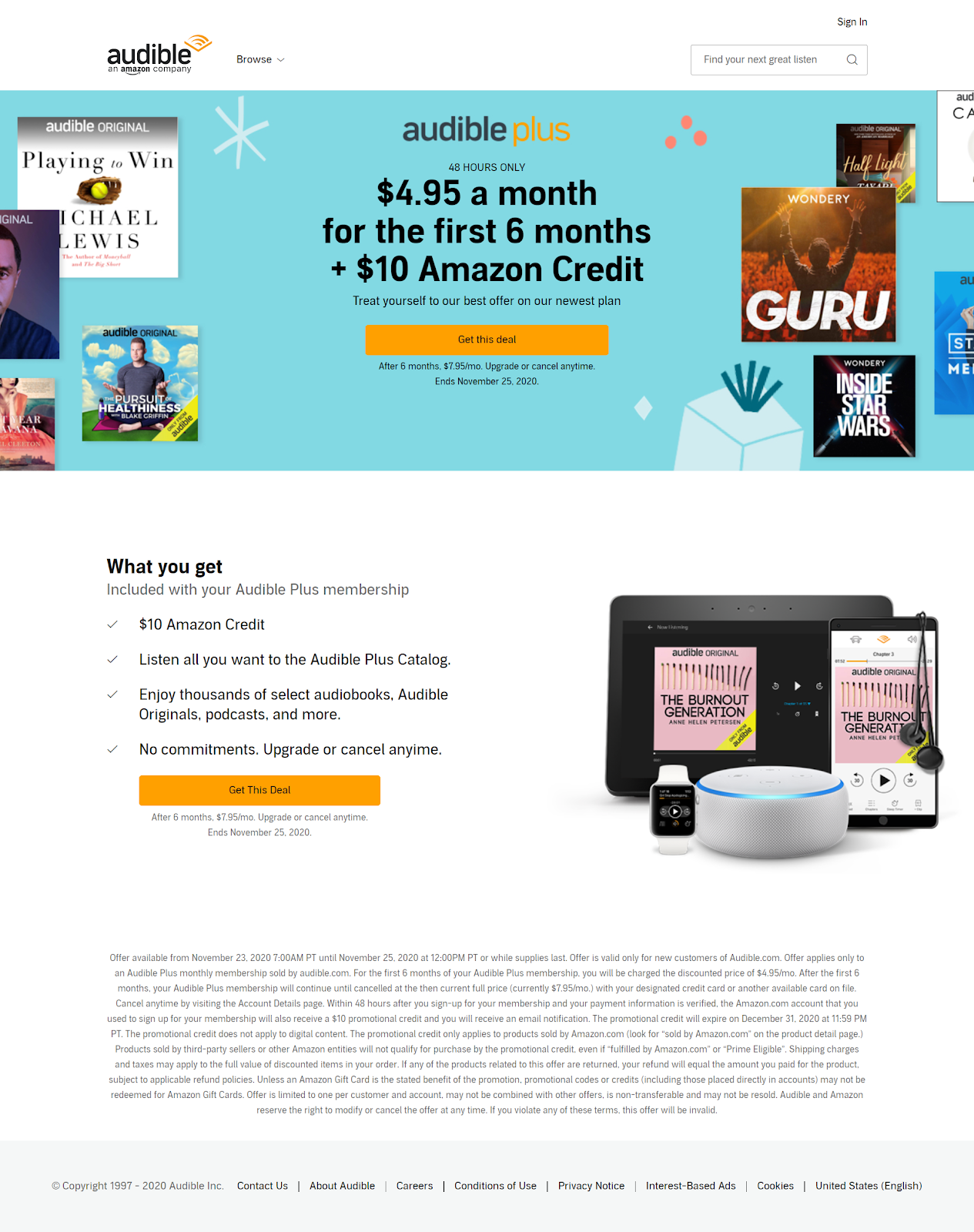
Though it does not have an optimized conversion ratio, this landing page is fairly distraction-free, with few highly visible links in the content. It also uses imagery to convey that the Audible app is available on all your favorite devices. The headline clearly states the offer, bulleted text highlights benefits, and the button colors draw attention to the CTA.
Scarcity appears in copy just above the headline and below the CTA button: “48 Hours Only” and “Ends November 25, 2020.”
Demand Gen Report
This landing page from Demand Gen Report offers users a webinar on what your sales team needs from you, but is too afraid to ask for.
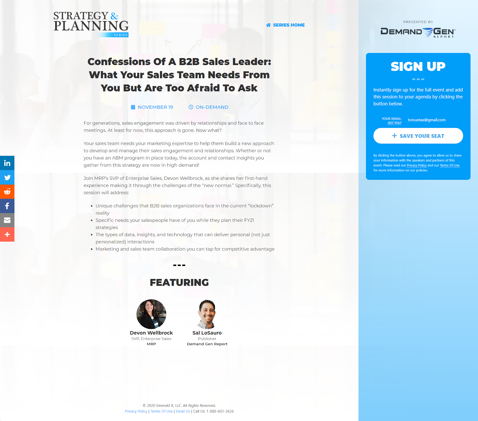
The word “confessions” in the headline communicates to visitors that they’re going to learn privileged information, and not just any secrets—ones from a “B2B sales leader,” which means they’ll be valuable to organizations. The bulleted copy does a good job of highlighting the beneficial content the webinar will cover.
You’ll see scarcity featured in the CTA button: “Save your seat” communicates to visitors that seats are limited, and if you don’t get one now, it may not be available later.
TikTok
This TikTok for Business landing page offers visitors a $2,300 credit when they sign up to run ads on the platform.
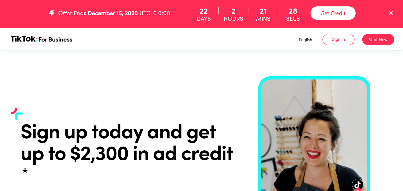
It uses some highly effective design elements to get users to claim the offer. First, it features a nearly optimized conversion ratio. With the exception of a social link in the footer and a homepage link in the logo, these buttons work together to convert the user. The page also distinctly states the offer in the headline and highlights the benefits in the “How can the program help?” section. An FAQ section also helps clear up any common objections and questions.
You’ll see several examples of scarcity on this page. The most obvious is in the big red bar at the top of the page, which tells the visitor when the deal ends and counts down to expiration with a timer. This text also appears below the CTA buttons. In the copy, you’ll see the words “limited offer” and “one-time ad credit.” Even the FAQ section makes it clear that the offer is scarce. There’s no question that, by the time you finish consuming this landing page, you’ll know you don’t have long to decide on the offer.
Scarcity is effective, but not a replacement for good design
Scarcity can work to pressure your visitors into deciding how to respond to an offer. It can also raise your product’s perceived value.
However, scarcity is no substitute for good landing page design and a personalized narrative. If you want to convert visitors, your page design needs to have the foundations of an effective landing page, like an optimized conversion ratio, visual hierarchy, skimmable content, benefit-oriented copy, and more.
And if you want to generate the highest possible ROAS, personalize each page to its audience for maximum relevance. Content should speak to each segment’s motivations and objections. Post-Click Automation is the only category of software that allows users to scale personalization in the post-click stage.
