
Step aside, Leonardo DiCaprio. Move over, Meryl Streep.
As it turns out, the best actors in the world aren’t found on movie sets in Hollywood, but in the silt and sand of the Indonesian seas.
The world’s most amazing role player is the aptly dubbed Mimic Octopus and it performs daily underwater dramas dressed as some of the ocean’s deadliest creatures. Its ability to quickly transform into sea snakes, a banded sole, or lionfish — no animal is too complex for this master impressionist — makes it one of the most adaptable creatures in all of nature.
The Mimic Octopus is the embodiment of the often cited Darwinian remark:
“It is not the strongest species that survives, nor the most intelligent species that survives. It is the one that is the most adaptable to change.” — Charles Darwin
Adaptation isn’t unique to the animal kingdom; it continues to plays a big role in digital marketing.
How?
Responsive website design.
Adapting to a mobile, multi-screen world
Things were a lot easier for web designers before iPods, mobile phones, and tablets. Internet users browsed strictly on desktop and laptop screens that didn’t vary much in size — which meant most websites looked similar no matter where you viewed them.
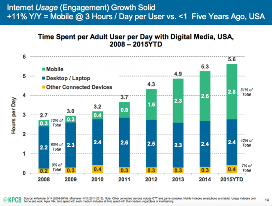
But, that all changed when we started surfing the web with our thumbs. In 2014, the majority of internet traffic worldwide came from mobile — and it’s been that way since.
A year later, we spent an average of almost three hours a day on our mobile devices, compared to just 20 minutes in 2008.
This shift resulted in a distaste for “fixed design” websites that couldn’t adjust to the many screen sizes that internet users viewed the web on. To satisfy them, new techniques had to be developed.
Adaptive design and the early days of mobile
When the mobile revolution began several years ago, initially the most popular way to tailor your website to non-desktop users was to create a completely different mobile version of your site.
The major issue with this?
Double the website maintenance. You needed separate SEO campaigns, PPC campaigns, content strategies for both the mobile and desktop versions of your website. But, people made due…
That is until the number of screen sizes and resolutions became too many to keep up with.
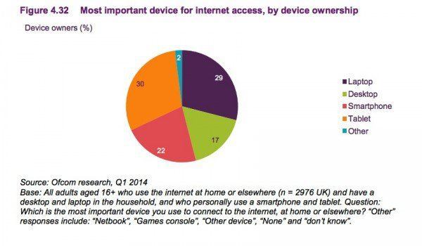
This graphic from Ofcom’s 2014 internet usage report shows the variety of our device preferences:
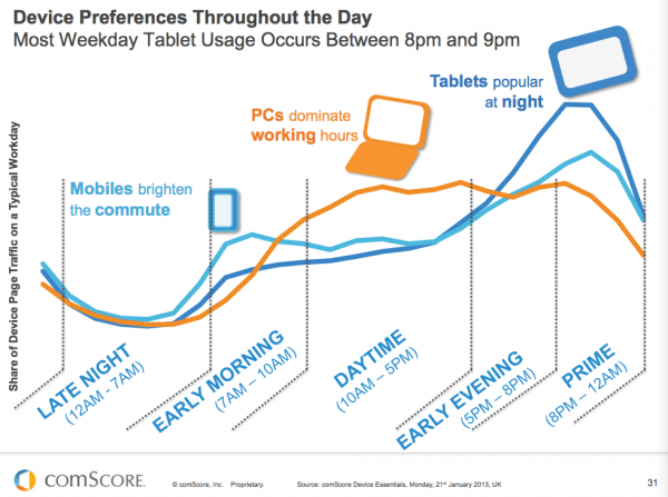
Here’s another visual from Smart Insights, which shows people’s device preference throughout the day:
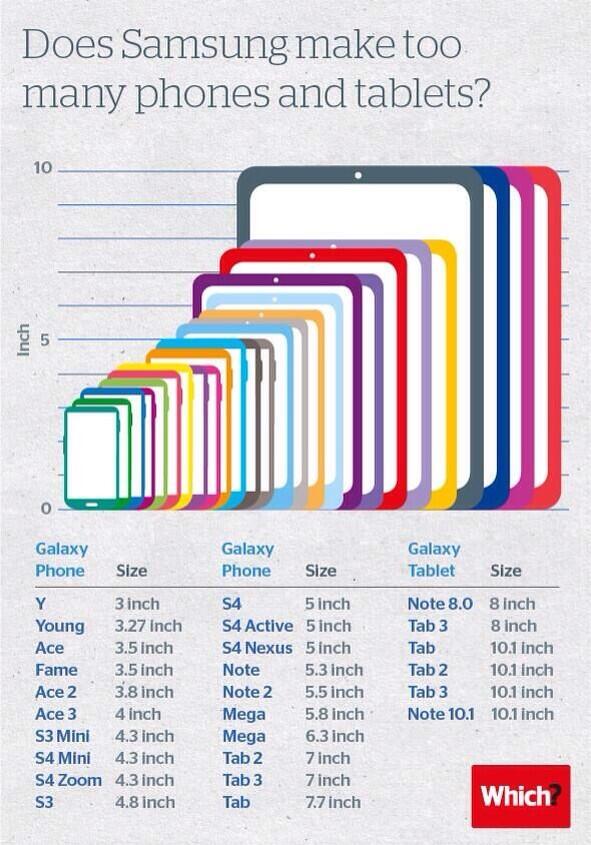
And to hammer home the point? Look at all the different mobile devices manufactured JUST by Samsung in the “Galaxy” series:
It was becoming clear, as Steve Cartwright explains, that building multiple versions of your website wasn’t going to work.
“These days are gone, the problem with this approach is that just because something is made to be viewed on a mobile device, it doesn’t mean it can be viewed on any and all mobile devices.”
Still, some people clung to adaptive design — until Google chimed in to reveal that their search algorithm would soon change to reward sites that were responsive, and penalize those that weren’t:
“Starting April 21 (2015), we will be expanding our use of mobile-friendliness as a ranking signal. This change will affect mobile searches in all languages worldwide and will have a significant impact in our search results. Consequently, users will find it easier to get relevant, high-quality search results that are optimized for their devices.”
(It should be noted that while at one point responsive websites ranked higher in search results, search engines have adjusted to accommodate adaptive sites as well.)
The message was clear: Adapt to more devices, or become obsolete (at least in search rankings).
How?
By using responsive design.
Responsive design: What is it, and how does it work?
As it turns out, Google had been advocating for responsive design long before they gave the “Mobilegeddon” ultimatum — specifically saying things like:
“If you’re ready to build a mobile-friendly site, choose responsive web design”
“Responsive design is Google’s recommended design pattern”
But what did this technique entail? Why was it better than adaptive design?
To answer those questions and more, Verve created an awesome infographic that breaks things down in a way non-techies can understand. Some highlights:
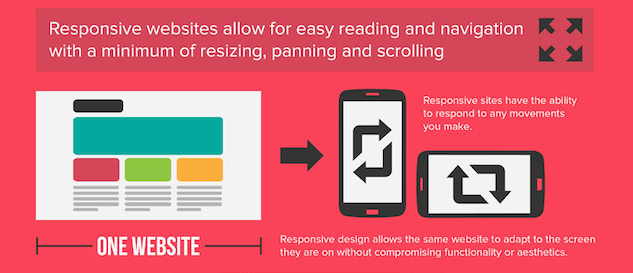
Flip your phone sideways, turn it upside down — no matter the orientation, device, or browser, user content always displays well. But how?
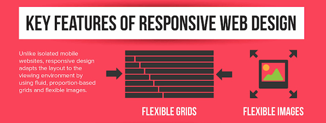
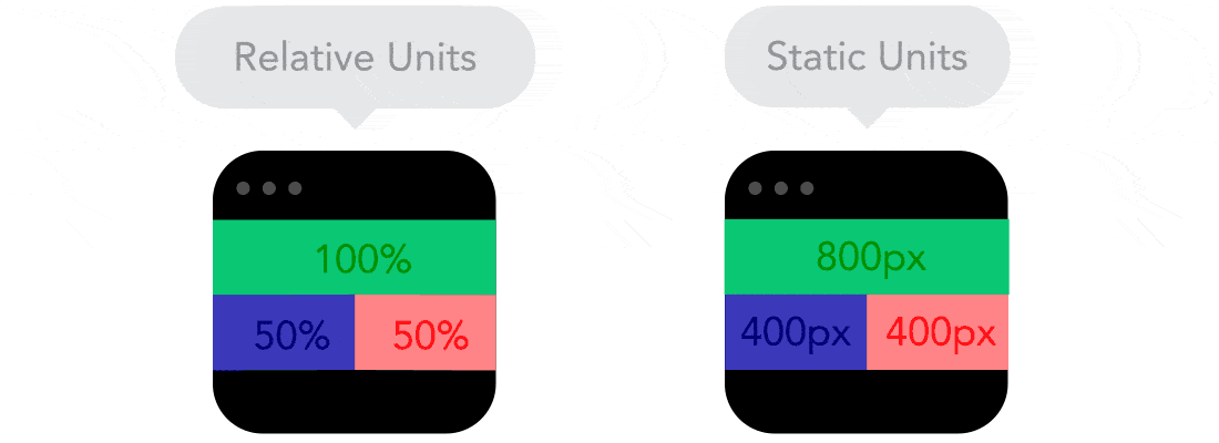
“Unlike isolated mobile websites, responsive design adapts the layout to the viewing environment by using fluid, proportion-based grids and flexible images.”
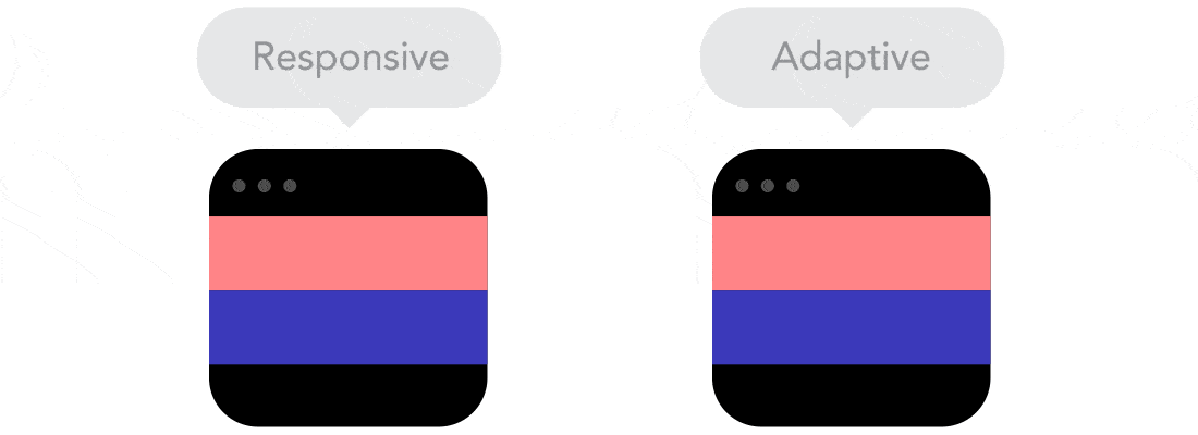
Basically, where adaptive websites were tailored to specific screen sizes, responsive ones were designed using percentages of the total screen of the device it was being viewed on. Here’s a great GIF to help you visualize the difference across desktop and mobile screens:
Because responsive website elements are coded to occupy a certain percentage of a screen, they will take up that portion of the screen no matter what size it is:
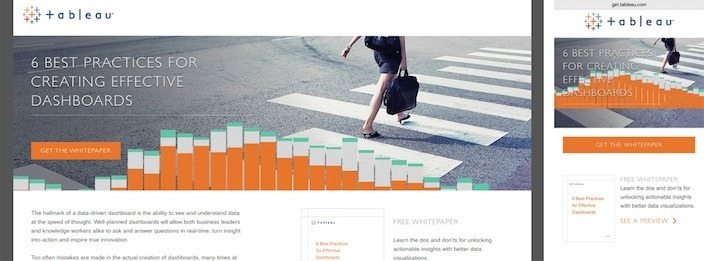
Responsive post-click landing page examples
To demonstrate how responsive pages appear on different devices, let’s look at three examples.
Tableau
PulsePoint

Fundbox

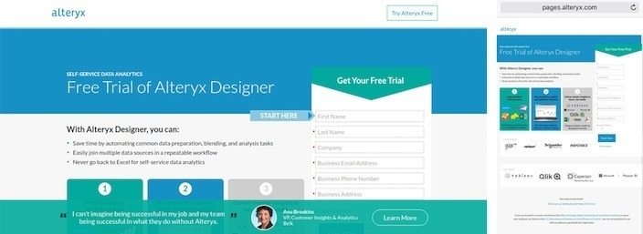
A static post-click landing page example
Now, let’s look at how a non-responsive page looks on different devices. Notice how the mobile version is much more condensed to fit the screen size and not as user friendly?
Alteryx
Is responsive design worth it?
According to a number of case studies, redesigning your website using responsive techniques can have a massive impact on your bottom line. Check out some results from businesses that have already adapted:
- Electric Pulp boosts conversions for O’Neill clothing company on Apple devices by 65.71%, transactions by 112.5%, and revenue by 101.25%. Android devices boast an even more impressive boost, with conversions improving by 407.32%, transactions by 333.33%, and revenue by 591.42%.
- Using responsive website design, Baines & Ernst boosted pages per visit by 11%, average visit duration by 30%, mobile conversions by 51%, all while decreasing bounce rate by 8%.
- According to Gravity Department, who responsively redesigned clothing retailer, Skinny Ties’ website: “By the numbers, modernizing Skinny Ties is already proving a watershed success. The normalized figures versus the prior three months are staggering.”
Examples
The new version of Skinny Ties’ website succeeded in skyrocketing a number of key performance indicators:
-
- 42.4% revenue growth for all devices
- 377.6% revenue growth for iPhone
- 13.6% increase in conversion rate
- 71.9% increase in conversion rate on iPhone
- 44.6% increase in average visit duration
- TIME magazine adapts to a growing percentage of mobile readers with a nine-month responsive rehaul of their website. The results speak for themselves, says David Moth of Econsultancy:
- Mobile and tablet traffic has gone from 15% of the site traffic pre-redesign to now almost 25%. The bulk of that was the migration of people who were using the old WAP site migrating to the new site.
- Pages per visit (PPV), across mobile, tablet and desktop are up “considerably” – for example, mobile PPV increased 23%
- On the homepage, unique visits increased 15%, and time spent went up 7.5%, with the mobile bounce rate decreasing by 26%.
Sounds like all good news from the responsive front. So why isn’t everyone responsive?
Why every web page is not responsive?
According to an article from Nielsen Norman Group, there are a few reasons:
- Responsive websites are generally a bit slower to load.
- A higher level of development skill is required to create a responsive website. If you don’t have that skill, outsourcing can be expensive.
- Responsive sites can’t always perform complex tasks as well as adaptive sites can, or resize rich media like spreadsheets on smaller devices.
So when you don’t have the time or skill to develop a responsive website — or the money to outsource the redesign to professionals — what are you to do?
We’ll refer back to Google for the answer to this one:
“…select a responsive template or theme for your website. A responsive template/theme adapts the display to the visitor no matter if they are using a desktop, tablet, or mobile phone.”
Instapage’s simple responsive post-click landing page software
Designing a post-click landing page that displays content beautifully across all devices is easy with Instapage. Here’s how to do it:
Step 1: Log into your Instapage account
Step one, of course, is to log into your Instapage account. If you don’t have one yet, you can create one here.
Once you’re in, click the “Create New Page” button.
Step 2: Pick your creation method
Now you should see a pop-up that will give your three options to get started creating your responsive post-click landing page:
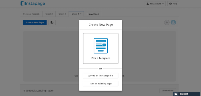
- If you’ve saved any post-click landing page designs, you can upload a “.instapage” file
- Premium account members can scan pages from your website into our editor
- If you want to start from scratch, pick one of our pre-designed responsive post-click landing page templates
Step 3: Decide which responsive post-click landing page template you want to use
Let’s assume you want to build a responsive post-click landing page from scratch. Before you choose one of our templates, sort them by the type of post-click landing page you want to create using the menu across the top of the page:
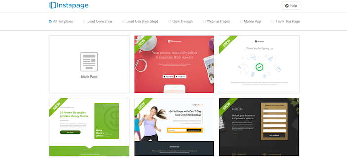
Pick from:
- Lead Generation post-click landing page
- Lead Generation (2-Step) post-click landing page
- Click Through post-click landing page
- Webinar post-click landing page
- Mobile App post-click landing page
- “Thank You” post-click landing page
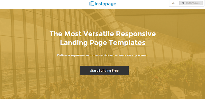
Step 4: Create your responsive post-click landing page
It’s time to get creative. Click any element on the page to select it, and delete, drag, or edit it with the click of your mouse. Here’s what ours looks like:
And here’s what it looks like on mobile:
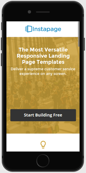
Preview yours by toggling between the mobile and desktop version of the page in the upper-left of your screen, then press the “Preview” button in the upper-right.
To make your responsive post-click landing page more persuasive, add:
- A compelling headline
- Some eye-catching images
- Benefit-oriented copy
- A dash of social proof
- A few testimonials
Now you’re ready to publish your responsive post-click landing page.
Step 5: Publish your responsive post-click landing page
Responsive post-click landing pages are easy to publish with Instapage. Now simply move your mouse cursor to the upper right-hand corner of the page and click the blue “Publish” button.
Once you do that, you should see a pop-up like the one below:
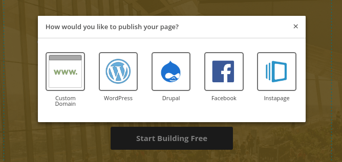
Now choose from five different publishing options. You can:
- Publish to your own custom domain
- To your responsive post-click landing page WordPress
- Upload it to Drupal
- Add your responsive post-click landing page to Facebook
- Or, let us host your post-click landing page on our servers by clicking “Instapage.” (Keep in mind, while we love hosting you, we recommend you opt for one of the others for purposes of brand consistency).
And now you’re done! It’s that easy!
Design responsively
Today your website visitors expect an experience tailored to the device they’re using. When you don’t have the time, resources, or skill to create your own responsive post-click landing pages from scratch, or the money to outsource to a professional. Sign up for an Instapage Enterprise demo today.

See the Instapage Enterprise Plan in Action.
Demo includes AdMap™, Personalization, AMP,
Global Blocks, heatmaps & more.
