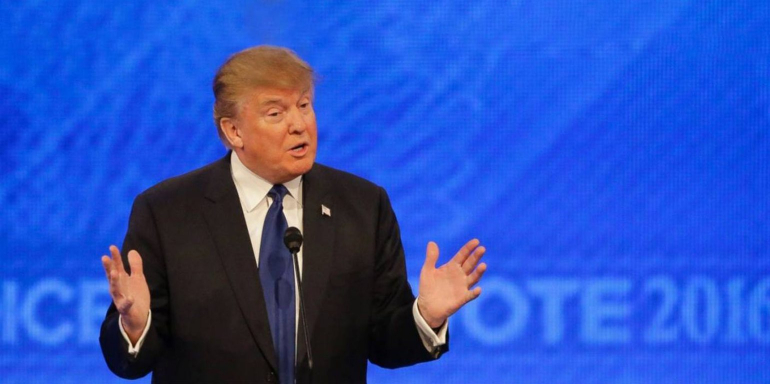
In what early ratings suggest could’ve been the most watched event of the year, the presidential nominees traded verbal blows and tackled some of America’s biggest issues. But, while we all tuned in to see Clinton and Trump debate the country’s future, a battle between their marketing teams raged behind the scenes. Who won the war for debate conversions online?
Donald Trump’s campaign marketing
Display advertising
With big, bold, in-your-face display ads, Trump’s marketing team declared victory following Monday night’s debate.


All three use attention-grabbing red CTA buttons, and one is even written in the first person, which studies have shown has the potential to boost conversion rates greatly.
When clicked, those ads drive users to this page:
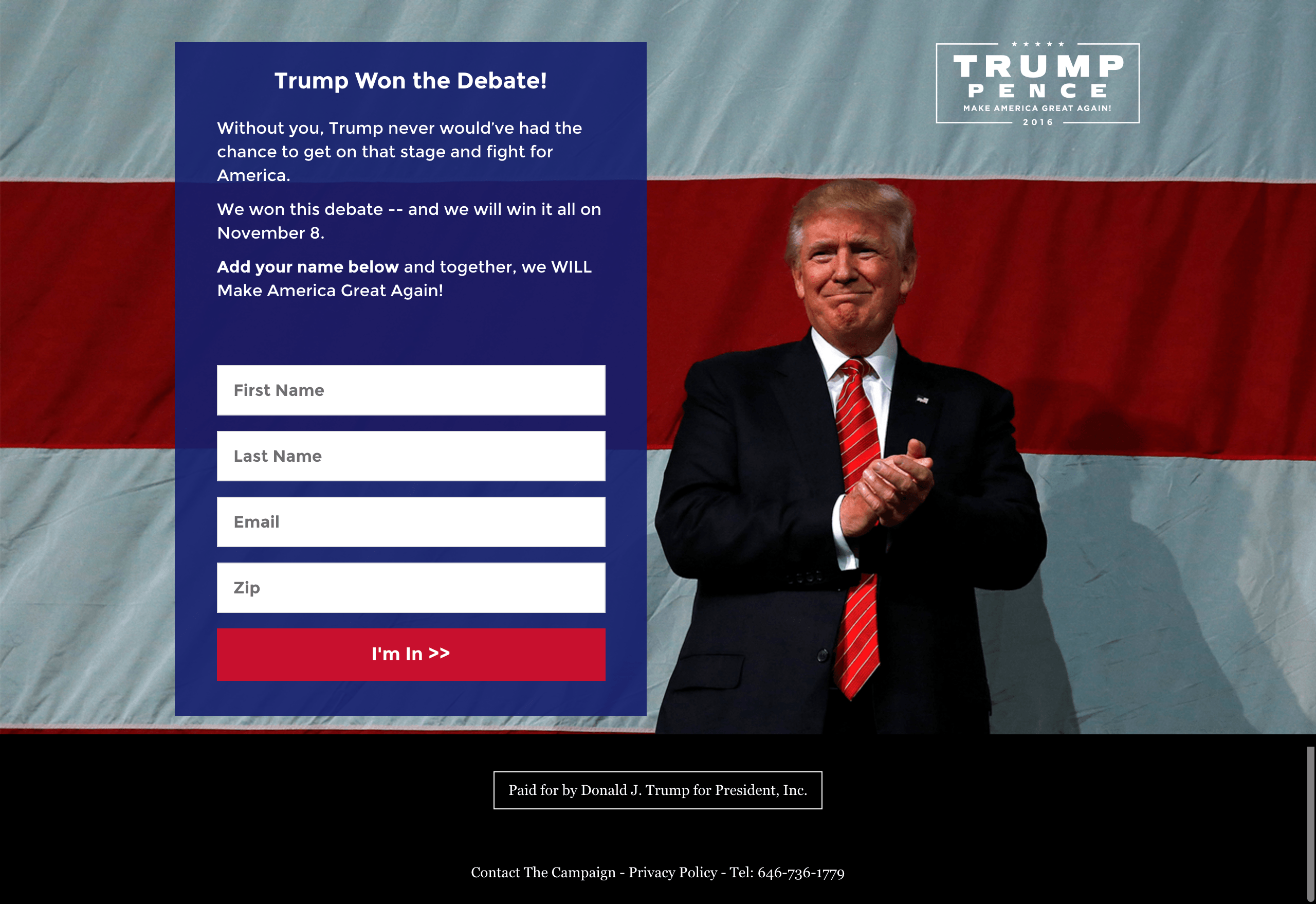
It uses the headline “Trump Won the Debate,” which matches the message of the ad content exactly. Below that, copy containing the word “you” involves the reader directly, as does the text “We WILL Make America Great Again,” which also reinforces the candidate’s consistent message.
To convert, all the user needs to do is complete four form fields that request basic personal information and click a bright CTA button that again uses the first person to boost conversion rates. Without a navigation menu or outbound links in the footer, prospects stay focused on doing just that. Though, they’d be even more focused if the logo didn’t include a link to the homepage.
Social media
In the hours leading up to the debate, Trump called for support by posting a message from his son:
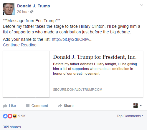
It invited his audience (albeit sloppily without an image thumbnail in the link) on Facebook to add their name to a list of supporters that would be shown to the presidential candidate before he took the stage for the debate. When clicked, it drove users to this post-click landing page:
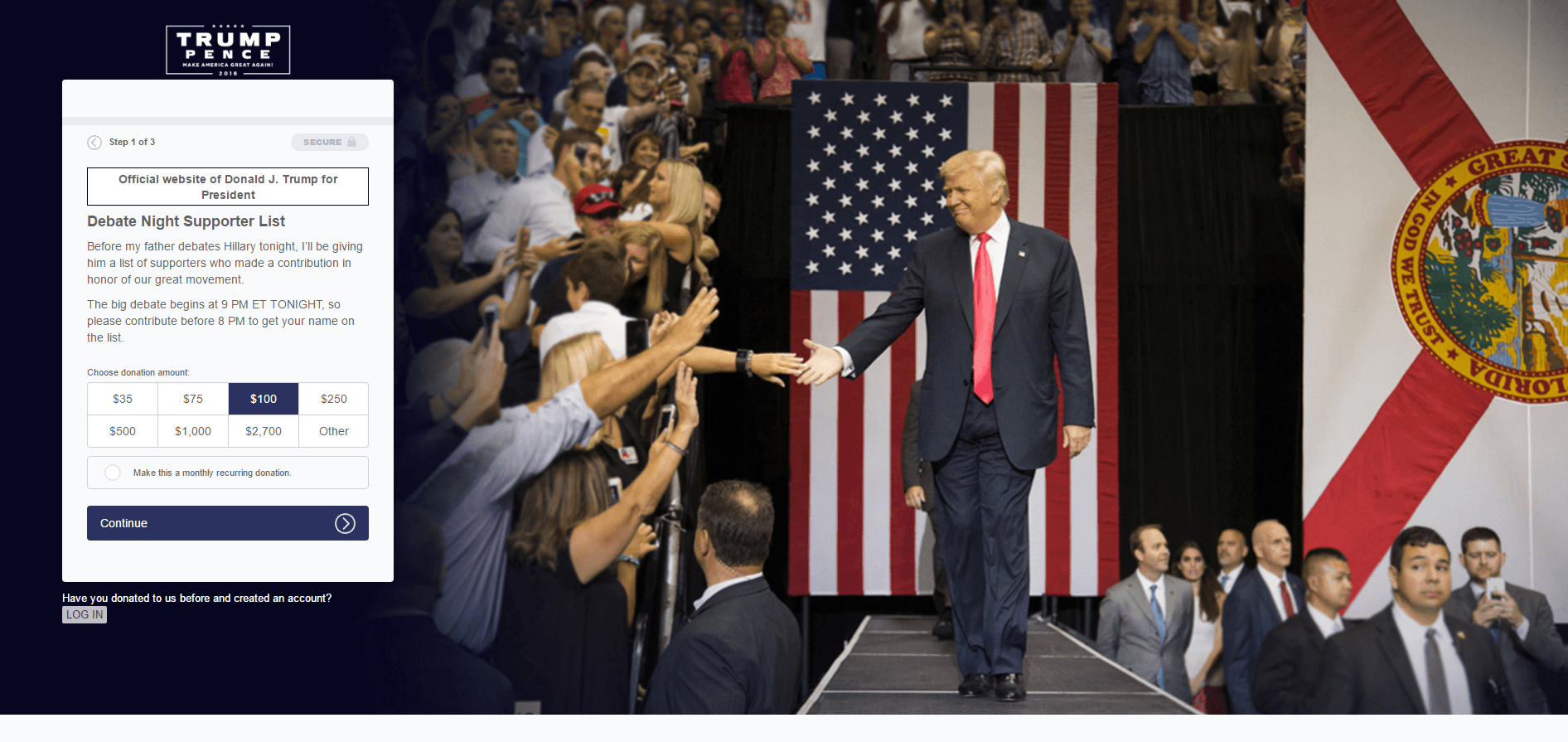
On it, an image of Trump high-fiving supporters makes him seem down-to-earth, and his gaze is in the direction of the form, which guides viewers toward it. When they get there, they’ll notice the conversion process has been broken down into three steps, which minimizes the friction involved in completing it.
Also reducing friction is that “Secure” badge at the top of the form, but it might be too vague to make prospects feel their information is safe. Below, a message identifying the page as an official part of Trump’s website reinforces the logo in the upper-left, which isn’t linked to the homepage, making it impossible to leave this post-click landing page without exiting the browser window or donating.
To increase the likelihood they do contribute, copy written by Trump’s son matches the message of the social media post and even uses scarcity to pressure visitors into converting before 9PM. In exchange for doing so, Eric Trump offers his father’s supporters a chance to be noticed by the Donald himself before he takes the stage later in the night.
Will they ultimately contribute? With a pre-selected donation amount of $100 and no option lower than $35, Trump’s team is telling visitors “We’d like $100, and really no less than $35. But you can click ‘Other’ if you absolutely can’t afford that.” Combined with a poorly-colored call-to-action that doesn’t grab attention like it should, chances are slim this page generates maximum conversions.
In addition to social and display, email was a go-to channel for Trump’s team before the event. First, this message from Eric Trump invited fans to support his father the same way that Facebook post did:
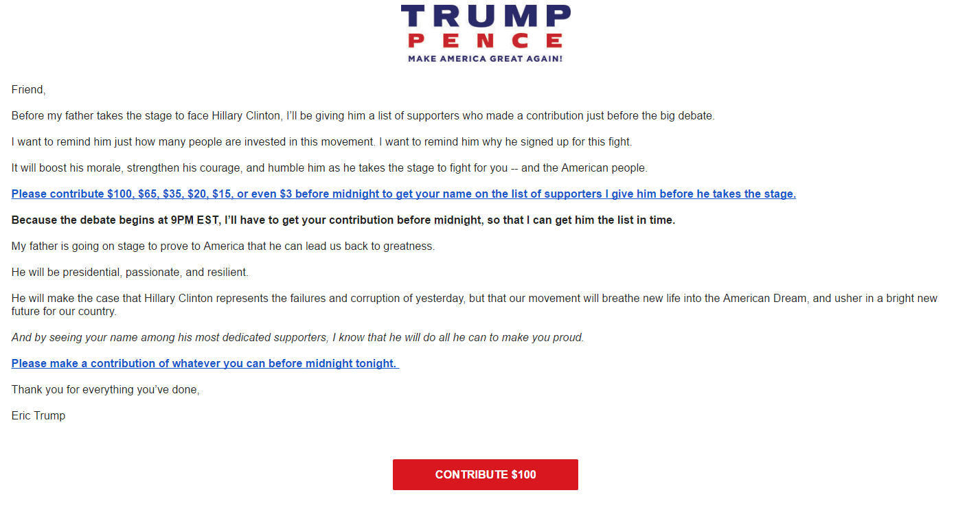
Then, Trump’s team used email in a creative way that, as you’ll see later, Hillary’s team didn’t:
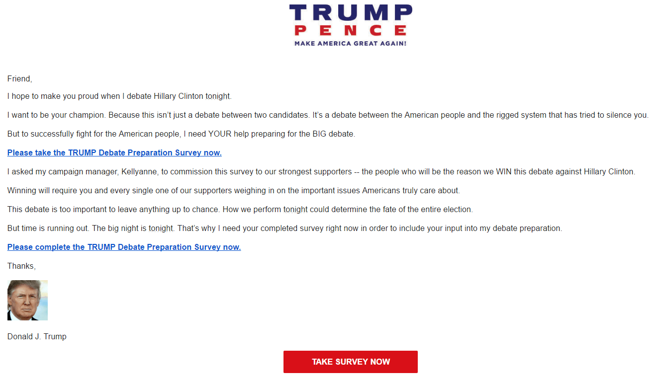
This one invites subscribers to help Trump prepare for the debate by filling out a quick survey. In it, they can answer questions like “Should Trump contrast his America-first foreign policy with Hillary’s globalism?” and “Do you think Trump should refer to Hillary as “Crooked Hillary” on stage?” By doing so, they make the night less about a one-on-one clash with Hillary Clinton and more about the whole movement. We know that personalization is powerful in marketing, and this survey is a great way to involve supporters in the debate.
Website
To generate even more support before both candidates faced off, Trump’s team used a splash page, which meant that instead of landing on the campaign homepage, users were met with the message below when they typed www.donaldjtrump.com into their address bar:
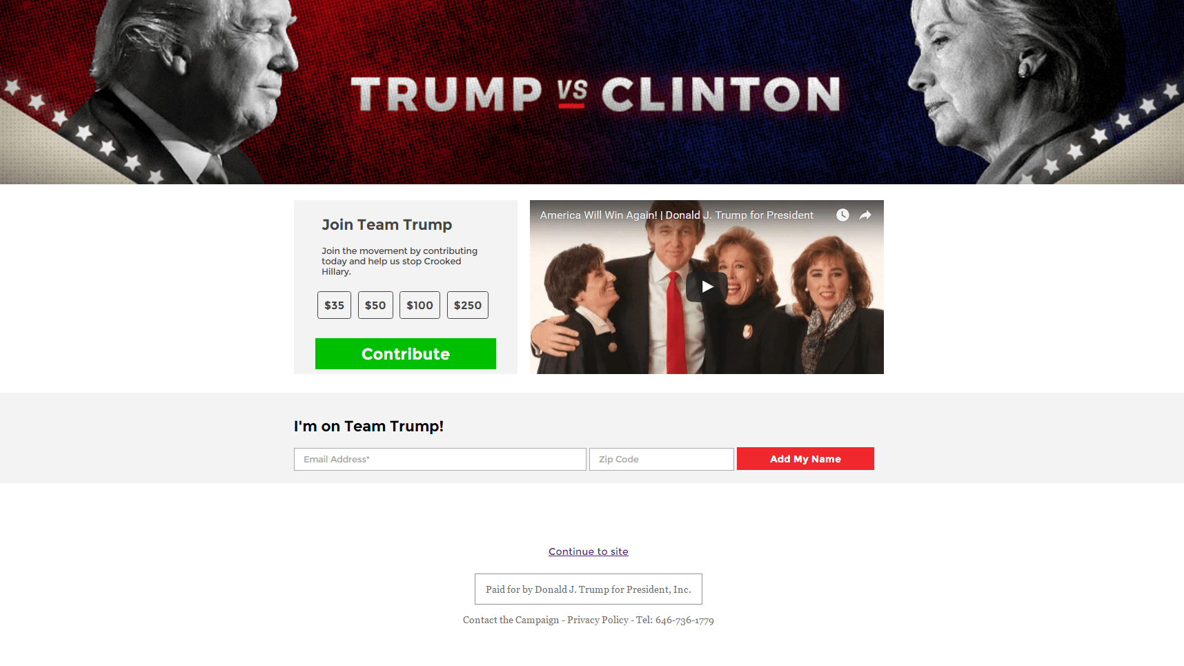
But, what kind of support are they hoping to generate here? A donation? An email subscriber? With two competing CTAs, it seems like both — and that goes against post-click landing page best practices. Each call-to-action here has the potential to detract from the other’s conversion rate.
Above the CTAs, a 2-minute video chronicles Trump’s rise from businessman to a presidential candidate, the header image relevantly relates to the coming debate and copy written in the first person adds to the persuasiveness of the page. But overall, is it enough to convince readers to convert?
Maybe. But the competing CTAs aren’t helping, and neither is the fact that there’s no option to donate any less than $35 to the campaign. One thing’s for sure — even if this splash page does produce conversions, it won’t be the maximum amount.
Hillary Clinton’s campaign marketing
Social media
Just before the debate’s start, Hillary’s team published a number of posts on social media to call for support:
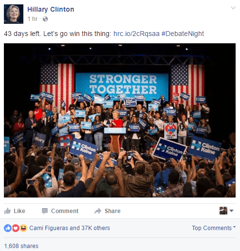
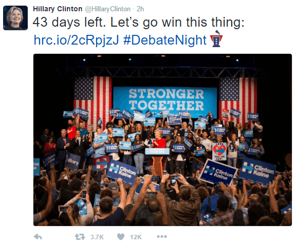
To readers, there’s no question about their purpose. With a relevant image showing Hillary on stage surrounded by fans, text reading “Let’s go win this thing,” and a “DebateNight” hashtag (which boosts the exposure of the Tweet by displaying it to anyone who clicks #DebateNight), it’s obvious the messages are meant to drive traffic to a campaign post-click landing page.
Here’s what that post-click landing page looks like:
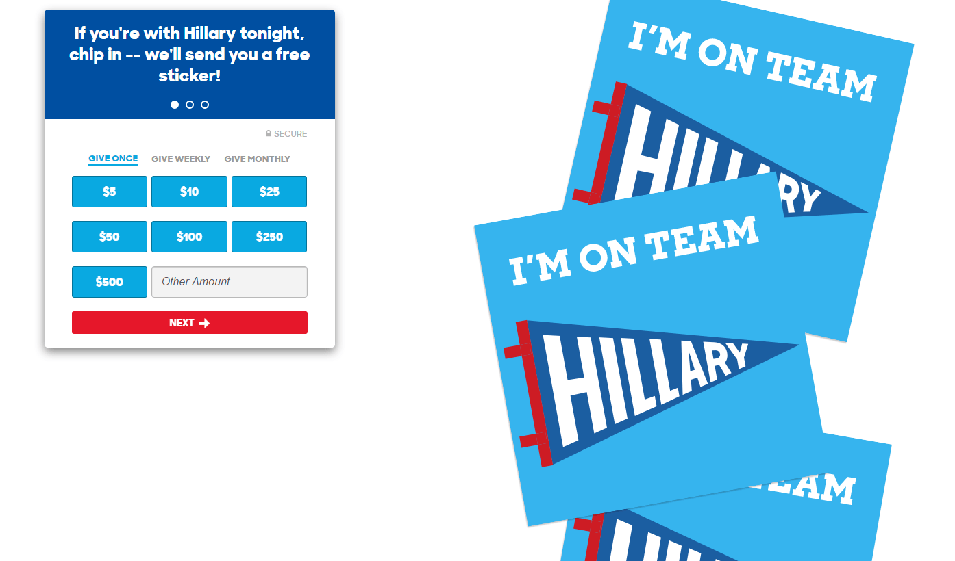
Without a navigation menu and links in the footer, visitors can only leave this page by contributing or closing their browser window. So which way out are they most likely to take?
The headline does a good job of speaking to the reader by using the word “you’re,” and even offers a free sticker to those who click the CTA button. That sticker, we can only assume, is what we see in the image to the right.
Underneath the headline, a multi-step form (indicated by the three dots) makes converting less overwhelming than if it required the completion of one long one. Each of those steps requires little work from the prospect outside of clicking the mouse and entering some basic information like name, address, and billing address.
To make supporters more comfortable submitting that information, Hillary’s team has added a “Secure” badge to the form, but a more recognizable one from a trusted security brand like Norton or TRUSTe may work even better.
The biggest issue here, though? There’s no mention of the presidential debate outside of the word “tonight,” which is an example of poor message match. If your ad or post alludes to the debate with a hashtag like #DebateNight and text that reads “Let’s win this thing,” your post-click landing page’s content should relate.
Also linking to that same post-click landing page was this email from team Hillary following the debate:
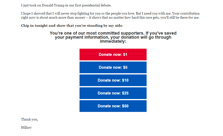
It calls to the reader in the subject line and throughout the email by using the word “you” often, and includes a red button to draw attention to the lowest donation option, which effectively says “All we ask is for a dollar, but if you can afford more, even better.”
To make donating even easier, the email states that supporters who have already submitted their personal information only need to click a button to see their contribution go through. That’s a great job by Hillary’s team to minimize the friction involved in converting.
Pay-per-click
Social and email weren’t the only channels Hillary’s team used to call for support. A quick Google search for “Hillary Clinton debate” reveals PPC ads that vary depending on when you entered the query:


Both use Google Ads sitelink extensions to drive traffic to campaign pages, and the ad’s title, when clicked, leads the user to this post-click landing page:
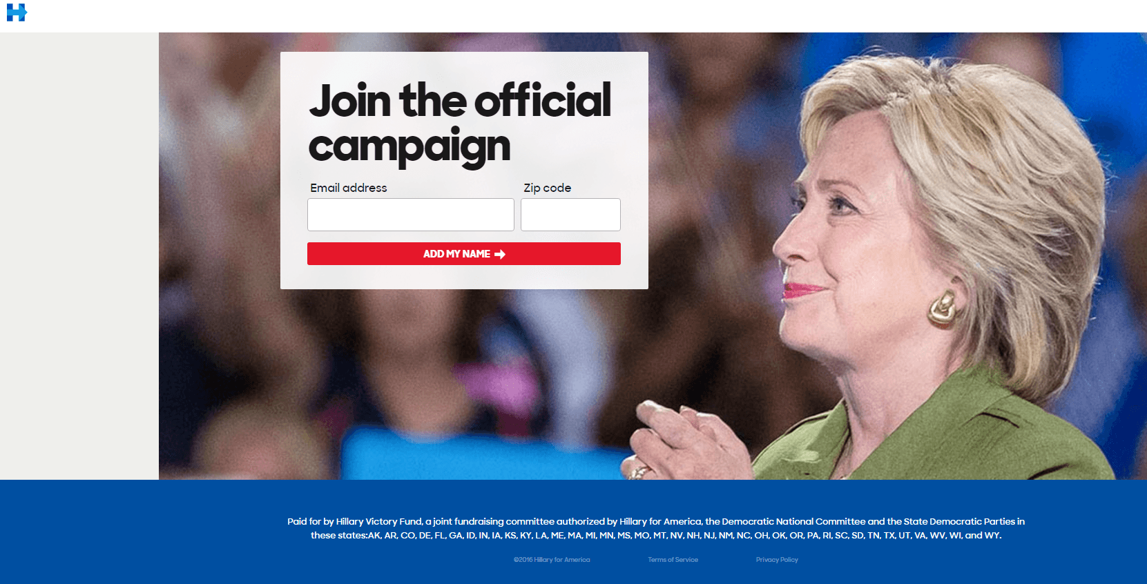
With only two form fields, an attention-grabbing CTA button, and an image of Hillary that guides visitors toward the form with her gaze, this post-click landing page has a lot going for it. On the other hand, that logo is linked to the homepage, which means users can leave before converting. Additionally, this page is lacking message match like the last one. Where’s the mention of the debate that we saw in the PPC ad?
Which presidential candidate won the behind-the-scenes battle for conversions?
The winner of last night’s debate varies depending on who you talk to. What we want to know is, who do you think won the behind-the-scenes marketing battle for conversions? Team Hillary or Team Trump?
Use Instapage to create a high-converting post-click landing page for your own campaign, request an Instapage Enterprise demo today.

See the Instapage Enterprise Plan in Action.
Demo includes AdMap™, Personalization, AMP,
Global Blocks, heatmaps & more.
