
Every presidential candidate has political advertisements across the web, vying to make an impression on citizens, strengthen their campaigns, and, ultimately, win votes.
The most successful ads, though, are ones connected to personalized post-click experiences (PCEs). Continuing the same narrative from the ad into the post-click stage ensures the page meets user expectations and the candidate achieves credibility with the voters.
That’s why both Trump and Biden are using PCEs to increase campaign donations and gain voter support.
How Trump uses post-click experiences to strengthen his presidential campaign
Trump post-click experience #1: Google paid search ad to generate donations
Since Trump pays for his name to show up at the top of SERPs, a search for “Donald Trump” shows this paid search ad:

The ad is segmented to those searching specifically for Donald Trump information and resources. Here’s how we can tell:
- The headline includes “Trump 2020.”
- His name is highlighted multiple times in the description.
- We can see “Paid for by Donald J. Trump for President, Inc.” listed beneath the description.
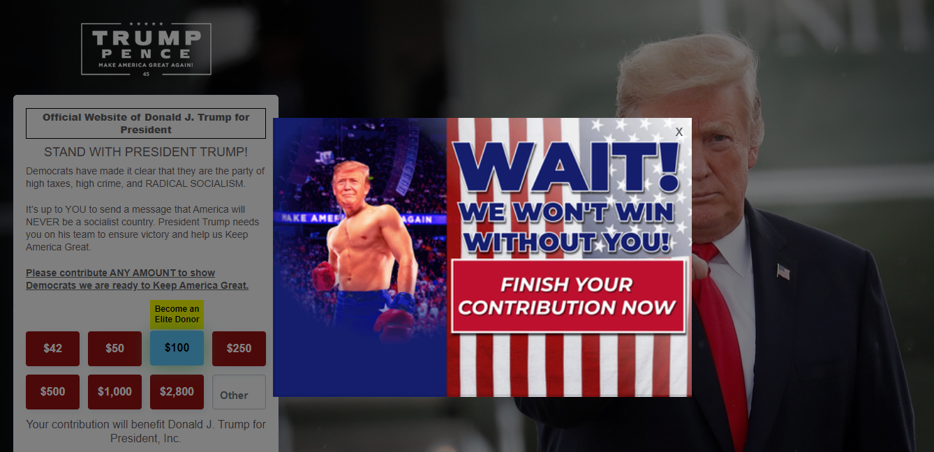
The ad’s message continues onto the post-click page where users click the main headline:

- What is the offer? The campaign’s goal is to entice visitors to “Stand with President Trump” and support him by donating to his campaign, just like the ad states.
- Why donate? The page copy tells visitors that their donations and votes are the only way to ensure Trump wins the election. The page reinforces this with an image of Trump pointing directly at the audience.
- Who can contribute? The list of four contribution rules at the bottom of the page indicates who can donate (U.S. citizens/permanent residents, adults 18 and older, etc.) and who cannot (corporations, labor unions, federal contractors, etc.).
- How can people take action? Visitors can select their donation amount and continue completing the multi-step form.
Trump post-click experience #2: Search ad sitelink extension
Clicking the “Drain The Swamp” sitelink extension directs prospects to another personalized post-click experience relevant to that specific topic:

- What is the offer? The page message (vote for Trump to “Drain the Swamp”) matches the ad extension, starting with the headline and continuing throughout the copy.
- Why contribute? Again, the copy reiterates that donations and votes are the only way to ensure Trump wins the election, which will “drain the swamp of corrupt Washington Bureaucrats.”
- Who can donate? The bottom of the page lists who can and can’t make donations.
- How can people take action? Visitors can select any contribution amount and continue completing the form to make their donation.
Trump post-click experience #3: Facebook image ad to encourage poll submissions
The Trump political campaign also targets online users with Facebook ads and personalized post-click experiences:

The ad begins a story about “fake” vs. “official” Trump vs. Biden polls, which continues onto this post-click landing page:

- What is the offer? Visitors have the opportunity to participate in an “official Trump vs. Biden poll.”
- Why participate? People feel encouraged to complete this poll because Trump’s team claims others are inaccurate.
- Who can participate? Anyone who clicks the ad and lands on the page can answer the survey.
- How can people take action? Visitors only need to answer one question and enter some contact information to submit their response.
Trump post-click experience #4: Google paid ad to donate to and support Trump’s campaign
A Google search for “donate to Trump” prompts this paid ad. The ad copy talks about how donating to Trump will help “Keep America Great”.

The following post-click experience delivers a narrative about how Trump has made a “Great American Comeback” during his time in office and how “the best is yet to come” if he gets reelected:

- What is the page offering? The page offers video content on Trump’s time in office so far and what’s to come in the future if he wins reelection.
- Why support Trump? The videos and their titles convey reasons to support Trump. They explain what he has done economically, how he is renewing, restoring, and rebuilding the country, etc.
- Who is the target audience? This campaign is for any undecided voters, as it provides multiple benefits of Trump remaining in office.
- How can people take action? Visitors can enter their phone number at the bottom of the page to continue receiving information.
Note: Each of these Trump post-click experiences also uses exit-induced popups to convince visitors to take action before leaving the page:
Compared to Trump’s homepage
The Donald Trump homepage isn’t segmented or personalized like the dedicated post-click experiences above:

- Comprehensive header navigation allows visitors to explore all other website pages, potentially without converting on this page.
- Competing CTA buttons (“Shop,” “Contribute,” etc.) could distract and confuse visitors, deterring them from clicking any option.
- No prominent headline might leave people wondering about the page’s purpose.
- Social media links at the bottom could distract visitors, cause them to leave the page, and decrease event signups, donations, etc., on the homepage.
- Other external links throughout the page provide more chances for prospects to bounce without converting.
Instead of having a 1:1 conversion ratio, it’s clear the homepage is a browsing experience with multiple conversion goals.
Now let’s examine how Biden uses the same technique of connecting each of his ads to a personalized post-click experience.
How Biden uses post-click experiences to win votes
Biden post-click experience #1: Google paid search ad to generate support
A branded Google search for “Joe Biden” reveals this paid ad:

The ad is relevant to the search. Here’s how we can tell:
- The display URL and main headline both include the search term.
- “Paid for by Biden Victory Fund” is listed above the headline.
- Sitelink extensions are also relevant to Biden and his campaign.
Clicking both the main headline and first sitelink extension take prospects to this page where they can show support and join the Democratic team:

- What is the offer? As the ad states, the offer is to sign on to support Biden, Harris, and the rest of the Democratic party.
- Why sign up? The copy beneath the headline explains that, since we’re in the most critical, final weeks of the election, supporters should act now to keep the momentum going.
- Who can join? The ad encourages anyone who wants to “take back the White House” to sign up.
- How can people take action? Visitors can complete the three form fields and click the red “Submit” button to sign up.
Note: The other three extensions (“We Want to Hear from You,” “Joe’s Climate Plan,” and “Hold Trump Accountable”) all direct prospects to similar landing pages with the same image and form fields, but with varying headlines and copy that tells a different story.
Biden post-click experience #2: Search ad to collect donations
Someone interested in donating to the Biden campaign might search Google and see this ad:

Ad relevance in this example is evident through the following:
- Matching keywords across the search, headline, and description copy
- “Paid for by Biden Victory Fund” above the headline
- The “Donate Now” extension beneath the description
Clicking through takes prospects to an alternative post-click page where they can donate to Biden’s team:

- What is the offer? The headline tells this part of the story, reiterating what the ad offered: an opportunity to donate to the Biden Victory Fund.
- Why donate? The story conveys that Democrats need financial support to win the election, and that they must win to make the country better than ever before.
- Who can donate? The list of five contribution rules beneath the form indicates who can contribute (U.S. citizens/permanent residents, adults 18 and older, non-federal contractors, etc.).
- How can people contribute? Visitors can select their donation amount, choose whether to donate weekly, then click the CTA button to continue to the checkout page.
Biden post-click experience #3: Facebook ad to increase event registrations
Biden’s political campaign also targets Facebook users with ads and personalized post-click experiences:

This ad begins with an invitation to join actress Jennifer Garner and NYT bestselling author Mark Kennedy Shriver for an event about early childhood policy and children/family issues. This messaging continues seamlessly onto the post-click landing page:

- What is the offer? To register for a virtual event on early childhood with Jennifer Garner and Mark Shriver.
- Why sign up? People may be more likely to participate because well-known celebrities are hosting.
- Who can attend? It’s clear that anyone can attend because the event is virtual via a public Zoom link.
- How can people sign up? Visitors must complete the five-field form and click the blue “Sign up” button to save their spot at the event.
Biden post-click experience #4: Squeeze page to encourage donations
Squeeze pages that appear before arriving on a page can also serve as post-click experiences, like this one does for visitors to Biden’s homepage:

- What is the offer? To donate to the Democratic Party to help them have more resources to win the election.
- Why donate? The headline tells this part of the story: Visitors should contribute because there’s less than one month until Election Day.
- Who is the offer for? “We still have voters to reach all across the country” indicates the offer is for anyone who hasn’t yet donated.
- How can people contribute? Visitors can choose their donation amount by clicking any of the red buttons. If they’ve previously saved their payment information with ActBlue Express, it will go through immediately. If not, they go to the next page where the story continues, and they can complete their transaction.

Compared to the Joe Biden homepage
Like Trump’s homepage, Biden’s homepage isn’t segmented or personalized:
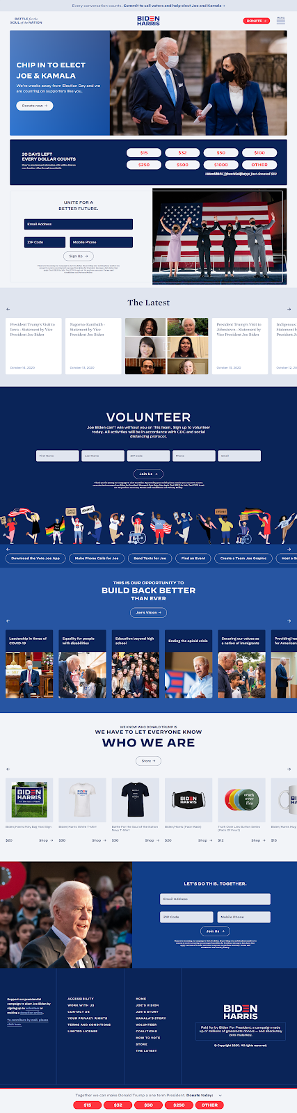
- The expandable navigation menu allows visitors to explore all other website pages without converting on this page.
- Competing CTA buttons (including the entire row of buttons in the middle of the page) could distract them from clicking any option.
- No single prominent headline could cause visitors to question the primary purpose of the page.
- Other external links throughout the page provide additional chances for prospects to leave without converting.
- A full footer menu offers one more opportunity for visitors to bounce.
Again, the homepage is a general browsing experience instead of a personalized, conversion-focused post-click experience.
Connect every ad to a personalized post-click experience
Trump’s and Biden’s marketing teams demonstrate the process of connecting segmented ads to personalized post-click experiences. Continuing the same ad narrative into the post-click stage ensures credibility with voters and helps generate donations.
Take inspiration from the examples above and tell the same story from ad to post-click landing page with every campaign. To see how you can begin creating dedicated, personalized post-click experiences at scale for each of your segmented audiences, request an Instapage Enterprise demo.
