
Creating segmented ads and connecting them to personalized post-click landing pages greatly improves your chances to increase advertising conversions.
A matched pre-click and post-click landing page reassures prospects and makes them more likely to convert because they see a relevant, personalized page.
We’ve recently showcased how Citibank, Oracle, and Dropbox create segmented ads and post-click landing pages. Today’s post will showcase how Peloton does the same.
Advertising with a Google Now card
Peloton’s Google Now card ad, which appears in the Google Assistant section on mobile devices teases viewers how much they can save on home cycling equipment with a calculator:
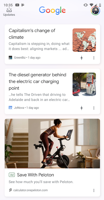
The woman cycling on a Peloton bike in the ad makes the image relevant to the offer while showcasing how the service works. The ad copy is minimal because it conveys the message of ‘saving’ while working out. The main offer highlighted is that the user can “see” how much they’ll get to save if they decide to choose Peloton.
When clicked, the ad takes users to this post-click page:
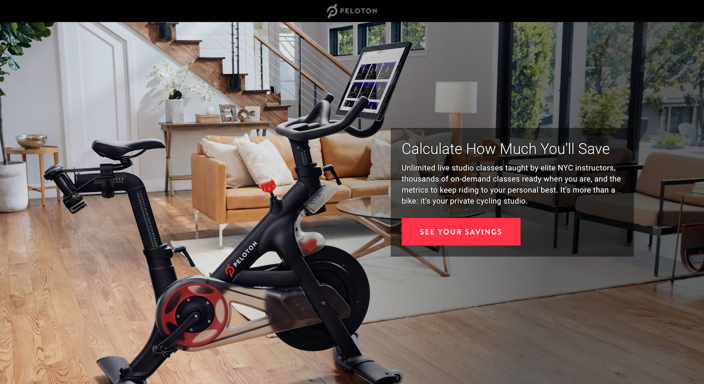
- The post-click headline highlights the offer in the ad, which is to “Calculate How Much You’ll Save.” This reassures the user they will get what they wanted when they clicked the ad.
- The post-click page images feature Peloton’s bike in the first page section, followed by a man and a woman working out on a bike following the live class on the other two page sections. All the images stay relevant to the offer and showcase how the service works, plus they match with the ad image.
- The page copy explains how the Peloton system works, users can access thousands of on-demand classes, and they can keep track of their fitness metrics through the bike. The copy in the first section explains the Peloton service, the next section asks users to calculate how many classes they’ll be taking, and the last section asks them to enter the current amount they spend on their workouts. That way Peloton can determine how much users save when they buy the service.
- The “See Your Savings” CTA button is relevant to the offer and lets the user know clicking it will calculate their savings.
- The form is very easy to complete. Once the user complete one field, it automatically jumps to the next.
After the user fills out the last form field, they are directed to this page:
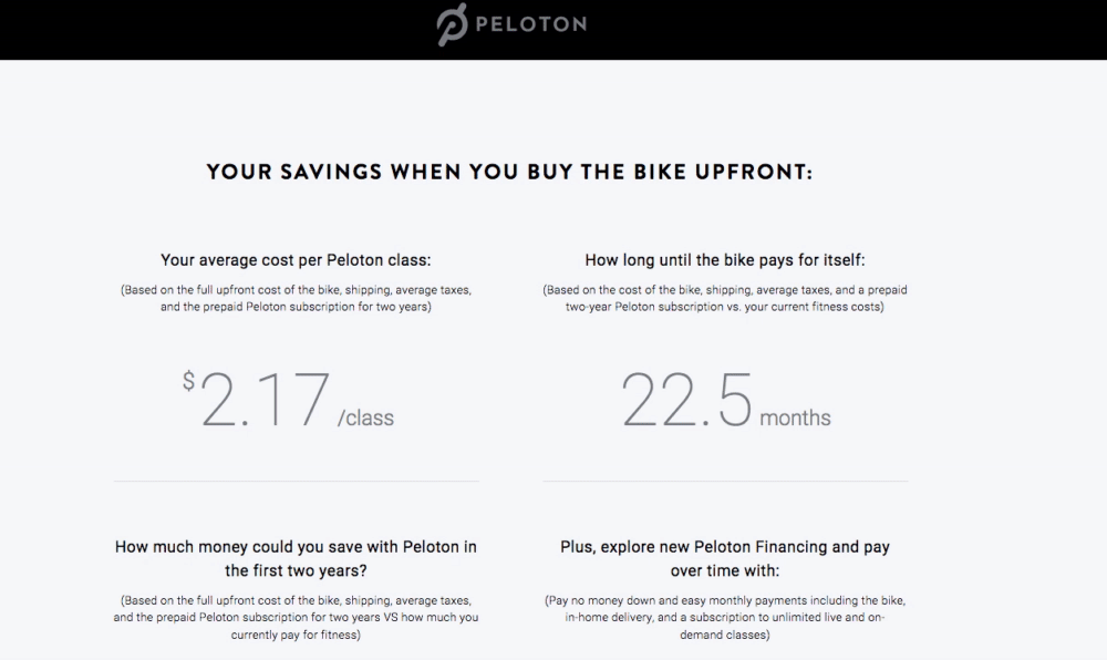
Based on the information the user submitted, this page explains how much they’ll save once they buy the Peloton bike upfront. It identifies the dollar amount they’ll save with Peloton in the first two years and outlines the options for financing the bike over time.
The page has two CTA buttons — users could either “Shop Now,” or “Get Started.” The Shop Now button takes users to a page where they can choose the package they want to buy. The Get Started button takes users to the service’s financing page to ascertain which financing option is best for them.
The entire post-click landing page stays relevant and personalized to the ad that brought the user to the page, all of which improves their chances of converting.
Facebook banner ad
Peloton runs this Facebook ad in the margin for the “savings offer:”

The ad features the same image as the Google Now card, but the copy is a bit more detailed than the Google ad. It lets the user know Peloton offers immersive cardio from the comfort of their home, and they should click the ad to see how much they’ll save with the service.
Once clicked, the Facebook banner sends users to the same post-click page as before. Since the offer is the same, the same post-click landing page stays relevant to what the user expects to see after they click the ad.
Now let’s analyze the experience users would get if they went to Peloton’s homepage instead of a personalized post-click page.
Peloton’s homepage in comparison
Like many homepages, Peloton’s highlights multiple offers. Navigation menus for bikes, treadmills, downloading the app, which hotels offer Peloton bikes, etc. all prove the page is meant for a browsing experience, so prospects can find the offer that suits them the best:
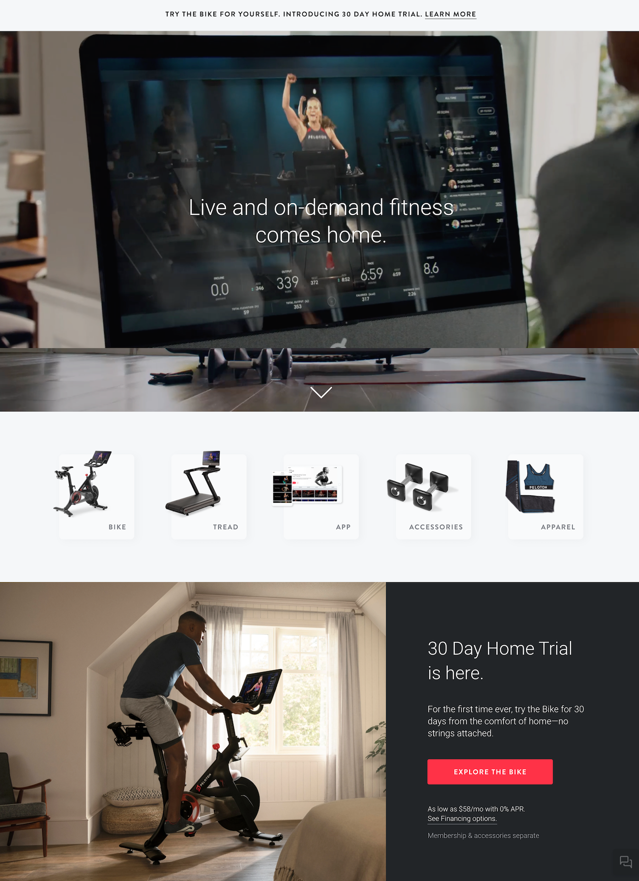
- The free trial offer highlighted in the header is likely the first thing people notice on the page. The 30-day free home trial can be accessed by clicking the “Learn More” text on the header.
- The country option allows prospects to choose the country they live so the website can customize their experience.
- The headline explains the UVP of the service — users will get “Game-changing cardio classes at home.”
- The background video plays on a loop and showcases people working out on the Peloton bike and treadmill.
- The two main CTA buttons help segment users into the ones who are interested in the bike and people interested in the treadmill.
- There are three main offers highlighted on the homepage. Users can try a 30 day trial, they can book a spot to try out a Peloton workout equipment at a location near them, or they can go to a dedicated page for the bike or treadmill.
- The page footer includes all the links users can access from the homepage to learn more about the service and how it will help them.
Give people what they expect with personalized post-click landing pages
People who click an ad are already eager to get what you offer; so show them a relevant and personalized post-click landing page to convert them. They will appreciate the message match consistency and you will have the best chance at increasing advertising conversions.
Get started creating unique post-click landing pages and see how Instapage enables you to create 1:1 ad-to-page personalization with a Personalization demo today.

See the Instapage Enterprise Plan in Action.
Demo includes AdMap™, Personalization, AMP,
Global Blocks, heatmaps & more.
