As one of the top 20 most valuable brands in the world, right next to Amazon and HP, Oracle has an estimated brand value of $26 billion! The company is also one of the world’s top 30 largest companies regarding market value.
The software giant understands that to stay top of mind, generate brand awareness, and leads, they must make a great impression and engage their audience at various stages of the marketing funnel. To help with this, Oracle uses post-click landing pages to promote a variety of content from different traffic sources while nurturing those leads to a sale.
Before we get to the examples, though, let’s quickly review the basics.
What is a post-click landing page?
A post-click landing page is a standalone web page created with a single objective in mind: to get visitors to take action. That action could be to download an ebook, register for a webinar, attend a live event, sign up for a free trial, etc. To convince visitors to take action, post-click landing pages use a combination of persuasive elements including attention-grabbing headlines, engaging media, compelling CTAs, and more.
Now let’s look at some Oracle post-click landing page examples the company uses in their marketing funnel.
(Keep in mind, for shorter pages, we’ve shown the entire page. However, for longer pages, we only displayed above the fold. You may need to click through to the page to see some of the points we discuss and some pages may be undergoing A/B testing with an alternate version than is displayed below.)
How Oracle uses post-click landing pages
1. To drive webcast signups
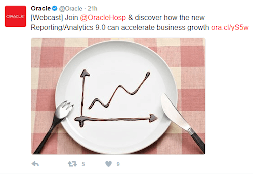
Oracle uses post-click landing pages to encourage people to sign up for webcasts. Here is a Tweet the company posted to notify followers about a blog article announcing the webcast:
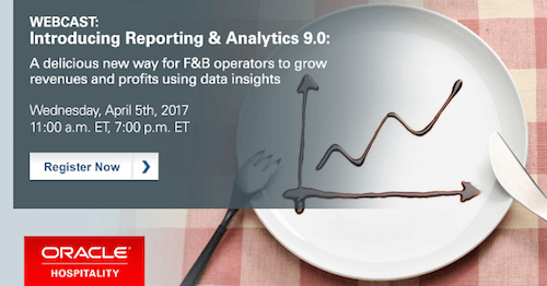
At the bottom of the blog article, Oracle included this graphical CTA for readers to click and sign up for the webcast:
Once clicked, they are brought to this page to register:
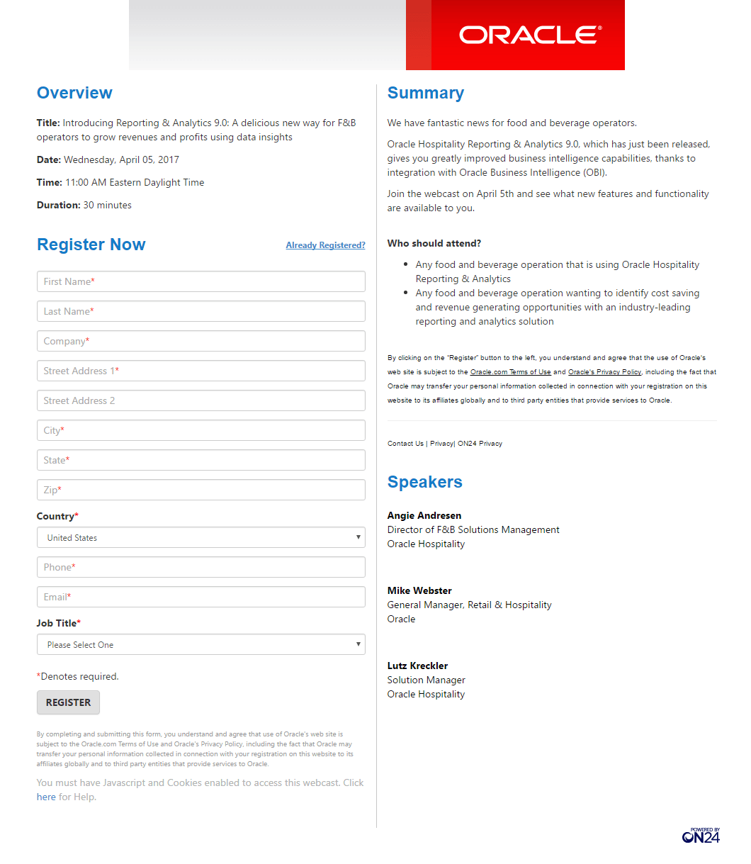
What the page does well:
- The company logo across the top of the page lets visitors know that they’re working with Oracle. And the fact that it’s not hyperlinked means people can’t easily exit the page before converting on the offer.
- 30-Minute duration lets visitors know how much time commitment is required to attend.
- “Who should attend” is a great addition because it identifies the target audience who should watch the webcast.
- Listing the speakers with their full names, organizations, and positions adds an element of trust to the company, and lets prospects know who exactly they will be listening to and learning from during the presentation.
What could be changed and A/B tested:
- Adding an image or video would make the page more engaging.
- Including a countdown timer would create urgency because prospects would know how much time is left before registration closes.
- The CTA button blends in with the rest of the page. Making it larger and testing it in a more contrasting color may attract more attention.
- The CTA button copy “Register” is as bland and uninspiring as it gets. Changing the copy to something more persuasive than “Register” could generate more clicks. For example, “Sign Me Up for the Webcast.”
- Multiple exit links throughout the page (“Contact Us,” “Click here for help,” and the ON24 logo) increase the possibility of prospects leaving the post-click landing page before registering.
- Adding headshots to the “Speakers” section would likely instill more trust in prospects.
- Including testimonials from Oracle customers or previous webcast attendees would add to the company’s trust value or the quality of the webcast content.
2. To generate report downloads
Oracle’s marketing automation team is also called upon to promote different content offers for the company. Upon clicking a link in an Oracle email, this post-click landing page for a report download is shown:
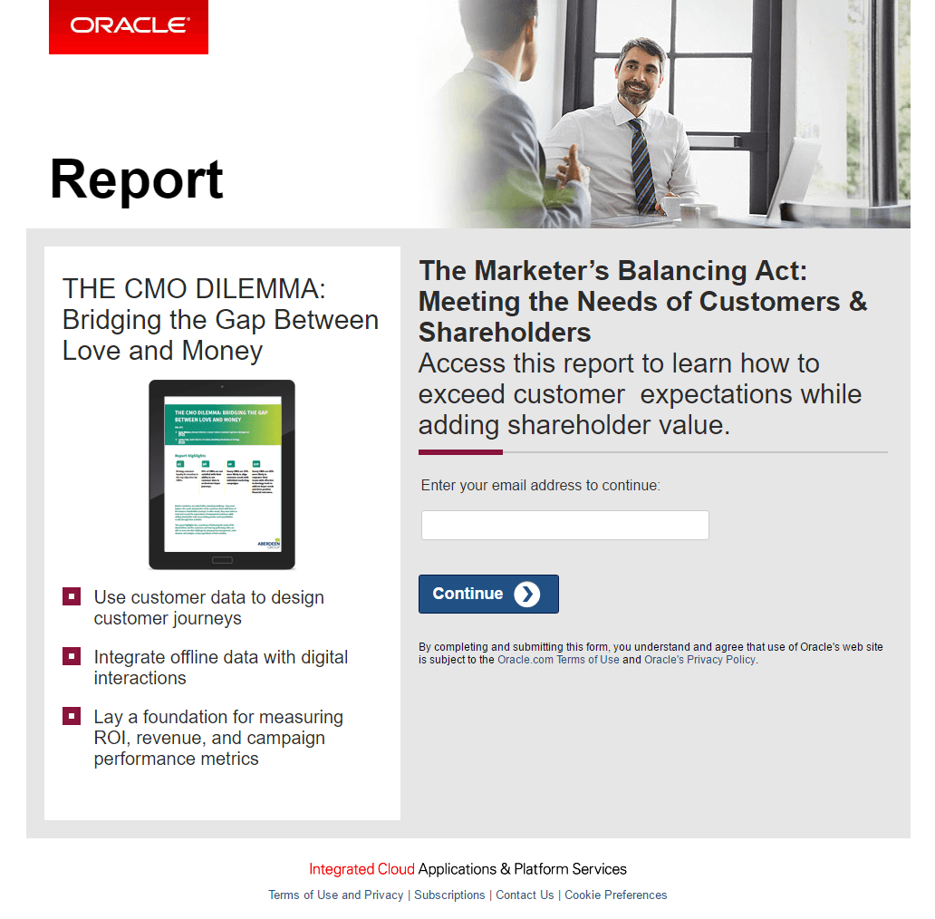
What the page does well:
- The company logo lets visitors know who produced the report. Again, the logo is not hyperlinked to Oracle’s homepage, which increases the chances prospects stay on the post-click landing page long enough to convert.
- The image of the report provides prospects with a sample of what they’ll receive by inputting your email address.
- Bullet points highlight the three main takeaways prospects can expect to learn from the report.
- The 1-field form reduces friction because it’s short, fast, and easy to fill out.
- The arrow on the CTA button serves as a directional cue, which implies they should “continue” and that there is more to see once they submit their email address.
- The “F-Pattern” design is used to direct visitors’ attention to the most important elements on the page: first, the type of content available (report), next, the headline, then the report image, and finally the three bullet points, and CTA button.
What could be changed and A/B tested:
- “Report” is used where a headline is normally placed so it doesn’t engage visitors as much as it could. It doesn’t tell prospects anything about the report, what’s included, or how it can benefit them.
- The two headlines are confusing. If the title of the report is “THE CMO DILEMMA: Bridging the Gap Between Love and Money,” then why is “The Marketer’s Balancing Act: Meeting the Needs of Customers & Shareholders” also there?
- Lack of white space (in the bottom two-thirds of the page) makes the page look cluttered.
- The CTA button design could be improved. Making it larger would make it easier to see and since the CTA button is the most important post-click landing page element, this is very important.
- The CTA button copy could be more personalized and relevant to the offer, such as “Send Me the Report.”
- Exit links in the page footer are distracting and don’t encourage people to download the report.
3. To increase ebook downloads
While searching “Oracle cloud storage” on Google, I clicked an Oracle ad (highlighted below) and landed on this 2-step opt-in page that Oracle uses to generate ebook downloads:
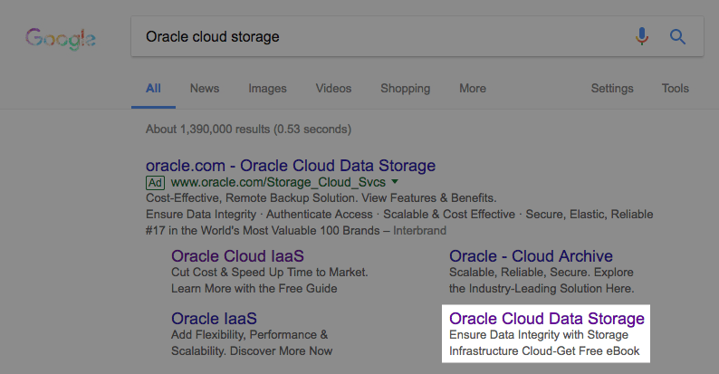
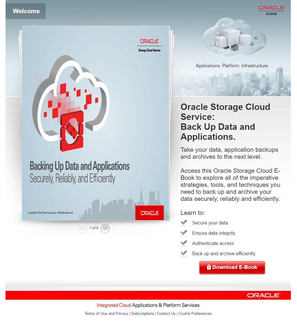
What the page does well:
- The ad and post-click landing page use message matching (“Oracle storage cloud”) so there is a clear path from search query to ad to post-click landing page. Oracle targeted the ad very well, and there is no confusion about what the offer entails.
- Displaying the sample ebook (broken up into detailed sections) gives prospects a preview of what they will be learning about by downloading the whole ebook. However, each page is legible, so technically a visitor could read the entire ebook without having to submit their email address to receive the content. This could be a missed opportunity for Oracle.
- Minimal copy with bullet points tells prospects what they will learn from the ebook without overwhelming them with too much copy.
- The word “you” is used in the copy, making it personalized to the reader.
What could be changed and A/B tested:
- The red CTA button blends in with other elements on the page. Changing the color to green would help it “pop” off the page.
- The CTA copy is okay but can be improved. “I Want the Ebook” is more enticing and would likely generate more clicks and downloads.
- Exit links in the footer may take people away from the page before they have a chance to convert on the offer.
- Adding white space around the most important elements, like the headline, bullet points, and CTA button, would draw more attention to these areas and could increase conversions.
- Adding a testimonial would add an element of trust and credibility while convincing visitors that the ebook is a valuable piece of content.
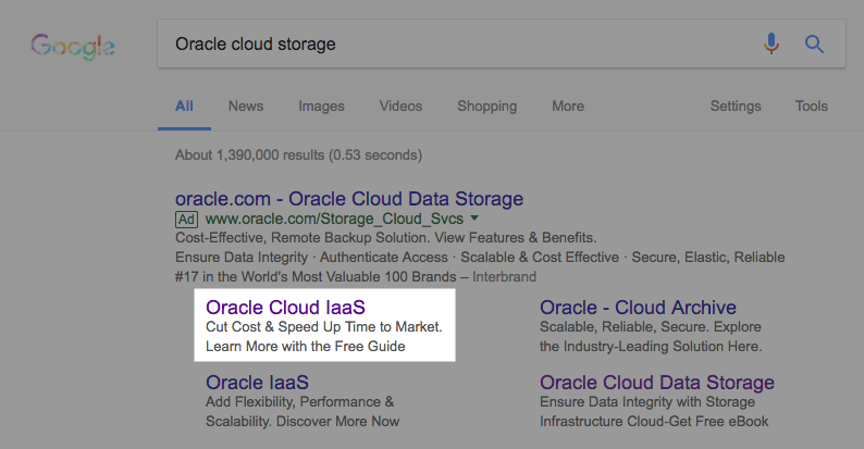
A different search for “Oracle big data” and this Google ad appears, promoting a second ebook:
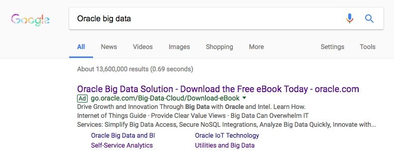
Upon clicking the ad’s main headline, I discovered this post-click landing page:
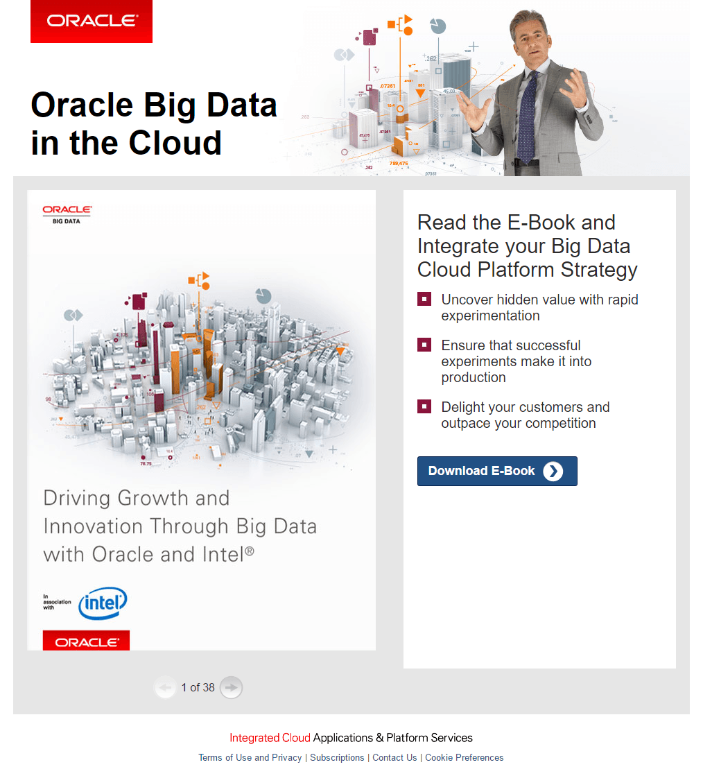
What the page does well:
- Message matching the ad headline to the post-click landing page headline and ebook cover page informs search users this offer is all about “big data.”
- The “Z-Pattern” design directs prospects to view the page in a specific pattern, drawing attention to the most important elements: first the page headline — then, the top right image — next, the ebook image — and finally, the bulleted copy and CTA button.
- Oracle’s logo is not hyperlinked, so visitors can’t easily exit this page.
- The images effectively symbolize growth and innovation, just like the ebook title reads.
- Personalized copy (“you” and “your”) speaks directly to the reader, likely making them want to redeem the offer.
- The arrow on the CTA button serves as a visual cue, telling prospects that there is more to see beyond this page.
What could be changed and A/B tested:
- Displaying the entire ebook likely decreases the number of downloads. If prospects are able to see the whole book (or at least 38 pages of it) on the post-click landing page, why should they give their email address and download it? Providing a small sample of the book would probably result in more downloads.
- The CTA button copy could be tested with more compelling copy, such as “Show Me the ebook.”
- Exit links in the page footer may distract prospects and take them away from the page before converting.
- Adding social proof in the form of a ticker that shows how many people have downloaded the ebook could entice new visitors to convert.
- Adding customer testimonials from those who have already downloaded the ebook and found success from it would likely persuade more people to download it themselves.
4. To offer guide downloads
Referring back to the same Google search ad, when searchers click the “Oracle Cloud IaaS” extension link:
They’re sent to this post-click landing page to download the guide:
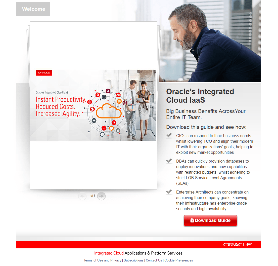
What the page does well:
- The headline uses message matching (“Oracle cloud IaaS”) so search users know they are in the right place for the offer, based on the exact Google Ads extension link they clicked.
- The model’s eye gaze is aimed at the cover page of the guide. This is good, but to make it even better, his eye gaze should be toward the CTA button.
- The sample guide gives prospects a preview of what they will receive once they convert.
- Minimal copy with bullet points tells prospects what they will learn from the guide, without overwhelming them with an abundance of copy.
- The subheadline helps to support the headline, informing prospects that the guide will benefit all members of IT teams.
What could be changed and A/B tested:
- Adding more personalized copy may help the reader feel more engaged and connected to the offer, resulting in more conversions.
- The CTA button could be tested in another color since there is so much red elsewhere on the page. Also, “Download Guide” is vague, and something more persuasive like, “Download my Integrated Cloud IaaS Guide now!” may result in more conversions.
- Exit links at the bottom of the page have the potential to send visitors away from the page before they convert on the offer.
5. To offer data sheets
Using the same search query and Google ad above, this time we clicked on the “Oracle — Cloud Archive” extension link:

Which brings you to this post-click landing page that offers the data sheet:
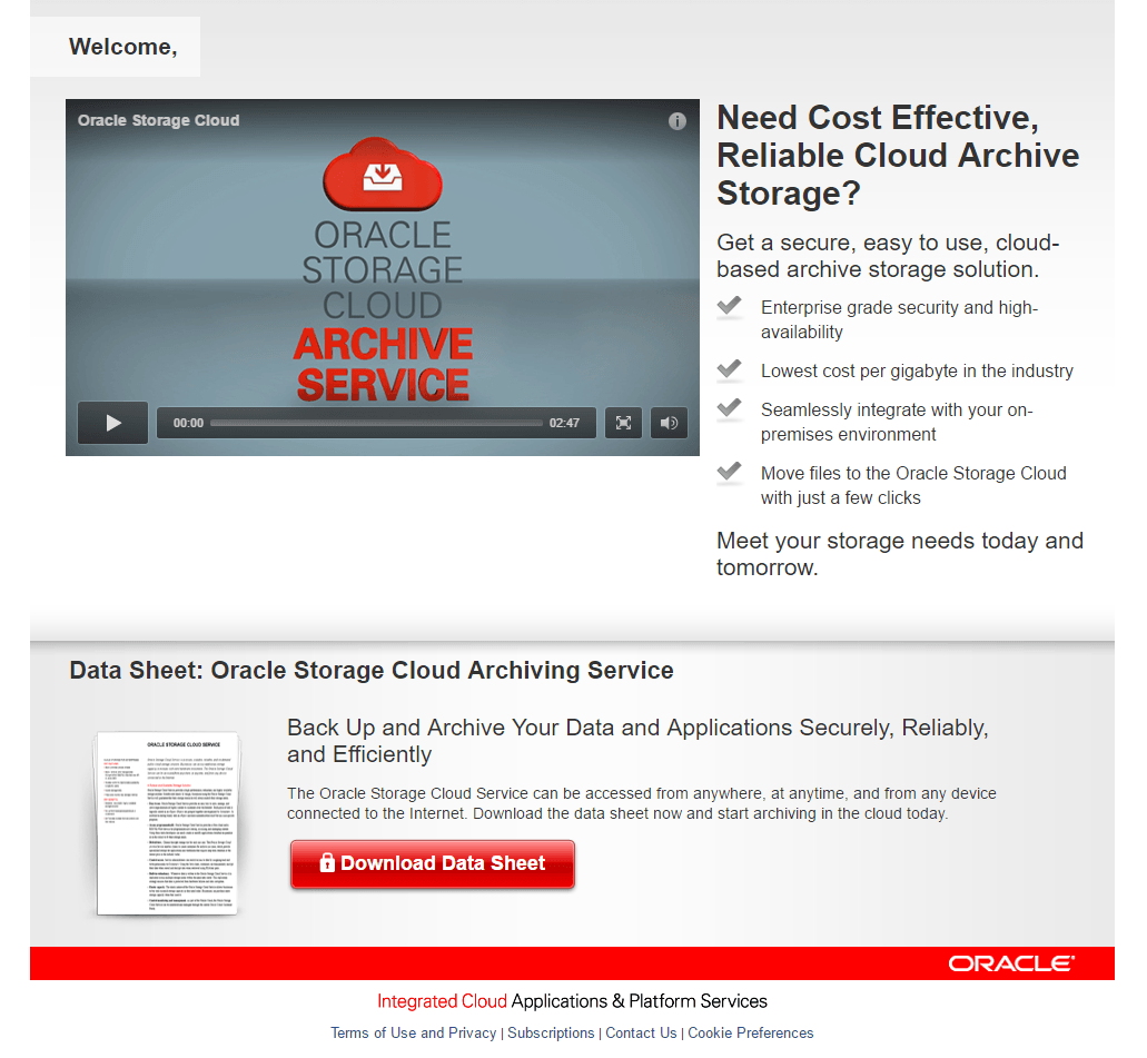
What the page does well:
- Message matching the Google ad to the post-click landing page headline means search users don’t have to wonder if they’re in the right place to find Oracle’s solution to “cloud storage.”
- The click-to-play video is a great inclusion, as post-click landing page videos are effective in educating prospects, leaving a great first impression, and convincing them to take action.
- The headline and subheadline combo — “Need Cost Effective, Reliable Cloud Archive Storage?” addresses a prospect’s problem, and immediately presents a solution for it.
- Bullet points highlight the four most important benefits of downloading the data sheet and signing up for Oracle cloud storage.
- The image of the data sheet shows prospects a preview of what they’ll be receiving, without giving away too much information like previous examples did.
What could be changed and A/B tested:
- “Welcome” in the top left corner is unnecessary. This could be replaced with the Oracle logo instead to make the page look more branded and professional.
- The video is too long to keep a majority of internet users’ attention. With nearly a 3-minute video, many visitors will stop watching well before the video is half completed.
- The red CTA button blends in with the other red on the page. Testing the button in a contrasting color, like green or blue, would likely produce more downloads.
- The CTA button copy is relevant to the offer, but could still be improved. “I Want the Data Sheet” or “Send Me the Data Sheet” could increase more clicks.
- Adding white space would make the page appear less cluttered and draw more attention to the headline, bullet points, and video.
- Too many exit links in the footer make it easy for visitors to leave the page and never return to convert on the offer.
6. To generate white paper downloads
Here is an Oracle post-click landing page example in which the goal is to increase the number of white paper downloads:
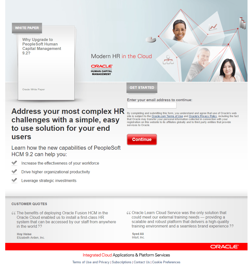
What the page does well:
- The F-Pattern influences visitors to scan the page in an intentional pattern (white paper across to the graphic, moving down the page to the headline and CTA, and scanning further down to read the bulleted copy).
- The image with smiling faces is great for adding a human element and emotion to the company.
- The headline acknowledges that prospects have similar challenges and provides them with a solution.
- Minimal copy with bullet points gives prospects a brief overview of the white paper without divulging too much information.
- The 1-field form is likely to appeal to visitors because it’s short, fast, and easy to complete.
- Testimonials allow prospects to hear from real Oracle customers about how effective and trustworthy the company is.
What could be changed and A/B tested:
- The page seems unorganized. There is too much white space in some areas, and not enough in others, and the middle section of the page is unbalanced.
- The CTA button design could be improved with a more noticeable color and making the button bigger.
- The CTA copy could be more engaging and compelling. Something like, “Take Me to the White Paper!” may increase conversions.
- Exit links in the footer have the potential to decrease conversions on the page.
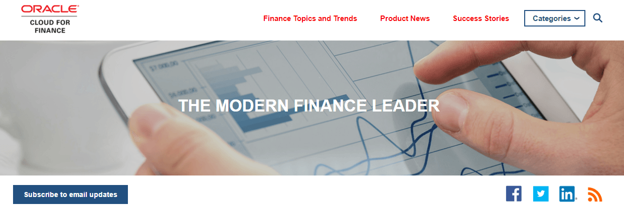
7. To increase blog subscribers
post-click landing pages don’t always have to promote a content download behind the form. As this example shows, the Oracle website blog includes a “Subscribe to email updates” CTA button at the top of each blog section and article, like this:
When visitors click the CTA, they are directed to this post-click landing page to subscribe to blog updates:
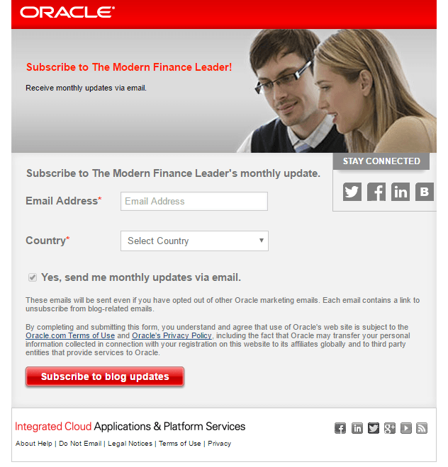
What the page does well:
- The image uses eye gaze, which is a visual cue to draw attention to the form and CTA button. This subconsciously makes prospects’ eyes follow the same path.
- The 2-field form is short and easy for prospects to complete, making it more likely they will do just that.
- The email frequency is mentioned immediately so visitors know how often they will receive blog updates from Oracle.
What could be changed and A/B tested:
- The pre-selected check box may deter some people from subscribing. Also, is the checkbox even necessary since the post-click landing page offer is to subscribe to “receive monthly updates via email?”
- Adding social proof such as the number of blog subscribers already receiving updates would be a great addition to this post-click landing page.
- Too many exit links including the company logo, multiple social media buttons, and footer navigation may distract prospects from submitting their information.
- Including the benefits of receiving monthly emails (or what the emails may include) may result in more conversions.
Which Oracle post-click landing pages would persuade you to convert?
From social media, to email marketing, to Google Ads, to their company blog, Oracle uses post-click landing pages from many traffic sources to promote their content. Some examples are more optimized than others, but each post-click landing page focuses on a single offer and demonstrates some best practices and things to A/B test.
What tips will you take from these Oracle post-click landing page examples when designing your next page? Whichever tips you decide, design your next page with Instapage, signing up for an Instapage Enterprise demo today.

See the Instapage Enterprise Plan in Action.
Demo includes AdMap™, Personalization, AMP,
Global Blocks, heatmaps & more.
