There’s a good chance bad post-click landing page design is costing you at least half of your PPC budget, recent research from Google suggests.
Data from the search engine giant indicates that over one in two mobile internet users will abandon a web page if it doesn’t load in 3 seconds. And as of February 2017, the average mobile post-click landing page takes an embarrassing 22 seconds to load.

If you stopped to do the math, you probably realize how detrimental a slow-loading page can be to your bottom line.
If you generate 5,000 mobile post-click landing page visitors per month and convert 5% of them, you’ll miss out on 1,500 conversions over the year. If loading takes longer than 3 seconds, half of your visitors — 2,500 a month in this hypothetical — aren’t even seeing your entire post-click landing page before they bounce. What’s worse, your PPC budget gets drained every time they do.
But maybe your page doesn’t load in 3 seconds. Maybe it loads in 5 seconds, or 6 seconds, or 10 seconds. If that’s the case, data from Google shows you’re losing out on even more.
New mobile page speed benchmarks
How do your pages stack up to others on the web? To establish some new benchmarks for loading speed, Google analyzed 900,000 ads’ mobile post-click landing pages across 126 countries at the start of 2017.
What they found was a confirmation of their hypothesis: Mobile pages are “bloated” with too many elements.
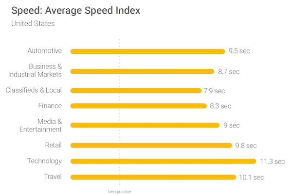
Among them, pages from the automotive, retail, and technology sectors take the longest to load on average. Regardless of industry, though, some shocking data shows mobile post-click landing pages on the whole leave much to be desired.
For example, 70% of the pages analyzed took 7 seconds to load content just above the fold. On those same pages, it took over 10 total seconds to load visual content above and below the fold.
With the help of some advanced algorithms from SOASTA, another Google study tied page load speed to more meaningful key performance indicators, like conversions and bounce rate. In a blog post, the researchers elaborate:
We built two machine-learning models: one for predicting conversions and one for predicting bounce rates. Each model used real-world data from a large sample of mobile e-commerce sites, correlating the impact of 93 different page metrics from image formats to a number of scripts. Simply put, the two models looked for which mobile-site factors would lead shoppers to buy or bounce. The conversion model had a prediction accuracy of 93%, and the bounce model was even more accurate, at 96%.
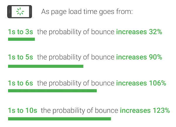
With near-pinpoint accuracy, the machine-learning models discovered that as a page load time increases from one to three seconds, the probability of a mobile visitor bouncing jumps by 32%. From there, a graphic shows, things get even worse:
Along with bounce rate, the study showed, a slow page load time can also decrease conversions. So what’s the culprit?
Researchers identified a few major mobile design flaws.
The biggest mobile post-click landing page speed killers
Speed isn’t only a detractor of conversions and paid advertising budget; it’s also one of Google’s search engine ranking factors. If your page doesn’t load faster than the recommended 3 seconds, you’re wasting money and not being found. Any of the following problems could be the reason.
1. Too many page elements
Today the average web page is the same size, in data, as the classic video game “Doom:”
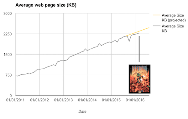
At 2.3MB, it’s grown into a heap of unnecessary elements. And its designers have BSO — “bright shiny object syndrome” — suggests software engineer, Ronan Cremin:
As the web went through its awkward teenage years we let creeping featuritus take hold and eventually clutter simply got the better of us. New JavaScript gallery module? Sure, why not? Oooh that new web font would look nice here but why not add another analytics tool while we’re in there? Should I bother resizing this 6,000-pixel image? Nah, let the browser do it, works for me.
Google has discovered that “featuritus,” as Cremin calls it, can have drastically negative impacts on load speed. The average page now features hundreds to thousands of elements — headlines, images, buttons — stored on dozens of servers. When those elements go unoptimized, the result can be an “unpredictable” and “volatile” loading experience.
Researchers even went so far as to identify the number of elements on a page as the most accurate predictor of conversions. Less, they claim, is more. When a page’s elements increase from 400 to 6,000, the odds of converting a visitor drop by 95%.
The internet’s top designers, data suggests, have known that since 2014. While the average page size has grown steadily for most websites, the top 10 have turned a corner:
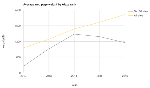
For them, page “weight” (data size) has been decreasing over the last few years. All the others, it seems, are victims of featuritus.
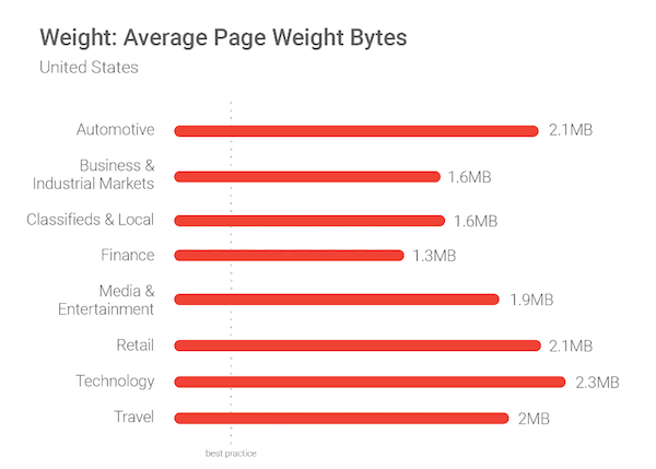
According to Google, 70% of pages they tested were over 1MB, 36% were 2MB, and 12% were over 4MB. As a result, there’s little chance visitors stick around long. Via a fast 3G connection (the speed of most cellular connections around the world), 1.49MB takes around 7 seconds to load.
Solving the problem
In the case of a heavily weighted page, the best solution is prevention. Luckily, prevention is as easy as setting what Google calls “performance budgets.” Before you begin building your page, determine how quickly you want it to load (the “budget”). Then, design your page within the confines of your budget.
“It is much more efficient to deliver something fast if it is part of the design criteria,” says Hakan Nizam of L’Oreal. “It would free up developer bandwidth. It would allow developers to focus on other factors that are affecting conversion rates. The speed conversation should be resolved in order to move on to other differentiators.”
In a blog post for Google, Jason Cohen likens the budget to other creative limitations:
Including speed as part of the design process is no different than accounting for the limitations of other creative mediums. Designers would not create a four-color ad for a black-and-white print publication or produce a 30-second video for a 15-second slot. If we don't design within the medium's limitations, the result is a bad experience.
Despite mobile’s overtaking of desktop internet traffic, the channel still lags behind desktop in most user experience metrics. Designers need to stop treating mobile as an afterthought. It’s its own medium, and the user experience should reflect that.
Of course, the “budgeting” technique assumes you’re starting from scratch. If you’re trying to optimize an already sluggish post-click landing page, researchers recommend conducting an audit of your elements and monitoring your third-party scripts to discover which are contributing most to its weight. Then, scale down to optimize accordingly.
2. Too many images
In their research, one particular image caught the attention of Google testers. It weighed a whopping 16MB. Over and over again, they continued to find images that bogged down pages.
“Graphic elements such as favicons, logos, and product images can easily comprise up to two-thirds (in other words, hundreds of kilobytes) of a page’s total weight,” researchers cautioned.
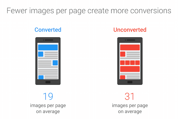
With the help of their machine-learning modules, they discovered that the second most accurate predictor of conversions was number of images on a page. Compared to pages that couldn’t successfully convert visitors, pages that could featured 38% fewer images.
Solving the problem
One of the easiest ways to give your page a big speed boost is with a quick image optimization. Do your best to…
- Cut down on unnecessary images
Do you really need to showcase six different angles of your product? Is that stock photo really adding value to your post-click landing page? Do you need to encode text in an image, or can you instead integrate your chosen font with Google Fonts or Adobe Typekit? If the answer is “no,” consider cutting some images from your design.
- Decrease the size of necessary images
If you do need all those images, a few different tools and strategies can help you save bandwidth. First, know your image file format. Replacing a PNG with a JPEG can save you lots of size, and in turn, speed. On the other hand, it will also reduce your image’s quality. For more on how to decide which format to use, check out this post.
Second, think about using a tool. Researchers claim that 30% of pages could save 250KB of data with the help of an image compressor. Google’s Guetzli and Zopfli are two worth trying.
3. JavaScript usage, full-page load time
Before elements like images and buttons can be displayed to a user, the HTML code a page is built with needs to be received and interpreted by the browser. The time that takes is known as “DOM ready time” — the most accurate predictor of page bounce, researchers found.
Google’s data shows that user sessions that bounced had DOM ready times that were 55% slower than nonbounced sessions. Slowdowns of that significance are often caused by JavaScript — a type of code that halts the parsing of HTML code — used in many third-party analytics tools, ads, and social widgets.
Daniel An and Pat Meenan compare the slowdown to an unorganized restaurant:
Imagine that you're at restaurant and your waiter is ready to bring your meal, but first has to wait for the salt and pepper to be delivered from another restaurant.
But JavaScript isn’t the only kind of code slowing down mobile pages. CSS, HTML, and the countless requests needed to process elements like images and fonts create a lag in full-page load time — the second most accurate predictor of bounce rate. The average web page users bounced from was 2.5 seconds slower than the average page they did not bounce from.
Solving the problem
In an attempt to improve the mobile browsing experience, Google developed the AMP and AMP for ads programs. Both frameworks give developers the tools they need to provide mobile experiences at lightning speeds. They include:
- AMP HTML: This is a stripped-down, basic version of what we recognize as hypertext markup language — the system of tags, numbers, and letters used to build the foundation of most web pages.
- AMP JavaScript: Google’s AMP version of the popular code restricts the use of third-party and author-written JavaScript.
- The AMP CDN: This allows developers to store a cached version of their web page on Google’s servers. That cached version is a digital snapshot of the page that contains all its data in one place. As a result, it can be served to the user faster.
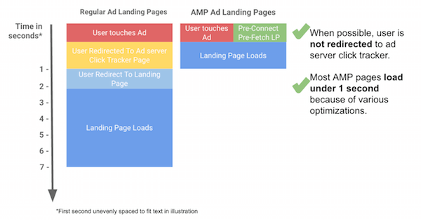
Together, the elements of the framework form the foundation of pages that use 10 times less data than average, and ads that load 6 times faster.
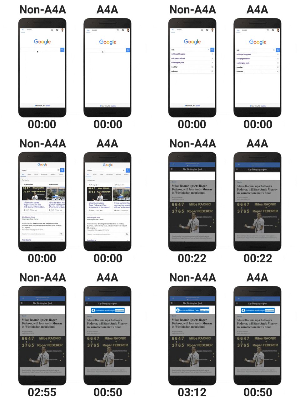 Head here to learn more about getting started with AMP.
What’s your mobile page speed?
Are your post-click landing pages optimized for mobile? Are they free of useless images, clunky elements, and heavy JavaScript?
Find out with a mobile-friendly test from Google, then check out our guide to optimizing the post-click landing page experience before creating your next page:
