Wouldn’t it be great if we could control the first impressions others have of us with every new interaction? Imagine the power behind managing the perceptions others have of you as an individual or as a business.
post-click landing pages make this possible.
As natural extensions of your digital advertising, post-click landing pages offer this level of brand management and an opportunity to provide a unique value proposition to highly segmented personas in a professional and credible way.
The power of first impressions
While SEO, social media, and other marketing channels have their place in top-of-funnel acquisition, they offer less control over how a specific persona perceives your brand during their first interaction. Similarly, direct traffic as a first interaction is rare, or even impossible. Even in offline word-of-mouth marketing, direct traffic operates as the second touch point. The endorsement of the product evangelist, despite its power, has already created that first impression.
On the other hand, the power of digital advertising as a means to reach your personas before the interest phase in the buyer cycle provides this level of brand management.
In short, advertising allows you reach them before they reach you.
Presenting your brand as an authoritative, relevant and trustworthy source within your industry is essential to successful brand strategy.
Although brand management requires consistency throughout the entire customer journey, top of funnel post-click landing pages are essential for the first experience with your company and your products.
Different types of first impressions
There are two general types of first impressions experienced by your target personas:
- Unaware of the problem or need for the solution
- Aware of the problem and looking for the solution
A member in group 1 will likely need to be educated, possibly on the fact they have this problem in the first place. It’s difficult to sell a product to someone, or even turn them into a qualified lead if they don’t know they have a problem in the first place.
Facebook or Display Ads are an excellent example of a platform geared towards this type of impression:
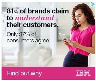
Someone who is in group 2 can be presented with an ad followed by a subsequent post-click landing page and call-to-action that is more conversion oriented. In this case, they might be ready to take action and engage with your product.
Google Ads is especially conducive to this kind of first impression because the ads displayed in search results based on the search query are highly intent focused. When your persona knows what they are looking for, give it to them as soon as possible (like we searched “email marketing” and got to this page from the following ad):

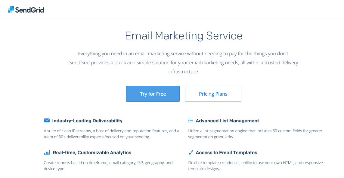
Regardless of how far along the buying cycle your persona is, first impressions matter.
How to create a great first impression
The Missouri University of Science and Technology determined that “It takes less than two-tenths of a second for a visitor” to form an impression about a brand based on their website or post-click landing pages. Even more significant is the fact that 83% of brands did not make a good first impression or any impression at all.
Creating a great first impression of your brand relies on two things: demonstrating professionalism and creating as much value as possible in the very first experience your target users have with your brand.
Presenting your brand as credible and legitimate indicates to your personas that you are invested in their pain point and your product as the best solution. This comes down to quality.
1. Quality creative assets
Images, video, and other creative assets explaining complex ideas provide an emotional
connection in ways that your copy can’t. As cliche as it sounds, a picture is worth a thousand words.
Neo Mammalian Studios states that visuals are also processed 60,000 times faster in the brain than text.
With the speed at which visuals aid in creating a positive first experience, it’s best to use a professional photographer or custom graphics demonstrating your product. If a professional isn’t available or beyond budget, a quality camera and an eye for photography might produce quality content on its own. At the very least, resort to stock photography and avoid taking photos on your mobile device.
It doesn’t take a professional designer to know that the image in this Facebook is very low quality:
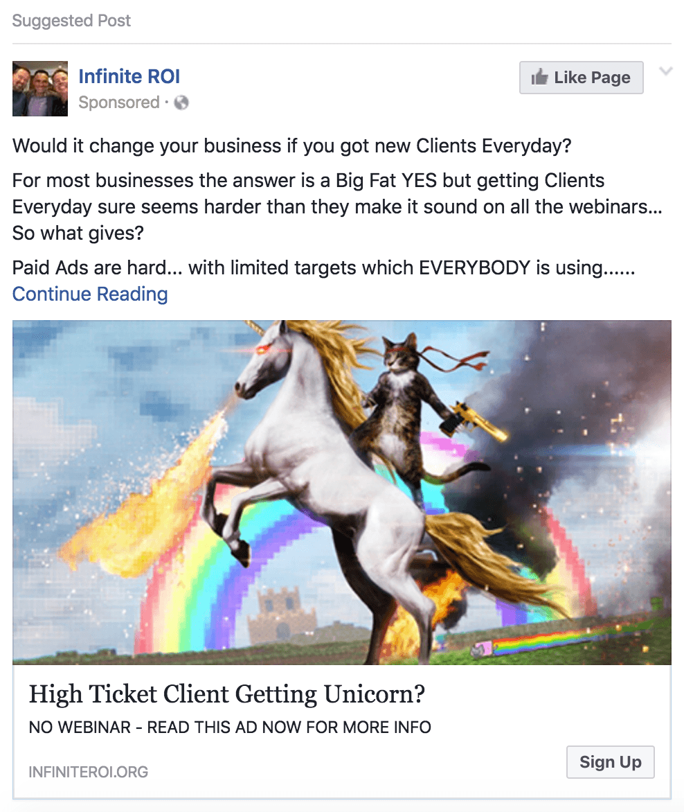
The post-click landing page that followed the ad doesn’t even include any images, only featuring a signup form.
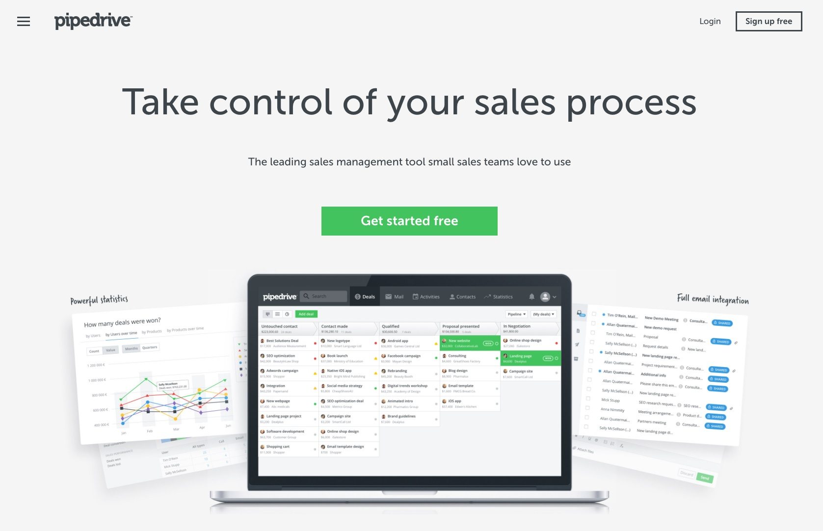
In contrast, Pipedrive provides high-resolution screenshots of the product on their homepage:
(For more information and to learn all the do’s and don’ts of how to select the best stock photos for your marketing campaigns, download this guide.)
2. Quality design
Among numerous other studies, researchers at Stanford determined that a majority of users make judgments about a company’s credibility based on their website design. More significantly, the same study found that first impressions are design related.
In other words, quality design matters, and having someone with design skills create some solid templates for your post-click landing pages is tremendously important.
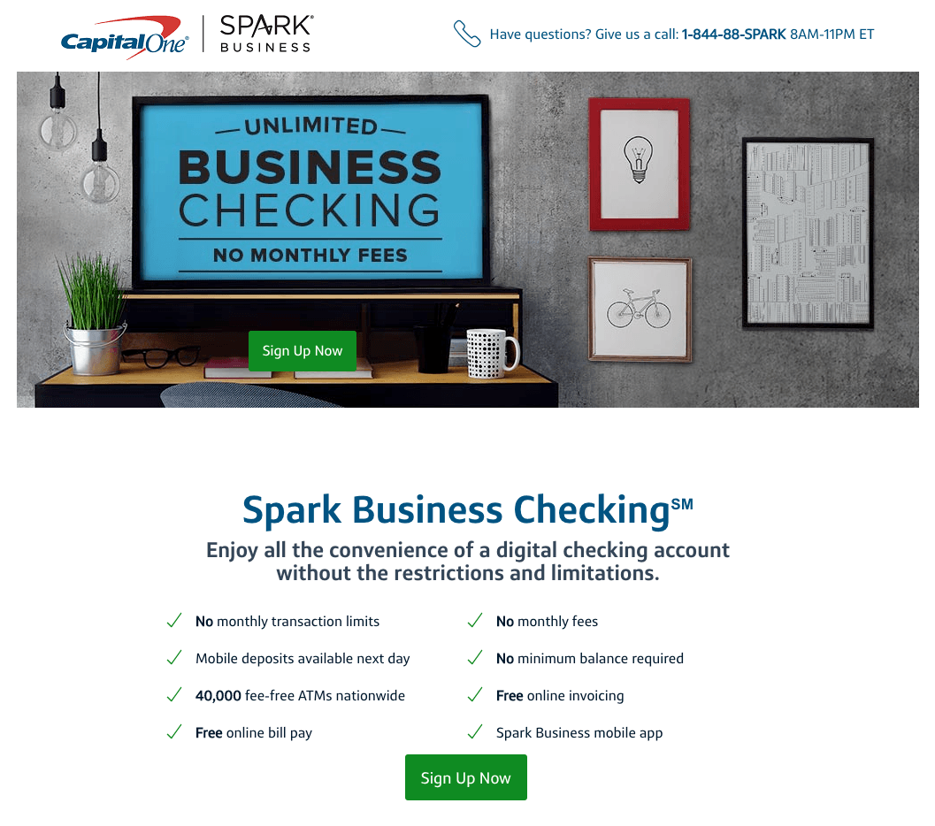
To demonstrate, let’s look at Capital One. In the past, they’ve created some pretty awesome post-click landing pages, but once you click on this Facebook ad:
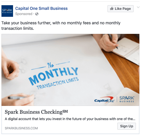
…It goes to this post-click landing page, which doesn’t feature the same level of upmarket design as past post-click landing pages because it includes the misalignment of elements, like the CTA:
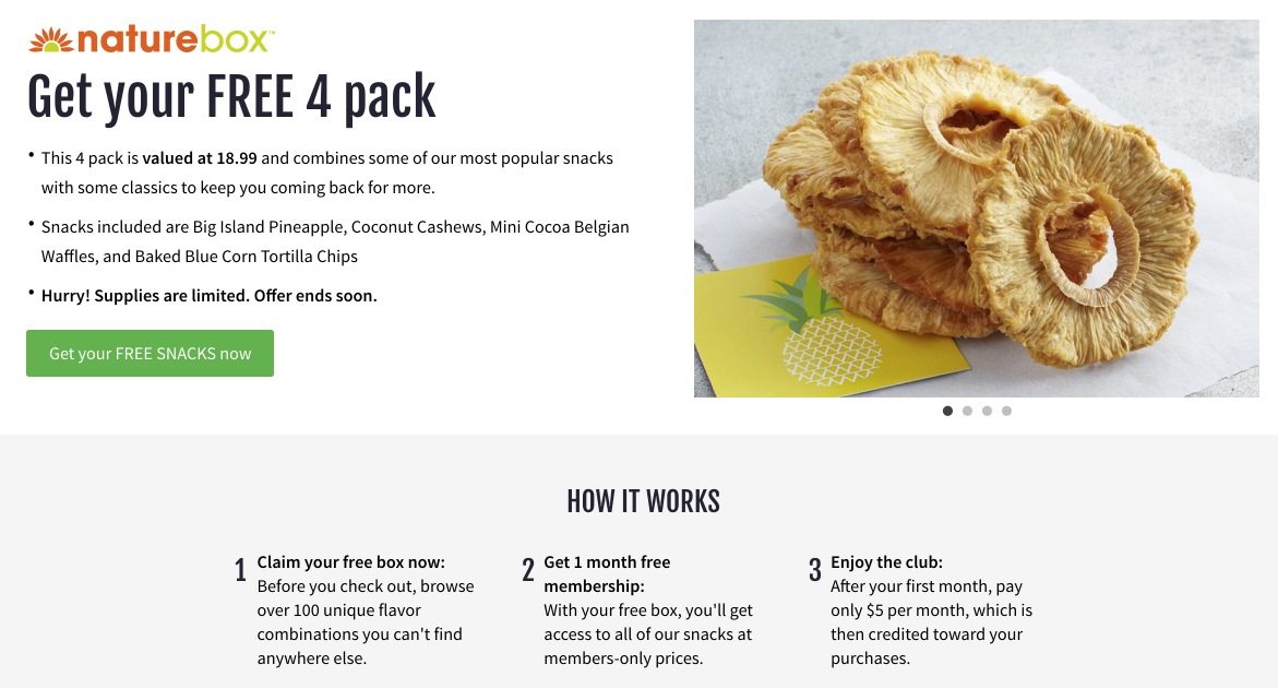
However, Naturebox, features a clean design with proper alignment and high-converting copy to introduce their target users to their customer journey:

3. Quality copy
Custom fonts and layout of your copy may have strong appeals to the aesthetic sense. However, it’s essential to articulate a message matched value proposition that customizes the value of the CTA to a specific persona.
In addition to matching the ad copy, ensure that you use language that resonates with your personas.
4. Perceived quality and social proof
While your ad and subsequent post-click landing page should make the case for the call-to-action on its own; third party reviews, testimonials, and endorsements carry a lot of weight when promoting a CTA.
In fact, 61% of customers read reviews before purchasing, so it’s probably a good idea to get started in this area as soon as possible.
Social proof takes many forms including testimonials from individuals your personas can relate to, as well as indicating that your business already has reputable customers that your target personas value and respect.
In this example, Foxtail Marketing’s ad goes to this post-click landing page, which provides a great example of a testimonial from someone the target persona can relate to:

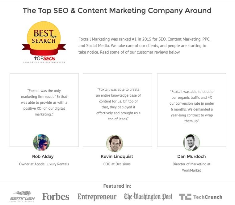
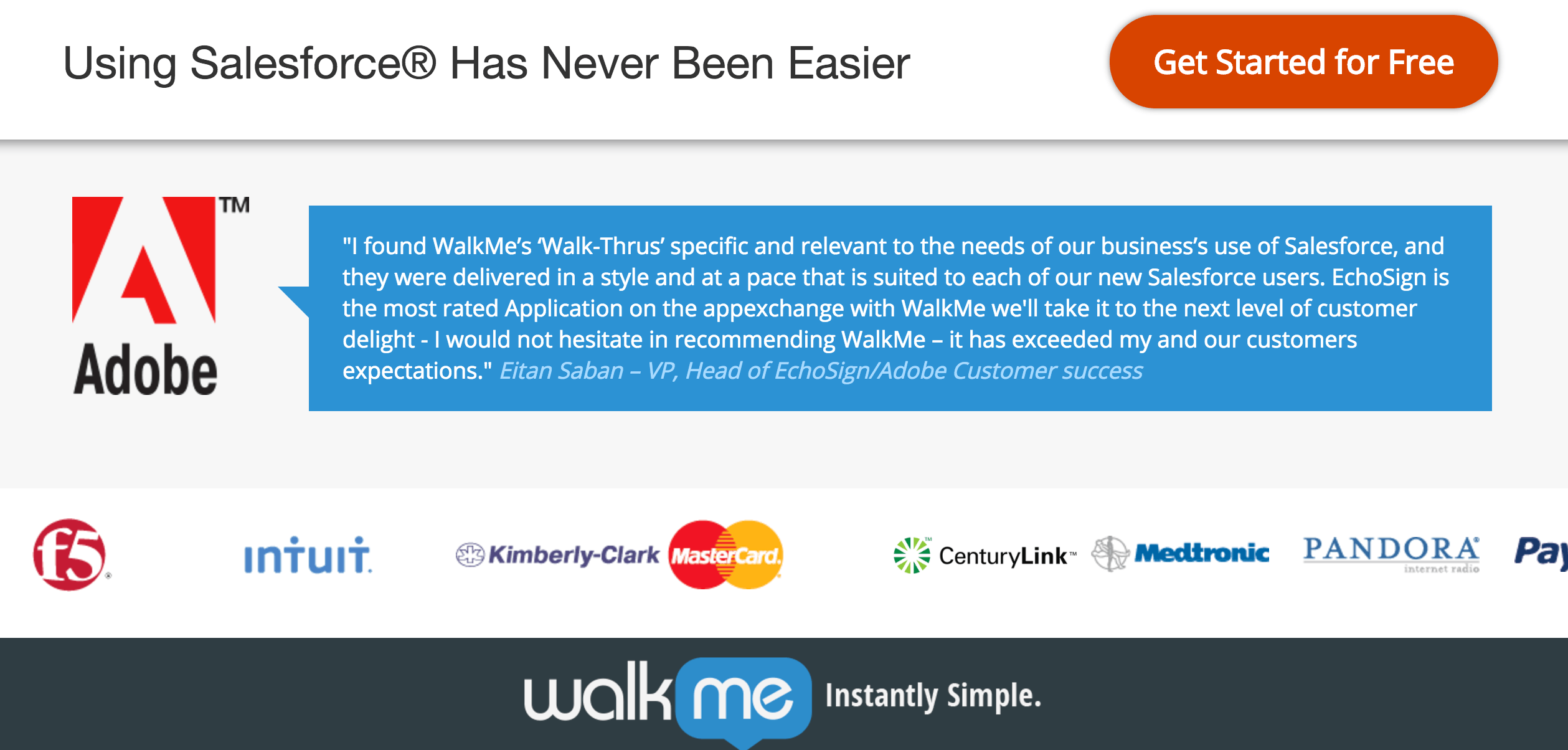
In another example, WalkMe employs an impressive list of company badges to illustrate that they are trusted by some well known professional and respected brands:
It’s all about creating personalized value for your users
Efficiency is key. You want to make it as easy as possible for a visitor to evaluate the opportunity and value proposition first mentioned in the ad. This is why a singular call-to-action is essential, without navigation to distract from what’s going on.
According to Esteban Kolsky, CEO at thinkJar a 67% of customer churn is preventable if the customer issue was resolved at the first engagement. With an ad click as the first interaction, a generic website or unfocused post-click landing page doesn’t provide potential customers with a simple path to resolution.
Realpage offers a great example of what not to do. The ad itself is simple, focused, and provides clear expectations for the user: The post-click landing page, however, is incredibly unfocused and does nothing to guide visitors down a clear path towards the call-to-action:

At first glance, with so many opportunities to take action and a prominent generic image in the page header, it’s even unclear that this page offers an ebook in the first place:

Infusionsoft, on the other hand, provides an ad with a no-brainer value proposition that seamlessly translates to the corresponding post-click landing page:


Very little additional action is needed upon arriving at the post-click landing page in order to access the free growth plan.
Quality, across the board, creates value. However, that value must be personalized to match the segmentation in the ad that created the first impression. In addition to providing a professional experience with easy to understand design, you also need the correct, personalized call-to-action for your audience.
What to do after creating a great first impression
Whether or not a visitor converts, there is still ample opportunity to maximize the brand perception established on the personalized post-click landing page as your prospects move down the funnel.
It takes 5 to 7 touch points for someone to remember your brand. Fortunately, the value already created for them has gone a long way to establishing authority within your industry.
Say thank you and continue to provide value
After a conversion, continue to build upon the first brand impression by extending the touchpoint. One way to do this is to immediately redirect them to a message matched thank you page that continues the level of personalization established in the original ad.
However, it goes beyond being polite and enhancing the quality of the experience. A personalized thank you page should also provide the next reasonable step for the visitor (post-conversion) by continuing to provide them with value. An easy way to do this is offering a written or multimedia resource that shows them how to take advantage of the product or service promoted in the call-to-action.
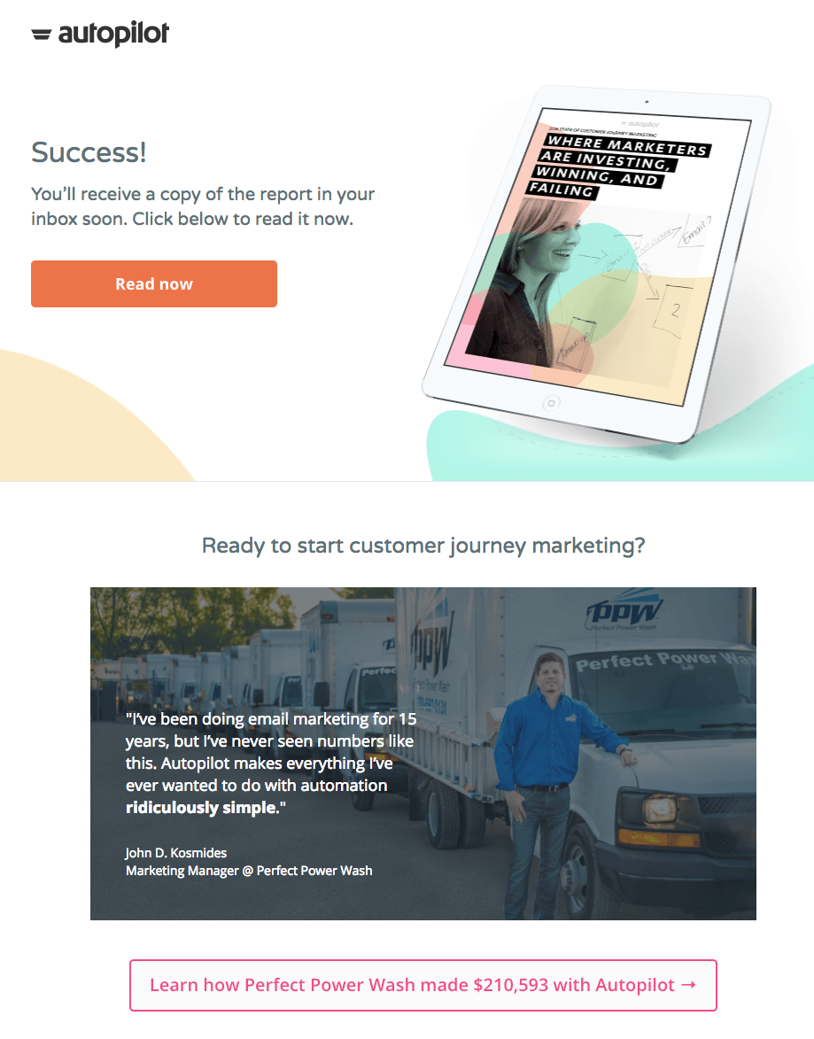
Autopilot provides an excellent example. Beyond directing traffic to download the report offered on the post-click landing page, this thank you page includes a video reinforcing the value proposition of the product:
Bring them back with remarketing ads
In the event a visitor doesn’t convert, implementing tracking pixels is a great way to continue engaging with them ads via display or social advertising through remarketing.
Instapage makes it easy to implement tracking pixels in our post-click landing page platform because you can add a Meta pixel in the page settings. Google Tag Manager and any other tracking pixels are simply inserted into the JavaScript.
Always remember to keep A/B testing
Even if you’re confident in your design and seeing impressive conversion rates, always make sure to test variations of your post-click landing pages to identify opportunities. Just because your first post-click landing pages were not optimized and unclear, doesn’t mean that you can’t fix them to optimize first impressions for the future.
Continue creating great first impressions
As your business offerings expand, post-click landing pages will begin to not only provide the first impression of your brand, but also serve as the introductory touch point to new features or products your company offers.
Inevitably, your ad spend will grow as well, as will the scope of your post-click landing pages. Don’t worry. Instapage allows you to easily scale your post-click landing page production with fully customized pages to increase the ROI on all your digital advertising. Request an Instapage Enterprise demo today.

See the Instapage Enterprise Plan in Action.
Demo includes AdMap™, Personalization, AMP,
Global Blocks, heatmaps & more.
