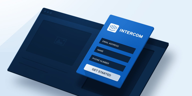
According to Accenture’s 2015 B2B Customer Experience Survey, 79% of B2B executives believe a differentiated customer experience has a direct impact on business results. Customer experience is increasingly important to business strategy and is one reason why Intercom, a customer messaging and engagement platform, has grown very well since its founding in 2011.
Businesses are better recognizing the relationship between customer engagement and growth, but that isn’t the only factor for Intercom’s success. Intercom also has a strong digital marketing strategy and uses post-click landing pages to generate leads.
post-click landing pages are standalone pages that use persuasive elements such as compelling headlines, hero shots, social proof, and contrasting CTAs to convince visitors to take action on an offer. That action could be to download an ebook, register for a product demo, sign up for a free trial, etc.
In today’s article, we examine a variety of Intercom landing pages to assess how effectively each page is optimized for conversions.
7 Intercom landing pages optimized for conversion
(For shorter pages, we’ve displayed the entire page. For longer pages, we’ve only show above the fold, so you may need to click through to the page to see some of the points we discuss. Also, keep in mind that some pages may be undergoing A/B testing with an alternate version than is displayed below.)
1. To encourage downloads of their customer support book
What the page does well:
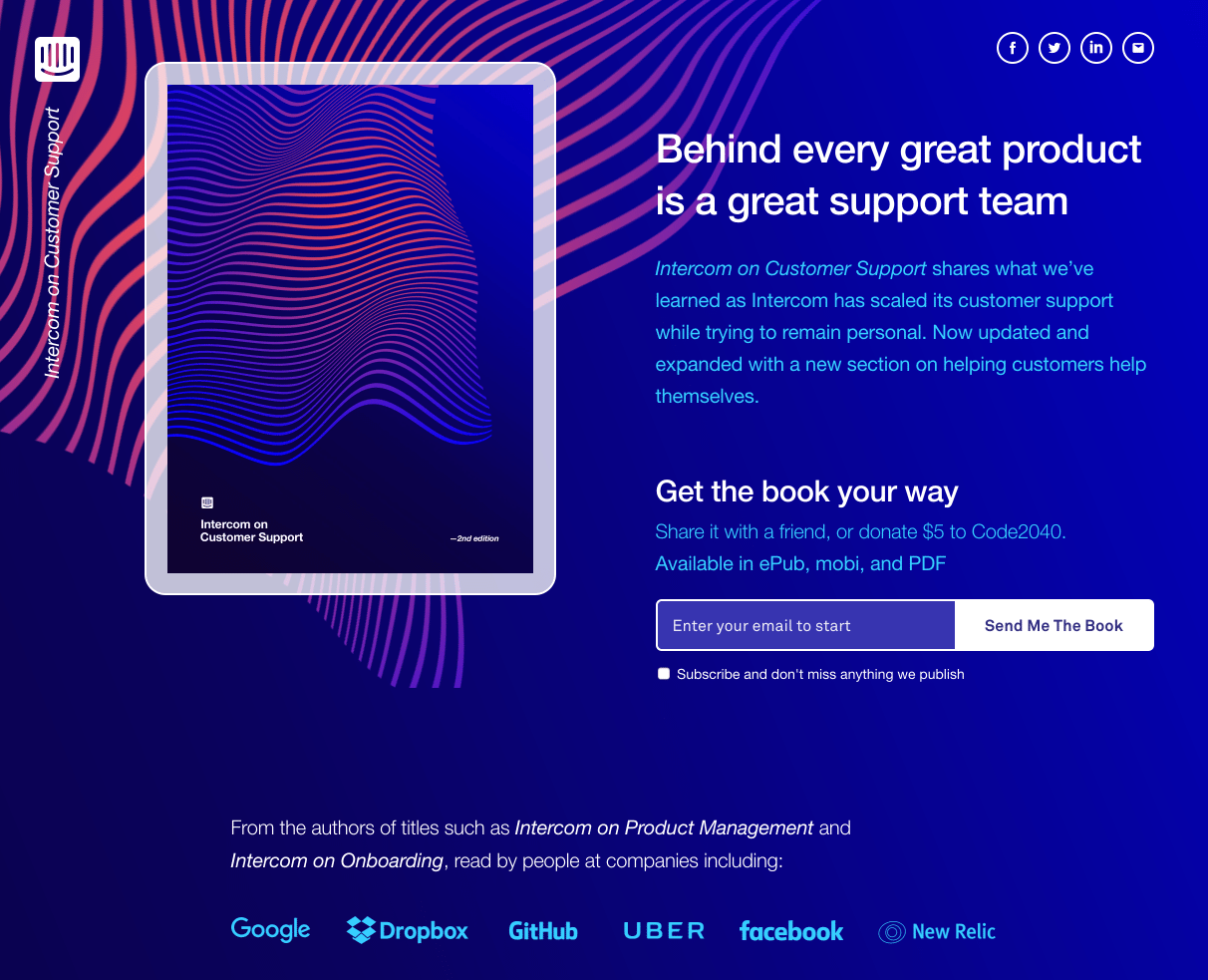
- The image of the ebook cover on the tablet shows visitors what they’ll be downloading once they enter their email.
- Minimal copy above the fold provides visitors with all the information they need to make a decision on converting.
- Multiple download options is pretty unique for post-click landing pages because it allows people to choose how they want to receive the book.
- The single-field form allows visitors to convert by only submitting their email.
- The customer logos are a strong form of social proof that let visitors know that executives at companies such as Facebook, Google, and Uber are also reading Intercom’s content.
- The ebook’s contributors all have a headshot, name, title, and biographies listed. This helps build trust with prospects.
What the page could change or A/B test:
- The header logo is linked, which gives visitors a chance to leave the page without converting.
- The social media links in the header also give visitors the opportunity to leave without evaluating the offer.
- “Enter your email to start” is confusing when combined with the CTA copy, “Send Me the Book.” What else is required besides an email address? Once they click the CTA button, it should provide the content via the thank you page or send it via email. But since the placeholder text reads like it does, it can cause confusion and maybe even lead them to abandon the page.
- The CTA color is repeated by surrounding elements, which makes it more difficult to standout. Intercom would increase conversions by changing the CTA color to green or yellow.
- The footer has a logo which is also linked. Removing this link will keep visitors on the page and focused on the offer.
2. To generate downloads for a customer engagement book
What the page does well:
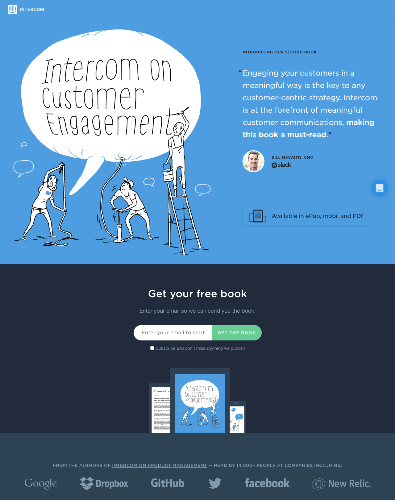
- No menu navigation keeps visitors on the page and focused on the offer. Menus give visitors an easy exit route as soon as they land on the page.
- Social proof above the fold immediately lets visitors know that other big names have read this ebook. Below the fold, quotes from executives at HubSpot and MarketingProfs help draw readers in. The quotes have a name, title, and headshot, which makes them more persuasive social proof.
- The image of the ebook gives visitors a preview what they’ll be downloading so they know exactly what to expect.
- The 1-field form is a great way to reduce friction and increase conversions. This post-click landing page only asks for email, which entices more prospects to complete the form than if more information was requested.
- The green CTA is distinct and the color isn’t repeated in surrounding elements. This helps it to stand out and increases conversions.
- The counter below the CTA acts as social proof. Intercom states that 14,000 people have already read their last ebook — and its readers are from noteworthy companies like Google, Dropbox, and Facebook.
- The ebook’s authors are accompanied by full name, biography, headshot, and Twitter handle. This helps make visitors more familiar with the authors, which makes them more likely to trust their content.
- The chat icon in the lower-right scrolls with the visitor and allows them to contact an Intercom support representative without having to leave the post-click landing page.
What the page could change or A/B test:
- The Intercom logo is linked in both the header and footer, which gives visitors an opportunity to leave the page without converting.
- The headlines for the different sections throughout the page are not as compelling as they could be. “Introducing Our Second Book,” “Get Your Free Book,” and “What’s Inside,” could be changed to “The Book That Will Change Your Customer Engagement Strategy,” “Download Your Free Customer Engagement Book,” and “Look Inside Before Your Download.”
- Enlarging the CTA button and email capture field would make it much easier to see when skimming the page.
- The CTA copy isn’t very convincing. “Get The Book” could be changed to “Download Your Customer Engagement Book.”
3. To offer their onboarding ebook

What the page does well:
- The menu navigation in the header uses anchor text to take visitors to different sections of the post-click landing page instead of off the page altogether.
- The single field form helps reduce friction and increases the chances that visitors will convert. Prospects are more likely to fill out forms when they don’t have to input too much personal information.
- The customer logos are an effective form of social proof that help visitors build trust with Intercom before conversion.
- The copy does a good job at detailing what is inside the ebook, and what prospects can expect when they download.
- The option to donate to a charity adds a unique element of social good which will appeal to a certain audience.
What the page could change or A/B test:
- The social media links in the header give visitors an opportunity to leave the page without converting.
- The linked logo in the header and footer also allows visitors a chance to leave without considering the offer.
- The CTA color is the same as other surrounding elements on the page, which makes it difficult to stand out. Changing this color to yellow would help increase conversions.
- The links to other Intercom ebooks directly below the CTA give visitors a chance to leave the page and consider other offers. Optimized post-click landing pages keep visitors on the page and focused on one single offer.
4. To increase newsletter subscriptions
What the page does well:
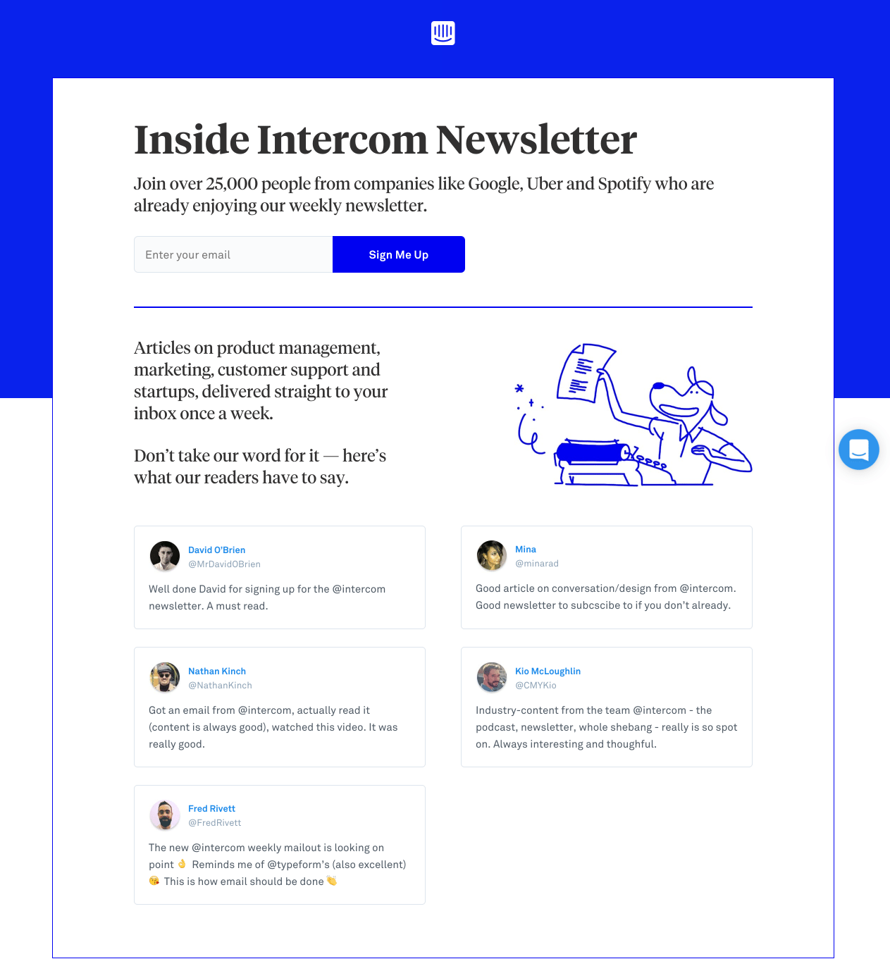
- No menu navigation keeps visitors on the page and focused on the offer.
- Use of a counter as social proof is immediately below the headline. Intercom lets visitors know that 25,000 people are already subscribed to their weekly newsletter.
- The single field form reduces friction and encourages more visitors to convert.
- Minimal copy allows visitors to quickly determine whether they should convert without having to read through walls of text.
What the page could change or A/B test:
- The logo in the header is linked, giving visitors a chance to leave the page without considering the offer. Removing this link could increase conversions.
- The CTA color is the same as other elements on the page, which makes it difficult to stand out. Changing the CTA color to green could increase conversions.
- The graphic of the dog isn’t relevant. An image of a newsletter cover would help visitors know what to expect in their inbox after converting.
- The social proof could be more effective by adding the title of the subscriber, the company they are associated with, and by increasing the quality of the responses. “Well done,” and “Good article,” could be replaced by specific insights into how Intercom’s newsletter helped improve their business.
5. To generate interest in their onboarding webinar
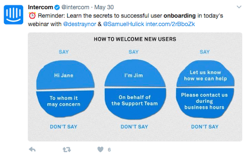
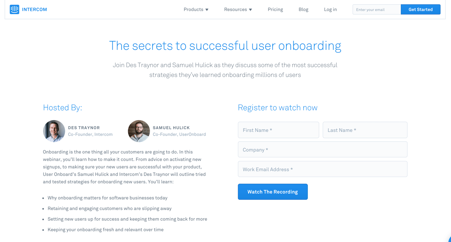
Intercom generates interest in their onboarding webinar by driving traffic through social media. Their Twitter post links to the corresponding post-click landing page below:
What the page does well:
- The headline and sub headline clearly describe the contents of the webinar. As soon as visitors land on this page they know what to expect.
- The calendar above the form lets visitors know precisely when the webinar starts.
- The short form helps to decrease friction and increase conversions. Intercom does a good job of not adding too many fields to their post-click landing page forms.
- Bulleted copy helps visitors to quickly read through the webinar and determine if conversion is worth their time.
What the page could change or A/B test:
- The menu navigation in the header and footer give visitors multiple opportunities to leave the page. Intercom is pushing traffic to this page with the sole intention of having prospects register for the webinar. But the header and footer navigation distract from that goal. Removing the navigation would go a long way towards optimizing this post-click landing page.
- The webinar hosts have a name, title, and headshot, but no biography. A biography could help establish their authority and build a connection with prospects.
- The CTA color is the same as other elements on the page, which generally we would say doesn’t help it stand out. However, in this instance, the fact that it is the largest element on the page and has a good amount of white space around it, helps draw the prospect’s eye to it.
- Social proof such as testimonials or customer logos could help showcase brands that have attended the webinar and got positive results.
6. To encourage prospects to start a free trial

What the page does well:
- No menu navigation keeps visitors on the page and focused on the offer.
- The relevant images of the campaigns and templates show visitors what they can expect to see during their free trial.
- The “Talk To Someone To Get Started Today” link below the CTA doesn’t take visitors off of the page. Instead it brings up a chat box where visitors can get their questions answered.
- Social proof below the fold helps Intercom to build trust with prospects. The testimonial contains a quote, headshot, name, and title, which makes it valuable.
What the page could change or A/B test:
- The logo in the header is linked, giving visitors an opportunity to leave the page without converting.
- The CTA color is the same as other elements on the page, which decreases conversions. Changing the CTA color to red or green would increase the number of eyes on the button.
- There is only one testimonial, and while having this section is a positive, adding several more testimonials would convince prospects that multiple brands are using Intercom’s service.
- A counter would be another good form of social proof to use. Intercom could let prospects know how many brands and users are already using Intercom’s services.
7. To generate downloads for their product building ebook

What the page does well:
- The menu navigation takes visitors to specific sections of the page, which keeps them focused on the offer.
- The image of the ebook on multiple devices is relevant. Visitors can see the ebook cover and know what to expect. They can also envision reading the ebook on multiple devices.
- The single field form helps increase the chances that visitors will fill out the form and convert.
- Customer logos below the CTA build trust between Intercom and its prospects and show visitors that big brands such as Google and Facebook are using the service.
- Testimonials include a quote, headshot, name, and title. Including this much information brings value to prospects.
What the page could change or A/B test:
- The logo and social media icons in the header are linked, giving visitors a chance to leave the page without evaluating and considering the offer.
- The links to other ebooks below the CTA bring attention to other offers. These links and mentions of other content should be removed to make sure focus stays on the product building ebook.
The long scroll could be A/B tested to see if condensing the information into a shorter page would lead to more conversions. - The footer contains both a logo link and social media links. Removing these links will help maximize this page’s potential.
Which Intercom post-click landing page inspired your next design?
Intercom does an exemplary job of optimizing their post-click landing pages with persuasive elements like hero shots, short forms, and social proof. Each example above demonstrates their ability to design professional post-click landing pages while leveraging a variety of elements.
Did one of these Intercom landing page examples inspire your next page? Let us know by tweeting us. Then, design your next professional post-click landing page with Instapage. Sign up for a 14-day trial today.

See the Instapage Enterprise Plan in Action.
Demo includes AdMap™, Personalization, AMP,
Global Blocks, heatmaps & more.
