If anybody knows marketing and its impact on sales, it’s Salesforce. Valued at around $55 billion, the cloud computing titan has built a reputation as an industry leader on the back of its customer relationship management (CRM) solution.
What many people don’t realize, though, is that Salesforce offers a much broader range of services than just a single CRM database. They include:
- Work.com: a cloud-based management platform that helps managers and employees boost performance through feedback, coaching, and recognition.
- Data.com: an automated, cloud-based system for obtaining and managing CRM records.
- Force.com: a platform in the cloud that allows developers to create custom add-ons to the main Salesforce application.
- Desk.com: a helpdesk system based in the cloud that helps businesses connect with customers and solve their issues.
- Site.com: allows the login to Salesforce’s Lightning App Builder, which is a technology developers can use to create apps at a swift pace.
To support those products and services — to drive downloads, signups, views, and more — Salesforce leverages the power of post-click landing pages more than any other business we’ve examined (Uber, Shopify, Airbnb).
What is a post-click landing page?
A post-click landing page is a standalone web page designed specifically to elicit a particular action from visitors. That action could be to sign up, download, buy, among others. To convince its visitors to complete it, a post-click landing page uses a number of persuasive elements like social proof, compelling headlines, explainer videos, and more.
Here’s how industry leader, Salesforce, uses them to accomplish key marketing goals.
(Keep in mind, for shorter pages, we’ve shown the entire page. However, for longer pages, we only displayed above the fold. You may need to click through to the page to see some of the points we discuss and some examples may be A/B testing their page with an alternate version than is displayed below.)
How industry leader Salesforce uses post-click landing pages
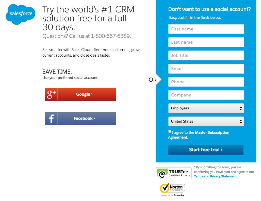
1. To get people to sign up for a trial of their CRM

What the page does well:
- The headline touts Salesforce CRM as the world’s number 1 solution, which is fine as long as it’s true.
- The image gives a very basic inside look into the CRM dashboard
- Bulleted copy stresses the benefits of using Salesforce’s CRM
- Statistics like “Salesforce users report 44% more leads, 37% increase in sales revenue,” etc., prove that the CRM system gets results
- Company logos showcase big-name customers who use the system
- Contact info lets prospects know where they can talk to a salesforce rep if they need help.
What could be A/B tested:
- The Salesforce logo in the upper left corner of the page is linked to the homepage, serving as an easy escape for visitors of this page.
- The CTA button color is the same color as the rest of the form, making it easy to pass over. One of the easiest and best ways to test the boldness of your CTA button color is with the “squint test.” When you squint your eyes, can you still tell where your CTA button is? If not, it may be time to pick out a more attention-grabbing hue.
- The block text you see on this page is very unlikely to be read word for word by visitors.
- An 8-field form is right on the cusp of being too long for visitors to want to fill out.
- Links to social media profiles and a sitemap give prospects way too many options on a page that’s supposed to drive just one action.
2. To generate free 30-day trials:
What the page does well:
- The headline leverages one of the most persuasive words in copywriting: “Free.”
- A one-click signup lets users bypass the form, and instead start their trial with their Facebook or Google+ account.
- Trust badges let prospects know their personal information is safe.
- The call-to-action also includes the word “Free.”
What could be A/B tested:
- No information about the benefits of using Salesforce can be found anywhere on this page.
- Numerous outbound links let prospects navigate away from the page as they please.
3. Free trial for their “Desk” service:

What the page does well:
- The headline engages the reader by asking a question and using the word “your.”
- The form headline emphasizes “Free.”
- Bulleted copy communicates the benefits of using Desk.com.
- The CTA button color contrasts the white form well.
- Company logos showcase the brands that have already had success with Desk.
- A TRUSTe badge lets prospects know their personal information is safe.
- The call-to-action emphasizes “free.”
What could be A/B tested:
- The vague phrase “jumpstart your customer service” in the headline doesn’t convey a clear benefit. How will Desk.com actually empower your customer team? Will it be able to solve customer issues faster? Will it make communication easier than ever before? Even if it’s listed in the body copy, the headline should convey Desk’s USP because without a good headline, the body copy won’t actually get read.
- The logo is linked to the homepage, making it easy for prospects to abandon this post-click landing page before clicking the CTA button.
4. To generate demo views:

What the page does well:
- The subheadline engages the reader by asking a question relevant to the benefit of their Pardot software: “Ready to boost your sales…?”
- Company logos highlight the well-known brands that trust Pardot.
- No outbound links (almost: The Pardot logo is linked to the homepage) make it less likely a visitor gets distracted, and more likely they convert.
- The call-to-action “Watch demo video” is relevant to the offer.
- Bulleted statistics tout the success Pardot clients have seen.
What could be A/B tested:
- A competing call-to-action, “Take it for a spin,” takes users off the current post-click landing page and onto a completely different one. If you’re going to use two CTAs, they should both point to the same place.
- A mandatory 8-field form might deter prospects from converting to watch this demo video. Is it a valuable enough offer to ask for all that information from prospects?
5. To give customers guided tours:

What the page does well:
- This slightly shorter form might be something prospects are willing to fill out in exchange for a guided tour.
- Bite-sized copy is separated into small chunks to make it easier to read.
- The photo gives prospects a brief inside look at the product.
- The Pardot logo isn’t linked to the homepage, meaning users can’t escape through it.
- Icons below the fold clearly communicate the benefit of using Pardot.
What could be A/B tested:
- The CTA button color doesn’t make it pop off the blue page.
- A link to the “contact us” page could be replaced with a telephone number that won’t drive the visitor off the page.
6. To generate webinar registrations:
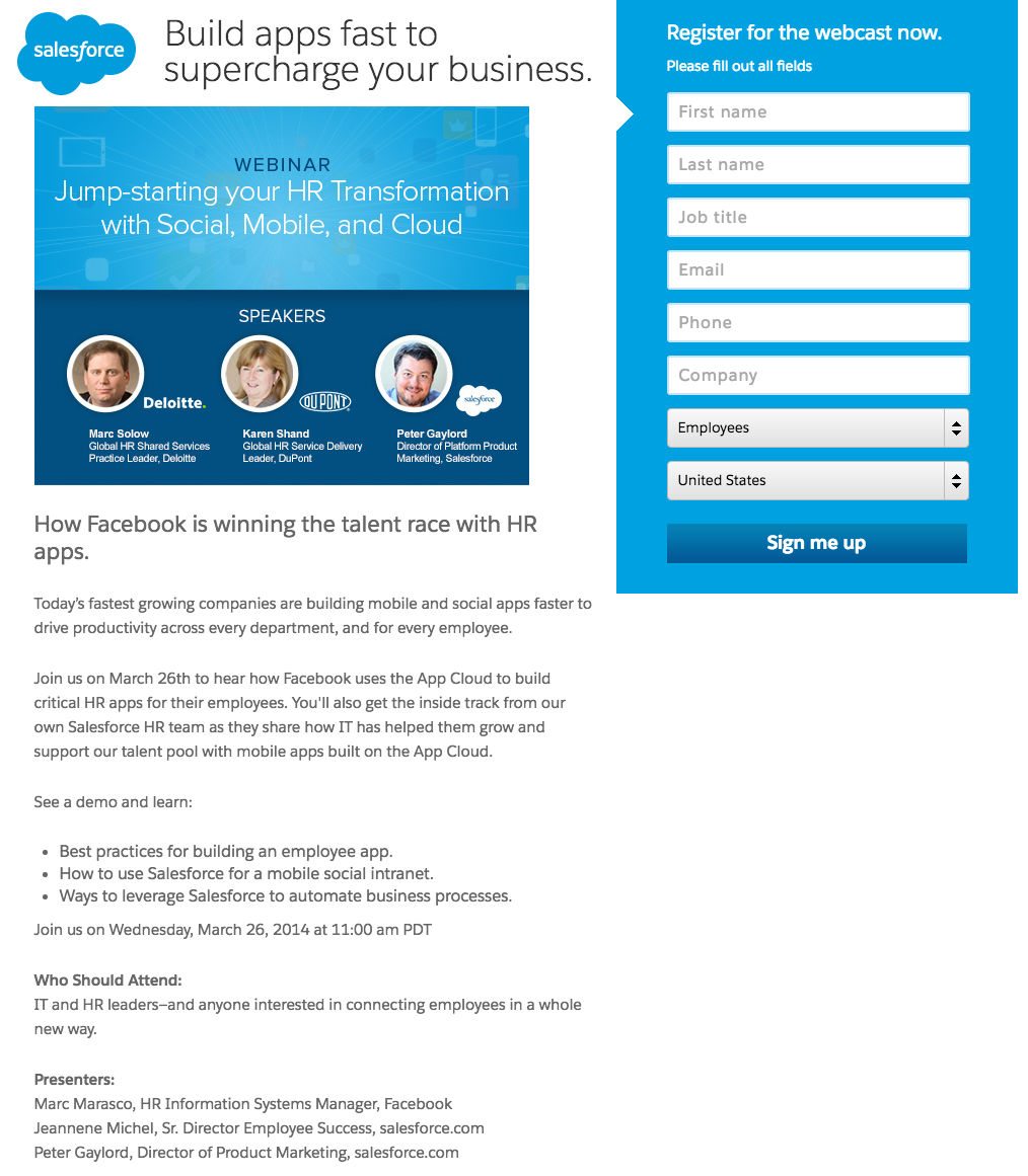
What the page does well:
- Speaker profiles, complete with name, title, and company, add authority to this webinar.
- Bulleted copy quickly communicates the benefits of registering for the webinar.
- The CTA is written in first person: “Sign me up”
- Bite-sized text is broken up into small paragraphs for easy readability.
- Trust badges guarantee the safety of personal information submitted through the form.
- No outbound links ensure that visitors stay focused on the task at hand.
What could be A/B tested:
- Vague terms and phrases like “supercharge your business” could be replaced with words that more clearly convey the message Salesforce is trying to get across.
- A blue button on a blue form background makes it easy for prospects to skip over.
- A mandatory 8-form field might leave prospects wondering if the knowledge they’ll gain from the webinar is worth forking over their personal information.
7. To drive event signups
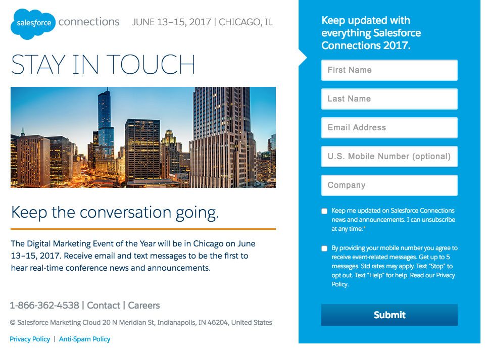
What the page does well:
- A professional photo of Chicago’s bustling downtown draws visitors into this event post-click landing page.
- A relatively short form doesn’t intimidate prospects into leaving the page.
- Opt-in boxes aren’t already pre-checked, increasing the quality of leads that do choose to opt in.
What could be A/B tested:
- Links labeled “Contact” and “Careers” distract users from completing the post-click landing page’s goal.
- The form copy switches uses both the pronouns “you” and “me” to refer to the reader. At best this will disrupt the visitor’s flow of content consumption — at worst, it could even confuse the reader: “Are you talking to me?”
- The call-to-action, “Submit,” is as generic and unremarkable as it gets. Why not use something like “Keep me updated”?
- The headline and subheadlines on the page don’t convey a strong benefit whatsoever. “Stay in touch,” “Keep the conversation going,” and “Keep updated,” don’t get us excited about converting. How about you? We’re willing to bet something like “Sign up to get exclusive information on Connections 2017” would work better.
8. To build their blog subscriber list:
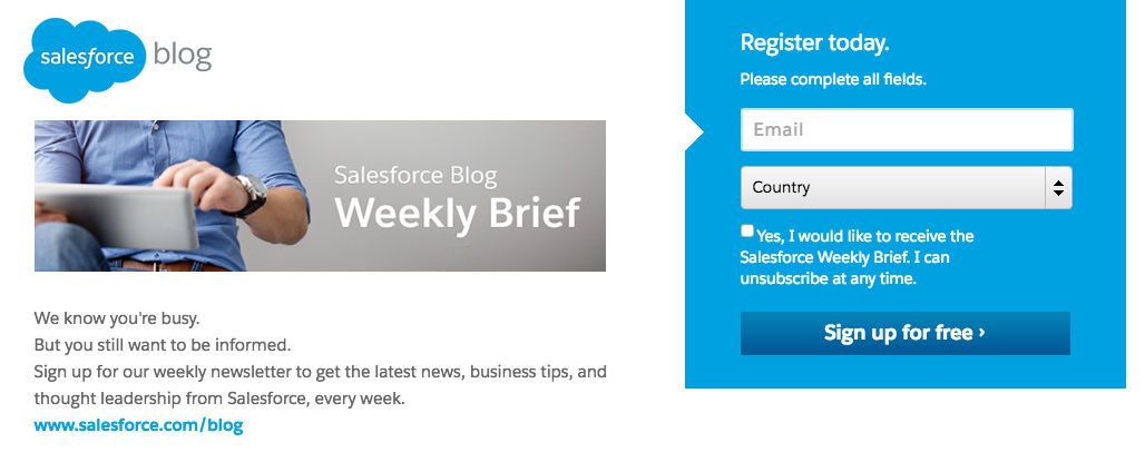
What the page does well:
- The short form only asks prospects to hand over their email address and country of residence. Clearly Salesforce marketers understand that the less they ask for, the more likely prospects are to comply.
- Trust badges give readers confidence, letting them know their private information is safe from being stolen by hackers.
- The copy speaks directly to the reader, frequently using the word “you.”
- Contact information lets readers know how to get in touch with Salesforce reps if they have any questions about the service.
What could be A/B tested:
- The image doesn’t provide much value. Why not try using a picture of a prospect’s inbox, highlighting a Salesforce subject line to show visitors the kind of valuable information they’ll be delivered when they convert?
- Too many outbound links — to the blog, the career page, and the contact page — all distract users from converting.
- The CTA button color is the same as the form, making it easily missable.
- The call-to-action could be much stronger. Why not, “Send me expert marketing tips”?
9. To generate newsletter subscribers:

What the page does well:
- This headline supplies a benefit: Learn from the best. Sell like the best.
- Norton and TRUSTe badges let your prospects know their information is safe.
- The short form only asks of prospects what Salesforce marketers need from them to deliver this offer: email and country of origin.
What could be A/B tested:
- The benefit could be stronger here. Learn from the best? Like who? Big names could add authority.
- Outbound links to social accounts and other Salesforce pages let users wander off the page as they please.
10. To educate marketers with ebooks

What the page does well:
- The image gives customers an idea of what the ebook, seemingly thick with knowledge, looks like.
- Testimonials from satisfied customers, complete with names and titles, boost the likelihood visitors sign up for the service.
- Concise copy provides a clear benefit to downloading the ebook.
- Trust badges let prospects know their information is safe.
- Clearly displayed contact information lets users know how to reach out to salesforce reps.
What could be A/B tested:
- A sitemap and social media icons let visitors wander off the page without converting.
- Testimonials could be even more powerful with the addition of relevant headshots.
11. To inform marketers with reports:

What the page does well:
- The headline and subheadline convey a strong benefit related to this great offer.
- Bulleted copy informs the visitor of what they’ll get when they read through the report, and makes reading this page less of a chore.
- Clearly displayed contact information lets visitors know where they can go if they have a question.
- Trust badges let visitors know their information is safe.
What could be A/B tested:
- This CTA button blends in with the rest of the form.
- Numerous outbound links, again, serve as escape routes for visitors.
12. To deliver guides:

What the page does well:
- The blue CTA button pops off the white background on this post-click landing page, though a different color would be better (since blue is used all over this page).
- The CTA is relevant to the offer.
- Benefit-centric, bulleted copy lets visitors know exactly what they’re going to get by downloading, and the benefits that come with converting.
- Contact information makes it clear to visitors where they can get immediate assistance.
What could be A/B tested:
- Three combating CTAs give prospects way too many options. Remember — a post-click landing page should be designed to accomplish one goal. We see three here: download an app idea guide, get a webcast, watch a demo.
13. To get developers to sign up for Force.com:
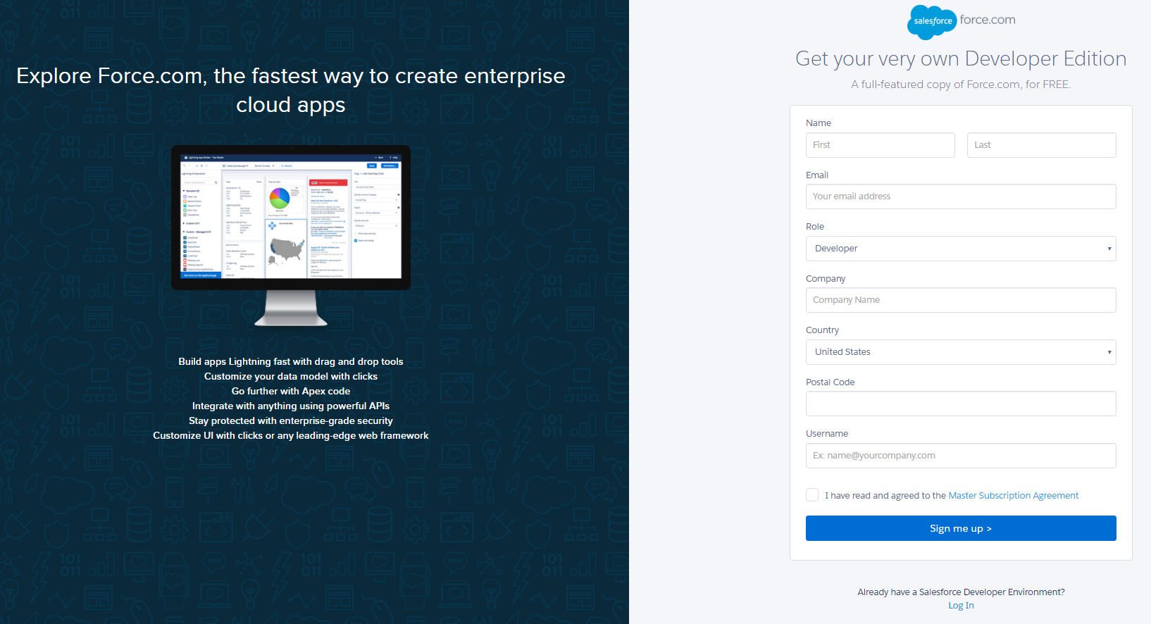
What the page does well:
- The headline conveys a clear benefit: Force.com is the fastest way to create enterprise cloud apps.
- Text below the image lets readers know all the things they can do on Force.com
- No outbound links means there’s no way off this page other than through the CTA button.
- The blue CTA button pops off the white form.
- The call-to-action is written in first person. Instead of just “Sign up,” it reads “Sign me up.”
- The form subheadline emphasizes the word “Free.”
What could be A/B tested
- Is postal code really necessary? It’s probably because they want to understand where their prospects live, but without full address, is zip code worth requiring?
- The CTA button could be bigger, which would draw even more attention to it and “signing me up.”
- More white space above and below the computer monitor would balance out the left side of the page better with the right side of the page.
14. To get prospects to reach out to sales:

What the page does well:
- The copy lets prospects know exactly what they need to do to get more information from the Salesforce team.
- Company logos from big brands like The American Red Cross, Comcast, Wells Fargo, and Dell, showcase the well-known companies that trust Salesforce.
- The call-to-action is written in first person.
What could be A/B tested:
- This image looks like a stock photo mashup mess, and we’re not sure what exactly it’s trying to convey.
- A mandatory 10-field form is likely way longer than anything a prospect will be willing to completely fill out.
- Numerous outbound links give prospects lots of ways off the page.
The CTA button, with that color, is easily missable.
15. To convince people to sign up for Salesforce IQ:
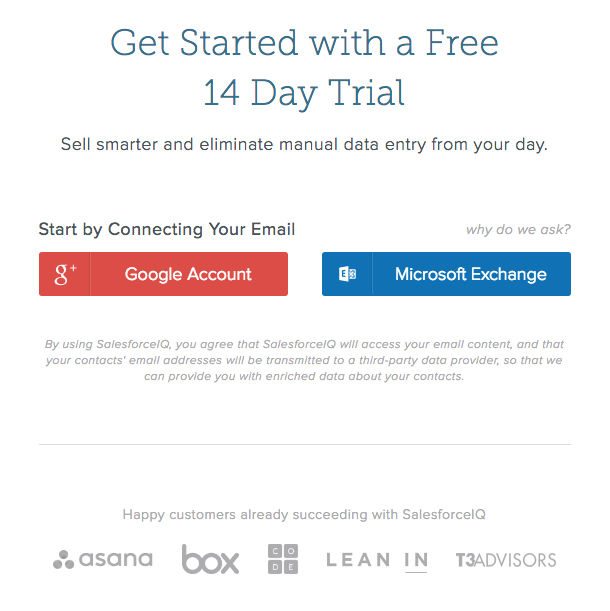
What the page does well:
- A one-button signup allows users to click to register instead of requiring them filling out all their personal information manually. Salesforce post-click landing page designers understand that the easier it is for prospects to complete their desired goal, the more likely they are to do it.
- Company logos showcase the well-known businesses that use SalesforceIQ.
What could be A/B tested
- A clickable logo in the upper left allows visitors to escape to the homepage.
- A lack of benefit-oriented copy on this page leaves visitors wondering why they should sign up to use SalesforceIQ.
- “Get started” is a fairly weak call-to-action.
Data has already shown that companies with 40 or more post-click landing pages generate 12 times more leads than those with only 1-5 post-click landing pages. Do you think it’s a coincidence that Salesforce is a market leader, and they leverage way more than 40 post-click landing pages for all their products and promotions?
No way.
Follow the lead of one of the biggest names in the sales and marketing industry, and start building more post-click landing pages. Sign up for an Instapage Enterprise demo today.

See the Instapage Enterprise Plan in Action.
Demo includes AdMap™, Personalization, AMP,
Global Blocks, heatmaps & more.
