Who are your best customers and what features do they enjoy most? How can you generate more customers and further engage with the ones you already have? How can you retain your current customers and earning more from them?
No matter your job title, Mixpanel analytics can help answer these questions and more.
Mixpanel is known as one of the most popular platforms for both mobile and web applications. Instead of just measuring page views, though, Mixpanel takes into account all actions that people take in your application — uploading photos, watching videos, sharing posts, and more. Analyzing each action allows you to truly understand your users.
One of the ways that Mixpanel has grown to be such a force in the digital marketing industry is using a variety of post-click landing pages to establish brand awareness, generate leads, and sales. Before we get into how they use them, though, let’s start with a quick reminder.
What is a post-click landing page?
A post-click landing page is a highly focused, standalone web page used to offer visitors something valuable in return for their contact information through a strong call-to-action. That action could be to sign up for a webinar, to download an ebook, to start a free trial, to purchase something, etc.
To convince visitors to take your desired action, a post-click landing page should include a variety of persuasive elements such as a compelling headline, customer testimonials, social proof, and an optimized lead capture form. Most other web pages don’t contain these elements, so they’re not designed to convert.
Now, let’s look at a few ways Mixpanel uses post-click landing pages to create a great first impression, generate leads, and drive new business.
(Keep in mind, some examples may be A/B testing their page with an alternate version than is displayed below.)
6 Ways Mixpanel uses post-click landing pages
1. In-person meeting at an event
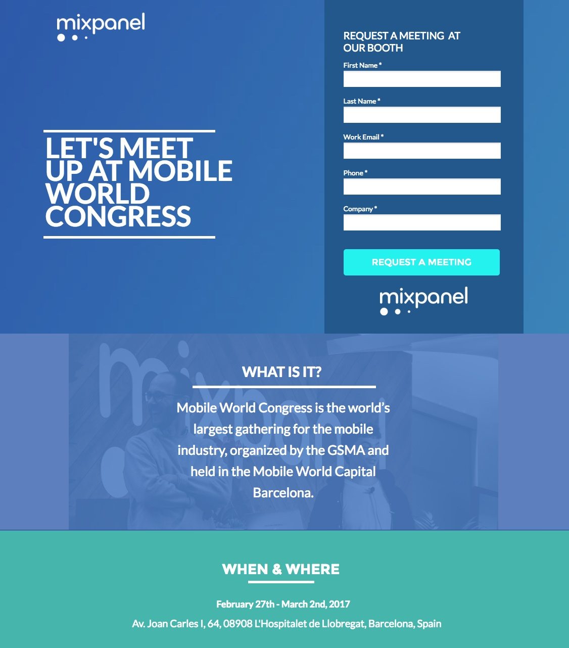
What the page does well:
- The form title acts as an extension of the headline because the headlines asks to “meet up” and the form title continues the thought with “request a meeting.”
- The relatively short form will likely capture more leads than a longer form would. Although it may be a smart idea to make one or two of the fields optional — like phone number and/or company — since email address is all that’s really required for lead nurturing.
- The dates and address of the event are useful because it serves as a reminder of the event’s location, and people may want to know this information before requesting a meeting.
- The page is simple and well-balanced. There are no distractions and it looks neat, professional, and branded to the company.
- There are no exit links on this Mixpanel post-click landing page. Since the only ways off the page are to enter the information and request a meeting, or click the “X” in the web browser’s tab, visitors are more likely to convert.
What could be A/B tested:
- Who is the meeting with? would be a good piece of information to include.
- Telling prospects why they should meet with Mixpanel — providing some of the major benefits, for example — would likely produce more conversions.
- The CTA button color could be more color contrasting (like orange) so it would pop off the page.
- The CTA button copy is okay because it does tell prospects exactly what they’re getting, but it could be a bit more compelling. Perhaps something in first person like, “Reserve My Meeting” or “Save My Spot.”
- The image behind the “What is it?” section is a good idea, but it’s hardly noticeable the way it is formatted currently.
- Trust signals could be added to the page. There is not even a privacy policy link to assure people that their personal information will be secure.
2. To highlight case studies
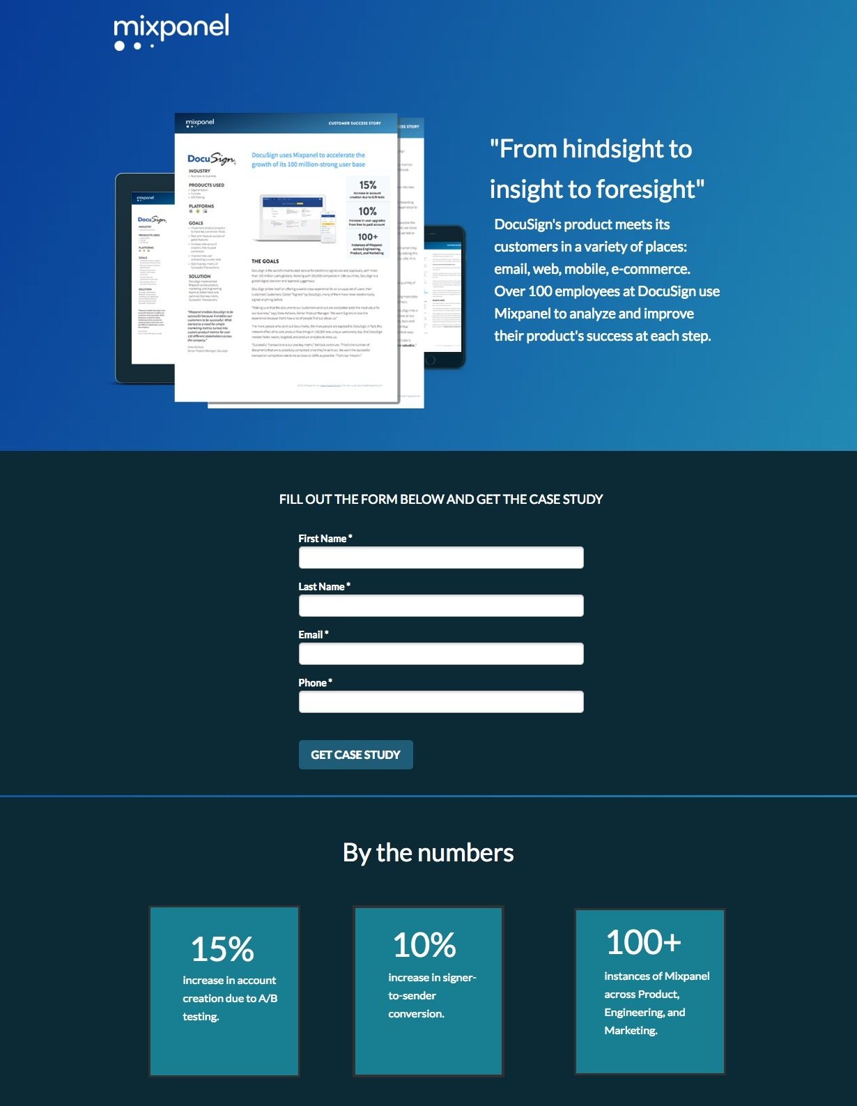
What the page does well:
- The image of the case study is helpful for prospects trying to get a better feel for the product being offered. Knowing exactly what they’re getting by submitting their information may increase their chances of taking action.
- The short lead capture form won’t scare visitors away.
- The “By the numbers” section acts as a quick summary of the case study and entices visitors to convert to get the more detailed story about Docusign’s experience with Mixpanel.
- No exit points means people can’t easily leave the page before converting. The only ways off the page are by submitting the form to receive the case study and clicking the “X” in the web browser tab.
- The page is aesthetically pleasing. It is simple, neat, and organized, and it looks very professional and branded.
What could be A/B tested:
- The headline is a bit vague and doesn’t say much about the offer. What, exactly, ranges from hindsight to insight to foresight? And where is this quote from?
- The CTA button color is nearly the same exact color as the background behind it. Changing the button orange or another contrasting color would draw more attention to it and probably get better results.
- The CTA button copy is not personalized as much as it could be. “Get Case Study” is good and descriptive but “Show Me the Case Study” would likely perform even better.
- Adding social proof, such as a testimonial from a DocuSign employee may increase conversion rates. The page states that over 100 employees at DocuSign use Mixpanel, so why not include a direct quote from one of them, explaining why they like Mixpanel?
3. To promote ebooks
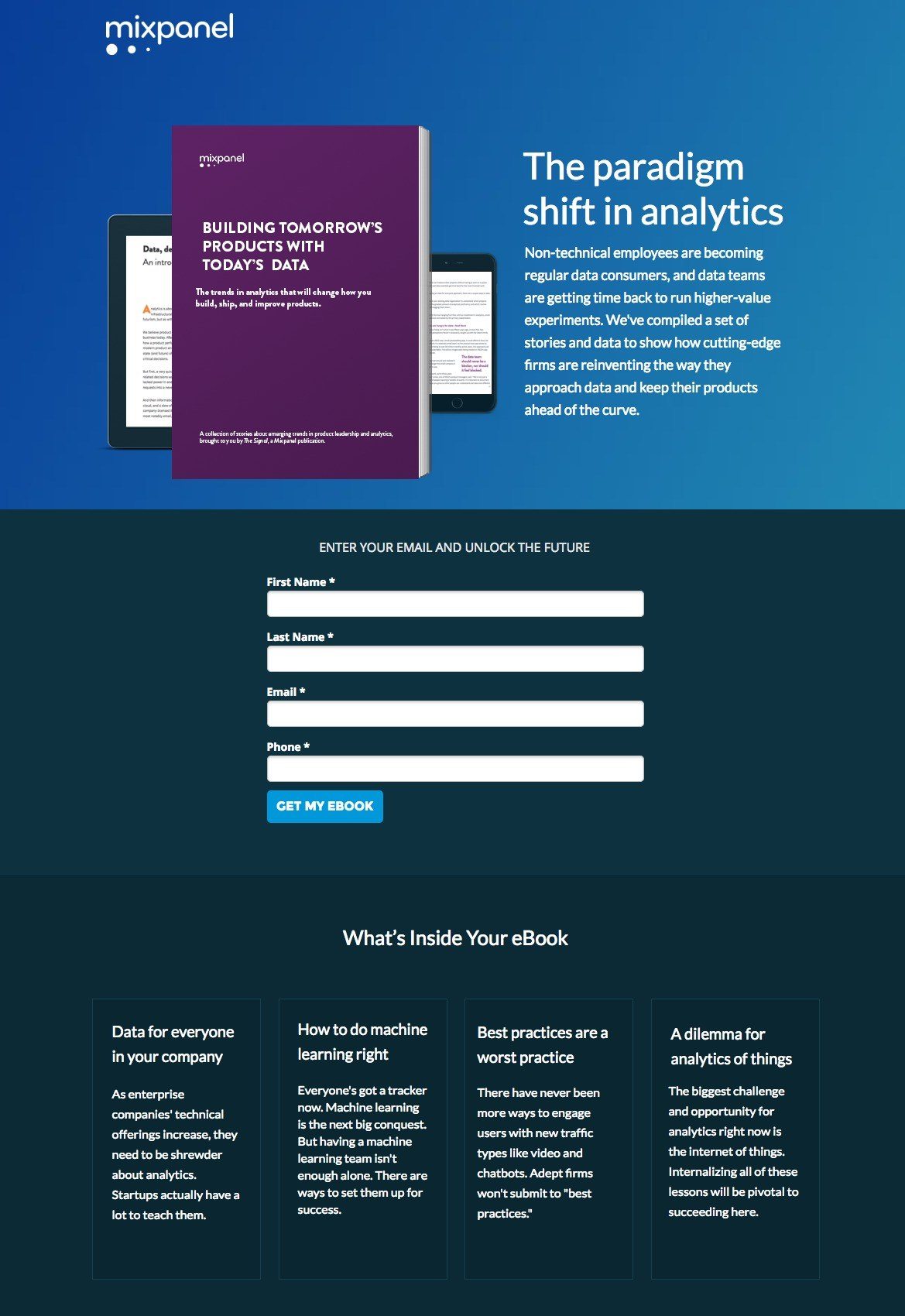
What the page does well:
- Minimal copy on this Mixpanel post-click landing page makes it easy for visitors to quickly scan the page and get the highlights of the offer.
- The short description of the ebook, located right of the image, provides prospects with an initial, brief overview of what the ebook contains.
- The lead capture form is short and doesn’t ask for very personal information, increasing the chances of it being filled out by visitors.
- The CTA button copy is much better than the one in the previous example, as it uses first person to make prospects feel like this ebook is right for them.
- The “What’s Inside Your ebook” section elaborates on the short description mentioned above, laying out all of the important points made inside the ebook. Also, using the word “your” was a very nice touch implying that this ebook is specifically for the prospect.
- No exit links make it almost impossible to escape the page without first converting. The only way to leave the page is to click the “X” in the browser tab or complete the form.
What could be A/B tested:
- The headline “the paradigm shift in analytics” doesn’t convey any benefit to visitors.
- The other devices behind the ebook are too small and blurry for them to serve as a good teaser for visitors to download the ebook.
- The form headline is somewhat inaccurate. It implies that the only piece of information required is their email address. But in reality, three other form fields are necessary to redeem the ebook.
- The CTA button color should be one that isn’t used anywhere else on the page so that it draws more attention to the button.
- Adding trust signals to the page could increase lead generation. Just like with the other examples here, there isn’t even a privacy policy link to assure people that their personal information will be secure upon submitting it.
4. To generate webinar registrations
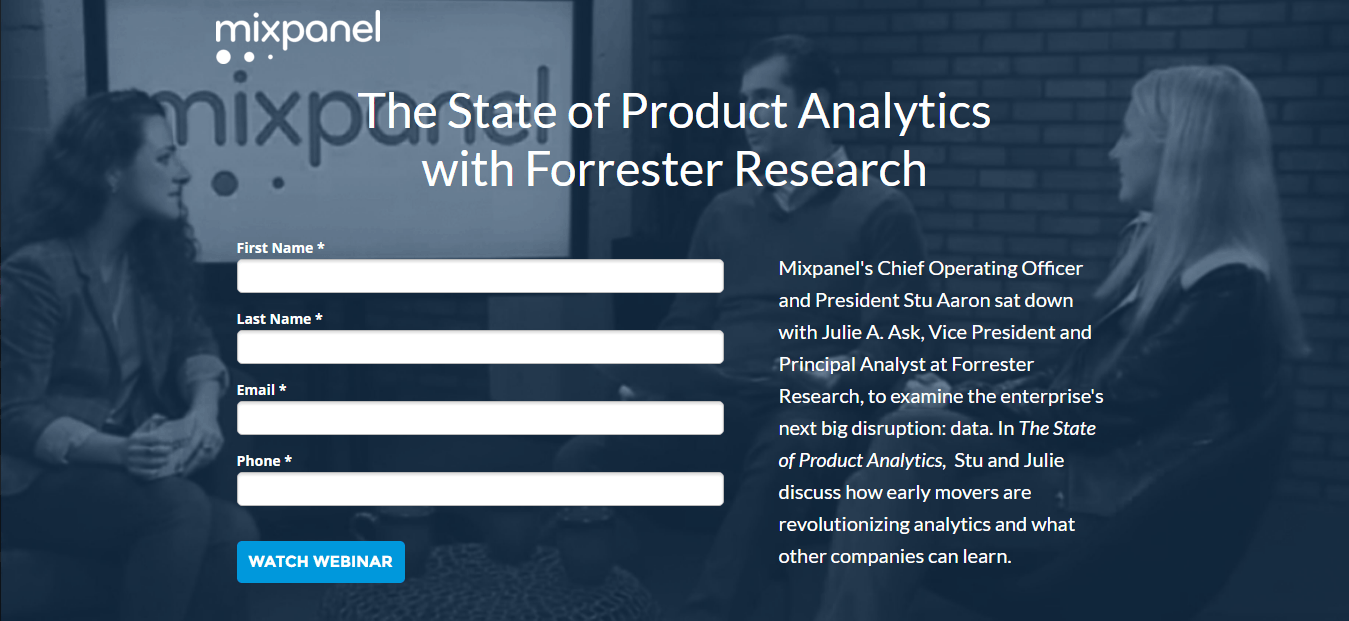
What the page does well:
- The image presumably shows the people mentioned in the short description.
- The short form is an element that Mixpanel is consistent with. Again, they probably get a lot of conversions with such short forms because prospects can tell right away that the “signup” process will be easy and not require much personal information.
No exit links on this page means no easy way off the page without converting. Mixpanel seems to be pretty consistent with this, which is a very good thing.
What could be A/B tested:
- Missing content about the benefits of the watching the webinar, or perhaps some of the key takeaways from the webinar, would be helpful. Aside from the short description at the top of the page, there is no information about the webinar.
- The CTA button color could be improved by testing a color that isn’t used anywhere else on the page to see if it draws more attention.
- The CTA button copy is a bit boring. Something more detailed, like “Watch The State of Product Analytics Webinar” might attract more prospects.
5. To offer research reports
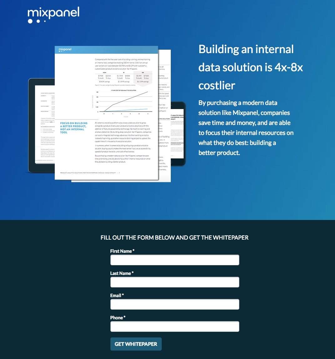
What the page does well:
- The headline uses numbers and stops you in your tracks, making you consider Mixpanel’s data solution even more.
- The image showing a preview of the white paper is useful for those who may want to see what they’re getting in return. Plus, including a page that contains graphs and charts shows the report is packed with research and is more appealing than a page heavy with text.
- The 4-field form is quick and easy for prospects to fill out, making it likely that they will do so.
- The page is succinct, organized, and well-balanced. Like previous examples, this page looks professionally-made and branded to the company.
What could be A/B tested:
- Including an arrow visual cue from the image to the form could help persuade visitors to convert. That’s because the form is below the fold and anything you can do to push visitors to take action on your page, you should.
- Using the word “you” in the page copy could help visitors feel Mixpanel is talking directly to them — could result in more leads for the company.
- The CTA button color has already been used on the page. Testing the button in a more contrasting color, like orange or red, may generate more leads.
- The CTA button copy is almost fully optimized. Again, if Mixpanel wrote the copy with personalized text such as, “Send Me the White Paper,” they would probably see more conversions.
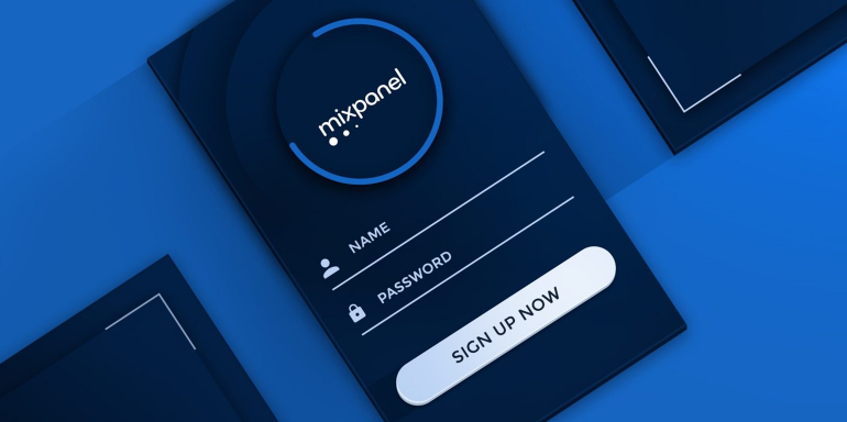
6. To sign up new accounts
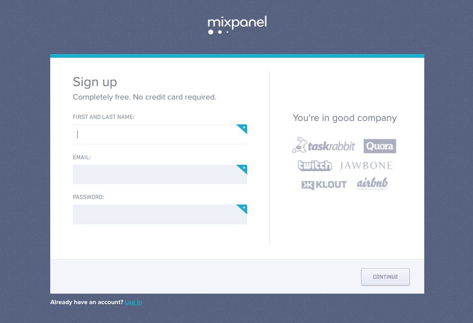
What the page does well:
- The word “free” in the subheadline helps reassure visitors that signing up for Mixpanel doesn’t cost a dime, not even a credit card is required.
- The extremely short form is another effective element of this Mixpanel post-click landing page. Requiring only three pieces of information likely drives higher conversions.
- Customer badges help make prospects feel more comfortable and secure in their decision to sign up for a Mixpanel account. “If these other high-profile companies trust Mixpanel, why shouldn’t I?”
What could be A/B tested:
- The Mixpanel logo is hyperlinked to their homepage. Removing the hyperlink would keep more visitors on the page and focused on signing up for Mixpanel.
- The “continue” CTA button is the same color as the background behind it, making it very easy to miss. Changing it to a color other than white, gray, or blue would draw much more attention to it and likely draw more conversions.
- The CTA button copy doesn’t inspire prospects to click. If it were rephrased to something like, “Take Me to My Account” would get them more excited to proceed.
- Missing content, such as some of the benefits of signing up for a Mixpanel account, could be added to the page.
Which Mixpanel post-click landing page inspired you?
Mixpanel is one of many brands that understands the power of post-click landing pages and how they can create a great first impression to generate leads. By using post-click landing pages to offer a variety of content and generate brand awareness; Mixpanel platform continues to fill its sales funnel and earn more business.
We hope the critiques above help guide you when you’re building your next post-click landing page. Create your best first impression and enjoy 100% customization with Instapage, sign up for an Instapage Enterprise demo today.

See the Instapage Enterprise Plan in Action.
Demo includes AdMap™, Personalization, AMP,
Global Blocks, heatmaps & more.
