Nearly ten years ago, Joe Gebbia, the founder of hotel-alternative service Airbnb, unknowingly let a kidnapper spend the night in his home.
Well… at least he thought he did.
As it turned out, his visitor was no such thing. He was an average guy, headed into the Peace Corps, looking for a place to stay during a cross-country road trip he was taking before his term of service began. And while he didn’t kidnap Joe that night, what he did do was spark an idea that would revolutionize the way we travel the world today.
It was the idea that strangers weren’t as dangerous as we were all raised to believe they were — that they are, in Joe’s words, “actually friends waiting to be discovered.”
Operating under that belief, soon, a broke Joe and his roommate Brian Chesky would open up their home to three designers traveling to San Francisco for a business conference, all in the name of making a few bucks.
And the rest is history.
Today, over 70 million guests have spent time in homes scattered across more than 34,000 cities around the world. Now valued at over $25 billion, in less than a decade Airbnb has become a globally recognized brand.
Its growth can be attributed to a great idea, and great content marketing. Airbnb’s storytelling ability rivals that of many of today’s most popular brands.
But how much of the content they create is for post-click landing pages?
We set out to discover just that, and we were surprised at what we found. Read on to see how the most recognized home-sharing service in the world leverages post-click landing pages to grow its business.
5 Ways Airbnb marketing campaigns use post-click landing pages
1. To convince people to become hosts
Persuading homeowners to open up their personal spaces to strangers is no easy task. You know what might help, though? Showing them just how much they could earn by doing it.
This Google Ads post-click landing page has a unique feature that takes advantage of our desire for monetary gain – a simple calculator that displays the earning potential of your home or apartment based on:
- The area you live
- The room type you offer
- How many travelers you can accommodate
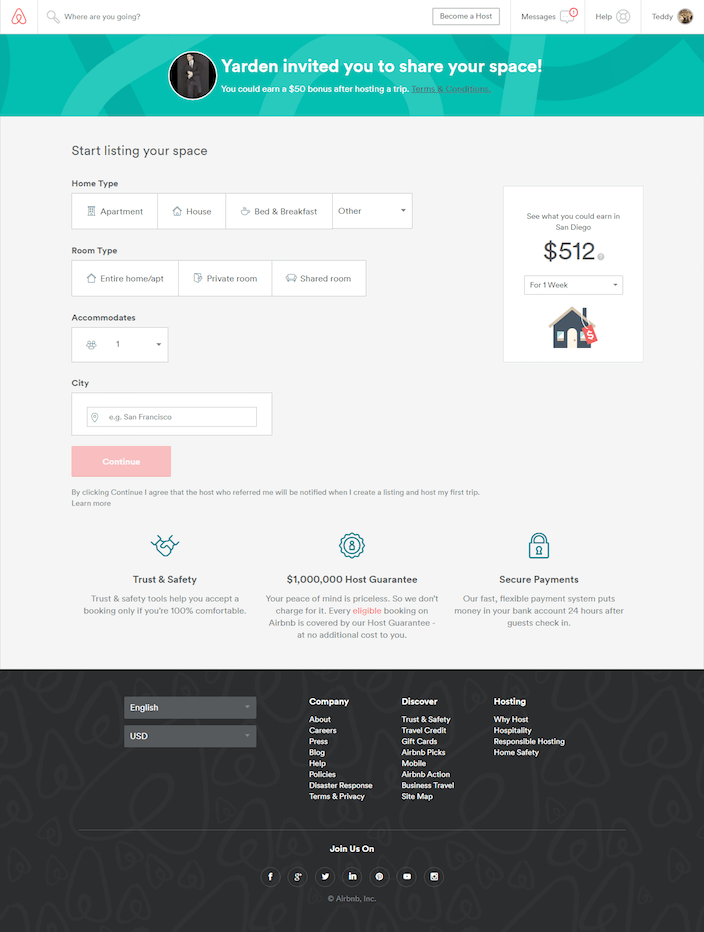
Apparently by renting out a private room that accommodates one in San Diego for a week, you could make up to $422. Not too shabby.
While the calculator might have you seeing dollar signs, it likely won’t convince you to let a stranger into your home. That’s why Airbnb includes some extra copy below their CTA button — to quell homeowners’ anxieties about hosting. It guarantees that:
- You’ll have trust and safety tools that will allow you to accept a booking only if you’re 100% comfortable
- Every eligible booking on Airbnb is covered for up to $1,000,000 in damages
- You’ll be paid 24 hours after your guests check in through a secure and flexible payment system
But is that enough to convince you? Let’s dissect.
Who this page is for: Potential hosts
Why this page works:
- It starts by enticing you with a $50 bonus, redeemable after hosting your first guest
- It appeals to humans’ universal desire for more money with the calculator
- Copy below the CTA button boosts trust
- The conversion process is broken down into segments. This is an effective tactic to use when a conversion requires more than one step, like in the case of listing your home on Airbnb. Breaking it down into manageable chunks makes it easier for your prospect to complete.
- The CTA button color is red, which pops against the gray background
Why it doesn’t work:
- It’s connected to Airbnb’s main navigation, which allows users to click away mid-signup if they want to.
- There are too many links in the footer of the page.
- Social media icons only serve as a distraction, allowing prospects to abandon the post-click landing page.
Here’s another Airbnb post-click landing page focused on the same goal:
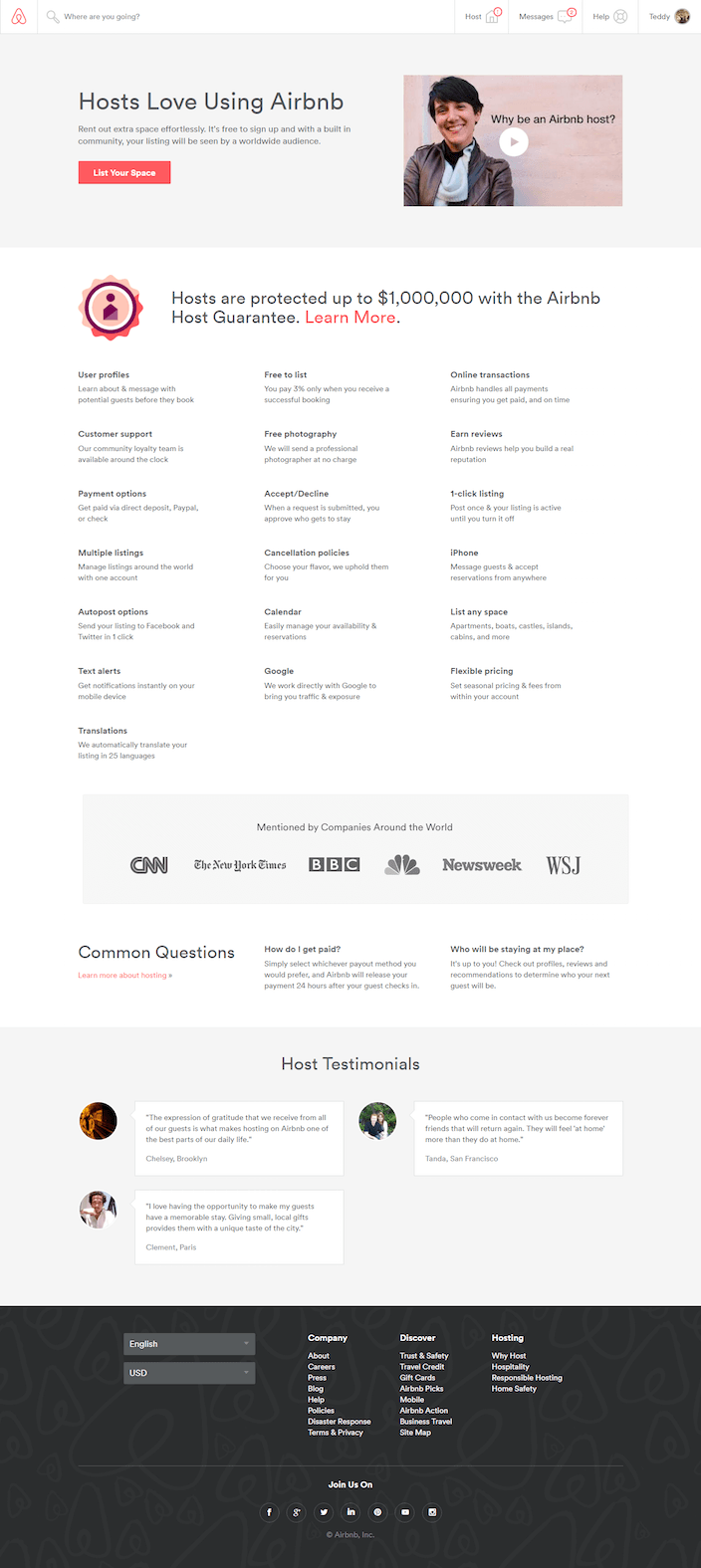
This one, however, uses different persuasive elements to make the same case for becoming a host. Let’s look at them individually.
Why this page works:
- A bright call-to-action against a dull background draws your attention.
- The video does a great job of giving you an inside look at how rewarding of an experience hosting can be.
- Next to the headline, the biggest text on this page emphasizes Airbnb’s Host Guarantee, which in part protects hosts from up to $1,000,000 in damages.
- Bite-size copy lists 19 different advantages of becoming a host.
- Authority badges on the bottom of the page associate Airbnb with well-known companies from around the world, like CNN, The New York Times, BBC, NBC, Newsweek, and the Wall Street Journal.
- Below that, they answer common questions like “How do I get paid?” and “Who will be staying at my place?”
- Testimonials from other hosts, complete with name and photo, reinforce that hosts enjoy their Airbnb experience just as much as travelers do.
Why it doesn’t work:
- The button copy “List Your Space” should be tested against “List My Space,” as it has been shown to increase conversion rate.
- The “learn more” link next to the text mentioning Airbnb’s Host Guarantee may help inform your prospect, and it will certainly take them off the page. This is something that could be included at the bottom of the page in a smaller, less distracting manner.
- A link that reads “learn more about hosting” under Common Questions distracts prospects from the task at hand. If they want to find out more about hosting, make them leave your page and navigate back to it from your main website.
- Why are there only three testimonials on this page instead of four? We know Airbnb has at least one more, so why not balance out a strange design by including it among the others at the bottom of the page?
- There’s no call-to-action at the bottom of this page. That means visitors have to scroll all the way back up to click “List your space” if they want to take action. Remember — you want to make converting as easy as possible. By including another CTA button at the bottom of your page, you give uncertain prospects a chance to warm up to your offer by reading your copy and testimonials and seeing authority badges.
2. To promote specific listings
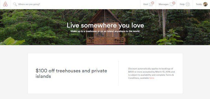
This one goes out to everyone who never got the treehouse of their dreams as a kid. For a limited time, Airbnb advertises a $100 coupon off treehouse stays and private island getaways.
We found out after watching a short, but engaging video that uses clips from the new Jungle Book movie as a primer to get travelers interested in spending a night in a treehouse.
And while Airbnb did a great job by closing the video with a clickable call-to-action (which, as we found recently, is something most marketers skip out on), the page it led us to was full of holes:
There were links everywhere to dozens of other Airbnb pages and even one to a service called “OpenWeatherMap.” When your prospect has clicked on a call-to-action like “Book now” at the end of a YouTube video, your focus on the following page should be to get them to book now. Here’s how this page did that, and how it didn’t.
Why this page works:
- Great message match establishes trust.
- Photos of the most beautiful treehouses and islands available help prospects imagine staying there.
Why it doesn’t work:
- If I landed here after clicking “Book now” at the end of a video filled with treehouses, chances are I’m interested in staying in a treehouse. While I don’t know anyone who wouldn’t want to stay on a private island, that offer shouldn’t be presented on the same page. Each category of rental should have its own page.
- As it stands now, the “Watch the film” link takes visitors to YouTube (off the site). Why not embed the video to keep visitors on the page? Once you’ve got your prospect on a post-click landing page, you don’t want to push them up your conversion funnel by sending them back to where they came from.
- This page is connected to Airbnb’s main navigation, making it easy to escape.
- There are way too many links on this page, including one to a completely different business called “OpenWeatherMap.”
- The call-to-action “See Available Places” could most certainly be replaced with something more compelling like “Discover More Picturesque Treehouses.”
Always remember: every promotion needs a page. For this one, we would’ve created two separate post-click landing pages: one for treehouses, and one for private islands. The more focused your page is, and the more tailored it is to the prospect’s interests, the more likely it will produce conversions.
3. To entice business travelers to use their service
As much as we all dream of exploring the world for pleasure, many of us will do most of our traveling on our employer’s dime.
For those traveling for work-related reasons, Airbnb offers businesses the opportunity to set teams up in spaces that are conducive to being productive.
After clicking a Google ad for “Airbnb for business,” we arrived at the page below:
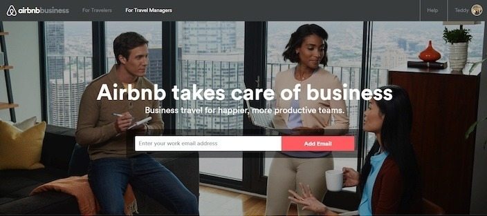
Again, while we landed here after clicking a Google ad, it still can’t be considered a true PPC post-click landing page. However, it does display some elements that give it that appearance.
Why this page works:
- The headline and sub-headline display a benefit. What will I get out of signing up for this service? A happier, more productive team.
- The short lead capture form only asks for email — a piece of information that’s very valuable to businesses, and easily handed over by prospects.
- Logos of brands like Salesforce, Google, and Soundcloud align Airbnb Business with authoritative brands.
- Minimal copy below the fold quickly conveys the benefits of signing up: Great value, better collaboration, convenient locations, and peace of mind.
- The $50 travel credit offer at the bottom of the page gives businesses yet another reason to sign up and invite their team members.
- There’s a CTA at both the top, and the bottom of the page (both to accomplish the same thing).
Why it doesn’t work:
- Again, this isn’t a true post-click landing page because it’s connected to Airbnb’s main navigation.
- Links on the page like “learn more” serve as a distraction to the prospect.
- Footers shouldn’t exist on a page like this one. The links on them will only push prospects away from the call-to-action.
4. To encourage people to buy gift cards
Here’s an Airbnb “post-click landing page” (more on those quotations in a minute) we reached after clicking through from Twitter:
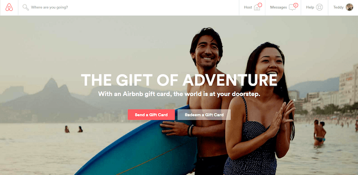
The social media headline read “Say #HappyHolidays to your favorite traveler with an Airbnb gift card.” So we figured, of course this link will take us to a focused Airbnb post-click landing page.
Not the case.
While it might be considered by some to be a true post-click landing page, since you “land” there after clicking through from Twitter, it’s not for one big reason (and a couple of other smaller ones). Here’s what they are:
- The biggest reason this isn’t a true post-click landing page is because it doesn’t have a singular goal. If the point of that Twitter post was to get me interested in purchasing a gift card for a travel enthusiast, the point of the page it’s linked to should be to convince me to do it. Why is there a CTA on this page to “Redeem a Gift Card”? We know — because it hasn’t been created specifically for buyers. One focused page with a single CTA would likely produce more conversions than this one for both purchasers and redeemers.
- It’s connected to Airbnb’s main navigation. That means if you get distracted by the little red number in the upper right-hand corner of the page, which indicates you have a new message, you could very well end up leaving this page and never coming back.
Creating a separate, standalone page for buyers with only one CTA would likely produce more conversions than the current one.
5. To prepare people for an upcoming conference
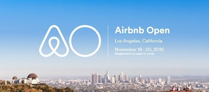
This “coming soon” post-click landing page for Airbnb’s “Open” conference starting in November has a few things going for it.
First, the fact that it’s even live drums up interest in the event nearly eight months ahead of time, and two months before registration opens.
Second, the beautiful photo alone is enough to convince me to travel to LA for the conference. Who doesn’t want to visit sunny Southern California?
But, what AirBnB’s team may have forgotten here is that post-click landing pages can be a great way to engage your audience. Right now it’s just a photo with minimum text that informs visitors when the next Airbnb Open is happening.
What it’s capable of doing is drawing prospects into the business’s sales funnel.
Here are two ways the page could accomplish that:
- Why not offer them a download of the major takeaways from last year’s conference in exchange for their personal information?
- What about adding an email capture form under text that reads “Be the first to know when tickets go on sale”?
While it’s great Airbnb is even leveraging “coming soon” post-click landing pages (most businesses don’t), there are certainly a few missed opportunities on this one.
Your turn
True post-click landing pages or not, Airbnb has used them in conjunction with great storytelling to create a powerful global brand.
Always connect all your ads to personalized post-click landing pages to lower your cost per customer acquisition. Start creating your dedicated post-click pages by signing up for an Instapage Enterprise demo today.

See the Instapage Enterprise Plan in Action.
Demo includes AdMap™, Personalization, AMP,
Global Blocks, heatmaps & more.
