Most ads don’t convert; the data confirms that because the average conversion rate is just over 4%. To ensure your ads don’t suffer the same fate, you must put the same attention and focus on dedicated post-click landing pages as you do with ads.
When your ads and post-click pages convey the same narrative, not only do you successfully meet user expectations, you also add credibility to the offer. Trust and credibility play a crucial role in getting conversions, especially for high ticket items such as finance platforms, where prospects are extra cautious about where to invest their money.
Let’s see how Gemini, a cryptocurrency marketplace, uses dedicated post-click landing pages to acquire new investors.
Google search ad for “bitcoin”
When prospects do a Google search for “bitcoin” they see the following Gemini ad:

The ad headline intrigues the prospect by claiming they can buy bitcoin in just 3 minutes and earn $10 for their first trade. The supporting copy is concise letting prospects know trading with Gemini is simple, safe, and secure.
The ad takes prospects to the following post-click page:
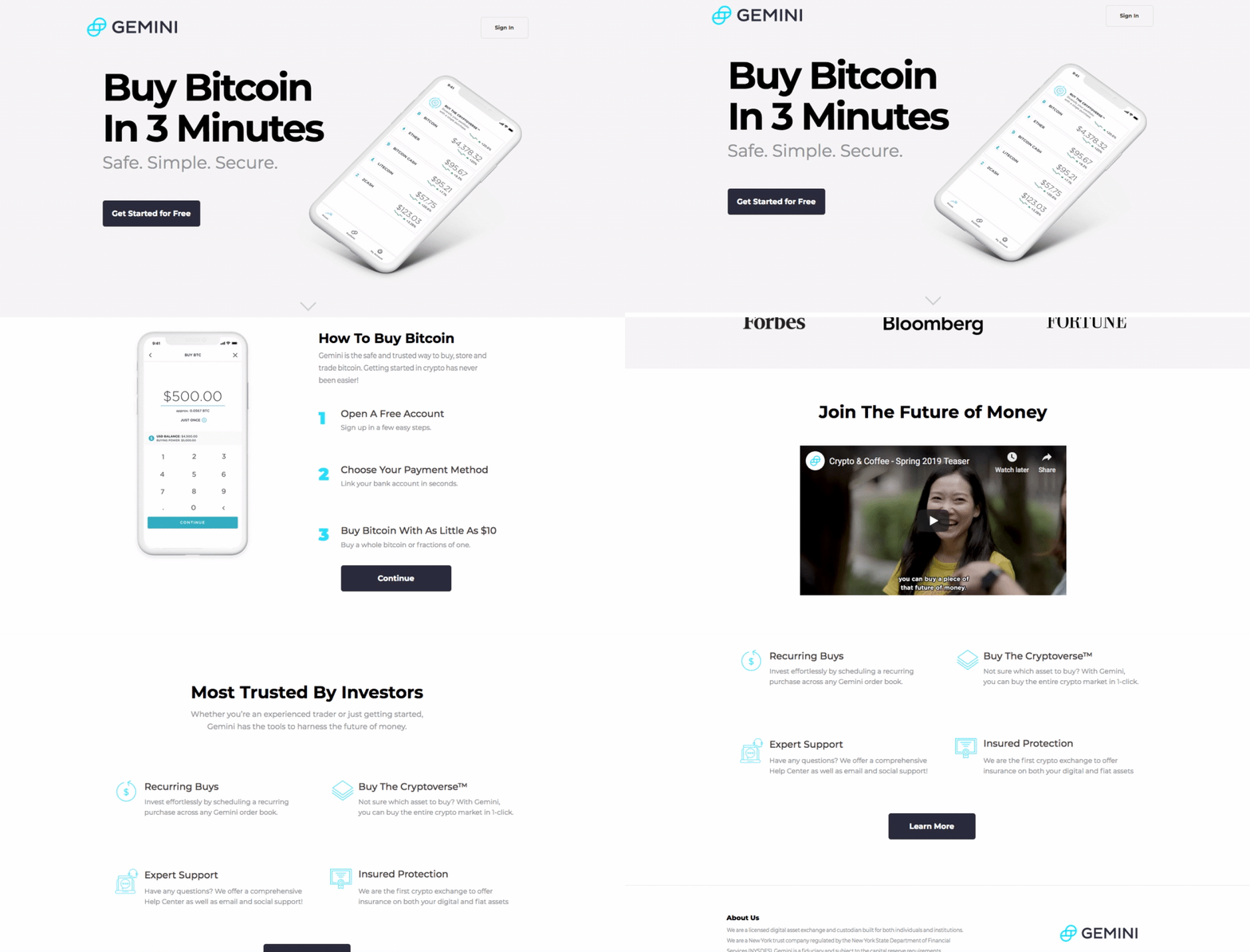
- The headline is perfectly message matched with the ad headline because Gemini allows you to buy bitcoin in 3 minutes. The subheadline restates the same “simple, safe, and secure” claim mentioned in the ad, making the prospect feel at ease they’ve landed on the correct page.
- The image demonstrates how the platform works by showing the marketplace’s dashboard with a list of cryptocurrencies and their respective rates.
- The CTA button copy also reiterates the offer in the ad and attempts to persuade users to get started for free on the platform.
- The featured section showcases reputable publishers like Forbes, Bloomberg, and Fortune. Each brand name is sure to add credibility to the Gemini platform.
- The video explains the Gemini platform featuring real people on the street asking questions and learning about the app and cryptocurrencies. How the service helps people buy bitcoin and join the future of money today.
- The “Most Trusted by Investors” section shows Gemini is for all kinds of traders, from experienced traders to novice. The bullet points in the section show the features of the service and the “Learn More” CTA button takes prospects to the registration page.

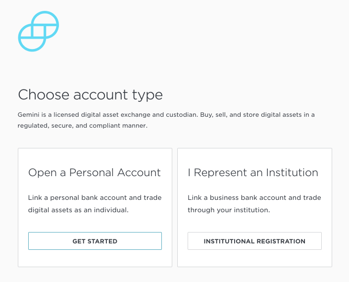
- The “How to Buy Bitcoin section simplifies the process of buying bitcoin through the platform in three steps. The image in the section shows how the process works and the “continue” CTA button directs prospects to a registration page where they can choose which kind of account they want to create.
The dedicated page follows through on the promise made in the ad, instantly gratifying prospects and reassuring them the platform is worth their investment.
When prospects search for the phrase “buy bitcoin” they see the following ad:
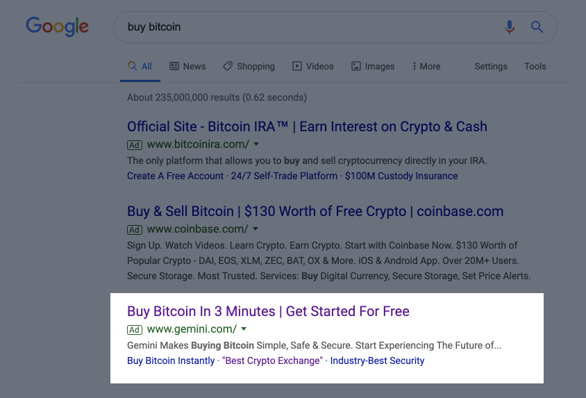
The ad headline is the same as the ad before, the copy is a bit more detailed and relates perfectly to the search query since it explains how Gemini makes buying bitcoin simple, safe, and secure. The ad goes to the same dedicated page above, as the message in the ad is the same one presented on the page.
Google search ad for “safest bitcoin wallet”
When a prospect searches for “safest bitcoin wallet” they see the following ad:
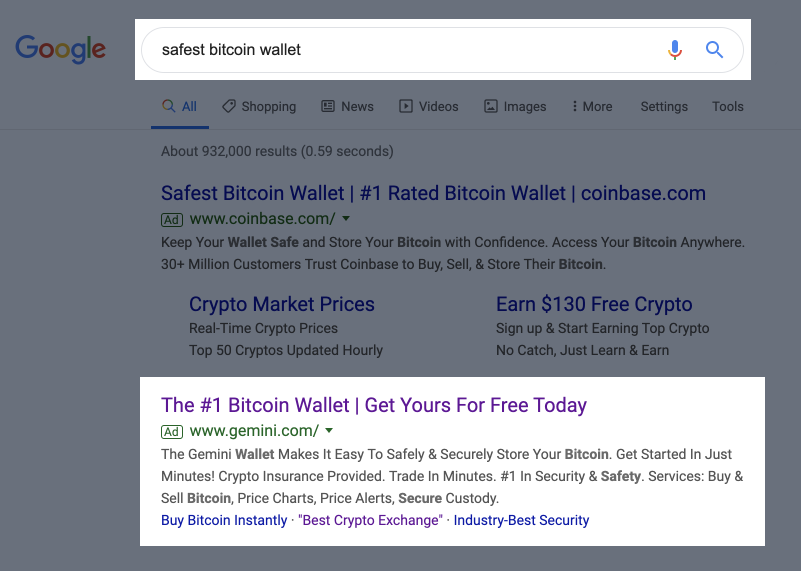
The ad headline states that Gemini provides the number one bitcoin wallet and prospects can get their wallet for free today. The copy elaborates on how the wallet makes it easy to safely and securely store bitcoin. It also mentions the services Gemini provides: buy and sell bitcoin, price charts, price alerts, and secure custody.
Prospects land on this page post ad click:
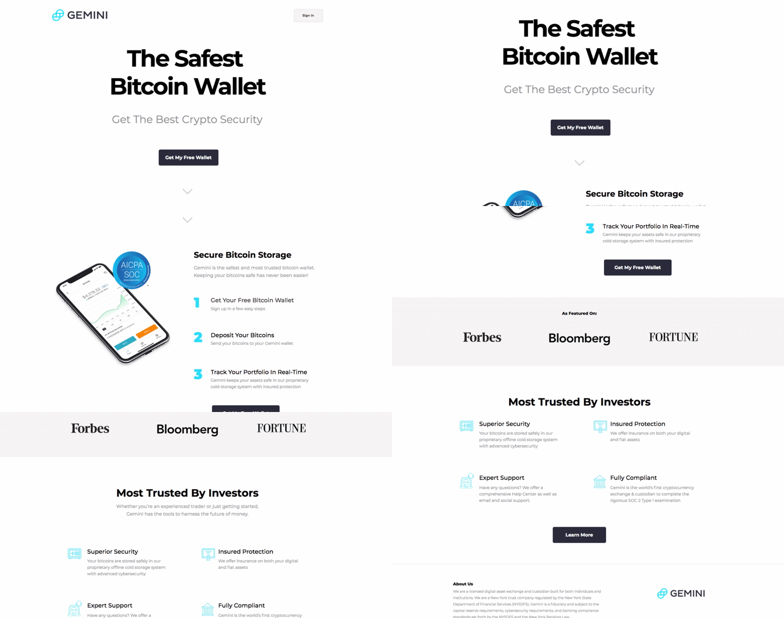
- The page’s headline follows up with the same claim that Gemini is the safest bitcoin wallet. The subheadline tells users to get the best crypto security.
- The “Get My Free Wallet” CTA button is relevant to the ad and page because prospects can get their free wallet by clicking and going to the registration page to sign up for their account.
- The “Secure Bitcoin Storage” section details why Gemini is the safest and most trusted bitcoin wallet in three easy steps. The image in the section shows a snapshot of the dashboard and features an SOC certification, which lets the prospects know they can trust the service with their personal information. The CTA button in the section also takes users to the registration page.

Furthermore, the headline and the “secure bitcoin storage” section are message matched to the search query for a bitcoin wallet.
Both the dedicated post-click landing pages told the same story as the ad that came before them. This message match consistency will likely lead to more conversions and people signing up with Gemini.
Now let’s see what would prospects see if Gemini had decided to connect their ads with the homepage.
In comparison, Gemini’s homepage
The homepage features all the products and services the crypto marketplace provides, demonstrating the difference between a browsing experience and a dedicated offer (like those above):
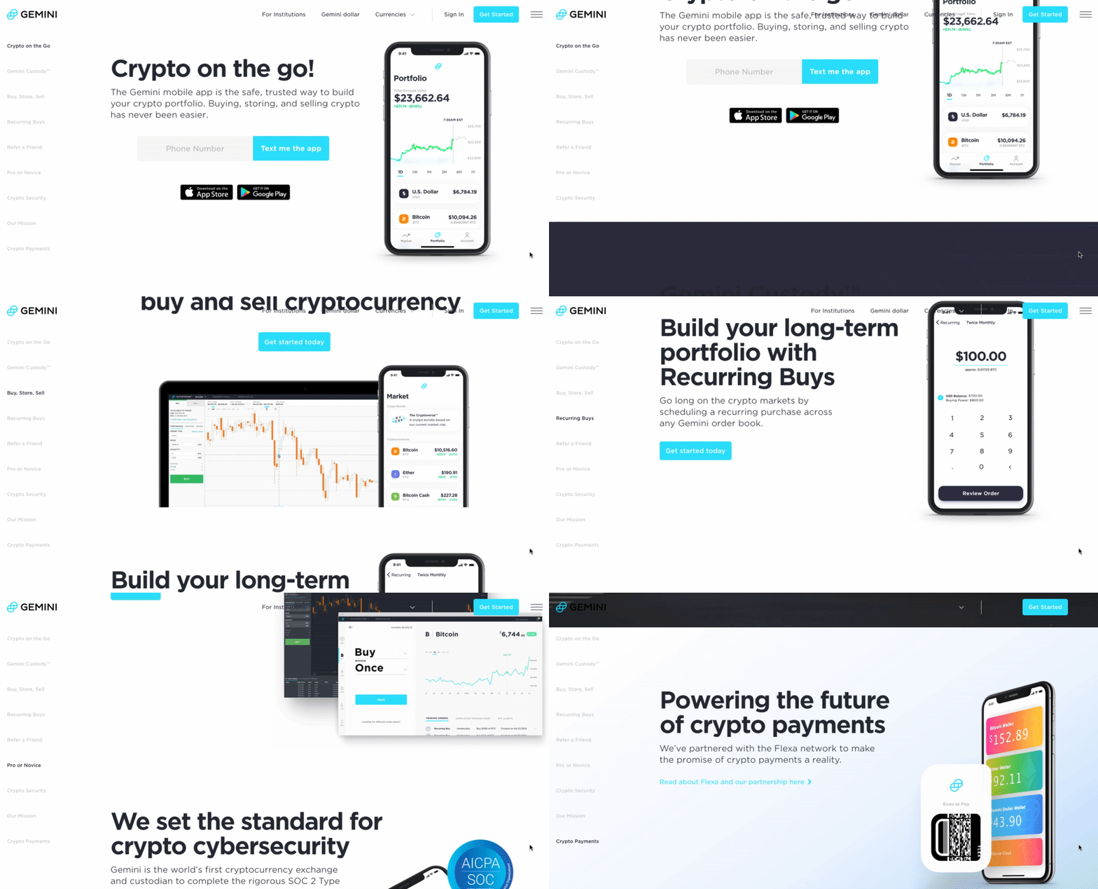
- The sticky navigation menu includes multiple links that take prospects to different website pages. For example, the “currency” tab lists all the currencies offered and someone could click away from the homepage very quickly.
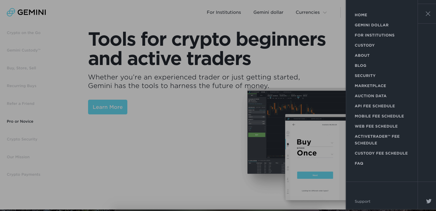
- The hamburger menu opens up more links for people to browse, including “Auction Data,” various fee schedules, “FAQ,” and more:
- The headline showcases Gemini’s UVP in that it provides “crypto on the go.” The subheadline features the mobile app and reassures prospects the app is the safe and trusted way to build their cryptocurrency portfolio where they can buy, store, and sell easily.
- The image shows what the mobile app looks like and features an image of an investor’s portfolio.
- The CTA buttons offer prospects three ways to get the app: via text, downloaded from the Apple store, or on Google Play.
- The features sections highlights all the platform’s capabilities in separate sections with relevant images of the mobile app. The sections go into detail on what each feature has in store for prospects. For example, the “refer a friend” feature allows users to refer Gemini to a friend and get $10 worth of bitcoin. The crypto security section features the SOC Type 1 badge.
- The page footer is overflowing with navigation links that help prospects go to different pages on the website and learn more about the platform:

The homepage is optimized to provide users a browsing experience; it is not focused exclusively on generating conversions and app downloads.
Always follow through with a dedicated post-click landing page
When you connect ads to your homepage instead of a dedicated post-click page, you risk losing the prospect’s interest in your offer and its credibility. Always follow through the claims made in your ads with a page that tells the same story and matches what the user is looking for.
To learn how to streamline the page creation process and provide 1:1 personalization at scale, sign up for an Instapage Enterprise demo today.

See the Instapage Enterprise Plan in Action.
Demo includes AdMap™, Personalization, AMP,
Global Blocks, heatmaps & more.
