By 2021, it’s expected the ecommerce industry will produce nearly 5 trillion in sales. Among the channels used to make those sales, Facebook has been called “a must to invest in.” Evidence seems to back that up.
Last year, over 7 million advertisers spent $55 billion on Facebook to reach over 2 billion of the network’s monthly users. Needless to say, ecommerce and Facebook are a power couple. Here are some tips for using the combination to your advantage, with critique of real ads.

Facebook ads for ecommerce: The three-step funnel strategy
When it comes to setting up a Facebook campaign for ecommerce, the confusion can start at the very beginning. Most people look at the goals offered on Facebook and immediately think conversions are the way to go.
While sales are the ultimate goal, few will buy your product the first time they see it. High-value conversions mostly happen after a user has interacted with your brand over multiple touchpoints.
Facebook marketers like Valentina Turchetti, Founder of YourDigitalWeb, and Brandon Thurgood of Disruptive Advertising, recommend using a three-step approach to earn users’ trust and maximize the efficiency of ecommerce ad spend.
1. Brand Awareness
If they don’t know who you are, they’re not likely to buy from you — no matter your product or service, or its success outside of Facebook. That’s the problem brand awareness campaigns solve.
By starting with a campaign like this one, you’re casting a wide net on Facebook. You’re getting your brand and product in front of as many users as possible. Valentina says:
The first campaign is focused on growing the page to increase the number of targeted fans. By “targeted,” I mean people who are really interested in investing in a related product or service.
In this campaign, the best idea is to start with a lighter, low-commitment offer. You’re not aiming, yet, for a sale or even a consultation. This is merely going to be used to inform the audience of how you can help them.
Brandon suggests using something engaging, like a video, to get Facebook users to stop scrolling and start paying attention. And, whether or not they see the whole video, you’ve set yourself up for step two of the strategy, affordably:
It’s not uncommon to have somebody watch 50% of your video and only pay about $0.05 for that video view. That’s nice, but it’s hardly a sale. Fortunately, now that they have learned about your company and engaged with your brand, you can put them into a Facebook audience and retarget them. At this point, you’ve paid $0.05 for this person to engage with your brand for the first time.
Now that they know who you are and what you offer, the next step is getting them to do more than watch, listen, or view.
2. Engagement
Imagine seeing two different Facebook ads for the same product: One has 500 likes, 50 comments, and 20 shares. There’s no interaction on the other.
Which are you more likely to engage with?
If you’re like most people, the one with likes, comments, and shares. This is known as social proof.
Offline, social proof could look like a line outside a restaurant, which would indicate its popularity. Online, social media is unique in this regard: Nowhere else can you see viewers’ reactions to ads. Not on search, Google display, YouTube, or in email.
The more positive engagement on your ad, the more likely viewers are to stop and interact with it. That’s why, after brand awareness campaigns, Valentina moves on to engagement campaigns. She says:
In the second phase, Engagement, my goal is to establish a relationship with the fans of the page. The goal is to receive likes, comments, shares, and maybe questions about how to buy the product or the service. In an engagement campaign, I usually use a video that immediately highlights the benefits, the advantages and/or the main strengths of a product or a service.
Here’s an example of one of her engagement ads:

The goal of this campaign was to reach 20,000 people and generate 50 interactions (likes, comments, shares). It ran for five days, spending 50 Euros (about $57) total, and it exceeded expectations, reaching 40,315 users, and garnering 69 likes, 22 shares, and messages that requested information about how to buy the oil.
Brandon recommends the same tactic, emphasizing the low cost of achieving high ROI at this stage. Campaigns like this, he says, can often cost around $0.30 per engagement. Combined with the low cost of a video view, this gives you two touchpoints at $.035.
These numbers will vary based on your audience, ad creative, product, placements, etc. While ads on the sidebar, for example, will cost less to run, they’re also likely to produce less impressive results: That includes clicks, and likes, shares, and comments, which you can’t get on a sidebar ad. Remember this as you work.
3. Click or conversion
With your two touchpoints, it’s time to solicit some higher commitment engagement. For Valentina, that means a conversions campaign, with which she’s had success in the past.
Brandon, though, takes a different approach:
We can now take this second audience of people who have engaged with our ad and put them into a traffic campaign that we can optimize for landing page views. At this point, our goal isn’t just to increase brand awareness—we also want them to visit a page on our site. You can often get clicks like these for about $0.50.
Including this campaign, we’ve now had 3 touchpoints with our customer, engaged with them in 3 different ways and we’ve spent $0.85 in total on that 1 individual. In contrast, if we had simply created a one-touch, conversion-focused campaign, the clicks would have cost $1.00 or more…for one interaction.’
With this strategy, you can generate 3x the interaction and pay less for it. Brandon offers proof from a campaign:
Keep in mind, even three steps to a conversion is a quick trip down the funnel. While it’s possible, it’s no guarantee. Depending on the value of the product you’re selling, what it is, the time of year, etc., a sale could take weeks or months to earn, and many more of the touchpoints above.
In her blog post, Valentina emphasizes the most crucial aspect to earning the sale: trust. Does your audience trust you? Your product?
If you’re creating Facebook ecommerce ads for an established brand, the process might look different. It may be faster. Here’s why:
The biggest draw to using Facebook is its targeting. Everyone knows the specificity with which you can reach new audiences on the network.
Among that powerful targeting, however, its most useful is the ability to create audiences from your own lists, traffic, leads, customers. These custom audiences can drastically cut down the time it takes to convert a video view, an impression, a click, to a sale.
If you’re an established brand with many customers or page visits, you can target these audiences based on their previous history. For example, you wouldn’t need to boost brand awareness to people who had already bought your product. They know who you are. They’ve purchased from you. For audiences like those, it may be more cost effective to go directly for the conversion.
Disclaimer: It’s also important to remember that, while it’s a powerful tool, you shouldn’t put all your eggs in Facebook’s basket. Data shows that ecommerce customers are more likely to progress through the customer journey on multiple channels (and spend more too), making a multi- or omnichannel strategy highly important to strive for. Facebook is just one of many platforms you should have a presence on.
A critique of 6 Facebook ads for ecommerce
You have a strategy, but what about the ads themselves? How should Facebook ads for ecommerce look? Find out through some critiques of what went right and what could be improved in the following ecommerce ads for Facebook:
Grasshopper
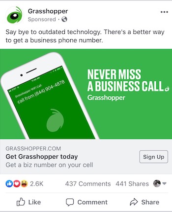
What this Facebook ecommerce ad did well:
- The green in this ad is likely to stand out against the largely blue and white news feed of scrolling users.
- The URL Grasshopper.com lets visitors know they’ll go to the business’s website.
- The text on the image makes good use of valuable space without violating the 20% rule.
- All the copy in this ad conveys complementary information. Nothing is repeated.
- The ad content makes it clear what the service does.
- The 3,000+ reactions on this post serve as powerful social proof.
- The hero image on the post offers a glimpse at what it will look like to use the service.
What could be improved:
- The post text could be rephrased to better convey the service’s ease of setup. How quickly can you be up and running? For a business, this is likely a common question.
- The CTA may perform better as the phrase “Learn more,” since people are unlikely to sign up for something they have little information about. Are they ready to sign up after seeing this ad? Probably not. If it were an ebook or a checklist, that’s a different story. But a full-fledged service? Doubtful.
CallRail

What this Facebook ecommerce ad did well:
- The logo quickly identifies the brand that this ad came from.
- The URL lets visitors know they’re going to the CallRail post-click page when they click through. This boosts trust.
- Body copy quickly and fully conveys the offer, and what it does to solve the customers’ problem.
- The word “Free” entices visitors to click through and claim the ebook.
What could be improved:
- The colors of this ad are the same as Facebook’s brand colors. It’s already in the sidebar, and difficult to notice. These colors make the ad nearly invisible.
- The headline is cut off. Grow your agency with…what?
- The image, while helpful as an identifier of the company, does not draw attention or convey anything about the offer. Why not an image of a colorful ebook cover? The word “Free”? There’s a lot of empty space here that could be utilized better.
CSU San Marcos

What this Facebook ecommerce ad did well:
- The headline conveys the benefit of the offer: Advance Your Career In Cybersecurity.
- The image of the young, well-dressed woman on her laptop is likely reflective of the target audience. A hero shot like this helps viewers see themselves in the position of the model.
- The body copy emphasizes the offer using authority with “Master’s in Cybersecurity.”
What could be improved:
- The headline, while conveying a benefit, is vague. The cut-off body copy would convey a better benefit: “Learn From Experts…” Even “Earn Your Master’s in Cybersecurity” would be a better option.
- The body copy is cut off, keeping us from seeing the additional benefits of enrolling at CSUSM.
- The acronym CSUSM is a mystery. What does it stand for?
- The image and headline are repetitive. To maximize effectiveness, the headline and image should convey two different but complementary benefits.
- The model should be looking in the other direction, or the headline should be moved. Studies have shown that users’ gaze follow the gaze of models. Those looking at this ad would look right, and not toward the headline. If the headline and model swapped places, the gaze of the model would direct the viewer toward the text. As is, the text pulls the user in, the gaze of the model pushes them right, out of the margin.
Grin

What this Facebook ecommerce ad did well:
- The reactions, total comments, and shares on this ad makes it hard to ignore the social proof.
- The text “pay no commission” conveys a benefit that similar services can’t match.
- The text “total control” implies that you’re in charge of your own success.
What could be improved:
- The unique selling proposition of this offer is missing. Why should we choose Grin?
- The headline and text use very similar wording. They don’t complement each other at all.
- The image here doesn’t convey much of anything at all.
- These brand colors are too subtle to be noticeable by scrolling Facebook users.
Outbrain
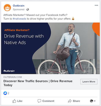
What this Facebook ecommerce ad did well:
- A question in the ad draws viewers in.
- The benefit of using the product is clear: Drive Revenue with Native Ads.
- The text directly addresses the audience: Affiliate Marketers.
- The orange text stands out from a primarily white and blue platform.
- The model is gazing toward the headline, drawing viewers toward it.
What could be improved:
- The headline “Drive Revenue” does convey a benefit, but one that’s likely too vague to earn maximum clicks.
- Social proof on this ad is not strong enough to grab users scrolling through Facebook.
- The image could be more colorful, attention-grabbing, and related to the offer.
Shopify
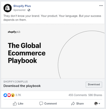
What this Facebook ecommerce ad did well:
- This ad’s social proof makes it a must-view as you’re scrolling through your News Feed.
- The Shopify logo speaks to users with a brand name that has high equity.
- The word “Global” makes the resource sound valuable for worldwide ecommerce businesses.
- The CTA is relevant to the offer.
What could be improved:
- The black and white creative makes it easy for Facebook users to scroll past this ad.
- The image of a half circle doesn’t convey anything about this ecommerce playbook. Why not show the cover page so users know what they’ll get by downloading?
- The benefit of claiming this offer is lacking. Why should we download?
- The word “Free” is missing here. This resource is very likely free, and the word has been known to boost clicks and downloads. Why not use it?
Boost Facebook ecommerce conversions
For ecommerce businesses, there are few platforms more valuable than Facebook. With a funnel that takes you from unknown to trusted in the minds of visitors, and critiques that will help build an ad worth clicking, these tips should have your ecommerce business ready to go on Facebook.
Instapage is focused on post-click landing pages and optimizing ad spend, always has been and always will be. Get a customized demo today and experience the power of Instapage yourself.

See the Instapage Enterprise Plan in Action.
Demo includes AdMap™, Personalization, AMP,
Global Blocks, heatmaps & more.
