When you look at some of the most circulated A/B tests on the internet, it’s easy to get hypnotized by dollar signs.
It’s true, Expedia did once generate $12 million simply by removing one field from a post-click landing page form. It’s also true that results like these are rare. Unfortunately, many DIY post-click landing page optimizers don’t understand that.
Enticed by the idea of winning big, they approach A/B testing with a lottery mentality — randomly testing every page element hoping to eventually produce a worthwhile lift.
Spoiler alert: they almost never do.
Here are 6 questions you should be asking when A/B testing post-click landing pages to make sure you don’t end up wasting time and money with pointless tests.
1. Why am I A/B testing my post-click landing pages?
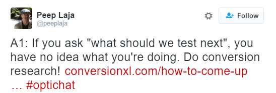
The answer to this might seem obvious at first (to boost my conversion rate, what else?), but without a specific reason for testing a particular element, you shouldn’t be testing at all. A red button vs. blue button test “just because” will only waste your valuable time. In the words of Peep Laja over at CXL:

You might be a copywriting fanatic who thinks that changing up a headline will cause a huge uplift in conversions; or maybe you’re a graphic designer who believes that your hero shot is what’s going to skyrocket signups. Whatever your inclination, it’s important to disregard your desires in favor of data. Peep explains:
You might be optimizing the wrong thing. Spending your time on something else is where the gains are. Maybe it’s the form, maybe it’s the pages they were on before they got to the quote request page, maybe something else.
Or you might spend tons of effort on your e-commerce product pages, only to find that even if you get wins, the financial impact on your business is negligible. You might be optimizing in the wrong place. Significant gains would be had if you’d spend your time fixing your biggest leaks instead.
This is where it’s important to ask “Why should I test?” instead of “What should I test?”
Every test you run should begin with research. Fortunately there are endless tools available to do-it-yourselfers who want to boost their conversion rates.
- Google Analytics allows you to figure out where your users are coming from, how they’re behaving, and the overall effectiveness of your web pages.
- Qualaroo helps conversion optimizers like Peep run surveys to find out from users themselves why they’re behaving a certain way on a web page.
- Crazy Egg and other heat mapping software will help you determine what page elements users are paying most attention to.
The second step to determining a worthwhile A/B test is to gather insight from that data. For example, if you find out on a survey that users are leaving your web page because it’s too confusing, try changing up your message. Consider testing a new page with more comprehensive copy, or one with infographics to help your users better understand the content.
From those insights and that plan, you can form a hypothesis that looks something like this:
“Through the collection of user survey responses, I found that many visitors find the content of this post-click landing page to be confusing. Because of that, I believe that changing the copy will result in better comprehension.”
At this point, the only thing left to do is determine how you’re going to measure the result of your test. For an A/B test that compares copy, a metric like scroll depth (how far down a user scrolls on your page), or time spent on the page, could indicate better comprehension. Or, if you’re still using exit surveys, a decrease in responses that indicate the page is too confusing would obviously prove the test succeeded.
This process can be easily replicated with any kind of data. Just remember to:
- Always research first to determine what needs testing.
- Come up with a hypothesis for your test.
- Determine how you’ll measure the results.
Forego these three steps and you’ll be more likely to waste time and money than boost conversions.
2. Will A/B testing my post-click landing pages produce the biggest lift in conversions for me right now?
Remember that your post-click landing page is just one part of your marketing funnel. That means uplifts in conversions don’t always have to come from bigger buttons or different colors. Many times more signups, sales, and downloads come as a result of optimizing other things, like traffic. Think of it this way…
If 1,000 people have visited your post-click landing page and your conversion rate is 10%, you’ve converted 100 people. You could spend your time trying to figure out how to optimize your page to improve conversion rate to 15% or 20%, and convert between 150 and 200 people, or you could generate 10,000 more visitors at the same 10% conversion rate and convert 1,000 people.
The answer to a more profitable campaign isn’t always on your post-click landing page. Many times it’s found elsewhere. Speaking of…
3. Am I generating the right traffic?
Every marketer knows that the success of a campaign hinges on the right targeting. So before you start optimizing your post-click landing page, check to make sure the people who land on it are the right people.
Ask yourself:
- How long are people spending on my page? If it’s a suspiciously short amount of time, the people landing there most likely didn’t want to be on it in the first place.
- Are the PPC networks I’m using trustworthy? Take a look at the networks you’re using to promote your page. Do they use sneaky popups or redirects to get unsuspecting internet users to visit your page?
- Am I bidding on the right keywords? One study found that only 12% of keywords produce 100% of the conversions. Yours might not be as profitable as you think.
- Am I promoting my page through channels that my prospects use? 72% of Bing’s users are over 35, females are the dominant user base on Pinterest, and B2B marketers find the most success on LinkedIn. Keep in mind that different audiences hang out in different places online.
The answers to these will help you figure out whether traffic is to blame for your low conversion rate.
4. What are my most successful paths to conversion?
When it comes to their website visitors, the best conversion optimizers follow the old proverb, “To know where you’re going, you must first know where you’ve been.”
Tracking your post-click landing page visitors at every step of the buyer’s journey will help you make informed decisions about what to A/B test. Use tools like Google Analytics to work backwards from the page you get the most conversions on, and ask yourself “how did my customers get here?”
If you find that most of your customers buy your product after viewing your pricing page, consider testing your current post-click landing page against a version with similar pricing information. If you notice that your page titled “Our clients” is a stop in the buyer’s journey, think about A/B testing your page against a version that includes logos of high-profile customers.
Never forget that while your post-click landing page is standalone, it’s the last stop before your prospects convert. So it’s important to take into account all the offers they claim, the pages they visit, and the emails or ads they click to get there.
5. Is my page optimized for mobile?
The mobile revolution has come and gone — everybody knows that more people access the internet via handheld devices than desktop computers today. Still, many post-click landing page creators prioritize desktop design over mobile usability. And oftentimes they’re eager to improve that desktop design before making sure their post-click landing page is optimized for smaller devices.
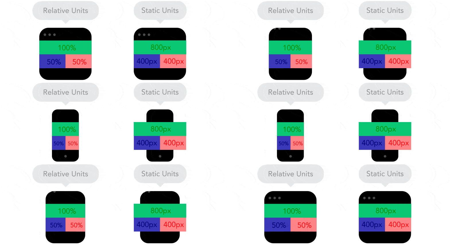
Make sure that when you build yours, you use responsive design (or a platform like Instapage that allows you to build pages that come pre-optimized for mobile), so that your post-click landing page will display well across devices of any size. Here’s how a page with static units will respond to different sized devices compared to one that’s responsive:

Otherwise, your customers may miss key elements they’ll have to pinch and zoom to find. With so many products and services like yours on the internet, they won’t waste their time struggling to navigate your post-click landing page with their thumb and forefinger — they’ll just leave and find a better one.
6. Have I done my homework?
You’re not trying to reinvent the wheel here — post-click landing page design best practices already exist. If you’re thinking about trying a turquoise CTA button, or using a gif as a featured image, chances are someone has done it before you.
There’s no need to test things that are already commonly understood. Everyone knows that navigation links kill conversion rate. Marketers everywhere know that people don’t like reading big blocks of text. So there’s no reason to test your page against versions with navigation or big blocks of text. We already know they won’t work.
School yourself in post-click landing page design before you waste time figuring out things that are already commonly known. Based on research, your post-click landing page should:
- Include a benefit-oriented headline and subheadline.
- Incorporate media like videos and infographics to explain concepts in a visual way that’s engaging and easy to understand.
- Have minimal text, organized into easily readable chunks.
- Not have any outbound links (in the navigation, the copy, or the footer) to pages on your website or any other to keep people focused on converting.
- Use social proof to let visitors know your service is valuable to others.
- Have a short form so that users won’t have to work hard to convert.
- Use a strong call-to-action to get people excited about claiming your offer.
- Include contact information so people can reach out to your customer service representatives.
There’s no sense in testing your page unless you’ve started with a strong design in the first place. A/B test your post-click pages to see which version better engages your audience and brings in the most conversions. Also remember to create personalized post-click landing pages to lower your cost per customer acquisition. Start creating your dedicated post-click pages by signing up for an Instapage Enterprise demo today.

See the Instapage Enterprise Plan in Action.
Demo includes AdMap™, Personalization, AMP,
Global Blocks, heatmaps & more.
