Creating email landing pages gives you access to a marketing channel that generated $38 in ROI for every $1 spent.
Sounds too good to be true, right? Well it’s not, and you do.
For ten years in a row, marketers report that email has produced a higher return on investment than any other channel.
Today, influencers like Neil Patel and industry leaders like HubSpot combine emails with landing pages to deliver a one-two punch that gets prospects converting like no other medium.
What is an email landing page?
An email landing page is a standalone web page that uses persuasive elements like testimonials, contact forms, and benefit-oriented copy, to convince visitors to convert on an offer. They’re reached after a prospect clicks on a link within an email.
Let’s take a look at how 20 pros create successful ones.
(Keep in mind, for shorter pages, we’ve shown the entire page. However, for longer pages, we only displayed above the fold. You may need to click through to the page to see some of the points we discuss and some examples may be A/B testing their page with an alternate version.)
1. LinkedIn
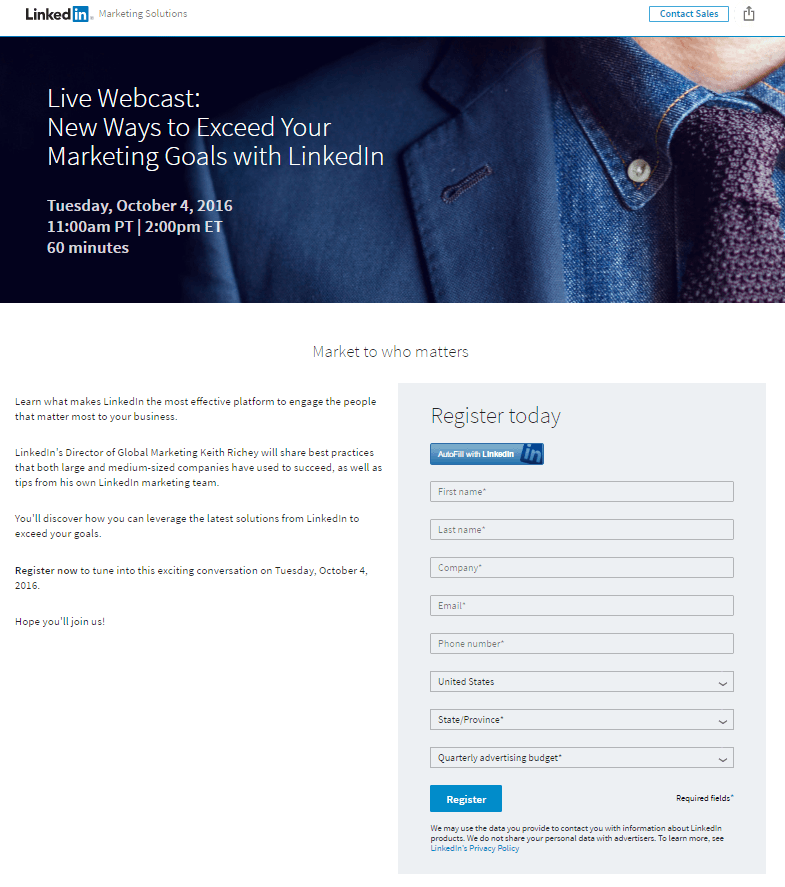
What they did well:
- The headline contains a benefit: Learn new ways to exceed your marketing goals with LinkedIn.
- An auto-fill button allows visitors to skip the form by importing information they’ve already submitted to LinkedIn.
- Text below the headline lets readers know when the webinar is and how long it will take.
- A photo introduces the speaker to the visitors virtually.
What to A/B test:
- The image of a man in a tie doesn’t really relate to the webinar topic.
- Numerous links on this landing page give prospects an out in the logo, the footer, and the “contact sales” link.
- The CTA button is tiny and it doesn’t draw prospect attention.
2. List Building School

What they did well:
- The headline uses compelling words like “exclusive,” “top,” and “free,” to convey the value of the offer.
- An image of the playbook serves a visual representation of the offer.
- An unlinked logo doesn’t drive prospects to the homepage from the landing page.
- Photos humanize the contributors to the playbook.
- Minimal copy makes processing this landing page easy for visitors.
- Company badges showcase all the well-known publications speakers.
What to A/B test:
- Social share buttons on the left sidebar make reading the copy difficult.
- A “support” link allows people to abandon the page before converting.
3. HubSpot
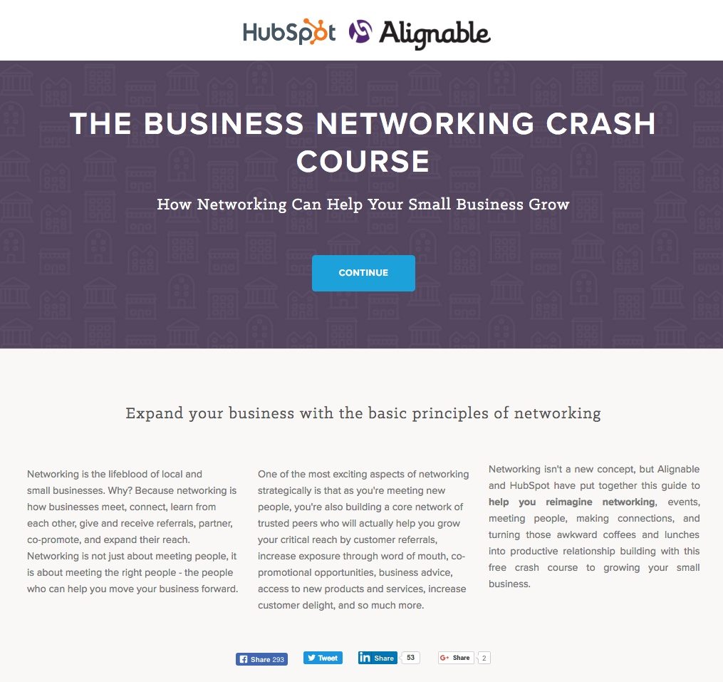
What they did well:
- A non-linked logo keeps prospects from escaping to the homepage.
- The headline and subheadline together convey a benefit.
- Bulleted copy describes the content of the course.
- A brief slideshow gives prospects a sneak peek of what’s inside the ebook.
- An FAQ section anticipates and answers objections before they’re made.
- Multiple cooperative CTAs work together to get prospects to convert on different parts of the page.
- A non-existent footer doesn’t distract the visitor from converting.
What to A/B test:
- Social buttons make it too easy for visitors to abandon this page without converting.
- A 10-field form might be intimidating enough to send prospects running for the hills.
- A message below the CTA states that by converting, prospects authorize HubSpot and Alignable to contact them.
4. Mixpanel

What they did well:
- A countdown timer conveys scarcity. Prospects need to act before the clock hits zero if they want access to the Fireside Chat.
- A schedule helps prospects coordinate time to attend the webinar.
- The arrow under the CTA encourages prospects to scroll down the page for more information.
- The detailed schedule lets visitors know what to expect during the chat, and when.
What to A/B test:
- The headline doesn’t convey a benefit.
- The graphic in the background makes reading the page difficult.
- Links to the speaker’s LinkedIn page, brand social media accounts, and the company “contact” page allow people to escape without converting.
5. Kabbage
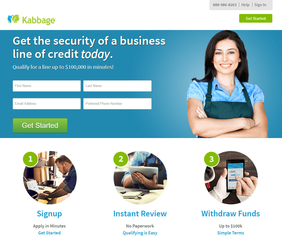
What they did well:
- The headline conveys a benefit, and uses the word “today,” which emphasizes immediate results.
- Multiple cooperative CTAs work together to get the prospect to convert.
- The subheadline adds specificity to the offer by describing how big of a credit line, in dollars, the prospect could secure by converting.
- Three quick images explain the service simply to the visitor.
- Four lines of copy below the images describe more benefits of using Kabbage.
What to A/B test:
- Outbound links in the logo, social buttons, and a packed footer allow prospects to escape before claiming the offer.
- The model in the featured image is staring at the viewer. Studies have shown that when we see people staring at us in photos, we’ll stare at them instead of the CTA. Placeholder text within form fields can distract people from completing them and strain cognitive processes, studies from NNG show.
6. Upwork

What they did well:
- The headline is benefit-oriented and tells prospects exactly what they’ll get in return for watching the webinar.
- Bulleted copy quickly conveys the benefits of watching the webinar replay.
- A bright CTA button draws visitor’s attention, even though the green accent color was already used in the headline.
- Photos and short bios both humanize and showcase the expertise of the speakers.
What to A/B test:
- A hyperlinked logo has the potential to draw visitors to the homepage.
- Social media links in the footer may tempt people to abandon this page without converting.
7. Neil Patel

What he did well:
- A headline that promises “secrets” capitalizes on our desire to be in the know, gain little-known strategies to get a leg up on our competition.
- Bolded words draw our attention to important phrases.
- The image of Neil humanizes his brand.
- Multiple, cooperating, in-your-face CTAs capture prospect attention.
- Company badges showcase all the well-known brands Neil has helped grow. If he can help them, he can help you, too.
- Bulleted copy communicates the benefits of the offer.
- Numbers add specificity to the offer “Over 150+ hours of actionable hacks from 30+ of the most respected marketers.”
- A countdown timer leverages the power of scarcity.
- Short bios highlight the experience of each speaker.
- A schedule helps visitors coordinate time to attend the webinar.
What to A/B test:
- A link to the “Contact Us” page serves as an escape from the page. A click-to-call phone number and email address listed on the page would keep visitors from abandoning.
- A different pose in which Neil gazes at the CTA button might help guide visitors to the CTA button
- The red CTA buttons could potentially draw even more attention if they were a different color. The page uses red in multiple places, including all of the bolded text.
8. Demand Gen Report

What they did well:
- The how-to headline implies the visitor will learn something by downloading.
- The word “now” takes advantage of our desire to get immediate solutions.
- A non-existent navigation menu keeps people focused on converting.
WWhat to A/B test:
- The 7 required fields might intimidate prospects into abandoning the page.
- A hyperlinked logo makes escaping to the homepage too easy for visitors.
- Paragraphs of text should replace with bullet points for easy scanning.
- The CTA button color blends in with the rest of the page. A color other than blue would pop more against the white background.
9. Owners.com

What they did well:
- A question headline speaks to readers by addressing them directly with the word “you.”
- The subheadline conveys a benefit. Saving thousands sounds appealing, doesn’t it?
- Bulleted copy expands on the benefits of converting.
- An arrow serves as a visual cue to guide the viewer toward the form.
- The CTA should be according to the offer. Instead of “submit” this refers to listings
What to A/B test
- The busy map in the background makes reading the page content difficult.
- A hyperlinked logo to the homepage serves as an avenue of escape for visitors.
- Social media buttons distract the user from completing the form.
- A pre-checked email opt-in might grow the quantity of Owners.com’s list, but not the quality. If they want to generate subscribers who want to engage with your email content, allow prospects to check that box themselves.
10. Content Marketing Institute

What they did well:
- Bulleted copy explains what the webinar is about, when it is, and how long it will take. Without it, prospects might not know whether they have time to attend.
- Short bios of showcase presenters’ accolades.
What to A/B test:
- The headline on this page is missing. Why should visitors stick around to read the rest of the copy?
- An abundance of text makes this page way too much of a chore to read.
- A long form has the potential to intimidate prospects into leaving this page.
- The CTA button is tiny and hard to notice, and it’s orange — the page uses this color multiple times on this email landing page.
- The call-to-action is unremarkable. Outside of “Submit,” it doesn’t get much more boring than “Register.”
11. eMarketer

What they did well:
- The image serves as a visual representation of the offer.
- Bullet-pointed copy quickly communicates the benefits of downloading.
- The CTA button pops on the white background. Blue isn’t used anywhere else on the page.
- The IBM Marketing Cloud logo adds authority to this offer by associating eMarketer with a well-known brand.
What to A/B test:
- A long, 13-field form may scare prospects off this page.
- A pre-checked opt-in box may grow eMarketer’s email list, but it might not produce high-quality subscribers.
- The call-to-action could be much better. Instead of “Submit,” why not “Show Me The Trends”?
12. Simply Measured
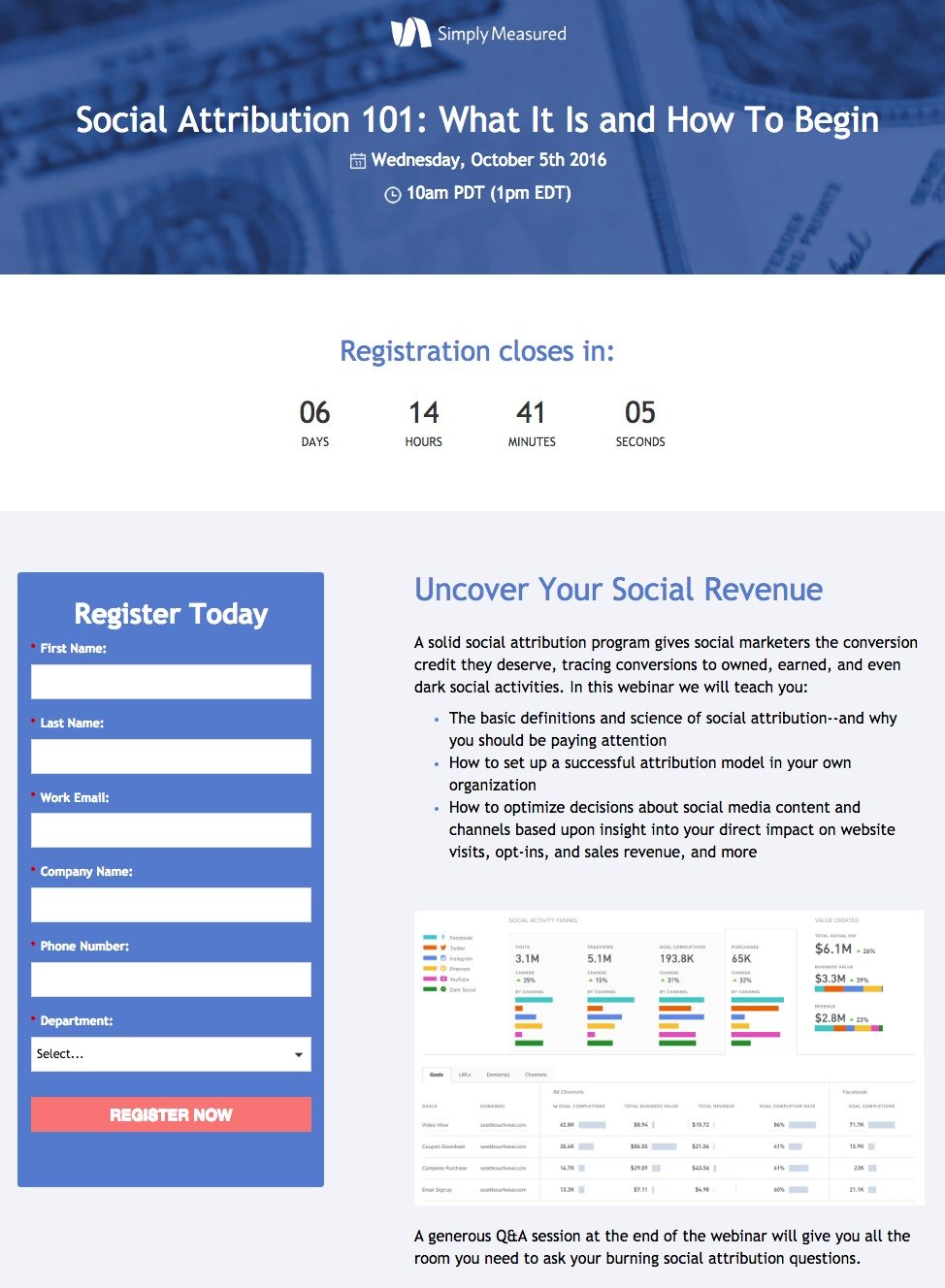
What they did well:
- The “how to” headline implies that the prospect will learn something by attending the webinar.
- The countdown timer conveys scarcity by letting visitors know they’re only able to sign up for a limited time.
- Bulleted copy communicates the benefits of the offer to the prospect.
- Bios and photos introduce the speakers and showcase their accomplishments.
- The red CTA button stands out well on a form with a blue background.
What to A/B test:
- 6 required form fields force prospects into handing over their information. Will they really be willing to give up their phone number to attend this webinar?
- Numerous outbound links in the logo and footer let visitors escape to the homepage before they register for the webinar.
13. Gartner

What they did well:
- The logo isn’t linked to the homepage, which means prospects won’t be able to flee before they convert.
- The “how to” headline promises readers they’ll learn something if they convert.
- Powerful statistics within the copy convince visitors they should know about personalization.
- Bulleted copy lets prospects know what they’ll learn by converting.
What to A/B test:
- The CTA button color is bland. It doesn’t stand out to the prospect at all.
- The call-to-action isn’t tailored to the offer. “Submit” needs to replace something more compelling.
- Social media links allow prospects to escape the page before converting.
- Two outbound links beneath the form are paths off the page.
14. Bynder-Forrester

What they did well:
- A bright blue CTA button jumps out to the prospect on a white web page.
- Date and time details help people schedule time to attend the webinar.
- A bio and photo get the visitor acquainted with the speaker.
- Bulleted copy explains exactly what the webinar will cover.
What to A/B test:
- The word “free” takes advantage of our desire for benefits at no cost, but it should be more prominently displayed.
- Links in the logo and in a collapsible menu allow the prospects to escape this page before they convert.
- This headline doesn’t communicate a benefit at all. What will digital asset management help prospects accomplish?
- A link to the speaker’s LinkedIn profile and a busy footer both distract visitors from completing the page’s goal.
15. Avast

What they did well:
- The text “Protecting 230 million people” in the upper-right uses social proof to persuade the visitor that Avast’s product is valuable because it’s widely used.
- A blue CTA button contrasts this background well.
- A 30-day money back guarantee makes prospects comfortable with purchasing.
- The phrase “Offer ends September 22” uses scarcity to pressure the visitor into making a decision.
- An infographic helps people visualize the kind of service they’ll get with each Avast plan.
- The blue CTA button pops on the white form, and the text below it tempts the prospect with a discount.
- The subheadline “Over 25 years of virus-fighting experience” builds trust with the visitors. If you’ve been in business 25 years, odds are you know your stuff.
- Company badges align Avast with some well-known brands.
What to A/B test:
- A hyperlinked logo allows prospects to flee to the homepage.
- The headline is benefit-oriented, but that benefit could be stronger.
- A footer complete with a sitemap gives visitors way too many outs.
16. Massachusetts General Hospital

What they did well:
- The CTA button pops off the white page.
- A “best hospitals” badge adds authority by highlighting Mass General’s award from US News.
- The word “your” speaks to readers directly. “You” is the most powerful word in copywriting.
What to A/B test:
- The headline and copy don’t trigger enough emotion in readers to compel them to donate. What will their money ultimately help Mass General do? “Hire world-class physicians” isn’t enough. The landing page designer needs to prove that this is a cause worth giving to.
- Links to the homepage and the footer allow prospects to escape without converting.
- Social buttons on the left margin act as escape routes off the page.
- A long form might scare the prospect from inputting their personal information.
17. Hinge Marketing

What they did well:
- A click-to-call button in the upper-right corner of the page allow people to contact the team in just one click.
- The word “free” emphasizes the no-cost nature of the offer.
- Bullet-pointed copy describes what this perticular webinar is going to cover.
- The form follows the visitor as they scroll, making it easy to fill out wherever they are on the page.
- The CTA button color grabs prospect attention.
What to A/B test:
- A navigation menu makes it easy for prospects to abandon the page, and as does a busy footer.
- The word “free” is compelling, but only if you can see it. The page can use larger font in the headline for easier reading.
- Without a bio or photos of these speakers, how will we know who they are? Why should we listen to their advice?
- “Submit” on the CTA is unconvincing. Something more relevant to the offer, like “Save My Spot,” would likely perform better.
18. Vertical Measures
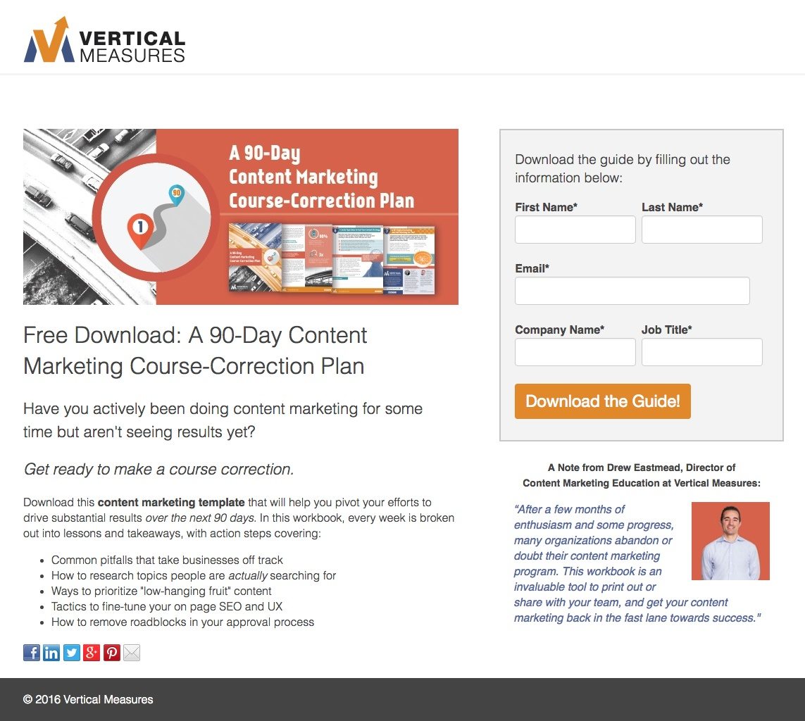
What they did well:
- The word “Free” is compelling. Who doesn’t like free stuff?
- Bulleted copy previews what the prospect will be able to do with the template.
- The CTA button color pops off the gray form.
- A minimalistic footer only includes copyright information.
What to A/B test:
- A hyperlinked logo allows prospects to flee to the company’s homepage.
- The testimonial would be more powerful if it was from someone who wasn’t a part of the Vertical Measures team.
- Social media buttons make this page easier to abandon. Your “thank you” page is a better spot for them.
- More white space would let everything on this email landing page “breathe” more, allowing each element to draw more attention.
19. Moburst

What they did well:
- A short form makes converting on this page easy.
- An image of the research serves as a visual representation of the offer.
- Company badges align the brand with some powerful businesses.
- An orange button pops on the white page.
- A non-hyperlinked logo keeps prospects from escaping to the homepage.
What to A/B test:
- This headline is awkwardly written, which makes it confusing to read. “Investing in ASO and not seeing any results?” or “Investing in ASO without success?” would be much clearer.
- The term “ASO” isn’t defined anywhere on the page. If prospects don’t know what ASO is, how can you expect them to download the research?
- The words “our,” and “we” appear a lot on this page. The focus of your landing page content should be on the visitor – not you, the marketer.
- “Download” is poor CTA copy. Something more tailored to the offer like “Improve my app store ranking,” would likely convert better.
- More white space would allow all page elements to draw more attention than they currently do.
20. Bluehost
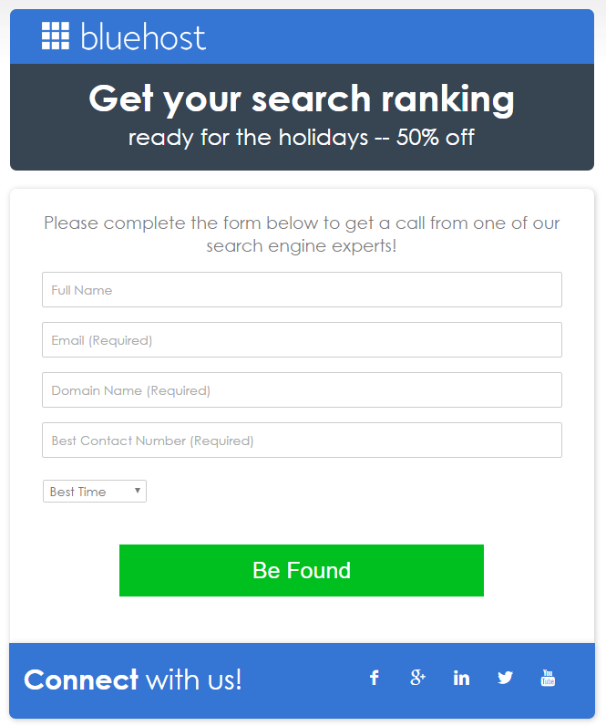
What they did well:
- The logo isn’t linked to the homepage, which means visitors can’t escape through it.
- Copy above the form explains how to complete it and what will happen after visitors do.
- The CTA button is bright green which pops off the white form, making it highly noticeable.
- The call-to-action goes with the offer.
What to A/B test:
- The headline is confusing. What’s the 50% discount on? What does “Get your search ranking ready for the holiday” mean?
- Social media links serve as escape routes off the page.
- The CTA copy “Be Found” is not as clear as it could be. What are prospects getting by converting on the form?
How do you use email landing pages?
Which offers do you promote with email landing pages? Has your brand seen any success with email landing pages? Sign up for an Instapage 14-day free trial today.

Try the world's most advanced landing page platform with a risk-free trial.
