Advanced targeting technology allows advertisers to serve highly personalized ads to audiences based on demographics, online behavior, previous engagement, stage of the funnel, and more. This naturally helps maximize ad clicks — however, more than 95% of those ad clicks don’t convert.
To maximize conversions, advertisers must be able to deliver post-ad click experiences that continue the personalized journey as quickly and easily as they create ads.
Dropbox is one company that understands that connection. As a file hosting service that offers cloud storage, file synchronization, personal cloud, and client software to more than 500 million users (including 400,000+ business teams). They recognize what’s necessary to convert prospects into customers: dedicated, unique post-click landing pages…
Let’s see how each segmented ad uses a dedicated Dropbox landing page and analyze the story each provides the visitor.
How Dropbox uses segmented ads & relevant post-click landing pages
Unique post-click landing pages go beyond simple message match consistency and dynamic text replacement. It’s about connecting the pre-click and post-click stages by telling the same story in both.
Example 1: Dropbox Business document storage
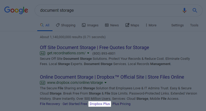
A Google search for “document storage” produced this PPC search ad that would likely show to prospects towards the top of the funnel who are in the market for different ways to store their digital files:

The ad headline summarizes how prospects can use Dropbox as online document storage, just as they were looking for based on their search. The display URL indicates the ad is relevant to the search query and matches the headline. Finally, the description copy details the entire document storage system with its ease of use, security, sharing capabilities, mobile access, customization, etc.
Once clicked, prospects are brought to the next stage of the customer journey — the post-click landing page — which continues the relevancy:
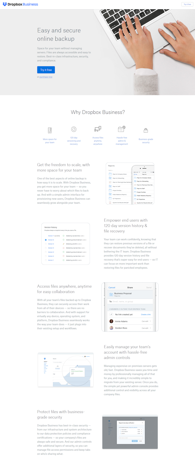
The page very clearly tells the brand’s story as it relates to document storage:
- What the offer is for — The headline reiterates that it’s for “Easy and secure online backup” — exactly what the user was searching for, based on their search query and ad click. The subheadline describes the offer further assuring visitors that they’ll receive plenty of space, ease of use and accessibility, and infrastructure, security, and compliance.
- Why businesses should use Dropbox — This part of the story is told with visual elements (iconography, anchor tags, section headers with short descriptions, software screenshots, etc.) to make the offer more engaging and easy to comprehend.
- Who else uses Dropbox business — The next section shows the other 200,000 businesses (with company logos) that already use Dropbox Business to securely store their online files.
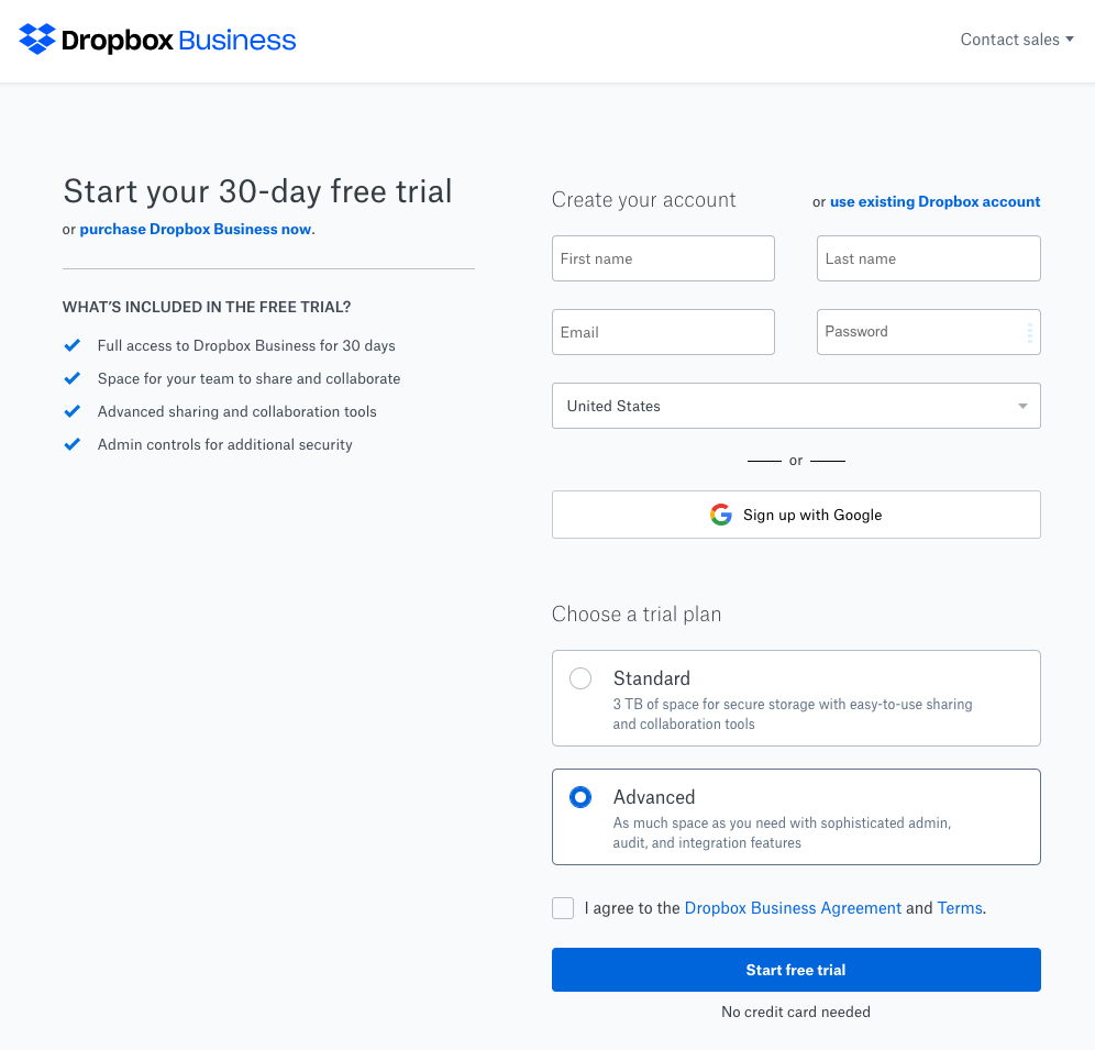
- How prospects can get started — Finally, they can start a 30-day free trial by clicking any blue “Try it free” CTA buttons that all lead to a very simple signup page:
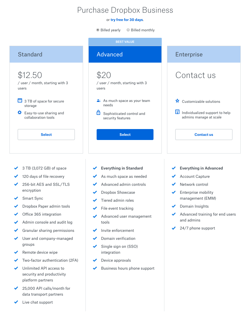
Or they can skip the trial and go straight to purchasing the standard, advanced, or enterprise Dropbox Business package:
Example 2: Dropbox Plus
Here’s another post-click page Dropbox uses in the sequence that prospects land on when they click the Dropbox Plus extension in the Google search ad above:
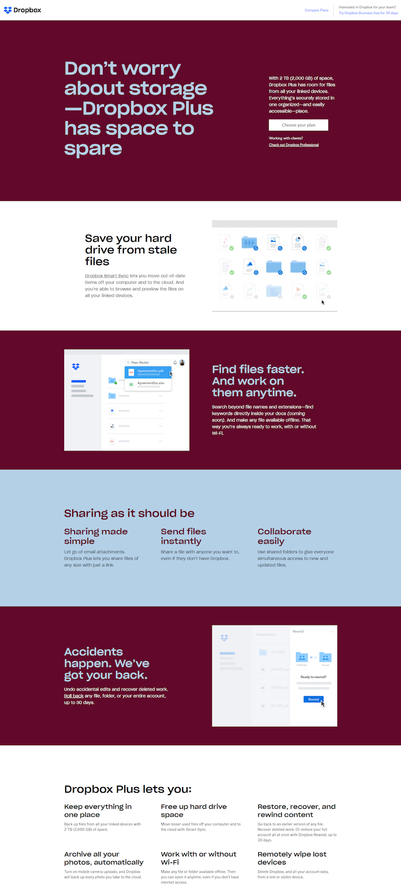
Again, it tells a detailed story to a specific buyer persona, rather than explaining everything Dropbox offers customers:
- What is being offered — Similar to the example above, this offer is for online storage as the ad suggests. However, in this case, the ad extension and corresponding post-click page is aimed at people looking for extra storage space.
- Why Dropbox Plus is beneficial — The benefits of Dropbox Plus are told with engaging visual elements (images and GIFs) and section headers, both helping visitors better understand the offer.
- Who should use Dropbox Plus — Toward the bottom, the “Dropbox Plus lets you” section gives a good idea of who would benefit from the software — anyone looking to keep everything in one place, free up hard drive space, etc.
- How to redeem the offer — Multiple CTA buttons throughout the page take prospects to a 2-step product page where they can purchase their plan:
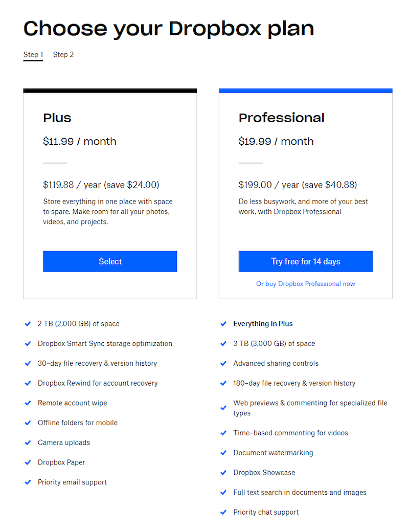
Both examples demonstrate that Dropbox is segmenting their ads to prospects who are in the market for a way to store their files and documents in a safe place online.
Compared to non-segmented ads & the homepage
When people search for the company name instead, they don’t have a similar experience. They’re still shown a paid ad, however, even the ad message is different from the previous example:

Neither the headline nor the display URL says anything about document or file storage, because that may not be what the searcher is interested in. Instead, the ad is vague and only mentions the company name, website, general qualities, and a few features.
Clicking this ad takes users to the Dropbox website instead of a personalized 1:1 post-click landing page:
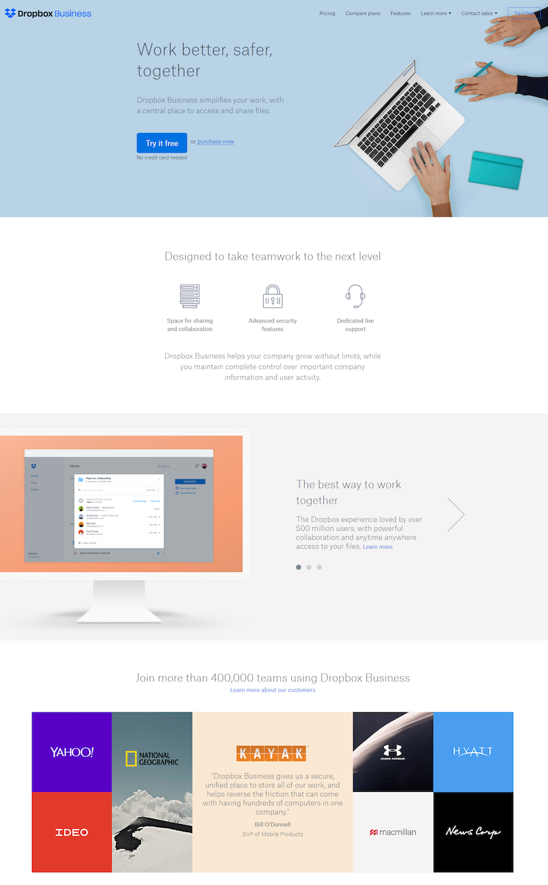
- Clicking the Dropbox logo or homepage link anywhere on the web would direct people to this page.
- Since it’s generalized to anyone who might be interested in Dropbox for various reasons, all visitors will see the same page — which isn’t the case with the paid search ad examples above because they are targeted for a specific keyword query.
- The page is primarily about teamwork, and how businesses can use it for collaboration purposes.
- Document storage and file backup aren’t even mentioned until the very bottom of the page.
Follow Dropbox’s example and provide unique experiences for each ad
Part of your job as a digital advertiser is to segment audiences and deliver the most relevant, personalized content at all times. It’s equally as important to provide matching, unique post-click landing pages to those audiences, so there are no gaps in the customer journey. Take a cue from Dropbox and segment your ads and provide dedicated pages for each target audience.
To see how Instapage Personalization can do just that, get a demo today and learn why customers see 4x the average conversion rates.

Get a Personalization Demo
See how easy it is to create unique experiences for any audience you target.
