In one minute, Facebook users share 2.5 million pieces of content — and as an advertiser, you have to compete with all of it.
That’s where your Facebook ad creative comes in.
Without a strong headline, an eye-catching image, a great offer, and a powerful call-to-action, your ad stands no chance of gaining the attention of scrolling Facebook users.
So before you begin running your campaign, make sure you’ve read through these 9 Facebook ad creative tips to instantly boost your ROI.
1. Create a benefit-packed headline
Are you giving them an unbeatable discount? Are you offering them a free whitepaper? Tell them in the headline how your product or service is going to solve their problem.
Here’s a great example from Club W:

The headline, the post text, and the description all complement each other, with no redundant information.
The headline draws the reader’s attention with a strong value proposition, the post text (above the image) explains the offer, and the description (below the headline) delivers a satisfaction guarantee.
Notice how the font size of the headline “Get 3 Bottles of Personalized Wine For $19” is larger than all the other copy on the ad? Take advantage of that by using it to highlight the biggest selling point of your offer.
2. Use a call-to-action relevant to your brand
Facebook offers nine different calls to action for your ad creative:

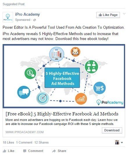
Make sure the one you select is relevant to your brand and goal. For example, if you’re a retail brand trying to sell a product, don’t use “Book now” as your call-to-action. This iPro Academy ad with the goal of generating downloads uses the obvious CTA choice, “Download.”
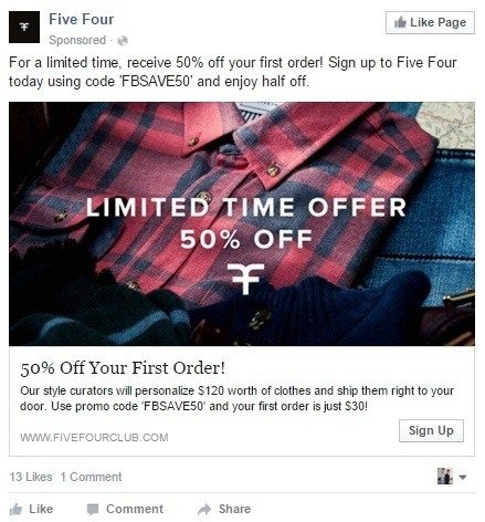
Whereas style service Five Four uses “Sign Up” as their call to action in this ad, since its goal it to generate sign-ups:
It may seem obvious, but a lot of businesses forget their ad should come together cohesively. Your text, headline, description, and call-to-action should all be consistent without being repetitive. When that doesn’t happen, it can create confusion in the mind of your viewer — which lessens the chance your ad gets clicked.
3. Use eye-catching images
The best images to use in your ads are high quality, but also:
- Bright, colorful, and eye-catching
- NOT Facebook colors (eyes will skip over your ad if they are)
- Images of happy people, bonus points if they’re using your product
- Pictures of women perform better than photos of men
- The right size for the ad type you’re using
Here’s a great example from Junon Jewelry of a bright, colorful, and attention-grabbing image:
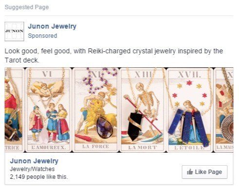
Remember: the people you’re trying to reach with these ads are scrolling through their Facebook feeds quickly, so your image needs to stop them in their tracks.
Aim to make yours stand out like this one.
4. Don’t be cute
You have a limited amount of text and only a few seconds to get the attention of someone sifting through their news feed. Don’t waste time trying to be clever or funny. Most of the time, clever and funny won’t sell product. Case in point: This TAL Group International ad:

Irrelevant? Yes.
In poor taste? Yes.
Amusing? Maybe to a teenager.
Does it make me want to like their page? Not at all. I don’t even know what “TAL Group International” is or does, nor do I have the desire to find out.
Be careful with cute, funny, and amusing. It’s okay to be entertaining, as long as you’re being relevant. If you don’t communicate your value proposition while you do it, you’re just wasting your money.
5. Keep Facebook’s 20% rule in mind
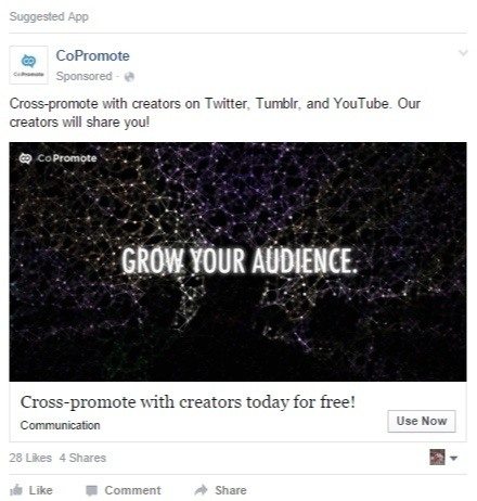
Remember — Facebook allows you to put text on your ad images, as long as it takes up less than 20% of the image’s total area. Since photos produce enormous amounts of engagement, powerful words, phrases, or numbers can make an ad even more attention-grabbing — like this one from CoPromote:
Or this one from Likeable Local, who uses a text overlay to emphasize their offer:
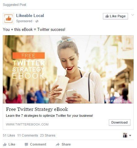
Since Facebook doesn’t let you format your text, this is yet another way to make your offer stand out like in the examples above. Use it to your advantage, but adhere to the 20% rule. Otherwise, your ad will be denied by Facebook, and it won’t run until you’ve edited the image to shrink the text.
6. Keep your text under 90 characters
As far as copy goes, there are three parts to your ad.
The headline is the biggest text on your ad; it’s right underneath your image. The purpose of the headline to grab the reader’s’ attention, and get them to read the rest of the ad.
Below the headline is the description. The purpose of the description is to elaborate on the headline — to explain the offer in more detail — but more about what the reader should expect when they click your ad.
Above the image is your post text. It’s kind of similar to the description. Use it to elaborate on your offer, or explain more about your post.
Just make sure not to exceed 90 characters. Anything longer than that, and Facebook will cut it off.
7. Try Facebook’s stock image database
A few years ago, Facebook partnered with Shutterstock to offer 25 million free stock photos to advertisers that use the platform. Now they can be accessed in the “Creative” section of the basic self-service tool, as well as in the Power Editor.
When adding an image to your ad, click the “Add Image” button in the editor, and then the “Stock Images” tab after the pop-up box opens (shown below):
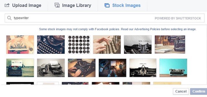
Type in your search query, and voila! Millions of high-quality photos at your fingertips.
8. Experiment with GIFs
A GIF, short for Graphics Interchange Format, is a bitmap file type that supports animation. You know — those short images that play on a loop?
(If that doesn’t ring any bells, get acquainted with the best gifs of 2015)
The file type was invented in 1987, and over the last several years it’s worked its way into pop-culture, and now, digital marketing.
In 2008, Bluefly attributed a 12% bump in campaign revenue to a GIF they added to one of their emails. More recently, Dell used GIFs to boost their email campaign revenue by 109%.
But for Facebook, GIFs are a relatively new thing.
After initially being outlawed by Mark Zuckerberg for fear that they’d interrupt user experience like all those flashing banner ads you see around the Internet, as of this summer Facebook is allowing people to use them in their ads.
The change comes following a great success with autoplay video in the news feed, which should be no surprise, considering visual content has become king on social networks.
While photos are great for brand snapshots, and videos for extended entertainment, a GIF’s strength lies somewhere in between. Use them to create short brand stories or product demonstrations, like this build-a-salad GIF by Wendy’s, or this beer brewing series from Dogfish Head.
Get some inspiration for your own campaign from brands that are rocking the GIF game.
To learn more about how to create your own, check out this post.
9. Vary font sizes for added emphasis
Since you can’t bold or italicize words in your Facebook advertisements, it can be tough to stress specific words in your offer, like “free” or “new,” that you want to draw reader attention to. Because of that, you’ll have to get creative.
Try capitalizing the words in your ad that you want to emphasize, like in this ad by Digital Marketer:
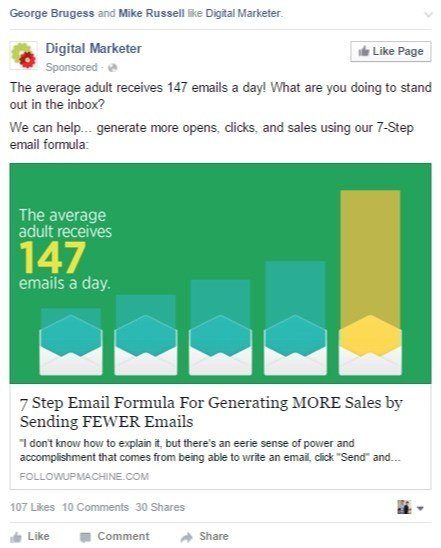
Just remember to use this technique sparingly. Writing one or two words in all caps can add emphasis, while WRITING AN ENTIRE AD IN ALL CAPS CAN MAKE READERS FEEL LIKE THEY’RE BEING YELLED AT VIA TEXT.
Optimize and conquer
Use these tips to optimize your current campaigns, and create new ones that will deliver a higher ROI than ever before.
Just remember: a strong headline, an eye-catching image, a great offer, and a powerful call-to-action may get Facebook user’s attention, but they won’t get conversions. For that you’ll need a highly-converting post-click landing page. Sign up for an Instapage Enterprise demo today.

See the Instapage Enterprise Plan in Action.
Demo includes AdMap™, Personalization, AMP,
Global Blocks, heatmaps & more.
