Since joining the airSlate family in September 2023, we have focused almost exclusively on product updates to upgrade our platform by offering industry-first solutions that our customers need.
We have already launched several new features in the past few months, including text formatting and expert layouts, and are on track to roll out more powerful features in the coming months.
Today, we’re happy to announce the launch of the new Carousel Feature. With this update, marketers can add a web carousel to their landing pages in seconds—no custom coding is required.
This was a popular feature request from our active customer community, and we’re thrilled that it is now a reality inside the Instapage builder.
Enjoy an interactive way to increase engagement
One of the most effective ways to engage page visitors is with interactive elements. Giving visitors an easy way to actively explore information on your page beyond passive scrolling helps inspire action, reduces bounce rates, and increases the chances of conversion.
Carousels offer an easy and familiar way to add interactivity to your landing page. Carousels provide an interactive way for users to explore different aspects of your page in a horizontally scrolling series of images, panels, or other content, similar to styles used on Instagram and Facebook.
They are also especially useful when you have limited screen real estate and want to highlight various aspects of your offer without overwhelming visitors.
The addition of the Instapage Carousel feature helps you add interactivity to your page, increasing page engagement and initiating the power of storytelling.
What to showcase in your carousel
The web carousel feature gives marketers plenty of flexibility in what to display on their landing pages. Marketers may use a carousel to create engaging testimonial blocks, product showcases, and image presentations.
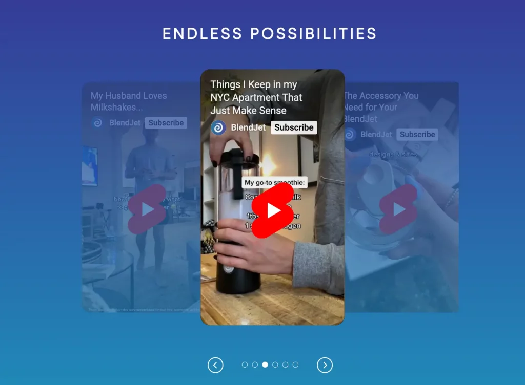
The Blendjet landing page uses a carousel to showcase how customers use the portable blender:
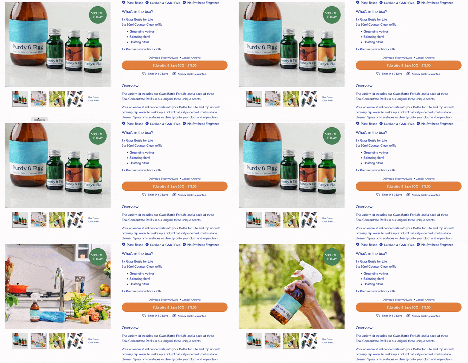
Purdy & Figg use a carousel to feature lifestyle and product images of the non-toxic cleaners:
Best practices for using carousels
While carousels can be easy to use and intuitive, it’s always a good idea to follow these best practices when adding the element to your landing page:
- Use high-quality images: Make sure your images are hi-res, sharp, and visually attractive
- Make navigation obvious: Visitors can either manually scroll through your carousel or it will auto-loop. Make sure there’s a straightforward way to show how to scroll through your carousel, either with arrows or indicators that match the number of slides you have. If your carousel is auto-looping, ensure it isn’t playing too quickly or too slowly.
- Make it mobile-friendly: Your carousel should function properly whether viewed on a desktop or mobile device. Make sure it loads, loops, and looks what you intend it to on all devices.
- Add descriptions: Include brief descriptions on each carousel slide when that makes sense. You want to give your users context about what they’re viewing and why it would matter to them.
Start using carousels on your landing pages today
If you’re looking for a way to turn up the engagement percentage on your landing pages, a carousel might be just what you need. Carousels allow you to increase the number of visual elements on your page without using up more real estate.
Find out how to add a carousel to your landing page using the Instapage app here.
Sign up for a 14-day free trial today and start adding your carousels today.
Try the world's most advanced landing page platform with a risk-free trial.
