Subscribe and get a box of beauty and grooming products, tailored to your needs, once a month. That’s the promise of Birchbox, a company out of New York serving the health and style conscious.
But there are lots of subscription box companies. And they, like Birchbox, know that how you present your product online is just as important as the product itself. To separate itself from the competition, Birchbox advertises with the help of unique post-click landing pages for their customers. Let’s take at five links from a paid Birchbox ad, and their corresponding experiences, to see how.
Birchbox post-click landing pages
Navigate to Google and punch in the keyword term “Birchbox,” and you’ll likely find this ad at the top of the search engine results page:

The headline
In this ad, there’s one headline, some copy, and four sitelink extensions with short copy beneath them. In the first part of the ad, there are some important indicators for consumers, which they’ll look for in the post-click stage:
- The main headline summarizes the product in 2 words, “beauty box.”
- “Custom” communicates to prospects that they won’t get a box of generic products, but ones tailored to their needs.
- “Sale: Get 2 Boxes For $15” communicates affordability to the prospect, and specifically, the word “Sale” uses urgency to pressure shoppers into buying before the sale is over.
The copy
Below the main headline, copy elaborates:
- It specifies that the box is delivered monthly
- It lets visitors know what it’s used to improve: hair, skin, and style.
- The code “DOUBLEFUN” offers visitors added value, with 5 extra “mystery samples,” which are more intriguing than any old sample.
- The mention that Birchbox has 4 million reviews means it’s highly popular.
- The phrase “Find products that work,” relates to the frustrated beauty shopper who has tried countless products without success.
How does the post-click landing page match the ad?
The post-click landing page
Clicking the main ad headline takes you to this page:
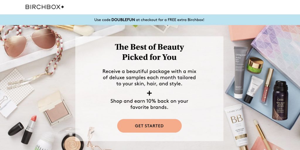
What you see is the entire page. It’s minimalistic, which is good because you want to take up as little of your visitors’ time as possible. However, it’s difficult to do minimalistic well, because you have to give visitors enough information to decide on the offer. A balance between information and page length must be reached.
While message match isn’t perfect between the ad and this post-click page, Birchbox does a great job of using elements from the ad to keep messaging consistent. “The Best of Beauty Picked for You” is a headline that conveys customization in a beauty box. The code “DOUBLEFUN,” which also appears in the ad, can be seen below the header of the page. The text “Skin, hair, and style,” reflects the content of the ad, letting visitors know where the product can be used. It’s clear visitors are in the right place, but is the rest of the page clear about the product?
- What’s the offer? Birchbox offers its visitors “the best of beauty” (which may convey high quality, but may also be too vague) in a monthly box, customized to the visitors’ needs.
- Why should you claim the offer? The product is customizable, it’s affordable, and it’s delivered to your doorstep. Converting through this page also brings the visitor added value: 10% off “favorite brands” and an extra Birchbox at checkout with the code DOUBLEFUN.
- Who else trusts Birchbox? Clear social proof is absent on this page, even though you see it in the referring ad, which mentions 4 million+ reviews. On the page, it would offer a persuasive boost. If you look closely, you may notice recognizable brands on the products in the featured image. This can be a form of social proof, which communicates to customers: If brands I recognize work with Birchbox, the brand must be trustworthy.
- Is there a clear next step? Yes, the clear next step is the “Get Started” button on the bottom of the page. This is the only way off the page, and the only conversion goal, making the conversion ratio of this post-click page a perfect 1:1.
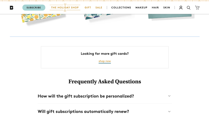
The “15% off Birchbox Gifts” sitelink extension
Clicking the “15% off Birchbox Gifts” sitelink extension directs you here:

This page is at least two, three times the length of the first page. As we covered earlier, that’s not necessarily bad. The first page could be suffering from too little information, and this page looks more comprehensive.
As far as message match is concerned, the headline identifies the page as the place for people looking to gift a Birchbox. It would be even better if the 15% discount offered in the ad were more visible, in a banner graphic across the featured image, maybe, or the headline. Still, those who click through are delivered what they’re promised: 15% off gift boxes for different subscription lengths.
- What’s the offer? This page offers Birchboxes for those looking to gift a subscription of 3, 6, or 12 months.

- Why should you claim the offer? You can’t argue with the flexibility that Birchbox offers here. Not only can you customize the product, but you can customize the length of the subscription to accommodate new buyers testing the product, or committed customers who want to renew. You’ll also get 15% off when you use the code in the banner at the fold of the page.
Below that, the process of buying the gift and sending it is presented in three easy steps, and images lower on the page show visitors the kind of products recipients may get if they purchase. At the bottom of the page, an FAQ section answers common prospect questions:
- Who else trusts Birchbox? Again, the mention of 4 million reviews is absent. However, this page uses a testimonial to tug at the heartstrings of its visitors: Sarah J says she gifts Birchbox to remind someone monthly that they’re loved. While they’re not powerfully persuasive statistics, her words play to the visitor’s emotions, helping them imagine what it’s like to make someone feel cared for with a personalized gift.
- Is there a clear next step? There is a next step, but it’s not the only one. Every link off the page that isn’t your call-to-action button is a potential escape route from your page. This page does a great job of offering visitors what they expect when they click through the ad. However, it could benefit from a little more focused messaging.
The “Get Birchbox For $1” sitelink extension
Click this sitelink extension and you’ll find yourself on this page:
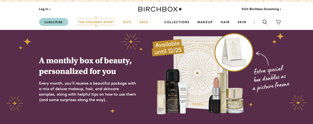
With a headline like “Get Birchbox For $1,” the story of this page should be affordability. Is it, though?
- What’s the offer? The headline touts personalization, and the image showcases a luxurious looking product, but there’s no mention of the $1 offer or affordability at all. When you scroll, you’ll see the offers available to you: a monthly box or a 6-month box. Still, there’s no mention of the $1 offer that was in the headline.
- Why should you claim it? Getting Birchbox for $1 sounds like a deal that’s too good to be true. Unfortunately, the lack of message match leaves the visitor feeling like they’ve been duped. There looks to be no mention on the page of the deal in the headline. And, while the rest of the page does a good job of showing the product and even highlighting some other affordable deals, the visitor is unlikely to purchase. They were promised a specific deal in the headline, and this page didn’t deliver.
- Who else trusts Birchbox? While this page doesn’t use traditional testimonials or badges, it does use a unique form of social proof: Instagram posts with account handles under them. These showcase the box while also telling the visitor: Look, here are just a few people who enjoy our product enough to post about it on social media.
- Is there a clear next step? Every post-click page should have only one goal, and one call-to-action. This one has several: There are two calls to action for a monthly plan and a six-month plan, and when you scroll down, a third for a twelve-month plan. At the top of the page, a full navigation menu distracts users, and at the bottom, a large footer does the same.
“Free Amika Hair Tool” sitelink extension
The third paid link in the ad takes you to this post-click landing page:

Unlike the page before, this one does a great job of letting the visitor know they’re in the right place:
- What’s the offer? A free straightening brush with the purchase of an annual plan. It’s mentioned below the header and shown in the featured image of the page. If the visitor clicked because they wanted a free brush with the purchase of a plan, they’re getting exactly what they wanted with this page.
- Why should you claim it? Though the image of the woman using the straightener might be better-featured, this one does a good job of showing the visitor the product. The rest of the page, however, is a little unfocused, with two other offers for socks and lipstick under the one for the straightener. If the page is made to advertise the box and the straightener, more should be said about the box and straightener, not other free gifts you get for purchasing different plans. Regardless, visitors will have a hard time ignoring such a valuable deal if they were already considering Birchbox:

- Who else trusts Birchbox? Like the previous page, this one also uses Instagram photos of the contents of the box, which is the main offer. However, it also would’ve been great to provide images of people using the straightener, since this is the offer promised in the headline. Still, the effect of these images is positive. They showcase the product and leverage social proof:

- Is there a clear next step? This page uses no navigation menu or footer, so visitors are focused on evaluating the content. But there’s an issue with that content: If the brush only comes with an annual subscription, this post-click page should offer only an annual subscription. Instead, there are three CTAs to purchase three different subscription lengths: monthly, six months, or annual.
Imagine a user lands on this page to see “Free amika Straightening Brush when you join,” then scrolls and clicks the CTA for a monthly subscription. They would have completely missed the terms of the deal below the CTA button, which clarifies that the brush only comes with an annual subscription. If your deals have special terms like this, they must be included before the CTA. In this case, the problem could be remedied by focusing the messaging to only one offer, which is standard best practice for post-click pages. With only an annual offer to claim on the page, no one would ever be frustrated by ordering Birchbox and finding out they don’t get the free brush they were offered.
“How it works” sitelink extension
Clicking the final paid link in this advertisement will land you on this post-click page:

This page seems to be aimed at someone who might be considering Birchbox, but wants to know more about it before they click through to a sales page. “How it works” is a very non-threatening headline, as opposed to anything with sales jargon in it, like “15% Off Birchbox Gifts” or “Get Birchbox for $1.” As a shopper, it’s less intimidating to click through to a page when you’re expecting it to be educational instead of a sales pitch. When they click through, here’s what they find:
- What’s the offer? The offer here is the main Birchbox product — a subscription beauty box delivered monthly. If you scroll down, though, you’ll see a second CTA that offers a free gift when you subscribe (which isn’t mentioned anywhere else on the page or in the ad). Inconsistent messaging like this can confuse prospects.
- Why should you claim it? The headline “Beauty for Real Life” and the copy below relate to an audience of people who have invested a lot of time in finding the right beauty products but have come up short. “Here’s How It Works” pictured above the fold matches the message of the ad.
Below that, sections of the page detail the steps of signing up, combined with high-quality photos and sales copy craftily disguised as educational copy. The page does a great job of fulfilling its purpose of explaining the product, while also selling it:
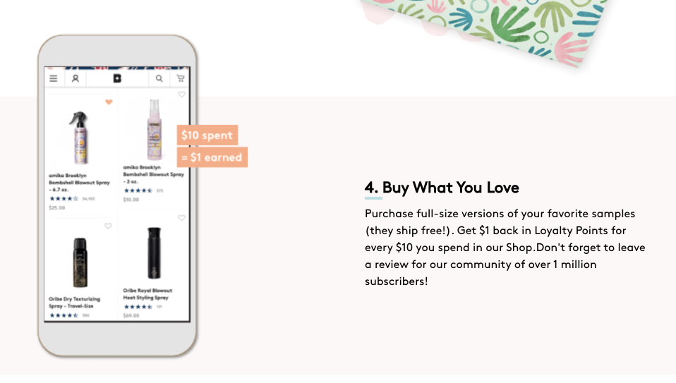
- Who else trusts Birchbox? With great skill, the copywriter of this page has inserted social proof to step 4, shown above: “Don’t forget to leave a review for our community of over 1 million subscribers!” Like the Instagram photos showcased photos from loyal subscribers, these words communicate to the visitor that Birchbox is a popular product.
- Is there a clear next step? This page has two CTAs, and they’re cooperative, meaning they work together to accomplish the same conversion goal. At the top, a navigation menu distracts users with links irrelevant to the offer. At the bottom, though, visitors are focused on the CTA because the footer is minimal, containing only copyright information. The promise of a free gift in the second CTA is also enticing to users, and if the conversion goal were optimized to 1:1, there would be an even greater chance it gets clicked.
The Birchbox homepage vs Birchbox post-click landing pages
Homepages should not be used as post-click pages. With the Birchbox homepage, let’s take a look at why that is:

Here, you have an above-the-fold image of Birchbox.com. You’ll notice…
- A full navigation menu, which, on a homepage, helps visitors browse. On a post-click landing page, however, it’s only distraction.
- Multiple offers, which is OK for a homepage because it’s designed to appeal to people who are at different stages of the buying process. On a post-click page, though, there should be only one offer: the one that was promised in the referring paid ad.
- It’s impersonal, which again is OK for a homepage because it’s designed to have mass appeal. An advertisement, however, is designed for a specific audience member in a specific place in the buyer’s journey. When you don’t personalize to match the pre-click experience, you leave revenue on the table.
Get more from your budget with personalized post-click pages
Like Birchbox uses specific post-click landing pages for each of their paid links, so should any advertiser who wants to maximize revenue. If you’re going to personalize an ad, you have to personalize the page it directs traffic to. Otherwise, you’re leaving revenue on the table.
Today, it’s all possible with Instapage, the only PCA platform that allows you to create personalized post-click landing pages at scale. Find out how by scheduling a demo.

See the Instapage Enterprise Plan in Action.
Demo includes AdMap™, Personalization, AMP,
Global Blocks, heatmaps & more.
