The reclusive author is dead. His cabin is empty; his whiskey glass dry. He has uttered his last caustic remark. Evolution did its thing, and he wasn’t the fittest. He is now a museum piece, a relic of another era when authors could float above the indignities of public relations, on a cloud of wit and mystery, and let other people do the dirty work for them.
But there is something in the reclusive author stereotype that stems in truth:
We are not, by nature, the most sociable of people.
Our natural habitat is writing dens, secluded places; we dwell behind closed doors and hide behind computer screens. We flirt with fame but shyly, from a distance. On top of which we are, like most artists, deeply insecure about our creative output. Hence the hiding, and being obnoxious: it’s a survival strategy. It is not one that prepares us well for a career in book marketing.
And yet, book market we must.
And we must do it socially because social is our only chance of making even the tiniest mark in the new world of publishing, let alone achieving any measurable commercial success or even a modest bit of recognition.
The new reality of publishing
It’s a new world, and it’s worse, and it’s better. It’s worse because the adage of “Everyone has a book in them” seems to have become “Everyone should get it out”, and they do.
It’s worse because thousands of creative writing courses, from evening classes all the way to PhDs, are producing more aspiring writers every day, and they don’t just aspire to write: They want to be published.
It’s worse because the book industry is declining, and yet there are more books available than ever before — with millions published annually on Amazon alone.
It’s worse because our chances of securing an agent and a publisher (slim at the best of times) are now practically on par with spontaneously growing a pair of wings and flying to the moon. Yet, thousands of authors selflessly contribute to the slush piles of the few who accept unsolicited submissions.
It’s worse because publication does not signal the end of the hard work, but the beginning. Now, authors need to wake up to the fact that the bulk of the marketing — once the responsibility of traditional publishers — must now be taken up by the authors themselves (whether we like it or not).
It’s not all doom and gloom, though.
It’s better because this DIY culture that we live in means we actually do have the tools to do it ourselves. Our new internet reality has given us access to opportunities and resources that were previously only available to a select few, and social networking has opened up the door to reaching millions of prospective readers. It’s not easy, but it’s possible.
I’m not going to talk about social media marketing here; you know you should be doing it, and how you use your social networks is up to you. I’m going to discuss how to use post-click landing pages as a tool for generating more interest in your books, turning followers into readers, and increasing your sales.
And for me, the way to do that is by making it easy and taking away the clutter.
Why post-click landing pages?
“Conventional” websites are great, but they can also be a great mess of menus and links and sidebars and distractions, taking visitors away from your core message, which is, ultimately, buy my book.
What you want is to send visitors directly to a page that contains only that message, and an easy way to act on it. In post-click landing page terms, that’s your unique value proposition and your call-to-action.
Simply put the reason they should buy your book, and the means to do it.
You could argue for the simplicity of sending prospective buyers directly to your book’s page on Amazon, but that’s a mistake.
Aside from the obvious clutter factor, we have limited control over those pages, and you don’t want visitors having to scroll all the way down to read the blurb, or coming across a less than positive review that’s appeared right at the top.
In contrast, post-click landing pages contain only the information you have chosen and serve only one purpose: to convert.
You should never hope to convert your visitors on Amazon (or another retailer site). Your Amazon page is your checkout, and visitors should arrive there ready to buy.
post-click landing pages with a twist
The way I have used post-click landing pages to promote my work as an author may not strictly conform to the original concept of a post-click landing page. The wonderful thing about evolution, however, is that it’s not only about adapting to new circumstances, but also about adapting the tools available to you to best serve your purpose (be it survival, or book sales).
That being said, I hope Instapage will forgive me this twist on their excellent tool when I propose the following post-click landing pages for authors.
Dedicated book pages
These are pages dedicated to a particular book that feature your cover (and/or other appropriate images), your unique value proposition (which may or may not be the blurb; it could also be an excerpt from a review) and your call-to-action button linking directly to the online retailer where your now converted visitors can purchase your book.
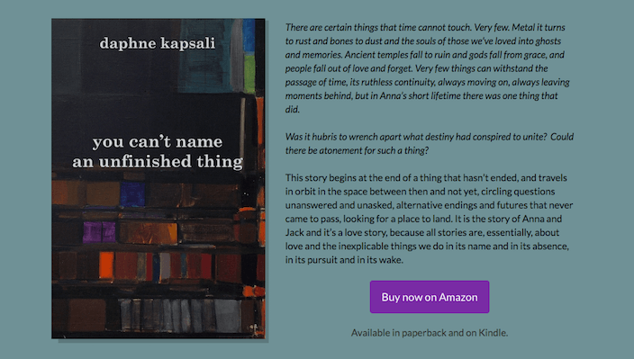
A variation on this could be a page offering a free download of part of your book, or another freebie (i.e. free short story), with or without the requirement to subscribe your mailing list.
When to use a form, and when not to
- Use a form: If you are actively building a list and consider it an important part of your marketing strategy, the former is a good way to generate leads, and your CTA, in this case, will be an email-collecting field.
- Don’t use a form: When list-building is not your priority, and you are more concerned with converting visitors into readers, then offering a free short story is worth a try.
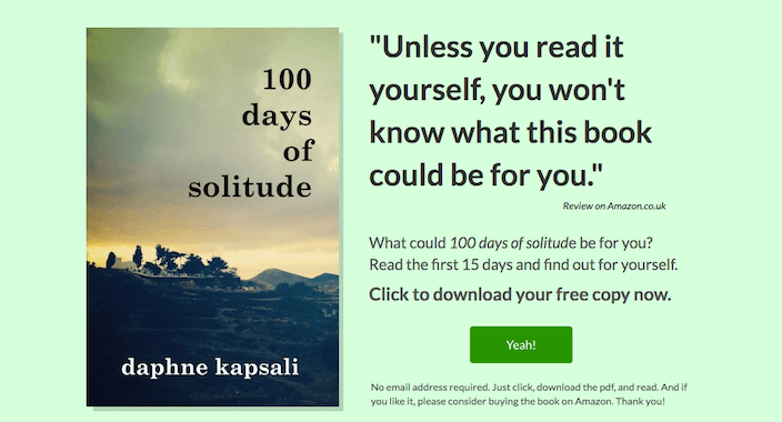
Since I’m not too concerned with building my email list, what I did was offer a free direct download of the opening of my first book, 100 Days of Solitude — no strings attached. I did this because I am fairly confident that most people who read it the will go on to buy the book:
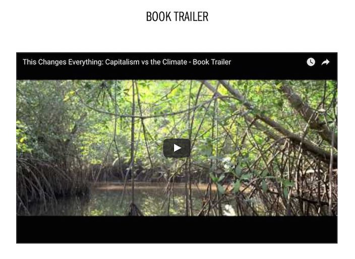
Finally, a dedicated book page could also feature a book trailer (a marketing tool which is growing in popularity) as well as the book cover and blurb, and a “Buy Now” button. For example, this page from This Changes Everything:
Temporary promotion pages
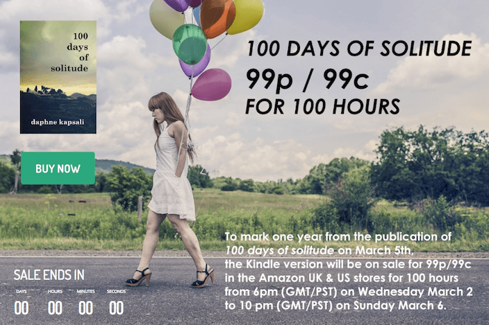
These are pages that only live during the course of a time-limited promotion or offer, such as a Kindle Countdown Deal or Free Book promotion, Goodreads or Amazon Giveaway. Your UVP, in this case, would be a description of the promotion (ideally preceded by a couple of lines about the book itself), and your CTA would link directly to a page where visitors can enter the giveaway or purchase your book at the offer price. I would also recommend adding a countdown timer, as it adds a sense of urgency that compels visitors to act now rather than later:
Author pages
Think of these as a single-page website for your author persona.
I don’t necessarily recommend this as a permanent solution or replacement for a “conventional” website, and I certainly can’t tell you what to do. It all depends on your particular author identity and what you use your website for. Is it simply a point of reference for your work, or a platform for blogging, interviews, and resources?
In my case, as someone who is veering more towards the latter category, my author page serves as a very efficient stand-in while I take my time redeveloping my full website.
The logic of an author page is very similar to that of book pages: simple, uncluttered, and targeted. My page features all three of my published books at the top (covers only) with Buy Now buttons linking to Amazon:
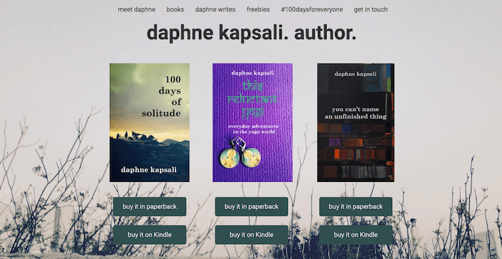
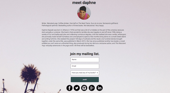
This is followed by my biography, social links, and a form to join my mailing list (I do keep one, despite email marketing not being my top priority). Finally, I include a section offering more details on my books, a brief description and review excerpts for each one, and more purchase buttons.
Although not recommended for post-click landing page best practices, the page does include a menu, linking to specific sections on the page itself or to external sites, but they are subtle and unobtrusive:
Where do you start?
There are several post-click landing page building platforms available to you, and they all have their respective pros and cons. But this post refers specifically to Instapage, because that’s the one I’ve been successful with.
Instapage gives me all the flexibility and creative freedom I need to build my pages, and which I’d have to work quite hard to recreate within WordPress (or another theme-based website builder). If your website is built on WordPress, no problem, because Instapage software integrates pretty easily with their publishing platform.
Instapage provides customizable templates (many of which are perfect for the purposes of book marketing), or you have the option to start from a blank canvas and populate it with only the elements you need. In either case, it’s a simple click logic that allows you full control over adding, deleting and rearranging elements on your page, to create exactly the look and functionality you want, in both the desktop and mobile versions.
It also offers integration with all the major mailing list management services (i.e. Constant Contact, MailChimp, AWeber), and A/B testing, which allows you to create variants of your pages and test which ones lead to the most conversions. Plus, the Instapage team strike me as a creative, forward-thinking bunch who are always looking for ways to improve their services and are open to user feedback and suggestions — which I appreciate.
This is your call-to-action
A few months ago I didn’t even know what a post-click landing page was or why they were useful. Now with the help of a complete post-click landing page guide, I have the audacity to make bad puns and write about post-click landing pages as if I understand what they’re all about. By which I mean: if you haven’t bought into the post-click landing page concept yet, try them out for yourself.
Don’t be intimidated by terminology; pick up the tools and play with them. As authors in the new reality, our marketing efforts may be one part strategy and one part hit-and-miss. But you’re never going to hit anything unless you have a target and something to throw at it.
Evolution is a wonderful thing. Embrace it. Say your goodbyes to the reclusive author, pay your respects, take a moment if you need to. And then leap off your cloud and land here, now, where you can make your own success.
Sign up for an Instapage Enterprise demo today.
About the author
Daphne Kapsali is a writer, occasional blogger, pathological optimist and author of three published books (all available on Amazon). She was once a recluse but is now fully immersed in the world of social media marketing. As one-half of The Nerd Twins, she also likes to dabble in technology, but her coding skills aren’t nearly up to scratch. She does her best.

See the Instapage Enterprise Plan in Action.
Demo includes AdMap™, Personalization, AMP,
Global Blocks, heatmaps & more.
