Adobe’s mission is to give everyone everything they need to design and deliver exceptional digital experiences. Adobe landing pages throughout the entire marketing funnel — to increase brand awareness with reports and white papers, promote special events, sell a variety of membership plans and packages (and more) — all help make this possible.
Let’s quickly review the landing page basics and review six persuasive Adobe landing pages that the company depends on to generate conversions.
What is a landing page?
A landing page is a standalone web page that uses persuasive elements — compelling headlines, engaging media, valuable social proof, attention-grabbing CTA buttons, etc. — to convince visitors to take action on a specific offer. That action could be to download a guide or ebook, register for an event or webinar, sign up for a free trial or demo, and more.
6 Adobe landing page examples
(For shorter pages, we’ve displayed the entire page. For longer pages, we’ve only shown above the fold, so you’ll need to click through to the page to see some of the points we discuss. Also, some pages may be undergoing A/B testing with an alternate version than is displayed below.)
1. Creative Cloud Plans
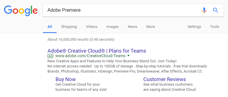
A Google search for “Adobe Premiere” displayed this paid search ad:
When search users click the ad headline or the “Buy Now” sitelink extension, they’re directed to a sales page where they can learn about the various Creative Cloud plans to select the one that’s best for them:

What the page does well:
- Message match between the ad (headline, display URL, and description text) and the landing page ensure prospects they’re in the right place and can find what they’re looking for.
- A click-through design removes the lead capture form from the initial page, so visitors don’t immediately feel pressured to make a payment.
- The numbered multi-step form, complete with section titles, breaks up the longer form into smaller sections to remove some of the landing page friction.
- Bullet points highlight the benefits of each package, without forcing visitors to read through excessive copy.
- “Special Offer” creates urgency by letting prospects know that this deal may not last forever, so they’re more likely to take advantage of it immediately.
- The chat feature (“Let’s chat”) allows prospects to contact customer service. However, placing a live chat directly on the landing page would make it more obvious and encourage visitors to utilize it.
What could be changed and A/B tested:
- Many exit links — Adobe logo, “Sign In”, “Learn more about Creative Cloud”, footer links, and multiple links throughout the copy — make it easy for visitors to leave the page without purchasing.
- The blue CTA buttons don’t stand out as much as they could because there’s blue throughout the entire page. Testing the buttons in a different color, like green, would make them more attention-grabbing.
- The CTA button copy is vague. “Buy Now” doesn’t say much about each offer and isn’t persuasive enough. Instead, something like “I want this package!” is likely to entice more prospects because it would be specific to the bulleted points in each section.
- Adding social proof such as customer testimonials would let prospects know that other design professionals have had success with Adobe Creative Cloud, likely encouraging them to purchase a package as well.
- Adding an image or demo video would give visitors a better idea of what’s being offered, without having to read through more descriptive copy.
2. Adobe Stock for Enterprise Free Trial
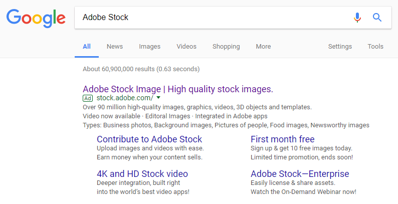
Searching “Adobe Stock” produced this Google search ad:
Clicking the “Adobe Stock—Enterprise” sitelink takes prospects to this Adobe landing page to sign up for a free trial:
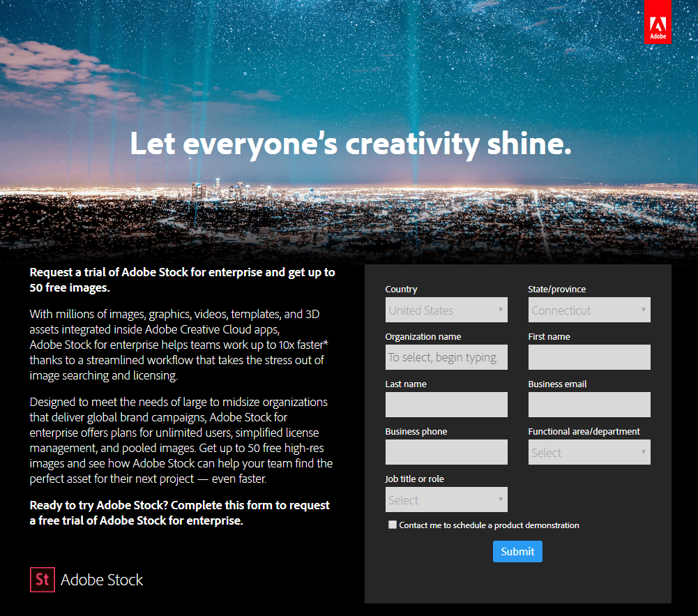
What the page does well:
- Boldening the primary benefit of the offer (50 free images) makes it stand out at the top of the body copy and entices visitors to keep reading.
- Encapsulating the form with slight color contrast helps draw attention to it.
- The unchecked opt-in box gives visitors the option to be contacted to schedule a product demo, so only highly-interested prospects will be contacted.
What could be changed and A/B tested:
- The hyperlinked Adobe logo could potentially send visitors away the page before converting.
- The blue CTA button would stand out more if it was a color that wasn’t already on the page, like green or yellow. Designing it bigger would also make it more attention-grabbing.
- The CTA button copy, “Submit”, isn’t specific or persuasive. Changing it to something more descriptive and personalized, like “I want the free trial” would likely generate more clicks.
- Extensive fine print in the footer could intimidate visitors and deter them from converting.
- Including social proof, such as customer testimonials or company logos, would help visitors view Adobe Stock as a valuable program.
3. Adobe MAX Conference
Adobe advertising also consists of promoting upcoming events. Here’s an event landing page that offers a discount on the cost of Adobe MAX — The Creativity Conference registration:
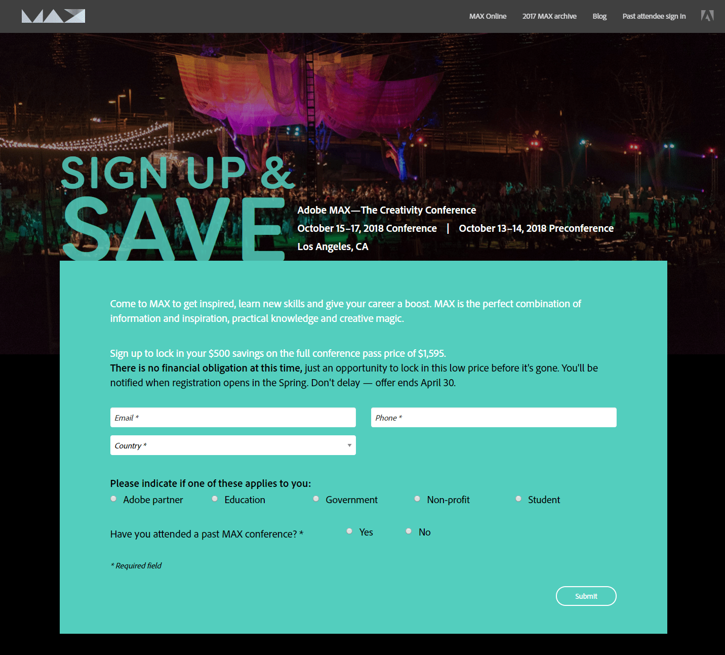
What the page does well:
- The background image appears to be a photo from the 2017 MAX conference, providing visitors with an idea of what this year’s conference will be like.
- The headline, “Sign up & Save”, immediately provides visitors with an incentive to sign up for the conference.
- Essential event details (title, dates, and location) listed above the fold make it easier for visitors to spot them immediately.
- Highlighting that there’s no financial obligation at this point increases the chances of prospects signing up.
- Three form-fields makes it quick and easy for visitors to complete the form.
What could be changed and A/B tested:
- Header and footer exit links could distract visitors and take them away from the page without redeeming the offer.
- The blue CTA button doesn’t stand out at all because it’s the exact same color as the background.
- “Submit” doesn’t serve well as the CTA button copy because it’s vague and impersonal. Testing more enticing copy, like “Save my spot” or “I want the discount”, would likely generate more conversions.
- Adding a countdown timer to indicate the time remaining would add a sense of urgency and help encourage prospects to sign up faster.
- The expired 2017 copyright date might cause visitors to question the validity of this offer.
4. Gartner’s 2017 Magic Quadrant Report
Adobe digital marketing was named a Leader in Gartner’s 2017 Magic Quadrant for Digital Marketing Hubs. This landing page encourages people to download the report to see for themselves:

What the page does well:
- A two-step opt-in form reduces landing page friction because it allows visitors to learn about the offer before having to complete a form.
- Multiple arrows pointing down the center of the page serve as both directional cues and anchor tags, providing for an optimal user experience. These also persuade prospects to see what Adobe wants them to. In this case a short description of where (and why) Adobe stands on the Marketing Quadrant, multiple forms of social proof, the Magic Quadrant image, benefits of Adobe, and a CTA button.
The sticky bar allows the CTA button to always be visible and ready to click. - The CTA button copy is action-oriented and tells prospects what they’ll be getting by clicking.
- Ample social proof — Ellen Lee’s testimonial, company logos, statistics, etc. — show prospects that Adobe is a trustworthy brand that delivers other companies much success.
- White space throughout the entire page makes it more aesthetically pleasing and easier to navigate.
- The Magic Quadrant image provides visitors with a visual of where Adobe stands in comparison to other brands.
What could be changed and A/B tested:
- The Adobe logo is linked to the company’s homepage, immediately providing visitors with an escape route from this.
- The CTA button color doesn’t stand out because of the monochromatic color scheme.
- The social media buttons and CMO link could distract visitors and send them away from the page before downloading the report.
5. 2024 Digital Trends Report
This Adobe landing page was also created to generate report downloads. This one came from a link in an Adobe blog post:

What the page does well:
- A captivating headline lures visitors in without giving away too much information.
- Minimal body copy then provides prospects with more information about the report, without overwhelming them with excess text.
- Bulleted copy makes it easy to scan the key takeaways from the report.
- Encapsulating the form helps it stand out a little more and draw attention.
- The blue CTA button “pops” because it contrasts well with the rest of the page. However it could be larger to be even more visible.
- The unchecked opt-in box let’s prospects decide for themselves to be contacted about a product demo, ensuring that only sincerely interested people are contacted.
What could be changed and A/B tested:
- The hyperlinked Adobe logo could potentially send visitors away from the page before they get a chance to download the report.
- 14 form fields is too many for a landing page in the awareness stage of the buyer’s journey, and is likely to deter prospects from completing it.
- The “Submit” CTA button copy is vague, and should be changed to something more specific, like “Show Me the Report!”
- The page is unbalanced. Adding an image of the report underneath the body copy would help balance it out and provide visitors with a preview of the content.
6. Adobe Captivate White Paper
This last Adobe landing page example came from an organic Google search result for “Adobe white paper”:


What the page does well:
- No exit links (aside from a privacy policy) makes it so visitors can only leave the page by clicking the “X” in the top right corner, or downloading the white paper.
- The headline is both descriptive and benefit-oriented.
- Small chunks of copy make the page aesthetically pleasing and easy to navigate without overwhelming people.
What could be changed and A/B tested:
- Too many font styles makes the page look chaotic, and not professional and uniform like it should.
- 10 form fields may intimidate prospects who are only in the awareness stage of the marketing funnel.
- The orange CTA button would “pop” more if it was a contrasting, complementary color, like green.
- “Submit” on the CTA button isn’t very persuasive. Something specific and personalized, like “Send me the White Paper”, would likely produce better results.
- Adding the white paper’s cover page or an Adobe Captivate software image would help compel visitors to download the white paper.
Were you inspired by any of these Adobe landing pages?
Adobe recognizes the importance of using optimized, dedicated landing pages to increase the overall success of their marketing and advertising campaigns. The examples above demonstrate that Adobe’s digital marketing strategy relies heavily on landing pages throughout the entire marketing funnel, from generating brand awareness in the awareness stage, to securing paying customers in the decision stage.
Like Adobe, your campaigns can benefit from professional, optimized landing pages. Only then will you create a great landing page for prospects.
Get an Instapage Enterprise demo and see how our platform allows you access to a suite of tools to significantly improve your advertising ROI and streamline your process.

See the Instapage Enterprise Plan in Action.
Demo includes AdMap™, Personalization, AMP,
Global Blocks, heatmaps & more.
