How to Create a Landing Page — Quickly and Efficiently
by Fahad Muhammad

How to build a landing page that converts visitors to customers, and how to do so efficiently, is a common question for marketers. In fact, building an effective landing page doesn’t need to be a time-intensive process. And a well-designed landing page is an essential digital marketing tool for converting visitors into leads or customers.
In this guide, we’ll provide a step-by-step guide on how to create a landing page that effectively communicates your value proposition, persuades visitors to take action, and drives conversions. For a visual guide to creating a landing page, check out this video.
A landing page is a standalone web page that’s designed to capture a visitor’s information or persuade them to take a specific action. Unlike a website’s homepage, which serves as a gateway to various pages and content, a landing page is focused on a single goal, such as capturing leads or making sales.
An effective landing page is designed to drive visitors towards a specific action, such as making a purchase, signing up for a newsletter, or downloading a whitepaper. It achieves this by keeping the messaging focused with a single call-to-action (CTA), using strong headlines and visuals, and eliminating distractions that could lead the visitor away before completing the desired action.
Most importantly, a good landing page is designed with the user in mind. This means aligning the messaging and overall experience to fulfill the visitor’s expectations, needs, and pain points. This is necessary to drive strong conversion rates and, ultimately, a high return on ad spend (ROAS).
There are numerous benefits to creating a landing page. Some of the key benefits include:
There are five steps to building a landing page: 1) planning, 2) design, 3) development, 4) testing, and 5) publishing. Let’s go through what’s involved at each step in the process.
The planning stage of landing page development is perhaps the most important as it lays the foundation for the entire project, and it’s important to not skip or rush this step.
During the planning stage you’ll be defining your goals, target audience, and outlining guidelines for the messaging, call-to-action, visuals and page layout.
By defining the goal and target audience, the messaging and value proposition can be tailored to the specific needs and interests of the audience, making the landing page more relevant and engaging. Choosing the right visuals and creating a clear and specific call-to-action improves the effectiveness of the landing page in converting visitors into customers or leads.
Having a clear plan in place before beginning development can have a significant impact on the ultimate success of the landing page. The following steps will help you build a solid landing page development plan:
To create an optimized landing page you should strike the right balance between the following core elements:
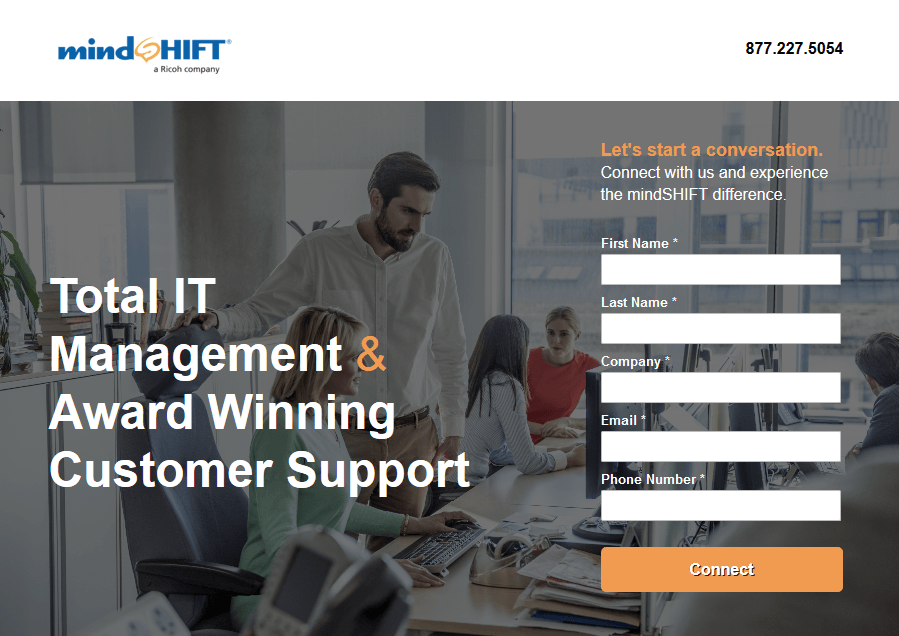
1. Headline: Your headline should grab your visitor’s attention the second they land on your page and compel them enough to stay on the page. The headline must be clear, understandable, and include your UVP (unique value proposition). Accomplishing these three things will help convince your visitors why they need to do business with you, and not your competitors.
MindShift includes their UVP in the headline, “Total IT Management & Award Winning Customer Support” persuading visitors to convert on their form:
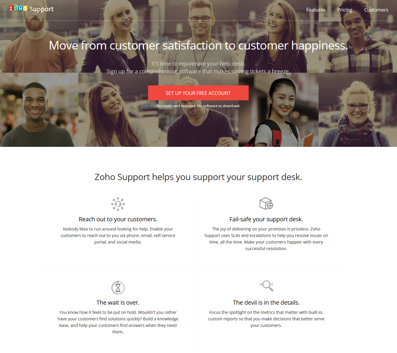
2. Copy: Your landing page copy should explain your offer in just enough detail for visitors to convert. It should be written with benefits in mind — not features — and written in a way that visitors feel that you’re talking to them and not at them. Include the word “you” as much as you can, showing visitors that they’re the primary focus of your page.
Zoho’s post-click landing page is a great example. Not only does the page address the visitors with multiple uses of the word “you,” but it also explains how the service benefits users:
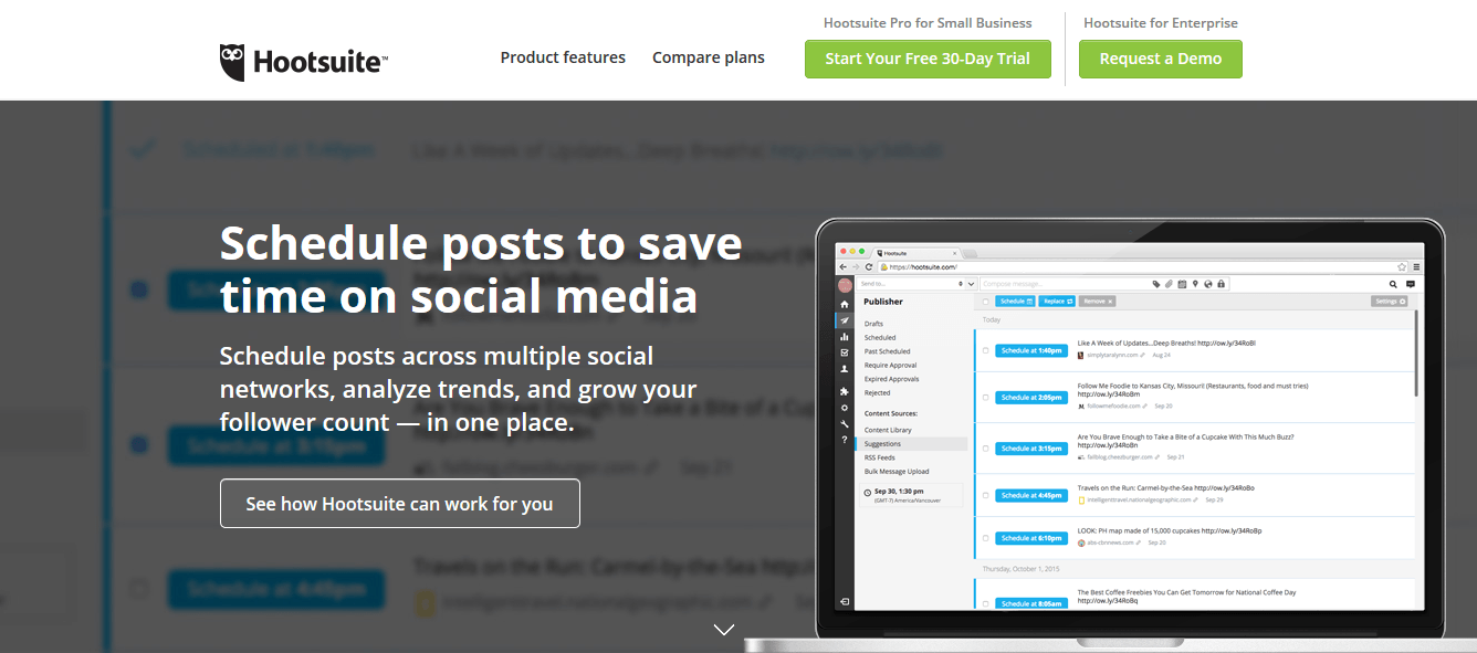
3. Call-to-action button: Your CTA is the gateway to your conversion goal. It’s the last place your visitors act before you get a conversion. Therefore, ensure your call-to-action copy is clear and the button is designed in a contrasting color. Also, the more personalized your button copy, the better it is for your post-click landing page conversions.
Hootsuite has a bright green, optimized call-to-action button on their landing page:
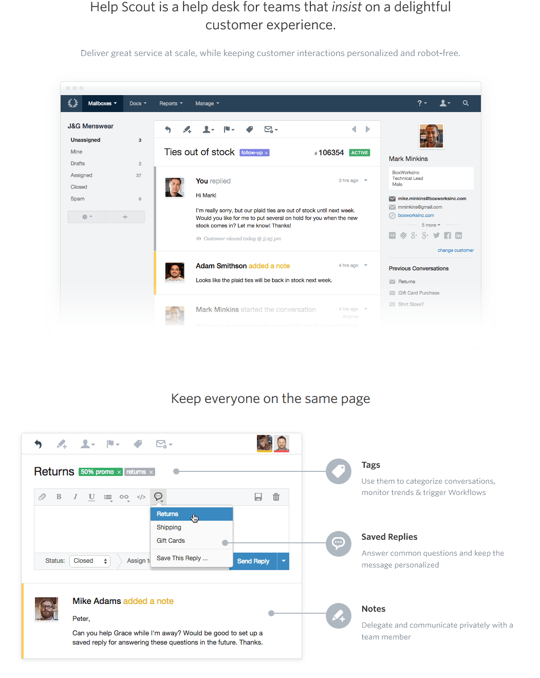
4. Images: landing page images have a greater purpose than simply being nice pictures on the screen. Your images need to be relevant to your offer and help explain what your product or service does for users.
The Help Scout landing page uses images of their dashboard to show visitors how the service can be useful:
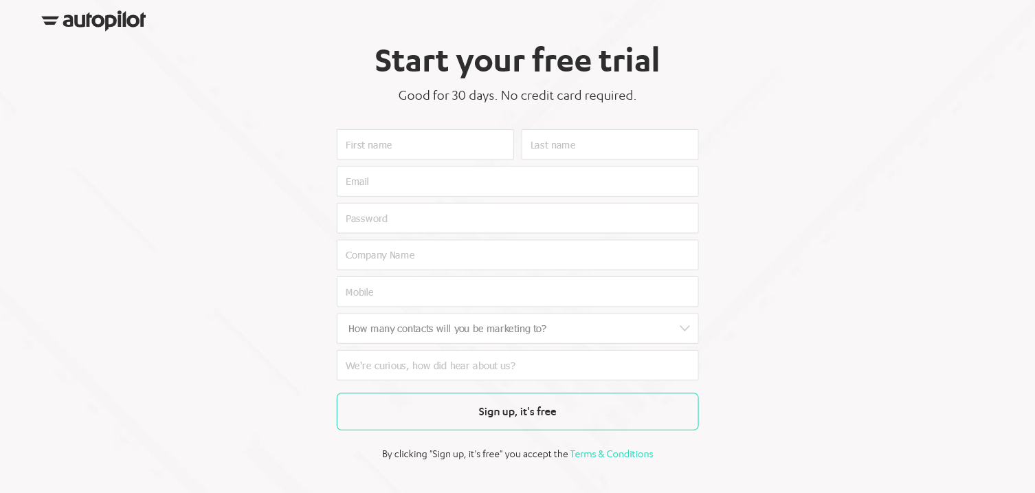
5. Lead capture form: The lead capture form is where you collect visitor information such as name, email, phone number, job title, etc. A form shouldn’t intimidate your visitors and discourage them from converting. Rather, it should be easy to complete and only ask for information that is necessary to your offer at that particular stage in your sales funnel. This combination makes your form optimized.
Autopilot’s free trial click-through landing page has an optimized lead capture form:
In addition to these five core elements, your landing pages should also include customer testimonials, trust indicators, and video.
The development stage involves creating the landing page using coding languages such as HTML, CSS, and JavaScript. This stage involves building the landing page functionality, integrating any necessary tools or software, and optimizing the page for speed and performance.
However, if you are using a landing page platform such as Instapage, the coding is built into the page templates. With Instapage, the development stage consists of incorporating your page copy and page elements.
Effective copywriting is critical to the success of a landing page, as it can influence the visitor’s decision to take action or leave the page. Copywriting should be concise, persuasive, and focused on addressing the pain points of the target audience and communicating the value of the product or service being offered.
Best practices for landing page copy include:
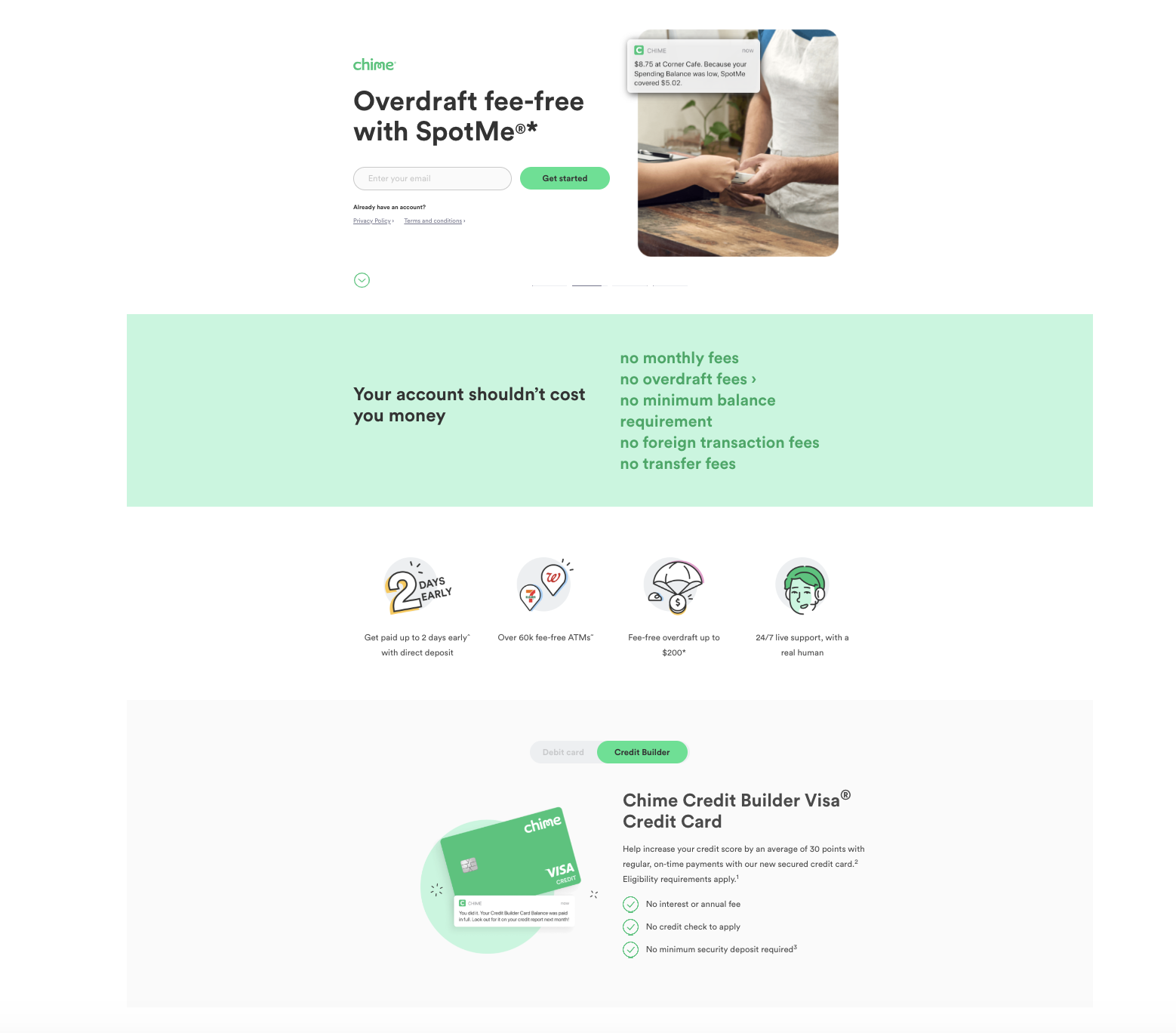
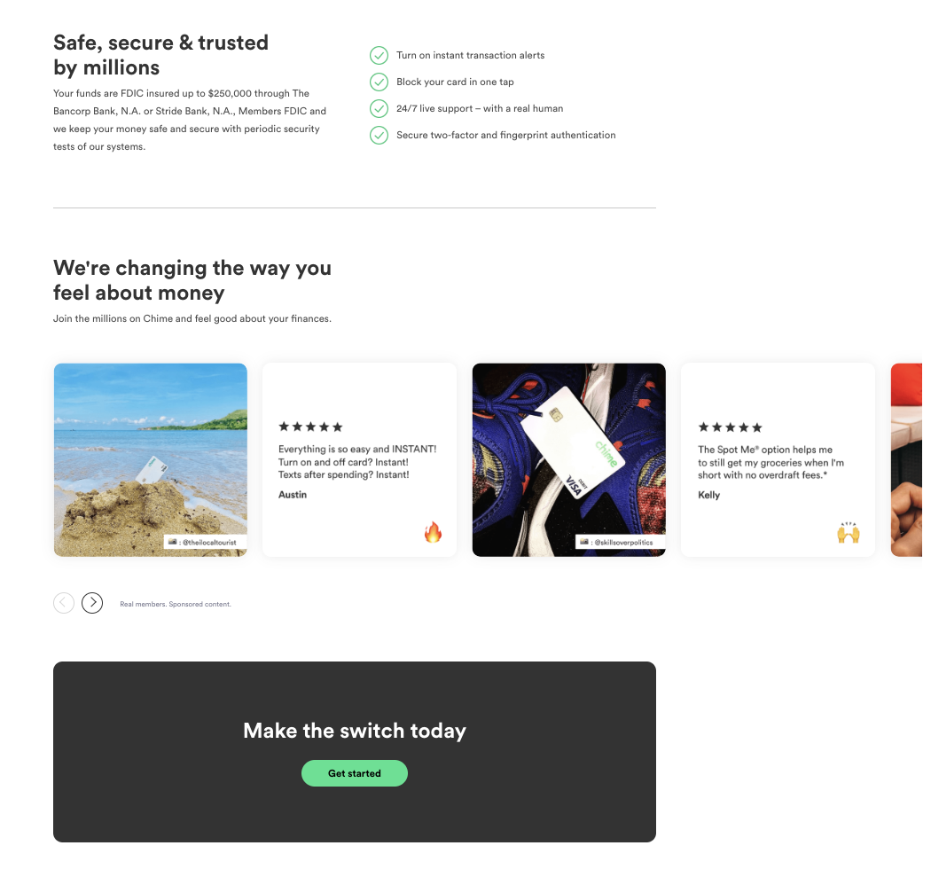
The banking app CTA should be prominent is an example of great landing page copywriting, with simple but catchy headlines, a well-designed visual hierarchy, a benefit-oriented value proposition and focused call-to-action.
AI content generation has become increasingly sophisticated over the last couple years, and can be a valuable resource for creating high-quality content quickly and efficiently. With these tools, such as the AI-based content creation offered by Instapage, you can generate headlines, subheadings, and other copy elements based on your target audience and messaging.
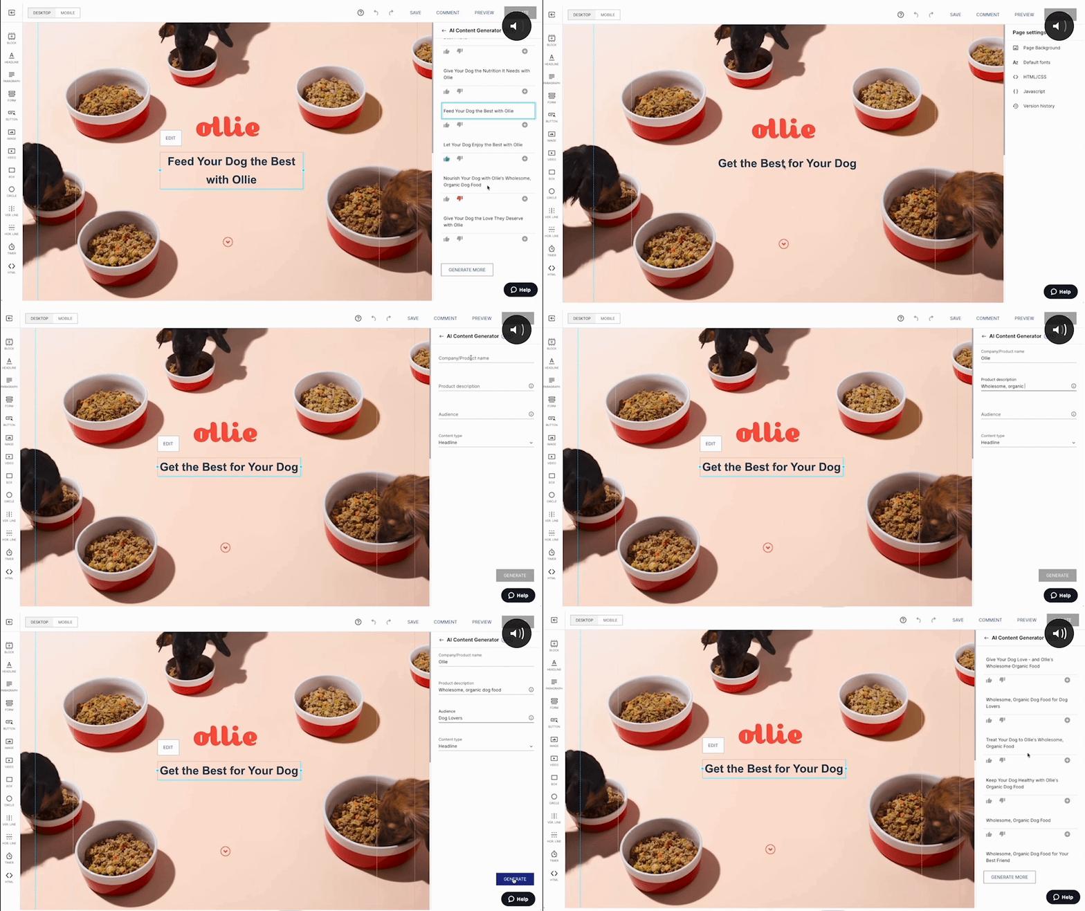
In addition to supporting copywriting, a couple particularly powerful benefits of these tools are personalization and A/B testing.
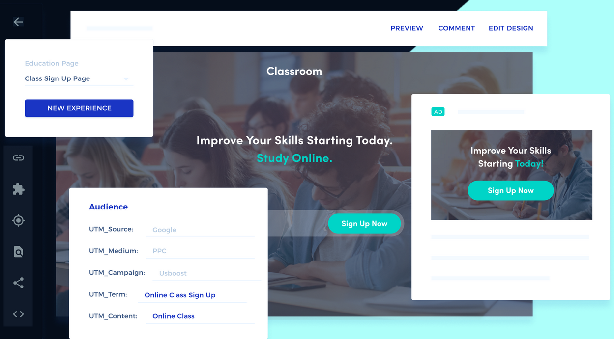
Visual elements such as images, videos, and graphics can help break up the text on your landing page and make it more engaging and visually appealing. However, these elements should also be relevant to the messaging and goal of the landing page.
When it comes to landing pages, less is more. The goal is to maintain a clear, focused user experience that will facilitate conversion. A cluttered landing page with too many visual elements can be overwhelming for visitors. Keep the design simple and focused on the key message and call-to-action. Select high quality images, videos and graphic elements that reinforce the message, but only include the minimum necessary.
Adding trust and credibility elements to your landing page can help build trust with the visitor and increase the likelihood of them taking the desired action. Some examples include:
This Ally Bank landing page builds credibility and trust by leading with social proof in the form of its 2,194 customer reviews, and reinforcing it with the assurance that customers’ money is “FDIC Insured.”

If your landing page goals include lead generation or data collection, you’ll likely want to include a form on your page. In addition to collecting visitor data, forms can be useful for audience segmentation, feedback collection, conversion tracking, and measuring campaign success.
There are a few simple best practices to consider when creating a form:
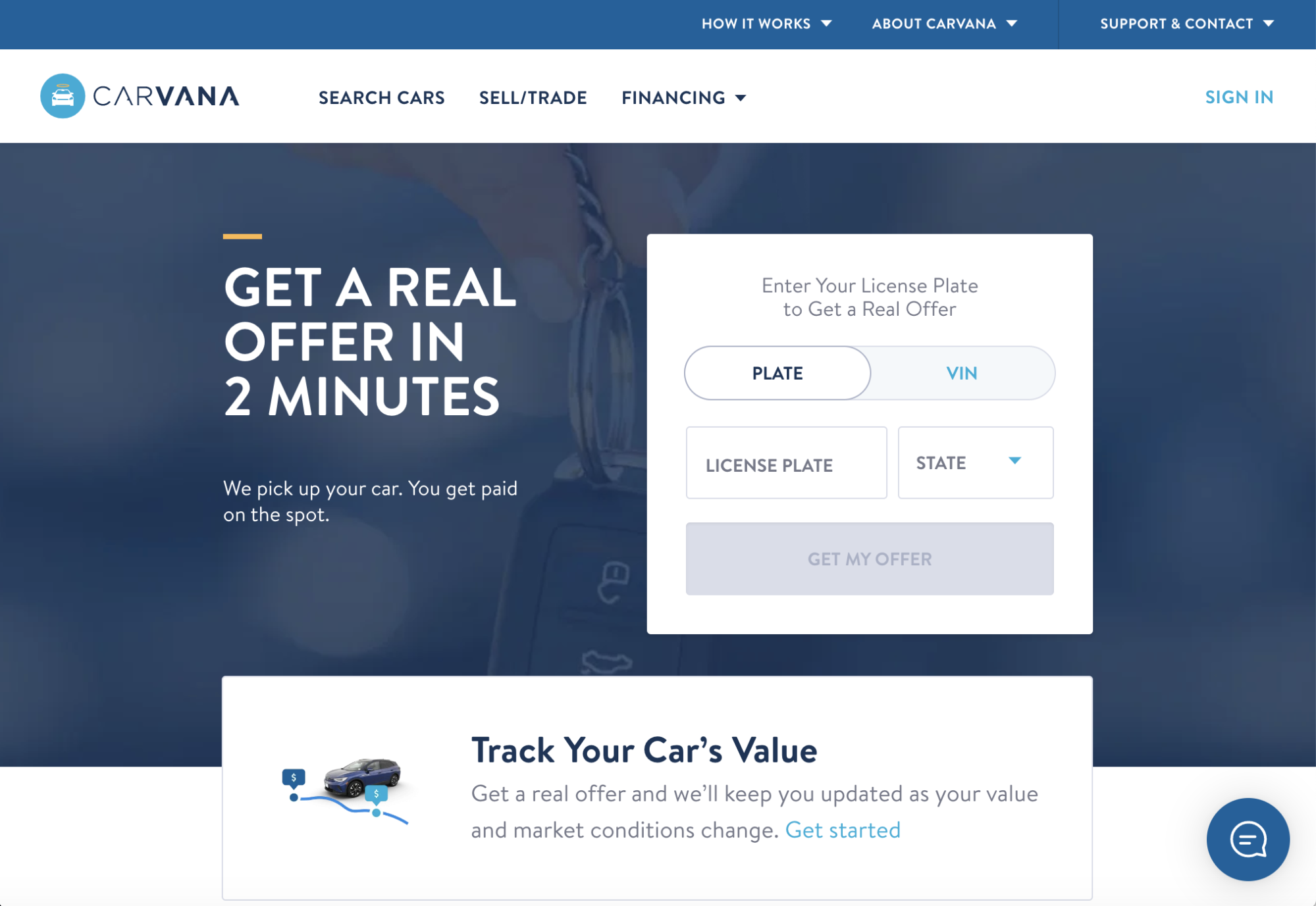
Carvana does a nice job of this on their sell/trade landing page by making it simple for curious visitors to get an immediate offer or simply find out what their car’s value is.
This is a step that marketers sometimes overlook, but when the goal is driving conversions, A/B testing, analyzing the data and optimizing the page is critical to ensuring a high-performing page.
Split testing, or A/B testing, helps you determine which landing page design and messaging elements are most effective. Test different variations of your landing page and analyze the data to make data-driven decisions. Here’s how to set up a simple A/B test:
As a general rule of thumb, it’s recommended to run the test for at least a week to ensure that there’s enough data collected to make informed decisions. However, the length of time required will vary based on the amount of traffic to the page and the size of the changes being tested.
If the traffic to the landing page is low or the changes being tested are relatively small, you may need to run the test for longer to achieve a statistically significant result. Statistical significance is important because it enables us to determine whether the differences between the variations are due to a real effect or simply random chance.
After the test is complete, analyze the results to determine which variation performed better. Use this information to make changes to the landing page and continue to improve its performance. Some of the metrics you’ll want to look at are conversion rate, bounce rate, and time on page.
Landing pages are never truly complete. To maintain a high conversion rate, it’s important to continuously optimize your landing page because consumer behavior, market trends, and search engine algorithms can change over time.
By monitoring and optimizing your landing page, you can improve its relevance, usability, and persuasive power. This can include changes to the copy, visuals, layout, forms, and other elements of the page, as well as changes to the targeting and messaging strategy. Additionally, A/B testing and other testing methodologies can help you identify which changes are most effective and refine your optimization strategy over time.
Platforms such as Instapage have built-in experimentation tools that make it easy to run A/B tests, analyze results, and optimize your page on an ongoing basis. If you’re new to A/B testing, you’ll benefit from the simplicity of having built-in features such as:
Before publishing your landing page, it’s important to preview it thoroughly to ensure that it looks and functions as intended. Be sure to proof the copy, check that fonts are correct, and that copy blocks and images are displaying properly.
Once you’ve made any necessary revisions, you can publish it to your domain or a custom URL. If you’re using a custom URL, be sure it’s clear and concise and memorable.
Next, you’ll want to integrate your landing page with your marketing tools to maximize its effectiveness. For example, you may want to connect it with your email marketing platform to automatically add new leads to your subscriber list.
For example, Instapage integrates with a range of marketing tools, including email marketing platforms, CRM systems, and analytics tools. Incorporating these types of integrations will help you to streamline your lead generation and conversion process.
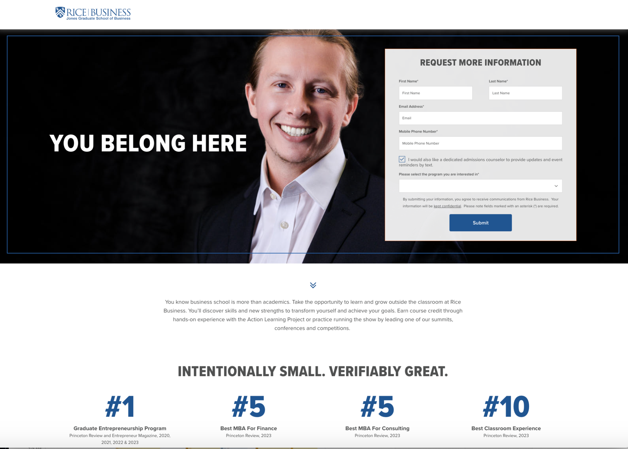
The final step is to promote your landing page. This may involve running paid advertising campaigns—like this Rice Business School example—sharing it on social media, or including it in email marketing campaigns. Use a targeted approach to reach your ideal audience and drive traffic to your landing page.

Creating a high-converting landing page doesn’t have to be complicated, and the more landing pages you create, the easier the process becomes. Just be sure to put ample thought into the planning phase and incorporate as much audience insights as possible, so that you can tailor your value proposition and copy to your target.
Need help getting started? The team at Instapage are here to help. Sign up for a 14-day free trial and you’ll have your next landing page up in no time!
Try the world's most advanced landing page platform today.