Research shows that as many as 9 out of 10 visitors bounce from the average landing page. Some leave because you’re deceiving them (whether you know it or not), and others because you’re wearing their patience thin.
Whatever the reason, it can be remedied. You can lower your landing page bounce rate by convincing visitors to navigate to other web pages. But, do you really want to? Let’s explore…
What is landing page bounce rate?
A “bounce” is a single-page session on your website. For example, if a visitor clicks on an ad to your landing page and abandons before reaching your “thank you” page, that’s a bounce.
Bounce rate refers to the number of single-page sessions compared to all sessions on your website. If five out of every ten people who visit your landing pages leave before visiting a second page, your landing page bounce rate is 50%.
So, is that a respectable bounce rate? If not, what is?
What’s a good landing page bounce rate?
Bounce rate can be a confusing metric. When you hear “high bounce rate,” it immediately triggers anxiety in most digital marketers. But it shouldn’t always. Here’s why…
In some cases a high bounce rate can actually be a sign of good user experience. Blog posts, for example, produce a high number of bounces. If you search “what is bounce rate?” on Google and click through to a blog post that explains it, then leave after you get the answer, that’s a good user experience. A bounce, in that case, is acceptable.
On the other hand, if you visit a landing page and leave immediately at the sight of a giant form, that’s a bad experience. A bounce, in that case, should be optimized for.
So to understand the implications of high bounce rate, you have to assess it based on page type. On landing pages, according to a QuickSprout infographic, the average bounce rate is between 70 and 90%:
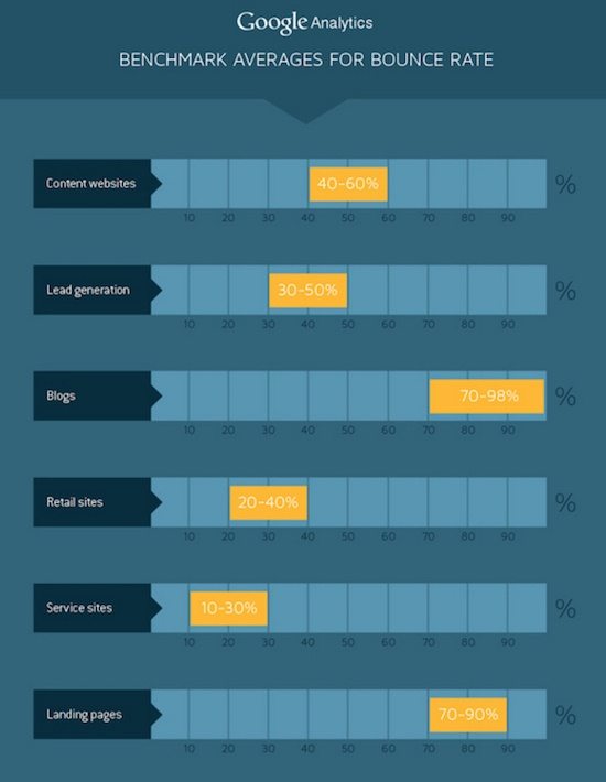
Is that too high? Is lower better? A closer look at that number reveals that landing page bounce rate is even more confusing than bounce rate on other pages.
The difference between landing page bounce rate and bounce rate
In most cases, your goal should be to lower your website’s bounce rate. Yes, it’s perfectly acceptable for a blog post to generate a high number of bounces, but ideally, visitors to that blog post would navigate to other pages on your website. Then they’d enter your marketing funnel.
On your landing page, though, minimizing bounces shouldn’t always be the goal. Remember, lowering bounce rate involves getting visitors to navigate to other pages. But, on a landing page, the only other page you want them to navigate to is your “thank you” page after they convert.
So at first glance, a landing page bounce rate of 50% might look better than the average 70-90%. But, if it’s lower because people are escaping to your homepage through a link in your logo, it’s not helping your bottom line. In that case, a low bounce rate is detracting from your conversion rate.
Keep that in mind when assessing landing page bounces. A low bounce rate is only desirable if your landing page is free of outbound links in the navigation, logo, and the footer.
High landing page bounce rate: causes and quick fixes
If your landing page bounce rate hovers around 70-90%, it could be a sign of poor user experience. Here are some of the most common causes, along with ways to remedy them.
1. Your landing page is deceptive
There’s a chance your visitors are bouncing because they feel deceived. You probably didn’t mean to mislead them, but it happened anyway — likely because you forgot something crucial: Their very first impression of your brand isn’t usually made on your landing page. It’s made moments before:
- First, an internet user sees a sponsored post on social media, or a link in an email, or a PPC ad, etc., and they click through it.
- Second, that internet user arrives at your landing page.
So, while a benefit-oriented headline will boost the odds your visitors stick around, it’s not enough on its own to convince a user to read the rest of your landing page. Your page also needs to have message match.
What’s message match?
The first thing your landing page needs to do is meet the expectation of the visitor. If someone clicks on a link in your email that reads “Learn the basics of landing page optimization from CRO experts,” your landing page headline should read “Learn the basics of landing page optimization from CRO experts.”
The page should also feature your logo, brand colors, and even images that were in the ad that corresponded to it.
Here’s an example from Autopilot of what that looks like. First, the ad:
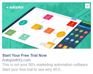
Then, the landing page:
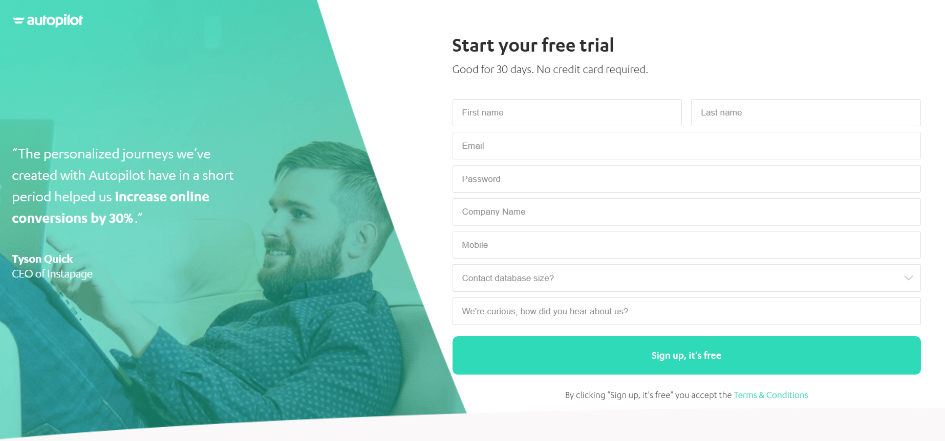
Notice how the headline of the landing page matches the headline of the ad, the offer is the one advertised, and everything down to the colors and logo is identical.
Here’s another example, this time from Marketo. First, the email:

And then, the landing page (above the fold):
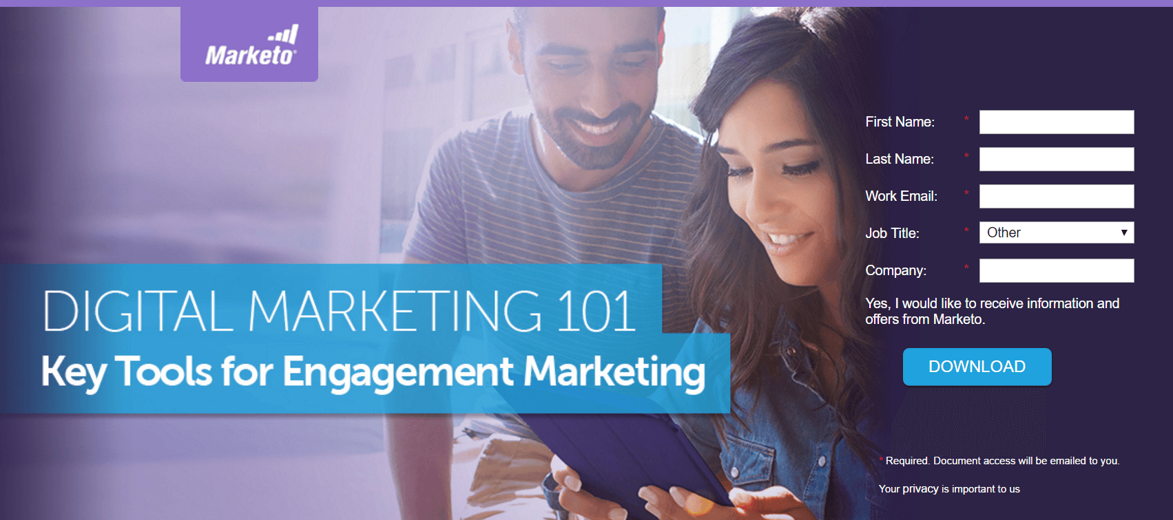
Everything matches between these two:
- The headline
- The logo
- The brand colors
- The featured image
- The call-to-action
As a result, internet users know where they are when they land on the page. Marketo made them a promise in the email, then delivered on it with the landing page. Do the same, or risk boosting your landing page bounce rate.
2. Your form is intrusive
We’ve all seen a lead capture form that could be called “formzilla.” Its intrusive fields send visitors scrambling for the “back” button. Here’s a good example:
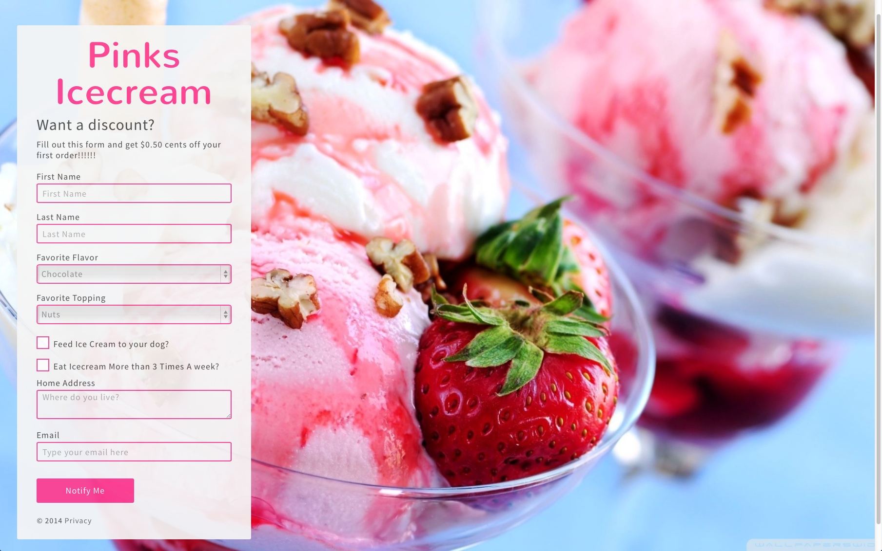
Will people fill out this entire form for a 50 cent discount? Unlikely.
Before you create your lead capture form, your marketing and sales teams should agree on the definition of a lead at different stages of the funnel, complete with the personal information needed to qualify them.
Your form should be built to solicit that information and only that information. Each optional field you add decreases your odds of converting visitors.
And if you absolutely need to collect 10 fields’ worth of visitor data, break up the form with a multi-step conversion process, or improve your offer. Remember the golden rule of landing page forms: The offer must always be greater than or equal to the ask.
3. Your page loads too slowly
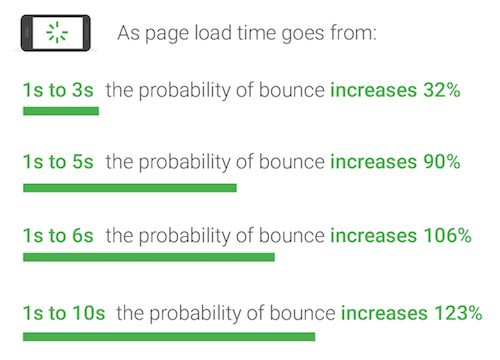
According to Google, one of the biggest contributing factors to high bounce rate is page load time. Multiple studies involving hundreds of thousands of landing pages, machine-learning technology, and behavioral data uncovered something surprising: The average mobile landing page takes 22 seconds to load, and the effect on bounce rate is huge:
How to improve page load speed
If your page doesn’t load in 3 seconds or less, Google researchers suggest trying the following:
- Cut down on page elements. According to Google, 70% of pages they tested were over 1MB, 36% were 2MB, and 12% were over 4MB. Via a fast 3G connection, 1.49MB takes around 7 seconds to load. The cause is too many page elements (images, headlines, buttons, etc.), and the result is visitors bouncing before they even see your entire landing page.
- Set performance budgets. Before you begin building your landing page, determine how fast you want it to load — aka “the budget.” From that budget, determine the elements you can include on your page to meet it. In the case of a lagging page, the best solution is prevention.
- Get rid of images. Favicons, logos, and product images can easily contribute to ⅔ of a page’s size. Researchers found that, compared to pages that couldn’t convert visitors, pages that could featured 38% less images. If you absolutely need to include them all, at the very least consider using an image compressor to compact their size.
- Minimize use of JavaScript. JS halts the parsing of HTML code, which slows down the speed at which a landing page can be displayed to visitors. Programs like AMP and AMP for ads give developers a framework to build pages without JavaScript, making them load in the blink of an eye.
4. You’re generating the wrong traffic
The biggest contributing factor to landing page bounce rate is traffic. That should be obvious, considering the people who navigate to the page are in control of whether they stay or leave.
Who they are and where they’re coming from have a big impact on how they interact with your landing page, says Jakob Nielsen, who sorts traffic into four categories:
1. Low-value referrers: These are content aggregators that you might click through from the bottom of a Huffington Post article:

People who click through these links are on a mission to satisfy curiosity and don’t necessarily have a strong interest in what you’re offering.
For example, the “36-Year-Old CEO Bets $560,100,000 on 1 Stock” link sends visitors to a landing page on which they can sign up to receive a free stock report. But, the people on this page have just finished reading an article about bees in the “Green” section of the publication, so why would they be interested in stock tips?
In the “finance” section, this link would make more sense. But here it’ll drive less relevant traffic.
2. Direct links from other websites: These are links like the one we just added above in the text “a landing page,” which, when clicked, drive you to the Motley Fool’s landing page.
Clicking on it to see that landing page means you have some interest in the content, but not to the level that someone arriving through a relevant ad or email will.
3. Search engine traffic: Traffic referred by this source is some of the most valuable, which is why some businesses pay over $900 per click on Google Ads:
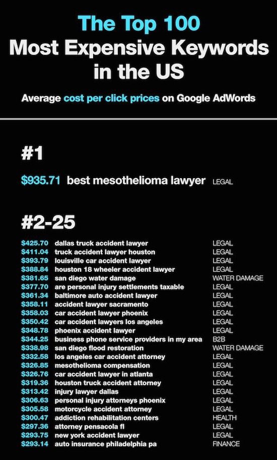
The reason that traffic is so valuable is because it’s high intent, meaning, the people typing “best mesothelioma lawyer” into Google are looking for a solution to a very specific problem.
If you bid on the right keywords and offer that solution with a perfect landing page, it’s less likely users bounce, and waste a valuable portion of your company’s PPC budget in the process.
4. Loyal visitors: These are people who frequently visit your website through sources like email and social media. As fans and subscribers, they’re familiar with your brand, which means they’re more interested in your offers than people who find you through low-value referrers or direct links on other websites.
The key to driving quality traffic is understanding your advertising channels and the people who use them. Get more from your optimized landing pages by creating comprehensive buyer personas, otherwise risk generating bad traffic with a high chance of bouncing.
5. You hid your call-to-action
Unfortunately, accidentally hiding your call-to-action button is easy to do. Certain colors and locations can make it almost totally invisible to your landing page visitors.
Just take a look at the heat map below:
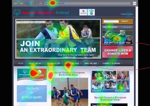
The big red rectangle on the right of the page that reads “CHANGE LIVES & DONATE NOW” is a call-to-action button. But, you’ll notice the heat spots on the page that it’s not getting noticed.
The navigation menu, featured image, and left sidebar are getting more attention than the call-to-action. But why? The button’s big and it’s red. How could it not lure eyeballs?
First of all, it’s in a location that most of us are used to seeing ads — the right sidebar — like this one:
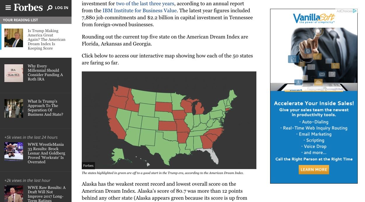
It’s overly stylized design also makes it appear, at a quick glance, like an ad. As a result, an element of banner blindness is at play. Users will ignore information they perceive to be an ad. In this case, that’s the CTA button and accompanying image.
Here’s another example:
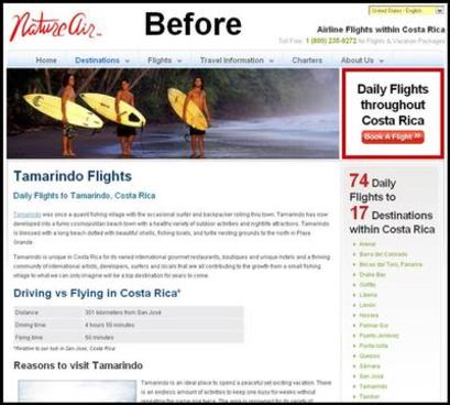
The call-to-action button is in a similar location here. Research shows that the right side of the screen tends to get noticed much less than the left side:
![]()
That makes sense, considering the left margin is our home base when reading.
The red border also makes the area containing the CTA button look a little ad-like. On the whole, the design of the page hides the call-to-action. Eyeballs are being drawn elsewhere.
Upon arrival to this page, there’s a good chance visitors’ attention was drawn to the three surfers on the left side of the featured image. From there, their eyes probably wandered downward, toward the “Tamarindo Flights” headline.
Then, they scanned down the page to subheadings, then briefly skimmed across until their eyes hit the right margin. Then they returned to the left margin and started all over again. In that process, the call-to-action gets totally missed.
But when the CTA was moved to a more prominent location, conversions increased by nearly 591%:
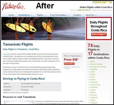
To make sure your visitors don’t bounce out of frustration that they can’t find your CTA button, remember the following best practices:
- Your CTA button should accommodate the F-pattern and Z-pattern styles of reading online.
- Do not overly stylize your button. In both the examples above, unnecessary design components made the button resemble an advertisement.
- Your call-to-action should contrast the rest of your content. Employ the use of visual hierarchy to make it stand out among less important elements.
- The colors you use have a big impact on the discoverability of your CTA button. Fill yours with a complementary hue that makes it pop.
Nearly 50% of websites have a clear call-to-action that’s noticeable within the first three seconds of landing on the page. Is yours one of them?
6. Your page isn’t skimmable
If you dislike writing, we have some good news: Your visitors don’t like reading (well, your landing page copy at least).
Instead of focusing on each individual word, studies have shown that people’s eyes usually scan particular areas of a web page. Even before the internet, they skimmed. They still do.
So ask yourself: “Is my copy formatted for skimming, or does it look like the passage below?”
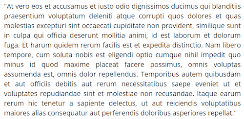
If it does look similar, it might as well be written in Latin, because your visitors will bounce before they read it.
That’s why your page needs to be optimized for three things:
Legibility
This refers to how easily visitors can discern between characters and letters of your chosen font. Decorative fonts can be used in headlines, but they should never be used in body copy. Here’s a visual example of why:
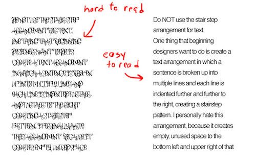
Both paragraphs are identical, but one’s infinitely easier to read. Stick to sans-serif fonts for anything in your body copy, as they’re easier to read at smaller sizes.
As far as how small you can go, stick to around 16px. That’s around the size we’re used to seeing in books, research indicates. (Book left, screen right).

Comprehension
Here’s an excerpt pulled from the abstract of a 1990 study on “the overconfidence effect.”
In 5 studies with overlapping designs and intents, Ss predicted a specific peer's responses to a variety of stimulus situations, each of which offered a pair of mutually exclusive and exhaustive response alternatives. Each prediction was accompanied by a subjective probability estimate reflecting the Ss' confidence in its accuracy—a measure validated in Study 5 by having Ss choose whether to "gamble" on the accuracy of their prediction or on the outcome of a simple aleatory event.
Without rereading that a few times, can you quickly and easily understand what the authors are trying to say? Probably not. (Don’t feel bad, most people wouldn’t be able to).
Words and phrases like “aleatory,” “subjective probability estimate,” and “reflecting the Ss’ confidence in its accuracy” sound like a different language, don’t they?
These are not written for high comprehension. Along with obscure words, they’re filled with jargon that’s only likely to be understood by professionals in the field.
Unless you’re selling to an audience with a high technical knowledge of your industry, stay away from jargon. Instead, write as though you’re communicating to a 6th grader.
For example, “aleatory” means “random,” according to Google:

So why not say that?
There’s more than just a benefit to your reader. Simpler words can actually make a writer appear more intelligent, a Princeton study shows. So use small words to convey big ideas.
Not only are they easier to understand, but they’re easier to spell and to use grammatically too. That’s crucial when research shows that even one error can ruin your chances of converting a prospect.
Consider these responses from visitors who were asked about their perception of a spelling or grammar error on a company website:
“Bad grammar or bad spelling is an indication of carelessness. A second error indicates
unprofessional people and problems will probably occur if I get involved with them.”
“If they are skimping on grammar, I wonder what else they are skimping on. The industry is
irrelevant.”
“I have to admit I will stop reading a website if I notice grammatical errors, and I actually become much more critical about the opinions of the site. That is how much it bothers me.”
‘If they can’t take the time for a spell check or some editing, they probably won’t
take time for their customers. Even if you think it doesn’t matter, subconsciously it
would.”
Mistakes like these not only damage comprehension, but they ruin your credibility, too. If you ever question whether you’re using a word correctly, use a different word. When in doubt, keep it simple.
Readability
To achieve readability, a page requires more formatting than you might think. Research shows that people prefer to read headlines, subheadings, and bolded words before unformatted text. That means you need to effects to make your body copy look more like the example on the left than the one on the right:
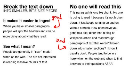
Draw visitors in with a benefit-oriented headline, separate your page into sections with subheadings, and divide long paragraphs into chunks or bullet points.
It’ll make your page more than readable; it’ll make it memorable too. Research has shown that it’s easier for people to retain information when it’s broken down into chunks.
What’s your landing page bounce rate?
How do your landing page bounce rates compare to industry benchmarks? Are they better? Worse?
Either way, we recommend you consult our guide to optimizing the landing page experience:
Then, improve your prospects’ landing page with designer-friendly features and 100% customizable templates. Sign up for an Instapage 14-day free trial today.
Try the world's most advanced landing page platform with a risk-free trial.
