In online marketing, it all comes down to the consumer moving their eyes across a screen. While clicks and conversions are an integral part of the marketing funnel — and sales are ultimately the end goal — all of this depends on eye movement.
- Is that headline you spent so much time carefully constructing stopping people in their tracks, or are they just skipping right over it?
- What about your CTA button? Is it big and bold enough to make people even consider clicking?
Landing page software used to measure click-through rates, conversion rates, sales, etc., but marketers also need a way to know whether the consumer is even directing their attention where it’s meant to be directed — a tangible way of measuring the visual impact of their content.
That’s where eye tracking software comes into play.
What is eye tracking?
In short, eye tracking measures where people look on a web page and for how long.
With eye tracking software visual data, you can see where a person looked first on your page, where they looked second, and for how they were fixated on those areas. You can also find out if there were areas on your page in which they didn’t look at all.
This information helps marketers discover what elements of their page users find most and least interesting, so they can then adjust their web page design and advertising efforts accordingly.
Although marketers use eye tracking software more heavily today than they ever did in the past, this technology is far from new. In fact, eye tracking research dates all the way back to the late 1800s.
A brief history of eye tracking
In 1879, Louis Emile Javal noticed that people don’t read smoothly across a page, but that they pause or slow down on some words, and move quickly through others.
Edmund Huey then created a device that was used to track eye movement during reading. Although it allowed Huey to observe where a reader was looking while reading (including which words they paused on), the device was quite intrusive and uncomfortable to wear.
In 1931, Earl, James, and Carl Taylor created the Ophthalmograph and Metronoscope — devices used to record eye movement while reading and train people to read more efficiently.
For many years, eye tracking was used primarily as a research tool in the medical field because of its high cost. It wasn’t until the 1980s that it became more widely used by other niches, including marketing.
At this time, marketers began using eye tracking to measure the effectiveness of magazine ads. Then, in the late 1990s, one of the world’s largest advertising and marketing agencies, EURO RSCG, instituted eye tracking technology to measure reactions to web content.
Over the past decade, eye tracking software has become more frequently used than ever before. In marketing, specifically, it’s used heavily in developing effective advertising campaigns and website designs.
Eye tracking software and online marketing
It’s no secret that creating a beautiful, aesthetically pleasing page is integral to catching the consumer’s eye — but equally as important is how each component is situated on the page. Whether you’re creating a homepage, post-click landing page, or any other type of web page, every element must be artfully and strategically placed to be properly noticed by visitors.
To do this, it’s critical to understand how people read content online. With the use of eye tracking research, marketers have learned that two of the most common design patterns to follow are the F-Pattern and the Z-Pattern layouts.
The F-Pattern layout is commonly used on highly-dense web pages in which people’s eyes move over website copy and other visuals in the shape of an F, or even an E.
![]()
- First, they scan the top of the page to read important headlines
- Then, down the left side of the page, taking note of numerals or bullet points
- Next, across the page again to read subheadlines or bold text
This pattern continues down the page with readers stopping when they find something interesting along the path.
Here’s a post-click landing page from ServiceNow that follows the F-Pattern:
- Visitors will see the bold headline and red CTA button first.
- Then they’ll scan from the top to the image of the man on the tablet.
- Next, down the left side of the page to find the numbered list stretching horizontally across the page.
- Finally, they’ll continue down the page to the lead capture form and second CTA button.
The Z-Pattern is another frequently used design pattern, but this one is primarily meant for pages with minimal copy. In this case, the most important elements should be situated on the page in the shape of a Z so that you can intentionally control where the viewer’s eyes move.
![]()
- The top horizontal line should highlight the major components viewers are supposed to notice first
- The diagonal line should include any critical information leading up to your call-to-action
- Finally, the bottom horizontal line should feature the CTA
Again, this pattern can continue down the page creating as many Z-shapes as necessary to display all essential elements.
Expo Pass created this post-click landing page with multiple Z-Patterns down the entire page:
![]()
Notice how there’s a CTA button on each turning point of the Z-path, making them more prominent to visitors.
How do heat maps come into play?
A heat map is a data visualization that uses a color-coded system to display how visitors interact with, and behave on a web page. Using heat maps to gain this vital information helps marketers decide which page elements to A/B test.
There are several different types of heat maps commonly used by marketers:
- Mouse-movement heat maps to indicate how a visitor moves their mouse and hovers over various sections of the page
- Click maps to track performance of important buttons, like the CTA button
- Scroll maps to show how visitors scroll down a web page
- And of course, eye tracking heat maps to show exactly where visitors are looking at on a web page
There’s a strong correlation between mouse-movement heat maps and eye tracking heat maps because they use similar technology. One of the main differences is that mouse-movement technology provides data from actual website visitors, while eye tracking technology provides data from a sample of people who are being studied outside their normal environment. With this in mind, it’s important to acknowledge that eye tracking software provides results close to 100% accuracy, while mouse-movement accuracy is around 85-90%.
The new Instapage Heatmap Visualizer provides 3-in-1 tracking functionality to provide insight on mouse-movement, clicks, and scroll depth.
Mouse-movement
![]()
Clicks
Scroll depth
![]()
Now let’s look at how eye tracking heat maps can substantially help marketers understand their consumers and improve their online marketing strategies.
Eye tracking heat maps
Regarding the F-Pattern mentioned above — this is what the layout looks like on an eye tracking heat map:
![]()
The color key is as follows:
- Red = most viewed and most fixated on
- Yellow = some views, but less fixation
- Blue = fewer views and hardly any fixation
- Gray = hardly any views and no fixation
While F and Z-Patterns are frequently studied in eye tracking research, there are also other design tactics and best practices to consider when it comes to eye tracking.
Best practices derived from eye tracking research
With these seven eye tracking insights, you can influence where your visitors focus their attention and fixation.
1. Place your most valuable content above the fold
Since you typically only have 8-seconds to grab your visitors’ attention, your most important and enticing content must be placed above the fold to captivate visitors immediately.
Plus, as you can see from the heat map below, content above the fold gets looked at the most:
![]()
2. Make headlines big and bold
In addition to writing a readable, impressionable headline, it’s also important that you design it to be big and bold. It’s simple — the larger and bolder your headline is, the more likely people are to read it.
3. Separate copy into small chunks
Humans tend not to readily absorb massive blocks of text. Instead, we tend to skim over the text on web pages, looking only at the most easily digestible information.
Therefore, it’s best to break up your web page content into short paragraphs or chunks of information, using headings, numbered lists, bullet points, etc. to draw attention.
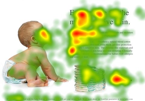
4. Use images to achieve specific objectives
Images on web pages serve a number of purposes.
Looking at a person online usually prompts a positive physiological reaction of understanding, identification, and trust in viewers. In fact, an image of a person’s face increases viewing, encourages interaction, and decreases bounce rate.
Images also influence where your visitors’ eyes are looking. Several heat map studies (including the one below) have shown that people tend to follow the direction of the human’s eyes when navigating a web page.
5. Utilize the left side of the page
Studies show that the left side of a website gets viewed first, and more often than the right side.
In fact, web users typically spend about 69% of their time viewing the left half of the page, and only about 30% viewing the right half.
6. Make use of contrast
According to a Caltech neuroscience study, when consumers are in a hurry and under pressure, visual impact influences their decision more than their personal preference does. In other words, when your website visitor is in a rush, they’re less likely to think about their personal preference, and more likely to make a decision based on what stands out to them and what they notice most.
7. Place CTA buttons at the bottom of the page
Whereas the top portion of a page is the most-viewed, the bottom portion is the second-most viewed. That’s because when people scroll on a web page, they tend to scroll straight down to the bottom. Of course, then, this is an ideal location for your CTA button.
This Crazy Egg heat map shows several calls to action located on the page. As you can see, the CTA button on the bottom, left-side of the page gets the most attention:
![]()
Use eye tracking to improve your online marketing
Although it’s impossible to force consumers to buy your product or service, knowledge is power. Using eye tracking research and heat maps to build your pages makes it possible to have more control over where visitors direct their attention on your page. This increases the chances of them taking action, and in turn, can improve your website, your conversions, and your business.
Sign up for an Instapage Enterprise demo today.

See the Instapage Enterprise Plan in Action.
Demo includes AdMap™, Personalization, AMP,
Global Blocks, heatmaps & more.
