Most Tuesdays are ordinary. November 6, 2018 was not an ordinary Tuesday — it was midterm election day.
Many post-click landing pages we come across are standard — they persuade visitors to redeem traditional offers like downloading an ebook or registering for a free webinar.
There are some post-click landing pages, however, that fulfill a higher purpose. They inspire people into performing actions that could significantly change the course of future events.
Political post-click landing pages — or election post-click landing pages to be exact.
What are election post-click landing pages?
Election post-click landing pages are standalone pages created to get users to perform an action regarding an upcoming election campaign or politics in general. These actions can range from submitting donations, volunteering, applying for a job, and getting rally tickets to join political forums.
During the 2016 presidential election, both Hillary Clinton and Donald Trump launched elaborate political marketing campaigns using dedicated pages to collect donations and sway voters in their favor. Furthermore, we’ve discussed how Clinton and Trump used post-click landing pages during the presidential election. Today, we review how election post-click landing pages are being used in the midterms.
1. DSCC (Democratic Senatorial Campaign Committee)

- “Support Democrats Today” headline is direct and to the point and explains what the visitor is expected to do.
- The copy explains why the visitor should donate.
- The multi-step form doesn’t overwhelm visitors because it is broken down into steps, making it easy to complete.
- The page is mobile responsive because it readjusts its formatting to suit the screen size (resize the browser or view the page on mobile to view this in action).
- The image of Trump is relevant and provides a comical element to the page. It looks as if he’s doing his famous “you’re fired” gesture but is instead implying you to donate to the opponent party.
- Including a blank/write-in donation amount is smart because it gives people the option to select a different amount. Presumably, more than the other donation amounts.
- Replacing the image with one that uses a visual cue of someone looking at the donation amounts/CTA button, is a stronger indicator the visitor should donate.
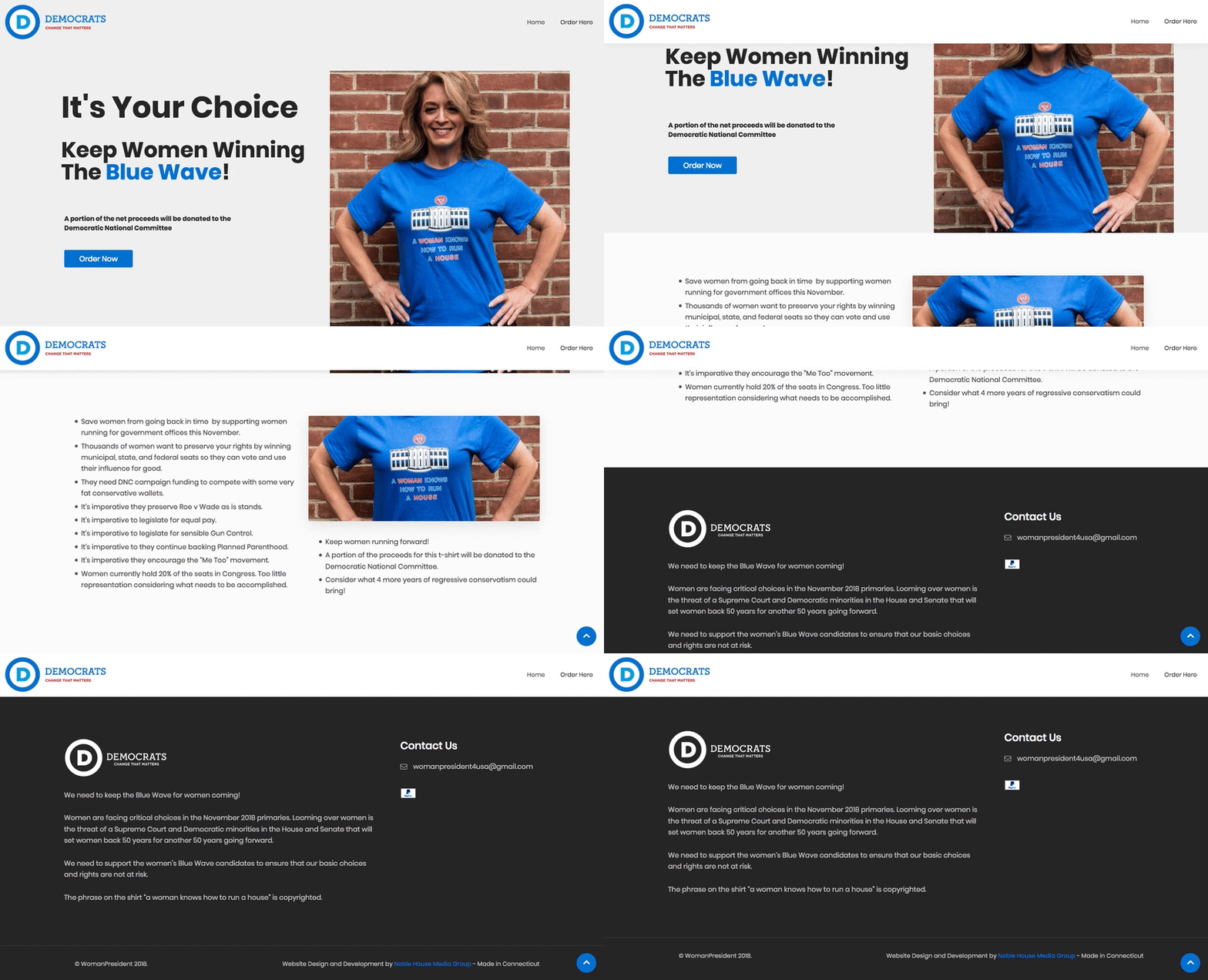
2. Woman 4 President USA

- The headline is a bit vague. It explains what the Blue Wave movement is, but isn’t really clear on the fact that the offer is actually the T-shirt the woman is wearing.
- The image of the woman in the T-shirt showcases what the merchandise looks like.
- The click-through page design introduces the offer but once you click the CTA button, goes to the pre-shopping cart page.
- The CTA button copy tells visitors that they’ll begin the ordering process for the T-shirt once they click the button.
- The bulleted copy explains what the Blue Wave movement is about and why it’s important for the visitor to support it.
- The blue arrow anchor link in the bottom-right corner directs visitors back to the top where they can click the CTA button.
- The Home navigation link on the main post-click landing page is redundant because it reloads the same page.
- The PayPal icon near the footer indicates people can pay for the offer with the service. However, it’s not hyperlinked and is too small for people to notice it easily.
- The hyperlink in the footer is unnecessary. As it is, it provides an exit route off the page before people can purchase the offer.
3. NRSC (National Republican Senatorial Committee)

- The headline explains the value proposition — the visitor needs to protect the majority by contributing to the NRSC.
- The outlined dots show exactly how many Senate seats are up for grabs, and which party currently holds those seats.
- The copy assures the visitor that their donation supports the NRSC and will work to expand the Republican Senate majority.
- The form is a bit too long for an on-page form. It would have worked better if it was a multi-step form, similar to the DSCC post-click landing page earlier.
- The “make this a monthly contribution” option gives people the option to make recurring donations. Also, bolding “monthly” makes it clear how often the donation will take place.
- The blue CTA button contrasts nicely with the page so visitors can’t help but notice it immediately.
- No security badges like Norton, McAfee, or TRUSTe could dissuade people from donating. They may think, how can I trust the NRSC to keep my payment information secure?
- The privacy policy link in the footer allows people to see how the NRSC will handle their personal information.
Optimized election post-click landing pages allow parties to fulfill their political goals
Election post-click landing pages can bring a lift to a variety of campaigns, including political marketing campaigns. Whether you’re creating a page to encourage donations or are educating visitors on important issues, your post-click landing page should be dedicated to a specific objective.
The above examples provide a small sample how to design an optimized election post-click landing page. To see a variety of post-click landing page examples with full critiques and what should be A/B tested, sign up for an Instapage Enterprise demo here.

See the Instapage Enterprise Plan in Action.
Demo includes AdMap™, Personalization, AMP,
Global Blocks, heatmaps & more.
