LendingTree is an online loan marketplace with one of the largest networks of lenders in the country. Since the brand provides multiple services to customers, they segment their audiences for every offer and target ads with relevant landing pages
. Let’s explore how.
How LendingTree uses landing pages
Example 1: Facebook refinance loan ad
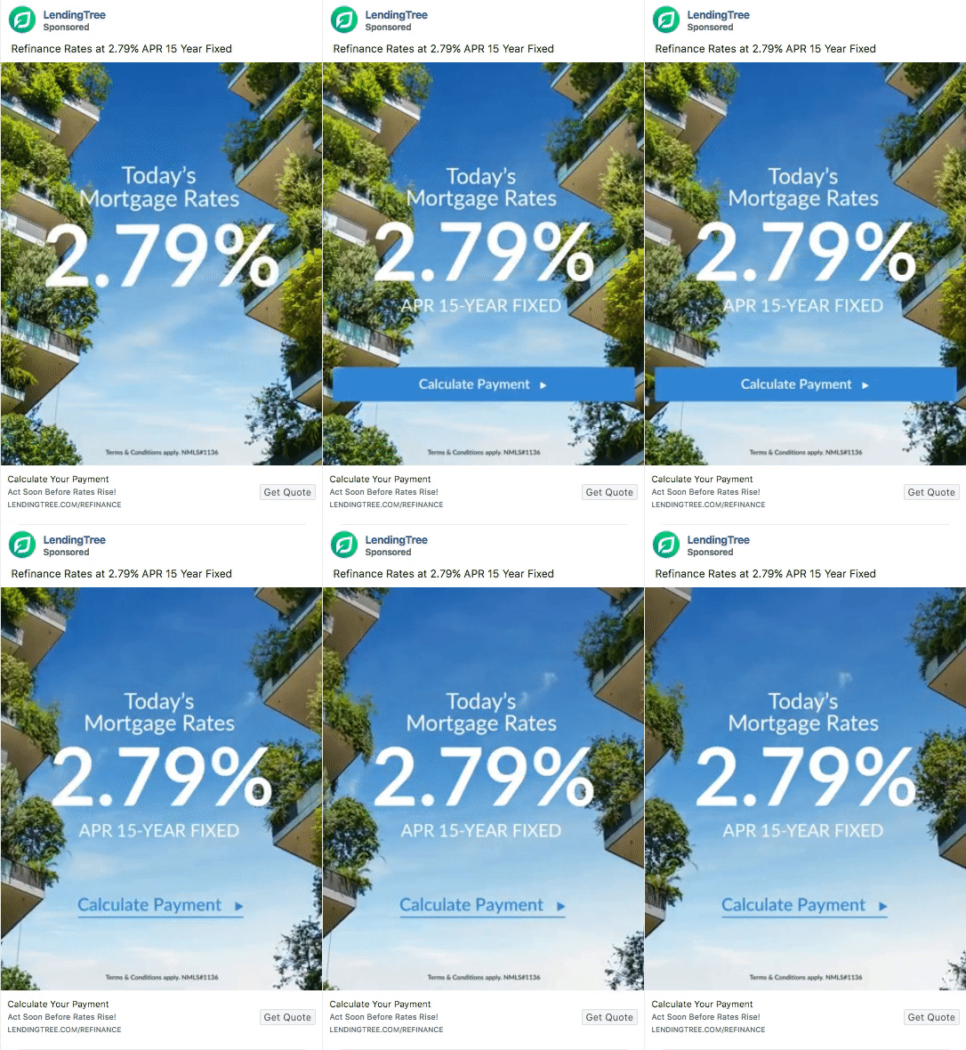
LendingTree uses this Facebook ad to promote their refinance loans. The ad describes that customers can get refinance rates at 2.79% APR and urges them to get their quotes quickly before the rates increase:

The ad directs prospects to this landing page (step 1 and step 2):


- What is the offer? Once clicking single family home, the page opens up to a multi-step form that asks visitors to select the type of property they are looking to refinance. Selecting their desired property allows the visitor to proceed to the second step and select how they’ll be using the property:

The form then asks visitors to select the reason why they’re refinancing, moving them to the next step. The platform asks visitors to enter their zip code, an estimation of their property, the remaining first mortgage balance, credit score, the property address and then shows them a quote based on this information.
- Who is the offer for? The multi-step form makes it clear the offer is meant for homeowners who are interested in refinancing their property.
- Why sign up? The primary page element is the multi-step form that asks visitors questions that help the platform learn about their exact needs, which ensures the visitor gets a quote that’s perfect for them.
- How can visitors sign up? The multi-step form is easy to fill out, plus they optimize the form with concise form fields and images that are relevant to the user’s information.
Example 2: Facebook homebuying guide ad
The platform uses this Facebook ad to promote a guide on home buying:

Clicking through the ad brings the user to this page:

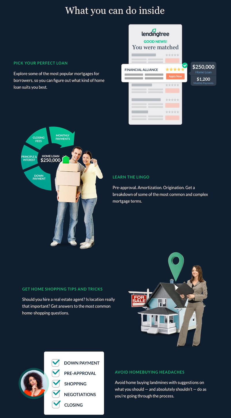
- What is the offer? The headline “The Complete Guide to Homebuying” reassures the visitor that they’ve come to the right place. The image of the guide and the CTA button copy “Get the Guide” also showcases the guide featured in the ad. The “What you can do inside” section explains how the guide should be utilized once downloaded:

- Who is the offer for? The offer is meant for prospects looking to gather information on the type of loan they should get, acquaint themselves with the correct terminology, and learn tips and tricks.
- Why download the guide? The guide unpacks the important stuff prospects should know about getting a mortgage, finding a house, and making an offer. They can avoid mistakes, get prepared, and take the uncertainty out of home buying.
- How can visitors sign up? Clicking the CTA button opens the guide in a PDF on the browser. No need to wait for an email or to download the guide.
Example 3: Google search ad for best loan rates
Doing a Google search for “how to get best loan rates” prompts this LendingTree ad. The ad’s headline highlights that the platform offers “best low interest loans,” which is relevant to the search query. The copy conveys that clicking through will allow users to compare low interest personal loans.

The ad directs visitors to this page:

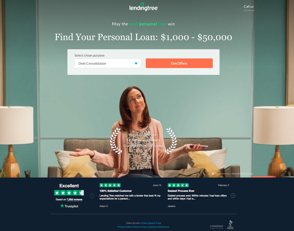
- What is the offer? Both the ad and page tell the same story – how to find your personal loan. Plus, the ad copy and page headline mention getting loans for up to $50,000.
- Who is the offer for? The offer is meant for prospects who want to compare personal loan rates to find a loan rate that suits them best.
- Why should visitors compare loan rates? The social proof helps users make the decision of using LendingTree to find the best personal loan rate. The fact that the platform has helped over 10 million customers and assisted customers in borrowing over $6 million further persuades prospects. Plus, the 7,958 customer reviews by Trust Pilot and an “Excellent” rating allow visitors to see others have successfully used LendingTree for their loans:

- How can visitors compare loan rates? Visitors can select a loan purpose from the dropdown:

Based on the option the visitor selects, they see a multi-step form that asks their loan purpose, how much they would like to borrow, how quickly they need the money, their zip code, etc. At the end, visitors get to see a comparison of rates based on the details they’ve submitted.
In comparison to LendingTree’s homepage
Compared to the unique, personalized landing page above, the LendingTree homepage introduces the service as a platform that gives customers the best loan deals possible:

- The option to select from all kinds of loans: Every page above was dedicated to the preceding offer highlighted in the ad. However, the homepage allows users to shop and compare all types of loans, insurance, and debt relief.
- A drop-down menu: lets users navigate to the website page that is relevant to them:

- The login link in the top-right allows visitors to sign into their accounts. But this isn’t necessary on a page where the primary goal is to persuade visitors to sign up.
- The Products menu showcases all the products that LendingTree deals in:

- An extensive footer provides additional external links, including many social media pages, blog, careers, etc. allowing visitors to bounce from the page without any conversion:

The homepage provides a comprehensive overview to anyone who might be interested in LendingTree’s services. Everyone sees the same page. And since visitors may be on the page for a variety of reasons, it’s designed to be a comprehensive browsing experience rather than having a 1:1 conversion ratio like an optimized landing page.
Tell the same story on your ad and landing page
Paying equal attention to your pre and landing page experience helps generate maximum conversions.
Use inspiration from the LendingTree examples above to always segment your pre- and landing page for the right audience.

See the Instapage Enterprise Plan in Action.
Demo includes AdMap™, Personalization, AMP,
Global Blocks, heatmaps & more.
