From hotels and resorts to airlines and other travel services, the main focus of every business in the hospitality industry is providing excellent customer service. Since most people who use these services do so because they want to — not because they have to — brand loyalty is essential. A great experience will keep customers coming back for more, while a bad experience might prevent them from ever returning.
landing pages are pivotal in driving new business for hospitality marketers. By employing well-crafted landing pages, hospitality marketers can harness their potential to engage, inform, and persuade potential guests more effectively. These dedicated landing pages provide a focused and tailored experience, allowing marketers to align their content and design with specific promotional campaigns or offers. Unlike generic booking pages, landing pages enable marketers to emphasize key features, benefits, and unique selling points of their offerings in a visually appealing and digestible manner.
6 hospitality post-click landing page examples
Please note that for shorter examples, we’ve shown the entire page. However, for longer pages, we’ve only displayed above the fold. You may need to click through to each post-click landing page to see some of the points we discuss. Also, keep in mind that some of the companies listed may be A/B testing their page with an alternate version than the one displayed below.
Hotels
To help you optimize your landing pages and achieve a higher return on ad spend (ROAS), we have distilled some critical takeaways from Rosewood Hotel’s successful approach. By incorporating these tactics into your hospitality campaigns, you can increase conversions and create a more impactful user experience.
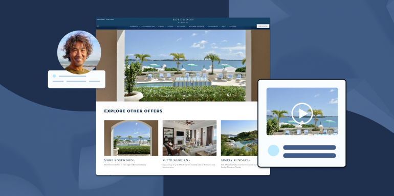
Three of our favorite elements of the Rosewood Hotels Landing Page (and why you should add these elements to your own pages!)
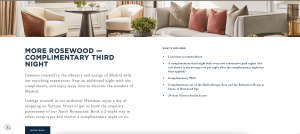
The interior photos help draw the visitors in: Unlike the usual layout featuring a grid arrangement and a prominent “book now” button, Rosewood’s landing page greets visitors with captivating interior photographs. The page also presents essential information through a concise bulleted list that outlines the inclusions of the stay. In addition to these engaging elements, a noteworthy offer in the header is showcased – a complimentary third night.
Evocative copy entices visitors: The above-the-fold section uses phrases like “Indulge yourself in our authentic Hamman,” “Enjoy a day of shopping on Serrano Street,” and “Get to know the exquisite gastronomy of our Amós Restaurant”—these phrases conjure vibrant imagery, allowing visitors to envision themselves delighting in the rich offerings of Madrid.
By infusing the entire page with this evocative narrative, Rosewood Hotels goes beyond the limitations of a homepage or booking list, leveraging the power of copy to elevate the visitor experience and establish a strong emotional connection with the destination and its offerings.
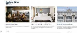
The page includes the ability to review other related offers: The page provides below-the-fold options that feature comparable deals or alternative suites within the same hotel. This approach enables them to maintain the immersive essence of a landing page, distinct from a standard booking page, all while safeguarding against potential conversion losses. This way, even those seeking extended stays or accommodations in different parts of town can find relevant choices without compromising on user experience or conversions.
What could be A/B tested
Add a room or suite tour: A video tour can help guests form a more realistic expectation of their stay, fostering a stronger emotional connection and trust in the hotel’s offerings. This heightened transparency can lead to more qualified leads and bookings, as users who have a clearer understanding of what to expect are more likely to proceed with their reservations. A/B testing this change would allow Rosewood Hotels to gather empirical data on user behavior and preferences. They can analyze metrics like click-through rates, video engagement rates, and conversion rates to assess the effectiveness of the video tour. If the video tour yields positive results, it could signify a stronger resonance with users and an overall enhancement of the user experience.
Airlines
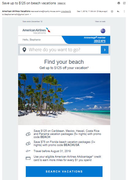
It’s common for airlines to promote vacation package deals since many vacations require flying to the destination. American Airlines created the email campaign below — complete with an offer and airline post-click landing page — to promote their sale on beach vacation packages:
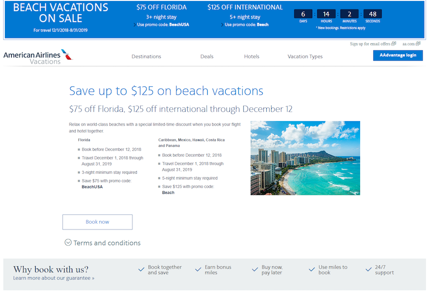
What the post-click landing page does well:
- Message match between the ad and post-click landing page assure visitors that they’re in the right place and their expectations will be met.
- A countdown timer conveys a sense of urgency.
- The terms and conditions are collapsed initially, as to not take up extra room on the page. It only expands if people want to read them.
- Bulleted copy allows visitors to skim the page and find the most important offer details.
- The benefits of booking with American Airlines Vacations are highlighted with a contrasting background and checkmarks.
What could be changed or A/B tested:
- Exit links (American Airlines logo, header and footer navigations, login button, “Why book with us?” section) act as escape routes for visitors, decreasing the conversion rate.
- The white CTA button blends in with the rest of the white page, so visitors may overlook it.
- Specifying and personalizing the CTA button copy would make it more persuasive. Something like, “Book and save on your next vacation!” for example.
- Adding white space around key elements (the headline and subheadline, image, etc.) would draw more attention to them.
Cruise ships
A cruise post-click landing page can serve a variety of different purposes, aside from just booking a cruise. For example, it can be used to offer a gated resource, such as a cruise guide, like Oceania Cruises does here:
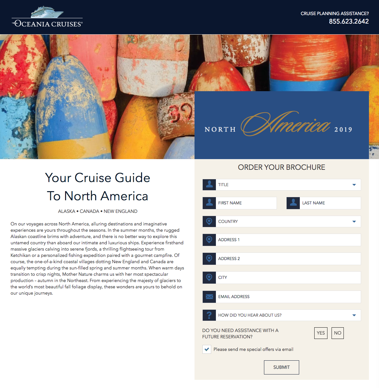
What the post-click landing page does well:
- The headline uses personalized copy (“your”) and tells visitors exactly what the offer is for.
- The subheadline supports the headline by listing the specific areas in the tropics that the guide includes.
- No navigation links (aside from the hyperlinked company logo listed below) are great for reducing the page’s bounce rate.
- Encapsulating the form helps draw attention to it for visitors to complete.
- The guide title lets prospects know that the information included will be helpful for the next 2 years.
- A 2018 copyright date indicates that both the offer and information are up-to-date.
What could be changed or A/B tested:
- The hyperlinked Oceania Cruises logo could send visitors away from the page immediately after landing on it.
- A click-to-call phone number would improve the user experience.
- Breaking up the guide description with smaller paragraphs, bullet points, bold copy, etc. would make it easier to read.
- The pre-checked opt-in box might generate email subscription leads who aren’t actually interested in receiving emails.
- Changing the CTA button color to a contrasting one (like red) would help it attract attention.
- The CTA button copy is vague. Replacing it with something more personalized, such as “Send my brochure!” would likely lead to more conversions.
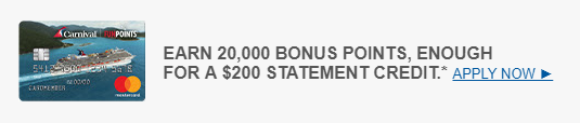
Cruise lines often work with other companies to offer unique promotions. In this example, Carnival teamed up with Barclays to offer a Carnival World Mastercard:
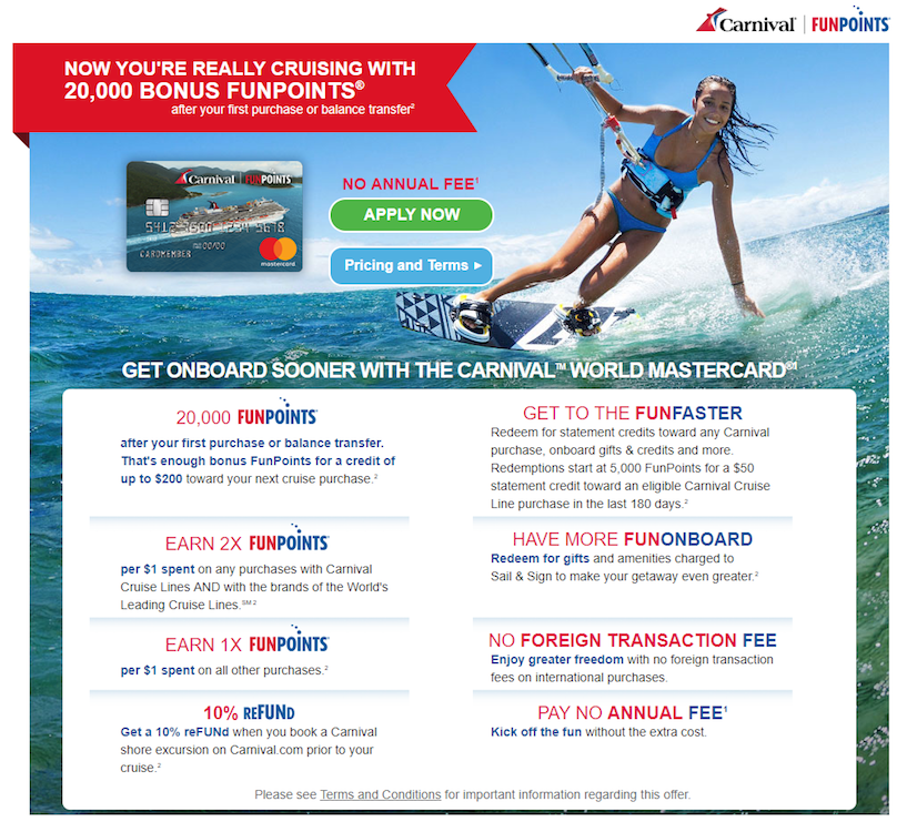
What the post-click landing page does well:
- The page closely matches the ad, from the credit card image to the copy.
- The hero image shows prospects how they could benefit from having a Carnival Mastercard and earning FunPoints toward their cruise.
- A click-through design allows visitors to learn about the offer without feeling intimidated by a form.
- The benefits of signing up for a Carnival Mastercard are highlighted by encapsulation, section titles, and bold copy.
- Personalized copy makes the visitor feel like the offer is specifically for them.
What could be changed or A/B tested:
- The company logos in the top right corner allow visitors to leave the page without converting.
- The Pricing and Terms button could distract prospects from the Apply Now CTA button (the main conversion goal).
- Adding white space between the card image and CTA buttons would draw more attention to each element.
Trains
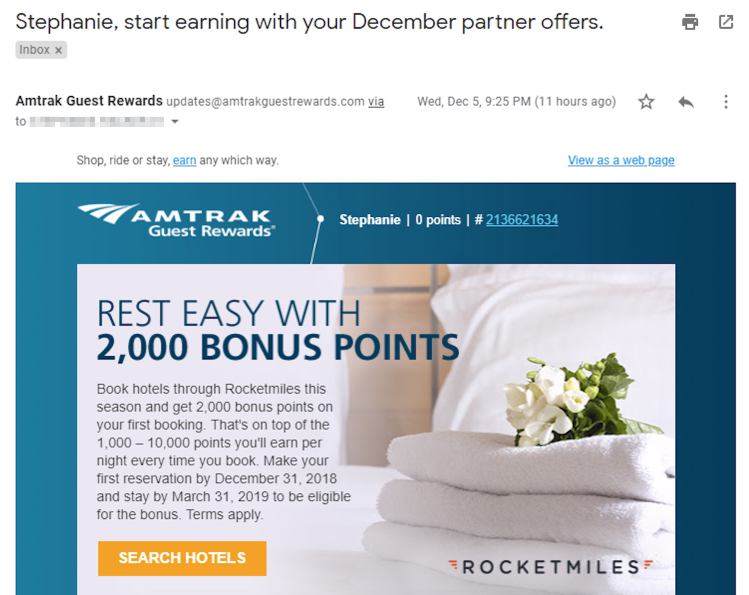
Here’s another example where a hospitality business collaborates with a separate brand to create a promotional campaign. In this case, Amtrak and Rocketmiles created a travel rewards campaign. First the promotional email:
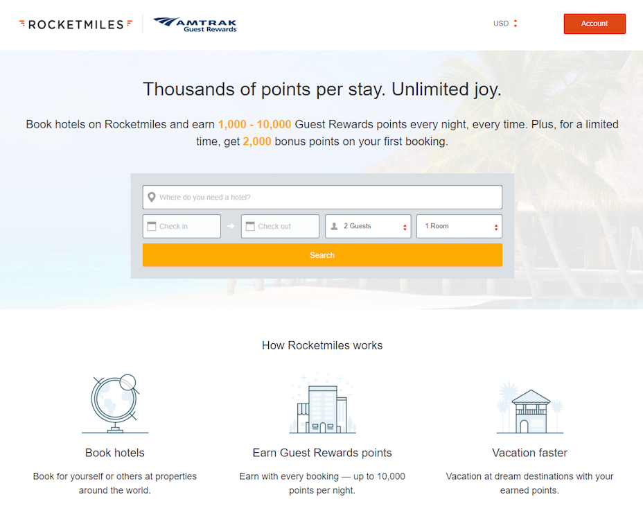
Then the post-click landing page that prospects are sent to:
What the post-click landing page does well:
- The squeeze page is another opportunity to capture the visitor’s name and email address.
- The company logos in the top-left tell visitors who is behind this offer without sending them away from the page via a hyperlink.
- The ability to change the monetary format in the top-right allows international users to redeem the offer.
- A “limited time” in the offer description adds urgency and scarcity to the page, likely making prospects feel pressured to convert now.
- The section below the form explains how Rocketmiles works and how they can benefit the user.
- The yellow CTA button “pops” on the page, easily capturing visitors’ attention.
- Plenty of white space makes the page look neat, organized, and easy to navigate.
What could be changed or A/B tested:
- The red Account button is distracting and may reduce the conversion rate.
- Adding a customer testimonial from someone who has used Rocketmiles before would likely encourage others to use the service as well.
- The footer navigation and social media links could remove visitors from the page without conducting their search.
Resorts
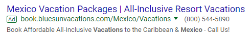
The resort post-click landing page below wasn’t created by a specific resort, but rather, by a full-service travel agency that books resort vacations. It was shown after clicking this Google Ad:
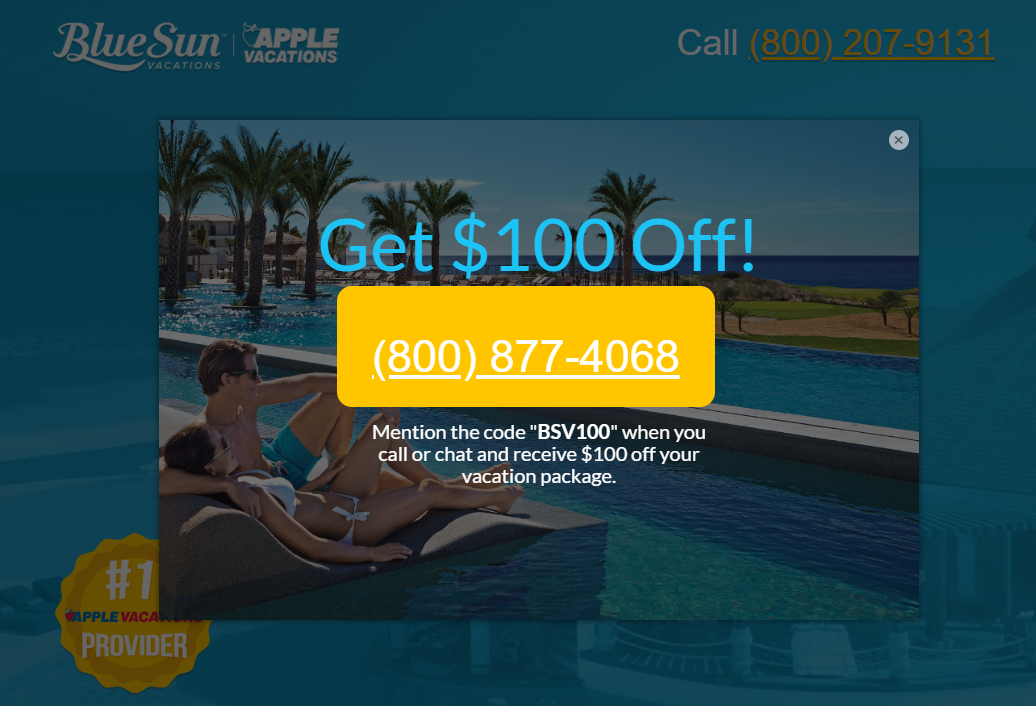
And includes this lightbox pop-up to get additional clicks/phone calls:
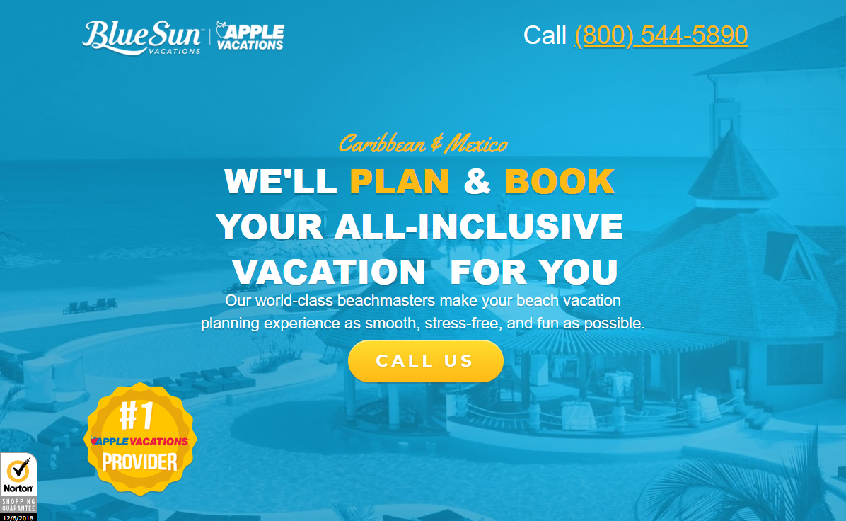
Here’s the post-click landing page itself:
What the post-click landing page does well:
- The company logo at the top of the page are not hyperlinked, so visitors know where they are immediately, but can’t click away.
- The personalized headline and subheadline tell prospects exactly how BlueSun Vacations will help them.
- Multiple cooperative CTA buttons provide various opportunities to call BlueSun Vacations.
- The click-to-call phone number is another chance for visitors to contact the company.
- Trust signals (the Norton logo, “#1 Apple Vacations provider” in several different locations, etc.) are likely to make prospects feel comfortable and confident in their decision to use the company.
- The benefits of using BlueSun Vacations are clearly marked by iconography and bold copy.
- The employee images add personalization to the company and offer.
- Trustpilot reviews serve as social proof, encouraging others to use the travel agency.
What could be changed or A/B tested:
- The yellow CTA buttons would stand out more if they were a color that’s not already used elsewhere on the page.
- The CTA button copy should be benefit-oriented for more clicks.
- The 2016 copyright date might make visitors wonder if this offer is still valid.
How will you set up your next hospitality post-click landing page?
The hospitality industry must ensure every customer is happy because brand loyalty is essential. Online, great customer service starts with the post-click landing page, as this is a prime opportunity to address a customer’s needs and convince them to take the desired conversion action.
Don’t ignore the post-click stage, provide every prospect with a personalized experience from start to finish. Sign up for an Instapage Enterprise Demo today.
