What do you call an article without a good headline? Unread.
Okay, bad joke. But it’s true. Bad headlines can make ads, emails, social media posts worthless. Worse still, they can set your budget back, and even raise questions as to whether your entire content strategy is a failure.
Why are headlines so important?
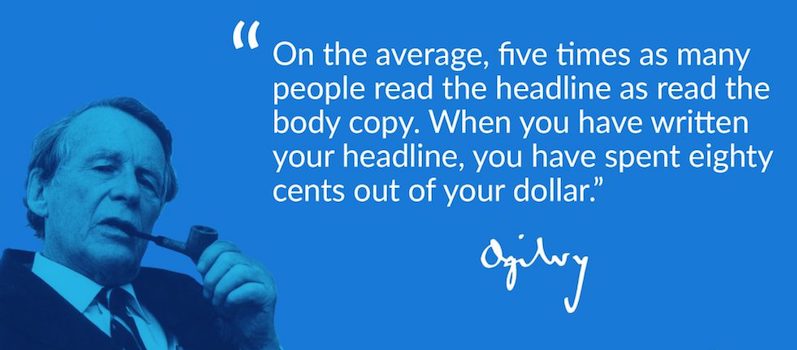
Advertising legend, David Ogilvy, once claimed that when you had written your ad’s headline, you’d spent eighty cents out of your dollar:
While his math is up for debate, the sentiment is surely not. After Ogilvy uttered the phrase, eye-tracking studies would support it. In Munich, researchers found that readers “entered” a printed page through the biggest splash of ink — the headline or featured image. Some progressed to the bolded and italicized words underneath, then fewer to standard body copy.
On the internet, research from the Nielsen Norman Group has shown a similar reading pattern occurs:
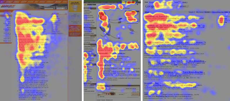
Called the “F-shape pattern” of content consumption, this shows visitors first look horizontally across the top of the page, then skim down it vertically for headlines and subheadlines to read.
Both online and off, the implications are clear: We use headlines to navigate words. Along with images, they’re the first thing we notice when looking at written content. They’re the lead-in, the teaser. In marketing, they’re your brand’s best foot forward at each stage of the customer journey. And without a good headline, even the best content won’t be noticed.
What do the best advertising headlines look like?
Some will tell you the role of a headline is to promise education or invoke curiosity. Some will say it should begin with “How to” or contain unique adjectives, or that it shouldn’t exceed a certain word count.
And while you should consider these, you should also know that none necessarily guarantee a good headline. A good headline is one that moves the visitor to the next step. The way you write it is highly dependant on where it’s going, and who will read it.
The big list of headline formulas
Some recommend you write 30+ headlines for every campaign. The last few, they say, are when you get your best stuff.
But, with so many campaigns, channels, and mediums, that becomes impractical advice to follow. So, for the busy marketers out there, we compiled a list of 200+ headline formulas for your next campaign.
This monster list comes complete with examples from real-life brands, along with variations of words and structures so that your headlines are always fresh. Consider each a template which you can easily plug your content for products, services, and promotions.
Headline examples
There’s more than one, two, ten ways to write a good headline. Below are just a few similar examples you’ll find in the new Instapage resource, along with why they work.
Email subject lines
Inboxes are constantly flooded with messages, so, a good email subject line has to stand out among the clutter. It has to be better than the trash folder, and then, it has to compel the visitor to click. Let’s take a look at a few.
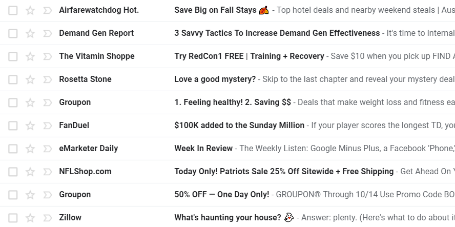
What do you notice first? For us, it’s subject lines from Airfarewatchdog and Zillow, which use emojis to grab attention. Beyond that, though, both leave much to be desired. “Save big” isn’t very specific. How big? Would that get you to click through?
What about Zillow’s subject line? It seems, to us, “What’s haunting your house?” is a little too vague as well. While they didn’t command the same attention, there are better subject lines in this bunch. Consider subject lines from…
Demand Gen Report. 3 Savvy Tactics To Increase Demand Gen Effectiveness works because it promises to teach something quickly (3 tactics). The word “savvy” also implies that what it teaches might be secret or less commonly known. This kind of headline is commonly categorized as the “quick and easy.” It offers something valuable that can be learned easily and implemented quickly. Since it capitalizes on our inherent laziness: the desire to get a lot for a little, this formula is common in headline writing:
Related formula: (Number) + tactics/methods/ways to + improve (technique)
The Vitamin Shoppe. Try RedCon1 Free | Training + Recovery works, because, even if you’re unfamiliar with the offer, the promise of a free product is hard to ignore (in any industry). Another common headline formula for copywriters, deconstructed, this looks like:
Related formula: “Try + (offer) + free)”
Fanduel. $100k added to the Sunday Million is likely to get people clicking through to learn how they can win the new, bigger prize. While this particular structure isn’t common, the category of formula is. This is a “new and improved” headline, which announces something better than its predecessor. So, as a formula, it may look like:
Related formula: “Introducing/announcing/now, + (new features or benefits) + with/added to + product/service/offer”
NFLShop.com and Groupon. These two headlines (Today Only! Patriots Sale 25% Off Sitewide + Free Shipping and 50% off — One Day Only) use scarcity to get the reader to click. Psychologically, scarcity induces what we commonly call FOMO — fear of missing out. The reader thinks, “I only have one day to capitalize on the sale, and who knows when there will be another one…” As a formula, this might look like:
Related formula: “Today only/Valid until (date)/Claim before (date)/For a limited time + offer”
With subject lines, remember they tend to get cut off around 40 characters. To get the most out of those characters, convey value quickly, specifically, and include details of your lead if you have them. Personalization has been shown to improve click-through rate greatly.
Search ad headlines
Search ad headlines have the tough job of drawing the visitor with very little customization outside of text. That said, they have an advantage over other headlines: People reading them are actively looking for something related to what they offer. Also, there’s less competition for attention than in other places like the inbox. Let’s take a look at a few…
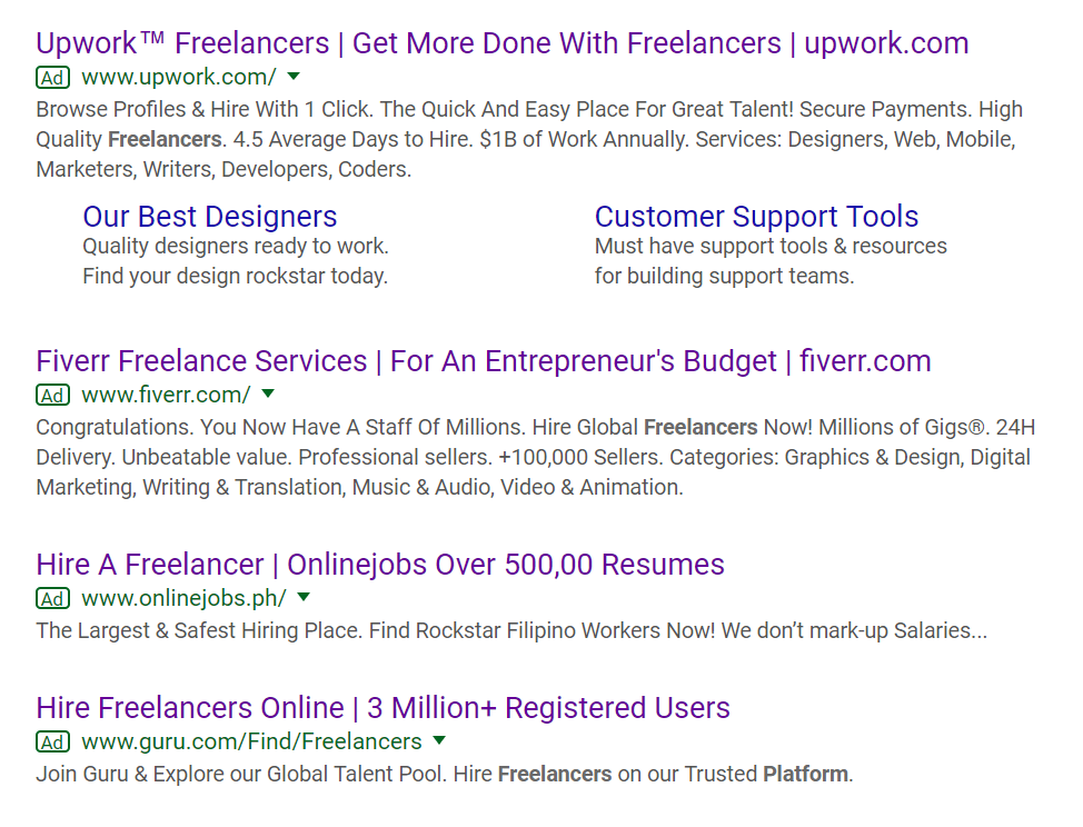
All these ads are a result of the query “freelancer platform.” And, while the first two headlines belong to more established businesses, the third and fourth use more powerful techniques.
Upwork uses the headline “Get more done with freelancers.” While it proposes value, it’s not unique value. You can get more done with freelancers from any platform. Below, copy elaborates, and in it, you’ll see a number of things that would bolster the headline. For example: Quick and easy hiring, secure payments, but, most of all, $1 billion annually in business. Upwork is the biggest player with the largest pool of talent in the space. That should be emphasized in the headline. As a formula…
Related formula: “(Benefit) + with + (product/service/offer)”
Fiverr is a better example of conveying a USP quickly. This headline calls to businesses seeking an affordable solution, with the words “For An Entrepreneur’s Budget.” Fiverr knows it can’t compete with Upwork’s size, so, it instead offers a lower cost solution. This is a great example of knowing where your brand fits in the industry. What might work even better is the emphasis on speed. You’ll notice Upwork copy advertises an average of 4.5 days project completion, whereas Fiverr shows 24 hours. If your audience is busy entrepreneurs, the fastest freelancers on the web could very well draw business. Broken down, it looks like:
Related formula: “(Offer/product/service) + for + (job titles/population segment)”
Onlinejobs uses social proof to get the attention of the visitor. It tries to emphasize its size: 500,000 available resumes. And, in a way, it works here, because Upwork fails to mention its titanic user base (12 million registered freelancers). However, when you look down, you notice the copy “the largest and safest hiring place,” which isn’t true, because below that is an ad which claims 3 million registered users. Only use superlatives if they can be proven. Also, you read in copy that this service is apparently only for Filipino workers. That’s a very specific detail that should be more prominent in the ad. All this feels a little like discovering key details in the fine print, which likely won’t help the click-through rate here.
Guru, like Onlinejobs, uses social proof to get the click. 3 million is a high number, and people who see it will imagine the service must be valuable if so many have registered to use it. It also communicates a lot of options for the user. The more freelancers you have to choose from, the better talent and end result you’ll likely get. And again, since Upwork doesn’t communicate its size, Guru comes out looking like the biggest player from these few ads.
Like subject lines, search ad headlines don’t leave much room for elaboration. You have to say a lot with a little. Ensure your headline communicates its unique value to prospects, the way Fiverr does, and if you have numbers on your side, as Onlinejobs and Guru do, use them to your advantage. Big, fast, easy, high-quality, and affordable are popular value propositions that span all industries. Find out where you fit and fine-tune your marketing down to your headlines.
post-click landing page headlines
The post-click landing page headline has a slightly easier job than these others, because it’s not as directly responsible for the key visitor action. For example, in a search ad, a headline carries more importance because it contributes more to the click. On a post-click landing page, headlines have two jobs:
- Let the reader know they’re in the right place.
- Get them to scroll down by conveying value.
The first objective can be accomplished by simply matching the referring headline. So, if your headline reads, “Get more done with freelancers,” your post-click landing page headline should read “Get more done with freelancers.” Otherwise, visitors may think they’ve fallen victim to the bait and switch.
The second objective can be accomplished with a headline that conveys a unique value. Why should the visitor scroll down? Give them a reason. It also has to be positioned in the right place. To many of us, positioning the headline at the top of the page is second nature. For others, though, the top of the page seems better space for a slider or a featured image. But this throws off the visual hierarchy of the page, which needs to be immaculate if the creator wants any chance at guiding visitors to conversion.
Let’s take a look at two of the examples from the preceding search ads…
Upwork
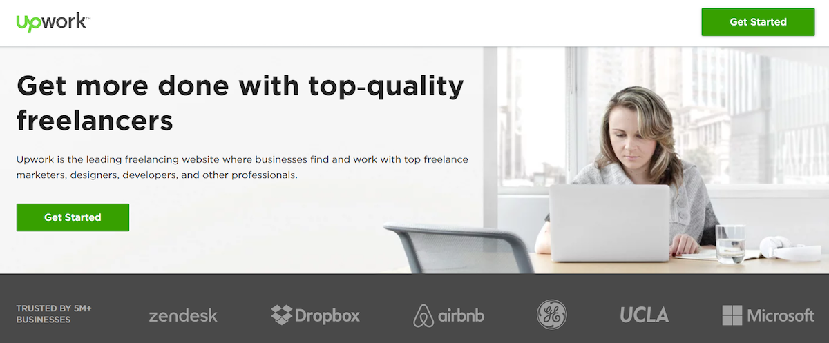
“Top-quality” appears in this Upwork headline, but not in the search ad. So, while this message doesn’t exactly match its referrer, it’s close enough to assure visitors they’re where they want to be.
As far as value goes, the proposition is still fairly weak for what’s supposed to be the world’s largest freelancer platform. The subheadline doesn’t help much here either. The only thing really improving the odds visitors scroll down is the banner of well-known client logos at the fold.
Where positioning is concerned, this headline does well. The writing is aligned left, positioned upper-left, and it naturally guides visitors to the subheadline, which then guides them to the CTA button.
Onlinejobs
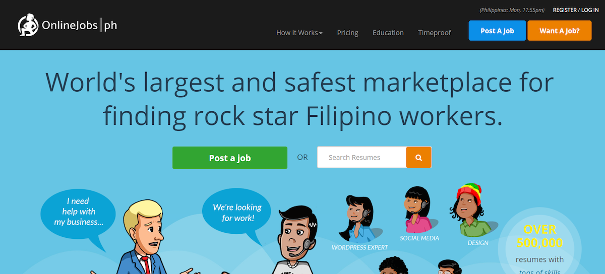
By looking at them, you probably wouldn’t be able to match this headline to its referring headline, which read “Hire a Freelancer | Onlinejobs Over 500,000 Resumes.” Visitors likely won’t be able to match it either.
There’s a disconnect of expectation here. Visitors expect a freelancer marketplace, and while they get one, it’s a highly specific freelancer marketplace composed of only Filipinos. When you consider the major draw of using a freelancer marketplace is the diverse global talent pool, anything less seems like a dealbreaker.
If the search ad were more straightforward, that would be one thing. But, the “Filipino” detail was tucked away in the copy. If people arrive here after skimming the referring headline, like we all do, they may feel confused or even duped.
As far as value and positioning goes, there could be improvement here. Centering the headline is fine, because it spans the page and naturally guides the visitor to the CTA buttons below. But, the USP uses words like “largest” and “safest,” which is always less persuasive than the proof behind it. Over 500,000 resumes was a great social proof inclusion in the search ad. It would be great here too.
What makes you the largest? What makes you the safest? In the hierarchy of believability, it goes: numbers over words, a customer’s words over yours, and your words last. If you have the proof, a headline is the best place to display it.
Create great headlines faster
The best headlines come from digging deep into your copywriting well. The more you write, the more creative you’ll have to be.
But, for those of us without the time to brainstorm thirty headlines per campaign, plug & publish formulas can come in handy. With Instapage’s big list of headline formulas, you’ll find ways to sell new products and offers, techniques to invoke curiosity, two words that always provide value, and more.
Put yourself in the best position to earn clicks and conversions. Download the list here.
Always connect all your ads to personalized post-click landing pages to lower your cost per customer acquisition. Start creating your dedicated post-click pages by signing up for an Instapage Enterprise demo today.

See the Instapage Enterprise Plan in Action.
Demo includes AdMap™, Personalization, AMP,
Global Blocks, heatmaps & more.

