Global Marketing Insights predicts the e-learning market size will exceed $375 billion by 2026:

With the majority of the world switching to online learning experiences, education digital advertising campaigns have been on the rise this year. This post features advertising campaigns of five digital marketing courses and advertising lessons you can learn from them.
1. CueMath
This CueMath Search ad promises an array of learning opportunities for children who need support in math, including 1:1 tutoring, intuitive learning, and live classes.

The ad is followed by this landing page →

- The benefits listed in the ad and on the page (above the fold) are message-matched, both in terms of the offer and branding.
- The CTA buttons stand out and clarify the next step for the user.
- There are no distractions on the page in the form of navigation links.
- The headline statistic “Trusted by 400,000 parents in 80 countries” offers social proof that their service is worthwhile.
- The content on the page is easily scannable.
What you can learn from CueMath:
This coherence established by ad-to-page relevancy creates a sense of continuity, assuring visitors that they have arrived at the right destination. Secondly, the CTA buttons are strategically placed and prominently designed, letting users know they can test out the service by booking a free class. By clarifying the next steps, Cuemath reduces ambiguity and encourages users to engage further.
Moreover, the absence of distracting navigation links prevents users from deviating from the intended conversion path, focusing their attention solely on the offer at hand. The inclusion of the headline statistic “Trusted by 400,000 parents in 80 countries” enhances the landing page’s credibility through social proof, instilling trust in prospective users.
Collectively, these tactics underscore the importance of maintaining consistency, clarity, trust, and user-centric design when crafting effective landing pages.
You can watch a full video of the effective tactics CueMath deploys on their landing page here!
2. Lessonly
This Lessonly Facebook ad promises visitors the tools to create better training programs:

The ad is followed by this landing page:
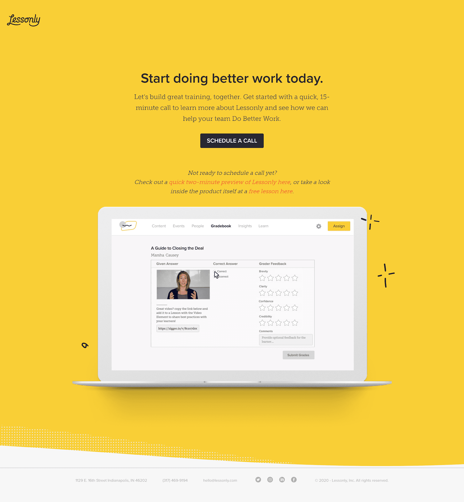
- The ad and page are message-matched, both in terms of the offer and branding.
- There are no distractions on the page in the form of navigation links.
- The headline conveys a clear benefit: “Do better work” by building great training programs. The ad content promises this.
- The copy communicates that the call will only last 15 minutes, so users know exactly what to expect.
- The CTA button copy clarifies the next step for the user.
- The secondary CTAs give users an alternate route to learn what Lessonly can do for them if they aren’t ready for the call yet.
- The GIF on the page serves as a brief demonstration of some of the product’s capabilities.
What you can learn from Lessonly:
Make your product the hero. Lessonly uses a product GIF to highlight what the platform offers customers. This helps potential customers visualize the experience of using the platform. Feature use cases on your landing pages tailored to specific audience segments to create a more personalized experience.
3. Codeacademy
This Codeacademy ad promises users that learning skills for a new programming career is going to be a breeze with their Pro Account:
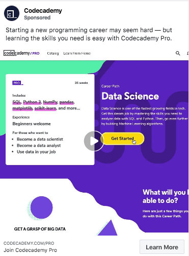
The ad directs visitors to this landing page:
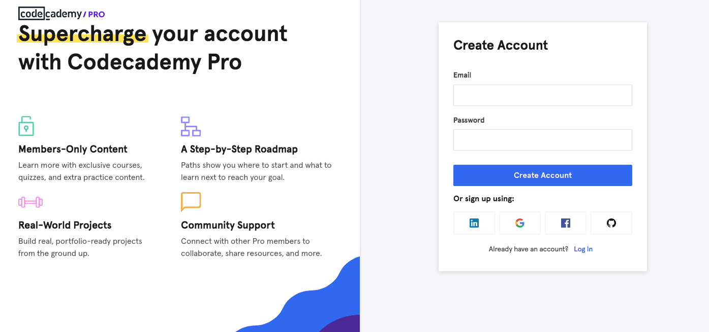
- The headline gets right to the point: “Supercharge your account” with all the benefits of the pro membership.
- The copy is in easily digestible bullets that highlight the pro account’s benefits.
- The lead-capture form is easy to fill out—just provide your email and password, and you’re in. Users can also use other accounts to sign up more easily.
What you can learn from Codeacademy:
Minimalism goes a long way. Focus on what matters, and craft your offer around the central page elements to create an ideal user experience.
4. Capella University
The Capella University ad promises users an online doctoral program without a GRE or an entrance exam.

Here is the landing page connected to the ad:
(Note: Please click through to the page to see the full view.)

- The headline is clear and message-matched with the ad: “Earn a Ph.D. Online.” The copy under the headline explains why the online doctorate program is perfect for students who want to take control of their education.
- The progress bar on top of the page makes it easy for the user to navigate the long-form page and easily go to the section they want.
- The “Chat Now” button helps users get real-time answers to any questions they have.
- The “What Happens Next” section lists what users should expect to get after they’ve clicked the CTA button.
- The list of accreditations add credibility to the offer.
- The statistic “92% of alumni are satisfied with their Capella education” offers social proof that their offer is worthwhile.
What you can learn from Cappella University:
Having a live-chat option on your landing page helps users get all their questions answered, so they can smoothly transition toward the CTA button. Live chats work well on pages where the primary offer requires a significant time or financial commitment.
5. Thinkific
This Thinkific ad offers visitors a free trial, so they can see how the platform can help them easily run their remote training:

When users click the ad, they land on this landing page:
(Please click through to the page to see the full view.)

- The headline and sub-headline mention selling online courses with Thinkific, which is relevant to the Facebook ad offer.
- The “Start a Free Trial” CTA button is perfectly message-matched with the Facebook ad.
- The stats showcase how popular the platform is with customers and how much Thinkific courses have allowed them to earn.
- The calculator puts an exact dollar value on what the user’s potential earnings can be if they decide to use the service.
- The sticky navigation bar moves with the visitors, so they can sign up for the free trial whenever they’re ready, without having to scroll to the top of the page.
What you can learn from Thinkific:
It’s always better to “show” than to “tell” the impact your service will have on the user. Thinkific does this with an online calculator that helps users do the math on what their potential earnings could be.
6. Full Sail University
Full Sail University’s ad campaigns aim to increase student enrollment. The following ad offers users who love to talk sports a sportscasting bachelor’s degree:

Users who want to “Learn More” get directed to this landing page:

- The ad and landing page tell the same story. Both mention the “Dan Patrick School of Sportscasting” and feature his image.
- The sub-headline adds more appeal to the offer by telling users they can be the voice of tomorrow’s sports experiences. This goal is likely why they were interested in sportscasting to begin with.
- The page highlights the focus areas in sportscasting, the opportunity for students to earn their bachelor’s degree in only 20 to 29 months, and a chance to work in major sports entertainment facilities.
- The video showcases the support users will have from Dan Patrick. His affiliation and collaboration with Full Sail lets potential students know that the degree is worth pursuing.
What you can learn from Full Sail University:
Using video on your landing page allows users to experience your message in a more convincing medium. It’s crucial to ensure your video’s content aligns with your offer, so it’s well-positioned to get you advertising conversions.
Create relevant landing pages for more conversions
Take inspiration from these education digital advertising campaigns to create your own message-matched landing pages.
Use Instapage to create dedicated landing pages to get the most out of your campaigns. The #1 landing page platform for marketers empowers you to get up to 400% more from your digital ad spend. Find out more sign up for an Instapage 14-day free trial today.

Try the world's most advanced landing page platform with a risk-free trial.
