Earlier this week, we looked at how Democratic candidates Mike Bloomberg, Pete Buttigieg, Elizabeth Warren, and Bernie Sanders all use advanced advertising techniques to meet user expectations and establish credibility with voters:
By using ads segmented to specific audiences, and connecting them to personalized post-click landing pages to tell the same narrative.
Now let’s see how President Donald Trump does the same to increase campaign donations, support, and get reelected.
How President Donald Trump uses post-click landing pages
Example 1: Google search ad
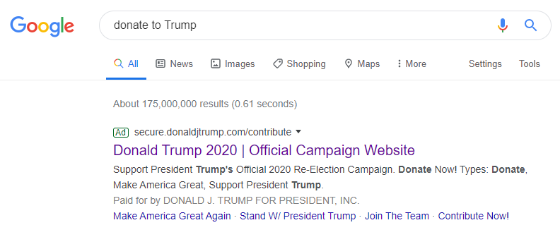
Someone looking to make a donation to the Trump campaign might search “donate to Trump” and see this paid search ad:

The user will know the ad is relevant to their search because:
- The headline is a partial match to the search phrase
- The display URL includes Trump’s name, with “contribute” as a path field.
- The description repeats “Trump” and “donate” multiple times
- “Paid for by Donald J. Trump for President, Inc.” indicates the offer is legitimate
- Sitelink extensions are relevant to the search phrase and President Trump in general
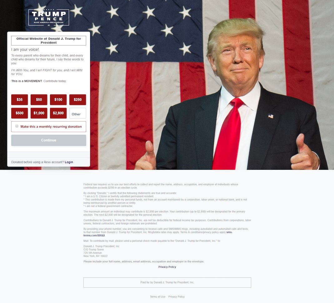
Clicking the main headline and any of the extensions take prospects to this post-click page where the donation narrative continues:

- What is the offer? — It’s clear the offer is sponsored by the Trump foundation just like the ad, since the logo is in the top corner, his name is mentioned in the headline, and his image fills the page. We can also tell from the form that this is where prospects can donate.
- Why contribute? — The copy on the encapsulated form (between the headline and donation amounts) conveys why visitors should donate to Trump’s campaign.
- Who can donate? — The three asterisks in the fine print at the bottom indicate who can make a contribution (U.S. citizens/permanent residents, adults 18+ years, non-federal contractors, etc.).
- How to donate — Visitors can select a donation amount by clicking any of the red boxes (or entering their own amount in the “other” box), and clicking the “Continue” CTA button. They can also choose to donate monthly by checking the opt-in box.
Example 2: Facebook ad
Sponsored Facebook ads like this one are also part of Trump’s campaign to inspire contributions:

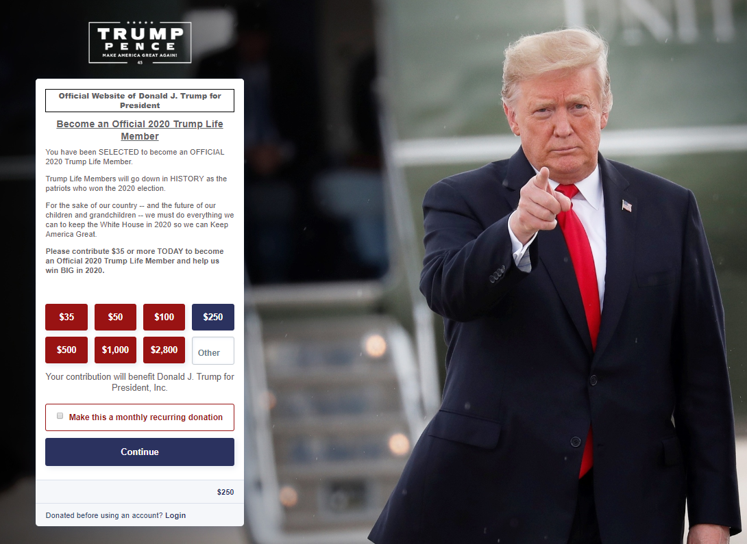
The ad begins a story about joining/donating to Trump’s campaign, and takes prospects to a different post-click donation page:

- What is the offer? — The headline reiterates the offer to become an official 2020 Trump Life Member by donating to the Presidential candidate’s campaign.
- Why make a donation? — Similar to Example 1, the copy between the headline and donation amounts explains why visitors should donate.
- Who can contribute? — The list of contribution rules indicates who can make a contribution (U.S. citizens/green card holders, adults 18+ years, non-federal contractors, etc.).
- How to take action — Visitors can donate by clicking any of the red boxes (or entering their own amount), and clicking the “Continue” CTA button. They can also donate monthly by checking the opt-in box.
Example 3: Instagram ad
Instagram is another channel of Trump’s reelection campaign to generate donations:

The ad offers donators a chance to win a vacation in Palm Beach to have dinner with the President, and leads to this page to continue the offer narrative:

- What is the offer? — In return for a campaign donation, visitors have the chance to win a private dinner with Trump, all-travel expenses paid for by his team.
- Why make a donation? — The main reason for contributing is the limited opportunity to meet President Trump. The top of the white section even assures people: “The President really wants to meet you for dinner in Palm Beach!”
- Who can contribute? — As long as visitors meet the four contribution rules in the fine print, they can make a contribution.
- How to take action — Donations can be made by choosing any of the red boxes or entering a custom amount and clicking the blue “Continue” CTA button.
Now, compare those to Trump’s website
The Donald Trump homepage isn’t as segmented or focused as the personalized post-click landing pages above, nor does it have a 1:1 conversion ratio. Instead, it’s meant to be a browsing experience with multiple conversion goals:

- A full header navigation allows visitors to explore other pages of the website, but might cause them to bounce from this one before converting.
- Competing CTA buttons (“Shop,” “Contribute,” and “Get your free tickets”) could confuse visitors and deter them from clicking any option.
- The North Charleston headline might lead people to believe that’s the only offer on this page, ignoring the others further down.
- Social media links at the bottom are likely to distract visitors, take them to Trump’s social pages, and decrease event signups, donations, etc. on the homepage.
- Other footer links provide more chances for prospects to bounce without converting.
Continue the same narrative from ad to post-click landing page
Trump’s marketing team understands the most successful advertising campaigns include segmented ads connected to personalized post-click landing pages. By continuing the same ad narrative, the team ensures credibility is established with voters and donations continue adding up.
Use the examples above as inspiration to tell the same pre- and post-click story, and request an Instapage Enterprise demo today to see how you can start creating dedicated, personalized post-click landing pages at scale for each of your segmented audiences.

See the Instapage Enterprise Plan in Action.
Demo includes AdMap™, Personalization, AMP,
Global Blocks, heatmaps & more.
