
When people think “automotive industry,” buying and selling cars at a dealership is probably the first thing that comes to mind. Not a lot of people think about automotive landing pages. In reality, there’s a lot more to it than that.
The automotive industry covers an extremely wide range of other products and services, such as lending, financing, insurance, car rentals — the list goes on. Since there are so many different elements, it’s imperative that auto industry professionals stay on top of their game. Marketing with paid search ads, email, social media, are all great ways to stay up to par with automotive marketing.
But creating these various ads is only half of the automotive advertising equation. The other half is where those ads send people — and if that’s not directly to an optimized post-click landing page — it may be a struggle to drive conversions and increase customers.
What is a post-click landing page?
A post-click landing page is a standalone web page, disconnected from a website’s main navigation, designed specifically to elicit a particular action from its visitors. This action could be to sign up, download, register, and receive a quote (among other things). To convince their visitors to do it, post-click landing pages feature persuasive elements like benefit-oriented headlines, authority badges, social proof, and strong calls-to-action.
Keep in mind, for shorter automotive post-click landing pages, we’ve shown the entire page. However, for longer pages, we only displayed above the fold. You may need to click through to each post-click landing page to see some of the points we discuss. Additionally, some of the brands listed may be A/B testing their page with an alternate version than the one displayed below.
How the automotive industry uses post-click landing pages
Now, let’s analyze a variety of businesses in the automotive industry and how they use advertising, combined with post-click landing pages, to grow their respective businesses.
1. To offer financing options
Nationwide

Visually, this Nationwide post-click landing page is quite pleasing to the eye because there’s no clutter. The page has an image, the colors contrast well, etc. However, functionally, it’s not the best post-click landing page out there.
First, omitting the navigation means that visitors can’t easily leave the page without converting first. The only downfall here is that the Nationwide logo that takes visitors to the homepage. Nationwide would probably be better off if the logo was just a logo, and not serve as a distraction.
Unfortunately, the headline doesn’t provide much value to prospects. While it may be a company slogan, it doesn’t tell visitors what they’re doing here. Luckily, the subheadline does a much better job of communicating the benefits of the offer: Customers can save both time and money by financing with Nationwide.
The image on the page doesn’t provide much value either. A man standing next to his car in the middle of nowhere doesn’t seem to have much to do with financing a vehicle.
The three separate financing options in the middle of the page look nice, but are they all necessary? All three CTA buttons lead visitors to the exact same Auto Loan Application page.
Nationwide may want to consider A/B testing a different page in which there is only one CTA button, and a description that explains that they offer financing for new and used cars, as well as a refinancing option.
The short list of benefits underneath the lending options is a great addition, but why the fine print? Doesn’t Nationwide want these benefits to stand out more? Having them as small as they are may result in missed opportunities.
Lastly, the security badge on the right of the page likely makes prospects more comfortable with the idea of converting.
1800FreshStart

Right off the bat, notice that this page is missing a headline. Without a headline, how will the visitors know what they’re even doing on the page? Compelling headlines are critical for effective post-click landing pages.
The company logo is not linked to the homepage. Also the security badge, ensuring visitors that their privacy on this page, and the information that they submit, is 100% secure. While it’s good to have a security badge on post-click landing pages. It’s even better to use badges of well-known security companies like TRUSTe, Norton, or McAfee.
Moving down the page, the 6-field lead capture form is a bit lengthy, especially since this is only step 1 of 3. The good thing, though, is that the list of steps across the top of the form is helpful for letting prospects how long the signup process is. Another positive feature is that this first step doesn’t ask for any overly sensitive information that might make visitors uncomfortable with converting. So even if steps 2 or 3 request sensitive information, the company already has the lead’s information and they can try to nurture them via email.
To the right of the form is an “About Us” section that provides some background information about 1800FreshStart. While this is great, it could be presented much better. In fact, all of the copy on the right-hand side could use some spicing up. Portions of the text — like the fact that the company approves people with all types of credit — should be bigger and bolder, and occupy more prominent space on this post-click landing page.
Although the green CTA button on this blue page isn’t bad, using an even more contrasting color like red or orange may be more effective in drawing attention.
Finally, the exit links in the footer may be hurting the conversion rate because if prospects scroll to the bottom, they may be distracted by all of the links and leave the page before converting.
2. To compare deals/prices
SmarterAuto

This automotive post-click landing page does have a headline, so we’re off to a good start. Although it’s not horrible, it could be more benefit-oriented; perhaps something like “Find the lowest vehicle prices.” Moreover, the subheadline gives further instruction on what to do on the page.
The SmarterAuto logo in the top left corner of the page isn’t hyperlinked anywhere, which is smart because it helps keep attention on the page. Strangely, though, the logo at the bottom of the page is hyperlinked. Luckily, the link only refreshes this same page, but why bother hyperlinking it in the first place?
There’s not much content on this page, so it could use more, and be benefit-centric as well. That’s because visitors should know upon landing here why they should choose SmarterAuto over competitors.
Next is the image, and it’s confusing. What does buffing a car have to do with comparing automobile prices?
The form is the best-designed element on this page because it’s short, includes an arrow visual cue, a form headline telling visitors to “Start Here,” and the pulsing, green CTA button makes it easy to attract visitor’s attention.
The security badge on the page is useful for instilling trust in visitors, but the fact that it’s hyperlinked and takes prospects away from the page is not a post-click landing page best practice. And what is the “Unsubscribe” link at the bottom of the page? If this is the first time a visitor has been to this page, what would they be subscribed to that SmarterAuto feel inclined to include this link? It’s almost like the company is pushing people away by including these types of exit links.
Car.Show
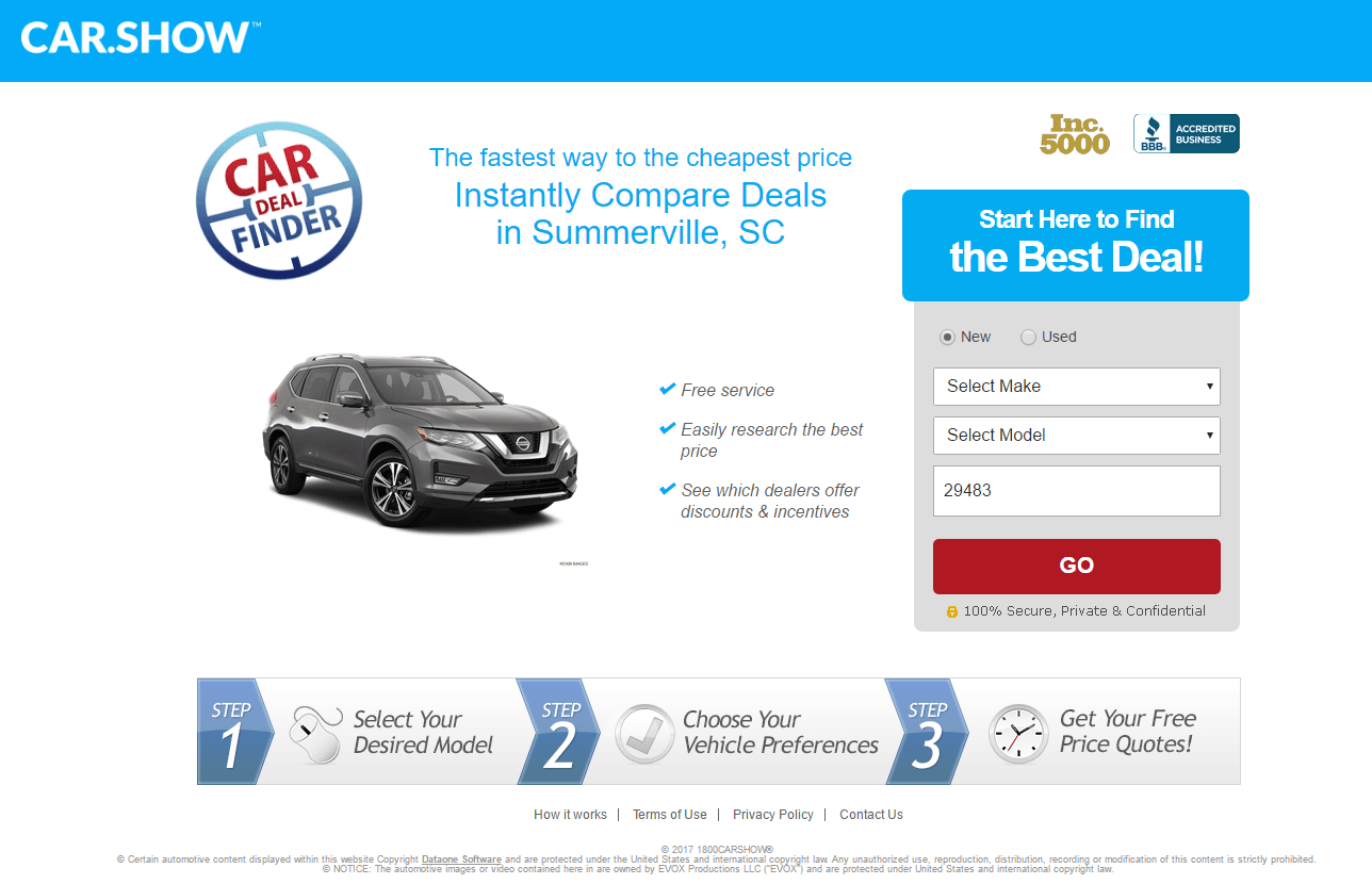
To start, the company logo is not linked to the homepage, so visitors can’t click it to navigate away from the page. Another great feature is the outline of steps across the bottom of the page because it shows prospects what they can expect at each stage of the process and how long it will take. Plus, the geo-targeting feature (see the town name in the headline?) makes the page more relevant to the viewer.
Similar to the previous example, including a security badge and a social proof badge on the page is useful for providing visitors with a sense of trust. But since they’re both hyperlinked they serve as distractions from the conversion goal.
The image of the SUV is nice, but what is that tiny print underneath it? Why is that even there? It appears to be just a distraction. Moving to the right, the bulleted list informs prospects of the major benefits they can expect. The red CTA button is attention-grabbing and sure to attract prospect’s eyes as they scan the page.
The headline, “Instantly Compare Deals in…” is a bit small compared to the other elements on the page, so it doesn’t quite stand out as much as it could. Also, why is the text above it so much smaller? That’s actually the benefit-oriented part, so why not make it the same size or larger? In fact, this entire page’s font structure is confusing. The majority of the text is big and bold, as are the badges, so it’s unclear where the visitors’ attention is supposed to go first.
3. To offer test drives
Kia

Although this offer from Kia recently expired, the post-click landing page they used for it was a relatively good one overall.
The absence of exit links means there were no easy ways for prospects to leave the page without clicking the “X” in the web browser’s tab, or submitting their information for the test drive.
While there were no security badges on the page, Kia is an extremely well-known brand, so people most likely felt secure enough with them regardless.
The headline is benefit-oriented and told visitors exactly what the offer was for. That said, it could have been rephrased to convey the benefit quicker. Perhaps something like, “Get a $25 prepaid gift card when you test drive any new Kia Optima” may have been worth A/B testing. Furthermore, it was written in large, red font which made it pop off the page better than the rest of the copy (and the CTA buttons). Therefore, the CTA buttons should have been designed in a more contrasting color, like orange.
The three options to receive the certificate was unique while offering the ability to opt out of receiving any additional information from Kia, probably resulted in higher conversions. That’s because as people most likely felt that they had more privacy and control over the signup process.
Lastly, since the offer was only temporary they could have added an element of scarcity with a countdown timer to boost signups even more. Or, even some urgent copy within the headline to show that the offer only had limited availability.
4. To sell auto insurance
Geico

At first glance, there’s not much to this automotive post-click landing page, but that may not necessarily be a bad thing, especially for such a well-known company like Geico. Let’s see…
The heading is specific and benefit-oriented, implying that visitors can join those 14 million people who have saved money on car insurance with Geico. Similarly, the Geico gecko is a great addition to the page because it adds familiarity and trust for visitors since the mascot has become popular over the years.
The contrasting orange button with personalized copy is more enticing to click than a vague “Submit” button would offer. The bulleted list is a good addition to the page because it adds credibility in that Geico is a long-standing auto insurer and is partners with Warren Buffett’s holding company.
The biggest items to fix are removing the hyperlink attached to the blue Geico logo and the “retrieve your saved quote” link, and clarify what visitors are supposed to type in the one-form field. Once visitors click elsewhere on the page, the word “ZIP” eventually appears. But until then, they have no idea what they’re supposed to type.
Esurance

Esurance’s post-click landing page is simple, well-balanced, and has ample white space — quite appealing to the eye overall. Now let’s investigate the rest of the page.
First, the company logo in the header of the page is an exit link. Potentially taking prospects away from the page before they convert. Also, the “24/7 customer service” text lets visitors know Esurance representatives are available around the clock to help answer any questions. Similarly, the phone number is click-to-call, which makes getting in touch with Esurance simple.
The image is directly related to the offer since the main point of this post-click landing page is to save money with various Esurance discounts. Likewise, the heading is relevant as well, letting prospects know that they’re in the right place to start saving money.
The first-person copy helps entice visitors to convert because the word ‘you’ speaks directly to the reader. Also, using persuasive words like “free” and “fast” likely grab prospects’ attention and make the offer look a lot more appealing.
The list of car insurance discounts that Esurance offers is extremely useful in convincing prospects to convert. On most other car insurance sites, it’s highly unlikely you’ll see this many discounts available, so this was a smart addition. The only issue here is that while most of these discounts are self-explanatory, the “Fast 5” discount isn’t very clear.
Furthermore, the CTA button copy is weak. “Go” is vague and it isn’t compelling or persuasive at all. Something along the lines of, “Get My Free Quote Now!” would likely perform better.
5. To promote special discounts
AutoSite

This AutoSite post-click landing page offers a specific deal from Hyundai. Let’s see if it does a good job doing so.
You won’t find any exit links on this page — no navigation bar, no footer links, or a hyperlinked logo. The only easy and obvious way off of this page is by converting.
Both the headline and subheadline are specific, benefit-oriented, compelling, and urgent. On the downside, though, ensuring prospects they’re getting the best deal could have been added to the headline or the subheadline, instead of placing it in the bullets and the footer.
The bulleted list of benefits is a nice addition because they’re straightforward and — let’s face it — everybody loves free, fast, and easy.
Normally, customer testimonials is a best practice. But in this case, visitors may question whether or not “James P.” is even a real person because his headshot and last name are both missing.
The page is balanced. However, the page structure could be improved. The font styles are different, the headline and the subheadline aren’t centered, insufficient white space in between sections. It seems like the page was thrown together and formatted with no rhyme or reason.
The zip code field is the most contrasting element on the page when in reality the CTA button should own that honor. Also, the copy on the button, “Get prices,” could be improved. Maybe something like, “Show me the lowest prices!” would produce better results.
Finally, why is there a “1” before “Hyundai Dealer Clearance” right above the image? There aren’t any other numbers on the page so including the number here is rather confusing.
6. To promote contests and giveaways
Nissan
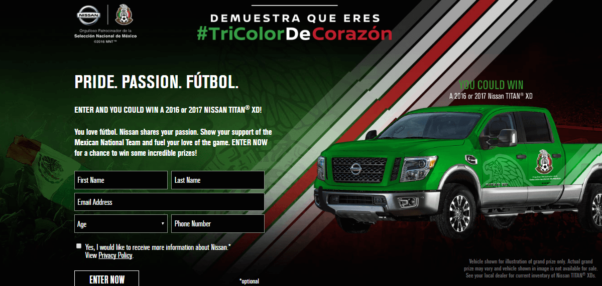
First impression: “Wait, is this page in Spanish?”
The idea behind the Spanish on the page is understood — support the Mexican National Team. However, without reading some of the smaller, English copy on the page, it’s hard to tell.
On the plus side, the page does a great job of meshing Nissan with the Mexican National Football Team. With its use of the foreground image, the background, the colors, etc.
Additionally, writing in second-person speaks to visitors more directly and makes them feel more connected to the offer. Likewise, leaving the opt-in box unchecked is also a smart idea. Because, it lets visitors choose for themselves if they want to opt-in to Nissan’s newsletter.
Countless exit links on the page make the primary conversion goal (winning the truck) easy to miss. In fact, nearly everything below the fold is one big escape route off the page. The “return to hub” link at the top of the page is another distracting exit point blocking the conversion process.
The CTA button is nothing special, and it doesn’t stand out. “Enter Now” is boring and generic, and the button blends in with the lead capture form. In fact, the most colorful and eye-catching elements on the page — the company name, the hashtag, the background, and the image — are all elements that aren’t even involved in conversion.
And what about the fine print below the truck? Apparently, this isn’t the actual truck that the company is offering, so why wouldn’t they just show the real vehicle that’s up for grabs? Also, why are the other prizes that are being offered only mentioned below the fold? If these are part of the offer as well, and the company thinks that these will compel people to convert, why aren’t they mentioned above the fold?
7. To offer extended warranties
Free Auto Repairs
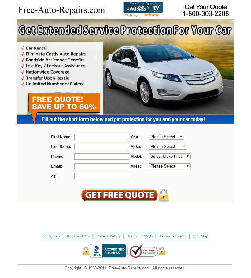
This post-click landing page was aiming to get prospects to sign up for extended service protection for their vehicles. The page does a good job of conveying this with its headline. The orange call-out box, and the attention-grabbing CTA button that uses the persuasive word, “free.”
The list of what’s included in the protection plan is also useful and helps encourage people to want to sign up for the warranty.
Unfortunately, though, people may not get the opportunity to sign up for either one of these things on the page. Because there are several easy exit points on this post-click landing page, including all of the security badges at the top and bottom of the page, as well as the links in the footer.
Also, the form is a bit long and intimidating. It might get better results if it was a multi-step conversion process. The company may want to A/B test having the vehicle information on page one, and then the personal information on the next page.
The spacing in the headline is off, too. There isn’t a lot of white space between the words, making it look like it’s all one word.
Moving to the bottom of the page, the copyright is outdated. Since that’s the case, is Free Auto Repairs still in business and able to fulfill its promise?
8. To promote truck rentals
U-Pack

The images give prospects a nice preview of some of U-Pack’s rental options. Also, the question box is likely very useful for some prospects who may have questions about the products or services.
The security badge logo adds trust and the BBB logo adds credibility to U-Pack, which do not link to either site. Similarly, the company logo in the header is not hyperlinked. In fact, there aren’t any exit links on this post-click landing page at all (aside from the privacy policy link, which is a good thing in this case).
Customer testimonials are typically persuasive post-click landing page elements. However, it seems a little strange at the top of the page here. Or maybe it’s because it’s not formatted and spaced strangely?
The orange CTA button pops off the page well, as it contrasts the predominantly white and green page. That said, the copy on the button needs to change. “Get Instant Quote Now” is repetitive — “instant” and “now” are pretty much the same thing. Changing it to “Get my free quote instantly” would likely perform better.
The company may want to consider A/B testing the copy with a bulleted list, as this may be easier for visitors to scan the page and determine if they want to get an instant quote.
Ryder

For starters, the background image complements the page well because it shows all of the different types of trucks. The headline and subheadline showcase benefits, but they’re not very specific. For example, how is truck leasing with Ryder “smarter” than any other company?
Flexibility is clearly Ryder’s main focus because they emphasize it in the subheadline. And people love flexibility when they’re paying for a product or service.
At first glance, it seems like the CTA buttons stand out because you don’t see any other red. But as soon as you scroll down the page, you see a lot more red. Therefore, designing the CTA buttons in a more contrasting color would certainly be a good A/B test to perform. Once a visitor does click any of the three cooperative CTA buttons, the form pops up. This two-step opt-in helps reduce clutter on the page and only very interested prospects will see the form and convert.
Fortunately, the absence of exit links makes it easier for visitors to focus on the page’s goal.
Create your own automotive post-click landing pages
How do you use post-click landing pages for your automotive business? What did you learn from these automotive post-click landing page critiques?
Start building your own professional and persuasive automotive post-click landing pages in just minutes with the help of Instapage. Sign up for an Instapage Enterprise demo today.

See the Instapage Enterprise Plan in Action.
Demo includes AdMap™, Personalization, AMP,
Global Blocks, heatmaps & more.
