
It doesn’t get any bigger than this.
With the most powerful position in the world on the line, you’d better believe Donald Trump and Hillary Clinton are pulling out all the marketing stops to get support for their presidential campaigns.
Today we’re going to learn some lessons in conversion optimization from two candidates locked in a high-stakes battle for voters. Use them in your own marketing to boost signups, downloads, or any other action you’re attempting to drive.
10 Lessons in Conversion Optimization From the 2016 Presidential Candidates
1. Take advantage of the foot-in-the-door technique
In 1966, psychologists Jonathan Freedman and Scott Fraser conducted a landmark research experiment that marketers still refer to today. In it, they divided 156 homemakers into four groups, and phoned the first three to ask them a small question: “Can you tell me what kind of household products, like soaps and cleaners, you are using?”
A few days later, researchers called them back to ask if they’d be willing to allow an experimenter into their homes to catalog cleaning supplies. In a blog post, marketer Jeremy Smith emphasizes just how big of an ask this actually is:
If you think about it, that’s a pretty big request. First off, this involves opening your home to a total stranger. The stranger would then open up your drawers, cupboards, closets and cabinets to investigate the items you own, hold them, touch them, measure them, and write down information about them. It’s a bit intrusive, to say the least.
Despite the enormity of the request, a surprising 52.8% of all three groups said “yes” to it. And in the control group that wasn’t called? Only 22.2% allowed the experimenter into their homes. All it took was a small question to win the first three groups over.
Today, marketers use those small requests to get their foot in the door, the way Hillary Clinton does on her squeeze page. Then, they ask for more.
Her marketing team understands that one in four US voters dislike both candidates, but many see her as the lesser of two evils. So, the first thing you’ll notice when you land on her website is this message:
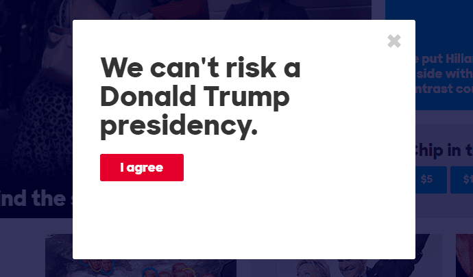
By getting the visitor to agree that Clinton is the lesser of two evils, they open up the opportunity to grab more information using the squeeze page below:
And after you fill out that form, another takes its place:
The moral of the story? If you’re looking for more information from your prospects, try starting by asking for something small first. The likelihood they’ll comply with subsequent requests will be significantly higher.
2. Break up long registration processes
The multi-step process shown above works in other places, too. Both Clinton and Trump use it on their donation post-click landing pages to get basic information from their visitors before asking for more:
Notice the three dots on Hillary’s form that indicate the multiple steps in the donation process, and the text that reads “Step 1 of 3” on Trump’s. Both have CTAs that indicate there’s more after this initial form, reading “Next” and “Continue” respectively.
By breaking down the donation process into several steps instead of displaying it all on one big form, both candidates reduce the “friction” involved in converting. People are less intimidated by a few small forms than they are by one long form with a ton of fields.
It’s a technique even we at Instapage use to boost webinar signups.
3. Keep navigation off pages designed to drive action
On your website, a navigation menu helps your visitors get from page to page, to learn more about who you are and what you have to offer. On web pages that are meant to drive action, however, that navigation bar should be omitted to keep them focused on completing that action.
These pages are known as “post-click landing pages,” and they’re designed for one purpose: to convert visitors from prospects to customers, donors, subscribers, and more. They don’t need to have outbound links to other pages because they include all the most persuasive elements of your website.
The marketing teams of both Hillary Clinton and Donald Trump realize that. Just take a look at the upper half of the pages they’ve designed to convert visitors…
Here are three of Hillary’s, designed to get prospects to sign up to protect the vote, to contact the campaign team, and volunteer:
Donald Trump leaves out navigation on his donation post-click landing page, too:
Research from HubSpot and Yuppiechef has shown that navigation links do, for a fact, reduce conversion rate.
The only way your prospects should be able to leave your post-click landing page is through the “back” button, or by clicking the red “X” in the corner of their browser window.
4. Use accent colors to make your CTA button stand out
Of all the persuasive elements on your post-click landing page, the one that should draw the most attention is your call-to-action button. The way to make it stand out most is by coloring it with a hue that isn’t already present on your web page.
Take a look at the CTA buttons on both candidates’ homepages:
Both pages are primarily white and blue. The colors green and red are ONLY used on CTA buttons (and in logos a bit), and for a reason. These “accent” colors draw attention to the most important elements on the page: the ones designed to get visitors to take action.
Make sure that when you’re deciding on colors for your post-click landing pages, you make your call-to-action button stand out with an accent that is barely used on your page already. Learn more about how to pick that color here.
5. Guide visitors to your CTA button with visual cues
Coloring your button with a bright and bold hue isn’t the only way to get your prospect to look at it. For example, what do all the following pages have in common?
Both candidates are staring at the form prospects need to fill out to convert. Trump and Pence both look at the “Contribute” CTA, while Hillary stares at the donation forms on all three of her post-click landing pages.
Studies have shown that when you use photos of people on post-click landing pages, their gaze tends to guide visitors’ attention. If those people are looking right, visitors look right. If they’re looking left, visitors look left. If they’re looking straight at the camera, visitors stare straight back.
So if you’re using pictures of people on your post-click landing page, make sure they’re looking in the direction you want your prospects to go. In all cases, that’s your form or CTA button.
6. Use the word “you”
The word “you” and its variations are the most powerful words in copywriting. Why? Because they speak directly to the visitor. In general, we all tend to act in our own self-interest, so putting things in your visitors’ perspective will help them understand how your product, service will benefit them.
Look at Donald Trump’s donation form again. What do you see?
That’s right — a message that emphasizes how a Donald Trump presidency benefits the donor. “I am your voice,” “I’m with you, and I will FIGHT for you, and I will WIN for YOU.”
It might seem like a small gesture, but to prospects, it speaks volumes. Think about it — the presidency is just like any other product or service. Both candidates are selling themselves and a version of the country they’ll create as president. It’s their job to let their followers know WHY they should want to be a part of that country.
7. Use a logo on your post-click landing page
Even though great post-click landing pages leave out navigation menus, they do always include one thing at the very top: a logo.
That logo lets internet users know they’re still on your website, and it’s imperative today. With all the fishy pop-ups and scammers on the web now, it’s very easy to mistake an unbranded page with one that’s been created to steal people’s personal information. Your logo and other trust signals (like the one we’re about to touch on next) make users comfortable converting.
8. Include security badges when necessary
Getting people to convert is tough because they’re protective of their personal information, and rightfully so. In the wrong hands, email addresses and phone numbers can be abused by spammers and sold to the highest bidder.
Ever wonder how telemarketers who work for businesses you’ve never heard of can call you at home? It’s because somewhere along the line, you submitted your personal information to someone who sold it. That’s why often a message that reads “We’ll never share your personal information,” or “We’ll never spam you,” accompany post-click landing page forms.
When the information you’re trying to capture is more sensitive than an email address or phone number, it’s even more important you make prospects comfortable with submitting it. That’s why on donation pages for Hillary Clinton and Donald Trump, which attempt to capture credit card numbers, they include “Secure” badges to let people know their information is safe.
Take a look here, at Hillary’s and Trump’s, respectively:
The only way these badges could be better is if they were from companies that have become synonymous with security, like Norton or TRUSTe. Take a look (below the form) at this post-click landing page from Salesforce to see what we mean.
If you can’t get your prospects to trust you, you won’t be able to convince them to convert. Signals like badges, privacy messages, and “HTTPS” in the URL will let your prospects know their personal information is secure.
9. Minimalistic footer
Normally your footer is a fallback for visitors who can’t find the content they’re looking for in your navigation menu. Links to your contact information, your blog, and many times an entire sitemap help confused prospects get to where they need to go.
But not on your post-click landing page.
A post-click landing page should have no outbound links to any other web page — not your own or anyone else’s. The navigation menu should be non-existent, your logo shouldn’t be hyperlinked to your homepage, and your footer should only contain links to your terms of service and privacy policy if needed. Anything else will serve as a distraction to potential converters.
Both Hillary’s and Donald’s marketing teams know this, which is why they’ve chosen to include the bare minimum in their post-click landing page footers. At first glance, Trump’s may look busy, but there’s only one link in there to his privacy policy. Take a peek below:
10. Write CTAs in first person
If the words “you,” “your,” and “you’re” are so powerful, marketers should use them all in their calls to action, right?
Not necessarily.
While it’s still the most powerful word in copywriting, research has shown that on CTA buttons specifically, replacing “you” and all its variations with “me” and its respective versions, has a more powerful effect. It’s a technique that Hillary’s team has used on nearly all her CTA buttons:
Try writing yours in the first person to see if it produces a lift in conversions.
Use these tips in your own advertising campaigns
The debate over who’s more fit to lead the country will rage on until November, but there’s no question about this…
If these ten marketing tactics are good enough for two people with the potential to become the most powerful figure on the planet, they’re certainly capable of boosting conversions on your post-click landing page.
Put them into practice by creating your own post-click landing page in minutes, request an Instapage Enterprise demo today.