A lot of significant events happened in 2010.
The world’s tallest building officially opened in Dubai, Space X successfully launched the Dragon Capsule, Apple released the iPad, and Ethan Marcotte created responsive web design.
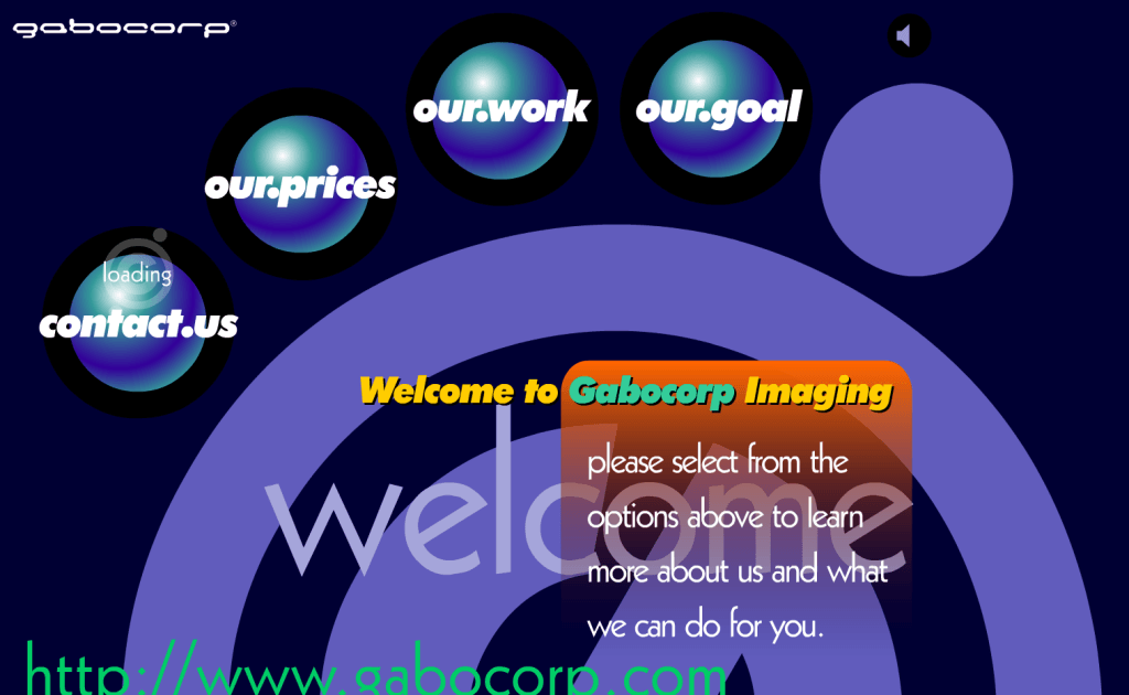
We’ve come a long way from web pages whose sole design purpose was to dazzle visitors with a colorful display of images, like this:
Web design now centers on functionality and user experience. And why wouldn’t it when 46.1% of people regard design as a top criterion to determine business credibility.
post-click landing page design wields the same power. In fact, Numara Software was able to improve form conversion rate by an impressive 133% just changing the page font.
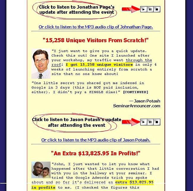
Newer design standards no longer focus on using flashy, in-your-face visual elements such as red color fonts and yellow highlighted passages to guide the visitor toward a blinking call-to-action button. So, you don’t have to look at pages that look like this:
In the past, we discussed post-click landing page trends that were hot in 2018. Today we’ll look at web design trends that will help increase your conversion rates going forward into 2019.
1. Card-based layout
Intercom predicts card based design to be the future of the web because it gives you the opportunity to showcase large amounts of copy or images in a more organized manner, and tell your story quicker.
A card based page layout ensures that there are visual breakpoints between the page elements. Plus, the approach removes clutter — regardless of the amount of copy and images you place on the page. What’s more, card-based design is an excellent replacement for the traditional page slider.
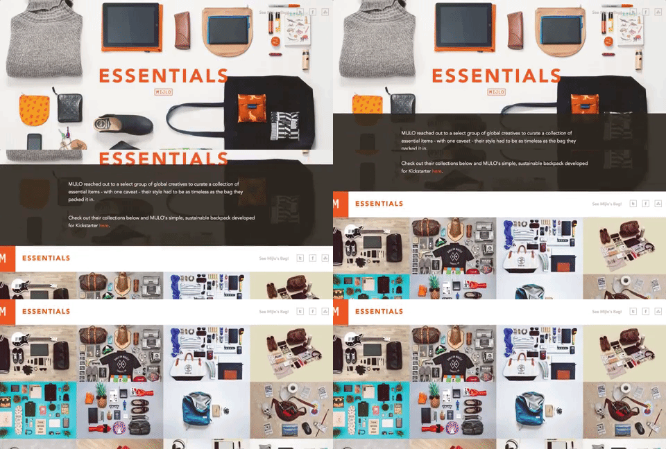
The Essentials homepage uses a card based page layout to showcase images curated by a group of global creatives:
2. Long scrolling pages
Getting all of your vital information above the “fold” was a design principle many marketers previously clung to believing that if a visitor couldn’t see the CTA button, they would never convert engage with you further, or purchase.
That practice is dead. “Short” web pages that contain all the important information above the fold are no longer considered the norm for higher conversion rates. Today’s web users expect to scroll. They’re craving more information, whether that’s in the form of 10x blog posts or long scrolling post-click landing pages.
The long scrolling page allows you to take visitors on a visual tour of your offer, providing answers to any questions they may have before they take action on the page.
A web page or post-click landing page that requires the user to scroll through your offering allays doubts and gives you the opportunity to tell a more detailed story.
A sticky scrolling menu improves the navigation experience for the visitor, as they are put in charge of where to move on the page. The visitor is always in charge of where he or she wants to navigate, thanks to the sticky scrolling menu.
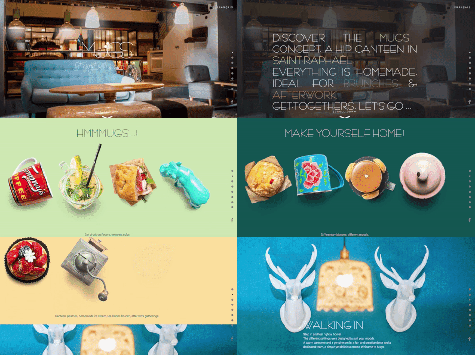
This is what Mugs does with its page:
3. Dramatic typography
Greater access to better device resolutions, faster internet speeds, and a whole array of creative fonts (thanks to Google Fonts and Adobe Typekit) make dramatic typography on web pages and post-click landing pages a natural transition. Dramatic typography allows you to establish your brand identity and gives you a chance to enhance the content experience for your visitors.
Be adventurous with your typography choices. However, remember that legibility should be your priority, because if the font isn’t readable, there’s no point in including it on any web page.
Try increasing the font size to get a dramatic effect, or contrast the font color with that of its surroundings. As a rule, limit fonts to two types per web page as not to distract visitors from the conversion goal.
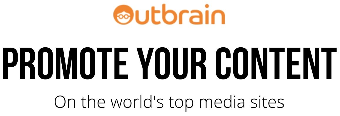
As an example, Outbrain uses large fonts on their post-click landing page that draw immediate attention as soon as you arrive at the page:
4. Micro-interactions
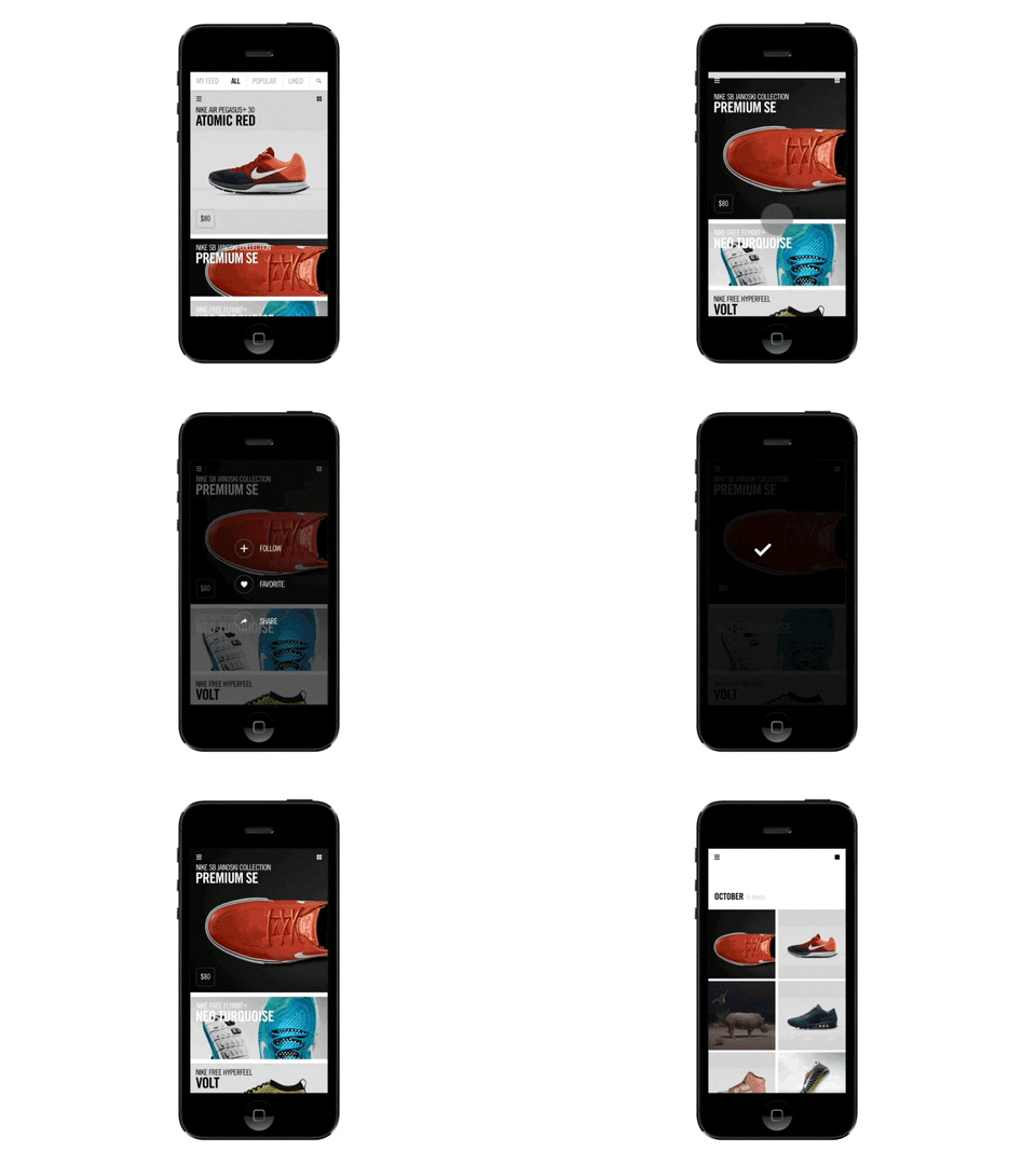
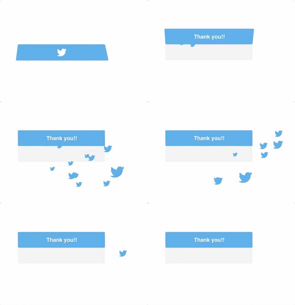
Micro-interactions occur in between larger interactions and enhance the mobile page experience for visitors by letting them know that they have already performed a particular action. For example, clicking a button and witnessing the color change, or hearing a particular sound after you perform a specific action.
These smaller interactions help visitors visualize the results of their actions, like this one from Nike:
 Micro-interactions can also help visitors understand non-standard layouts like vertical split screens, or a card based layout and encourage visitors to click a call-to-action:
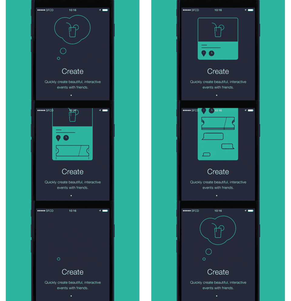
 Another way you can use micro-interactions on your mobile pages is by giving an animated tutorial of how your product works (and having navigation dots at the bottom to show visitors which stage they’re viewing):
5. Color blocking
Color blocking involves using different colors to create a mosaic. You can use color blocking on content or image heavy web pages to break up the elements and give them room to breathe.
This is what the Wrist homepage does:
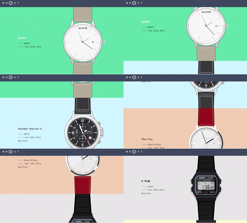 You can also pair the color blocking design technique with hover states, and cause color blocks to change color when visitors move their cursors over the block.
To demonstrate, the Barn + Co homepage uses color blocking and hover state simultaneously:
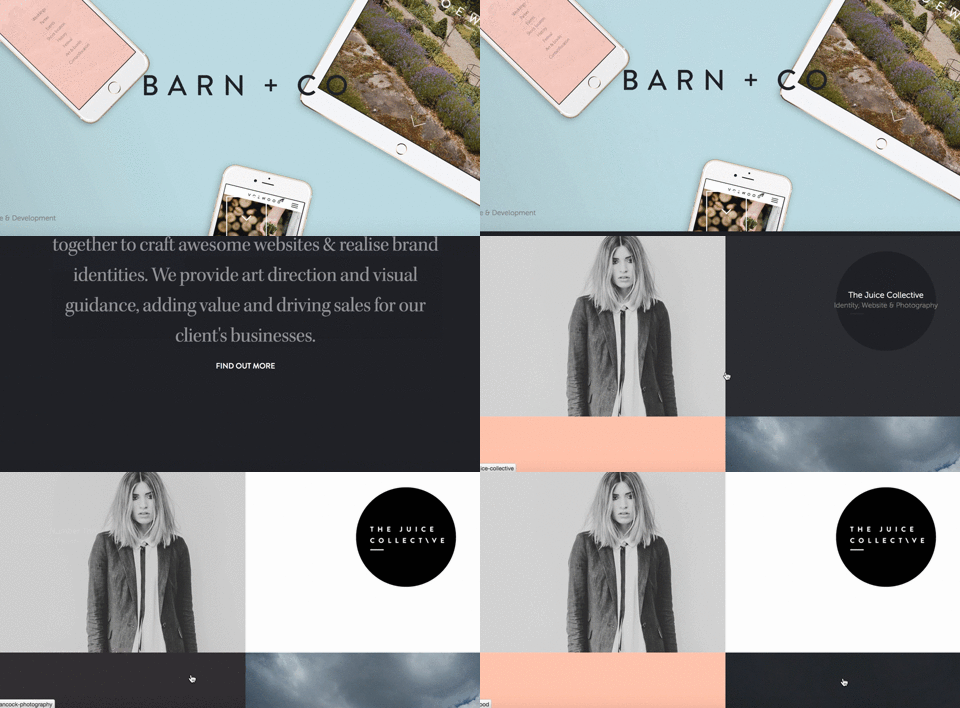 Although not a post-click landing page, Barn + Co shows they’re ahead of the curve on implementing new design trends to their website. These types of interactive elements help improve the user experience and overall engagement with their brand.
6. Using screens as pages
Have you ever struggled to determine the most appropriate page layout for a long form sales page? Struggle no more; this trend is for you. Using screens as pages provides new meaning to web page scrolling.
When you use screens as pages, you’re mostly configuring each screen in a fold to act as a separate page — which has its own image, headline, etc.
If long scrolling pages are not for you or your visitors, screens as pages may be an excellent alternative to keep everything organized while providing the necessary information.
Google App uses screens as pages:
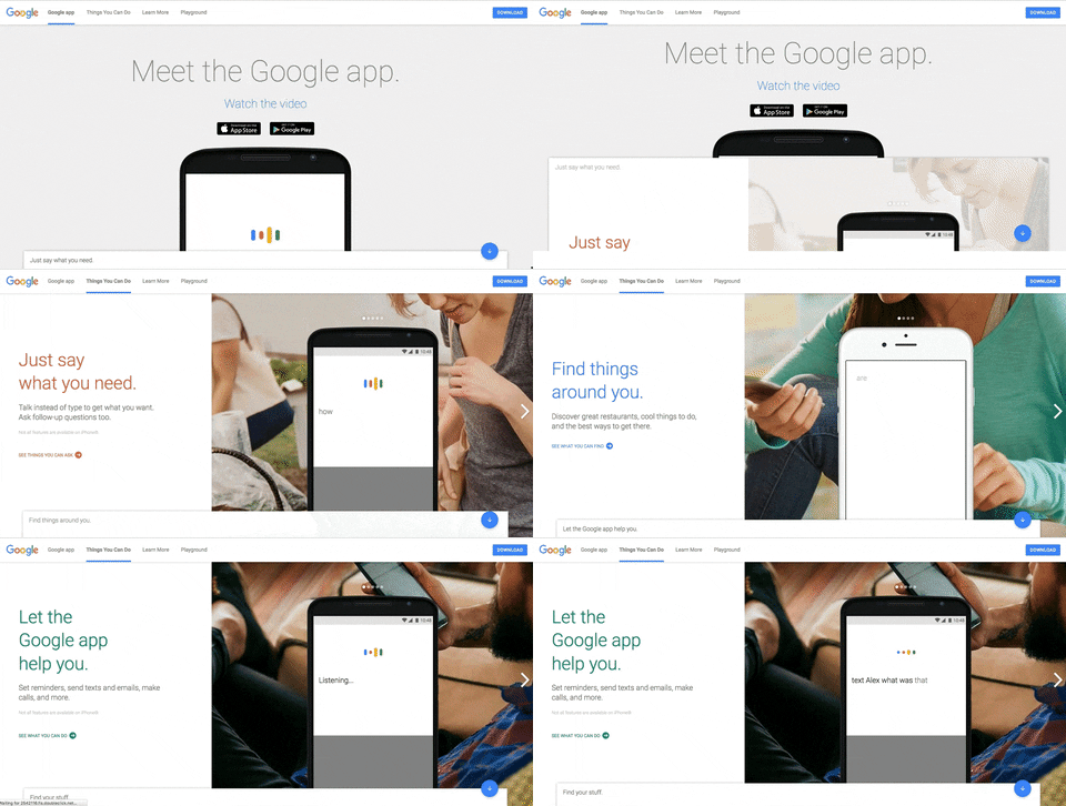 You can switch between the screen from the navigation header, scrolling by mouse, or by using the arrow keys.
Reinvent the page scrolling wheel by using your screens as pages.
Which web design styles suit your brand the most?
Web page design should focus on user experience and functionality. Every element you include must add to your conversion goal and serve an individual purpose.
Think your visitors prefer a visual experience? Use card-based design. Have a rather complicated offer to promote? Use a long scrolling page to explain every little detail to persuade visitors to convert on your goal.
Which design trend do you think fits your web pages the most? Please comment below and let us know.
Haven’t started creating post-click landing pages yet? Design high quality post-click landing pages, sign up for an Enterprise demo today.

See the Instapage Enterprise Plan in Action.
Demo includes AdMap™, Personalization, AMP,
Global Blocks, heatmaps & more.
