
We’re going to be talking about evolution today, no not the whole monkey to man thing, sorry Mr. Darwin. An evolution of a different species, a species that you no doubt have encountered, because it preys on innocent folk just like you – people who arrive at landing pages to get some information or to buy something and it just pounces on you.
Because it’s no venomous snake, you do escape easily but it still annoys you, unhinges you from the task at hand and generally leaves you feeling icky.
I’m talking about pop-ups and what we’re going to be delving in today is a bit of a history lesson about this particular marketing tactic that has certainly evolved overtime.
Let’s start with the ugly.
The UGLY
What comes to your mind when you hear the word pop-up? Probably an annoying JavaScript window that idiotically asks you if you’re ready to leave the current web page you’re on because you’ve just hit the exit button. A sleazy window that asks you to put in your email address after it’s totally turned you off.
A pop-up that not only makes you leave the page faster but also makes you vow never to come on that particular website again – and if you’re the website owner whoosh goes your sale.
This is the ugly side of pop-up marketing, the side that makes your teeth hurt because really it’s just that annoying. These kind of pop-ups were the reason why browsers incorporated pop-ups blockers to ensure that the user doesn’t tear his hair out in agony.
The good news is this breed of pop-up ads is generally extinct, you won’t see them around so much because they’ve been replaced by a newer version.
The BAD
Wait, what? Are they still bad? What’s the point of this post then, you ask?
Wait till they end of it and you’ll see what I’m getting at.
The thing is pop-ups sure have changed, a lot of the annoyance has now been cleaned off of them and the truth is when done right pop-ups do work. They help you get a higher opt-in rate, increase your conversions and sometimes convince your visitor to make that last minute sale.
This is exactly whey marketers are still using them on their homepages and their landing pages.
When done right pop-ups make an impact on your audience, the problem is that really few people know how to do it right with pop-ups.
When done wrong however, they have great potential to put your visitors off completely.
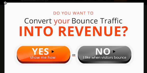
How do you feel about this pop-up ad? Does reading what the grey button has to say make you mad with rage because you’re being manipulated into hitting the bright orange button?
This kind of pop-up is exactly what’s wrong with the whole thinking behind this pop-up ad marketing. You can’t trick your visitors, whether that’s tricking them into staying on your website or tricking them into checking out your offer by asking them stupid questions like if they like to see their visitors bounce?
Can this type of ad really bully a visitor into clicking on the CTA, do you really want to shame your visitors into buying your service?
No one likes to be manipulated and humiliated, especially paying customers. The only thing that these kinds of pop-ups do is swear your visitors off your site.
If it’s trickery you’re selling, no one is buying – trust me!
Making it right
When it comes to pop-up ads you need to consider a few conditions that you need to take care of:
- The time that it takes for the visitor to show up on your site and time that the pop-up shows up in front of your visitor is really important. If you do it too quickly, your visitor will be taken aback and there goes your sale and if you do it too late you might lose the opportunity to do it at all.
- Make it really easy for your visitors to close your pop-up ad, don’t hide away the close button, because no one’s going to spend time looking for that X, they’re just going to go away from your website.
- How many times does your pop-up ad appear, does a single visitor see it more than once?
- What the copy of your call to action button says, does it say something like the ad above?
Think of these 4 things when you decide to jump into the pop-up ad marketing scene; whether that’s for your homepage or your landing page.
The GOOD
Yes, there is a good!
See case in point.

The thing is when your pop-up ads are designed professionally and you pay attention to what your call to action button says, pop-ups can actually help you get conversions.
GetResponse takes the pop-up ad experience to a whole new creative realm.
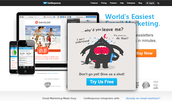
This is just cute and so unique; you’re tempted to click the CTA button. The design of the ad is clean, there’s a lot of white space and the CTA button is both prominent and clear.
So, what did we learn today?
Pop-ups can work; they can easily give you higher conversion rates if you know exactly what you need to do with them.
Sign up for an Instapage Enterprise demo today.

See the Instapage Enterprise Plan in Action.
Demo includes AdMap™, Personalization, AMP,
Global Blocks, heatmaps & more.
