Every year brings new advertising opportunities—advertising trends, technology, and tactics are never stationary. To keep generating advertising conversions and scaling your ROAS, your business must remain abreast of these developments to stay ahead of the curve.
In 2020, Facebook’s monthly active users swelled to nearly 3 billion, with 1.8 billion people using the app daily. It’s time to tap into this tremendous potential. Listed below are five Facebook best practices that will help increase advertising conversions in 2021.
Facebook Shops
Facebook Shops launched in 2020 to help ease the disruption caused by the COVID-19 pandemic. The feature lets DTC brands showcase their products directly on their Facebook Marketplace and Instagram Shopping in a single native shopping experience—for free.
Facebook Shops is a mobile-first shopping experience that enables you to create custom collections by grouping items from your inventory so customers can discover your products, save and share collections, and direct-message businesses through Messenger, Instagram Direct, and WhatsApp. With full-screen images and customizable design, Facebook Shops lets you easily create a consistent brand identity across Facebook and Instagram.
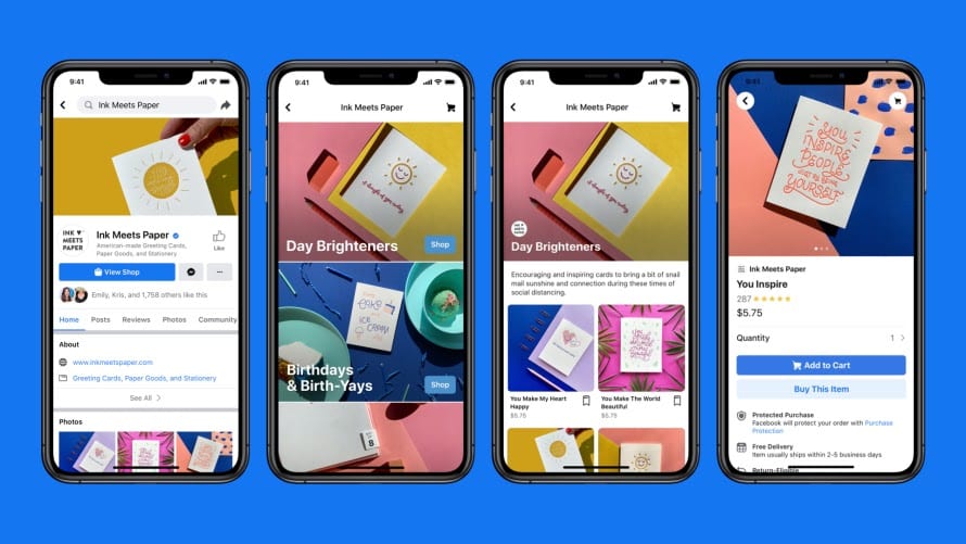
Customers can purchase products through a company’s website or within the app so they move from the awareness stage of the customer journey to the purchase/conversion stage in record time.
Shopify merchants can also use Facebook Shops as an additional sales channel. Shopify has been working with the advertising platform since 2015 to provide its sellers with multi-channel commerce solutions. Now the company partners directly with Facebook to make the mobile-first shopping experience easy for Shopify merchants.
No matter what industry you’re in, Facebook Shops allows you to retain complete control over your brand and access a suite of features designed solely to help you increase your ROAS.
Facebook Live
Especially amid the pandemic, connecting with people through visual and audio contents is critical with Facebook Advertising. According to Oberlo, Facebook Live usage increased by 26.7% year-over-year in Q2 2020, and the overall percentage of Facebook video content in Q3 2020 rose by 2.6% YOY.
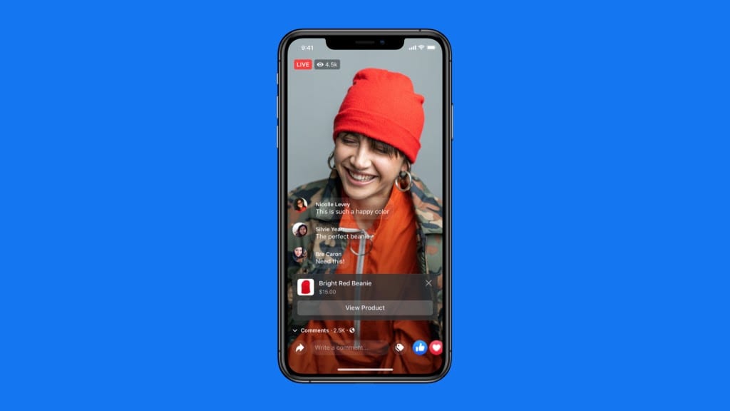
Before the arrival of Facebook Shops, it was challenging to get audiences to complete transactions via Facebook Live sessions. Now, Shops enables brands to sell their products in real time. Tag products from your Shop or catalog before going live, then showcase them at the bottom of the video so people can easily tap to learn more and purchase.
Short videos
The moment you bring video into your Facebook ads, audiences start paying attention. However, not all video ads generate the right metrics. When creating video assets, keep the following two things in mind:
Don’t obsess over production quality. The videos you create for Facebook ads don’t need to have a high production value or look like a television commercial. Videos taken with your smartphone can be super-effective, as they more closely mimic the content your target audience typically sees in your feed and on the platform. The secret to creating video assets that work is providing high-value content, not high-quality videos.
Keep your videos short. Brands often get intimidated by the idea of creating video assets, thinking they need a 3-minute or longer scripted, polished video. Simplify this process for you and your team by creating shorter videos. You may be surprised at how much content you can fit into a 20- or 30-second video and how effective it can be in your ads. A shorter video also means that your target audience is more likely to watch enough of it to see the most valuable content, value proposition, or selling points.
This Airbnb ad is a great example of a short engaging video asset that isn’t overly produced, is true to the brand, and engages visitors:

Impactful Facebook ad copy
Most Facebook ad creative must fit within specific limitations. For instance, the image needs to be a set ratio and size, and if the headline or description are too long, they get cut off and you could lose a relevant part of your message.
Contrary to popular belief, there is no “golden length” of Facebook ad copy. However, Facebook research shows that images with less than 20% text perform better. Whether you have one word or a few words on your image, or whether you only use body text, keep your message concise and clear when explaining your offer or adding a lead magnet.
This Supergoop ad explains their offer in just 5 words, then uses an animation with text to talk about the product benefits:

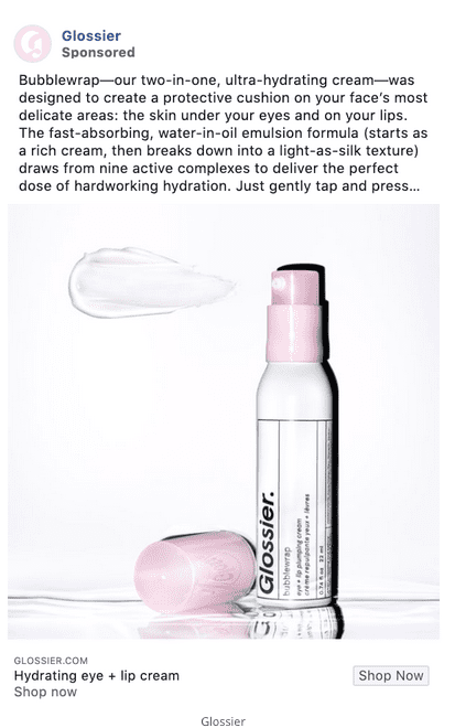
In contrast, Glossier’s ad features longer body text to introduce visitors to their new hydrating eye/lip cream. The ad image is free of text apart from the product packaging:
A/B test your copy and experiment with different lengths—and with text on your image or not—to gauge engagement rate, conversion rate, and the metrics that are most central to your advertising strategy.
Chatbots
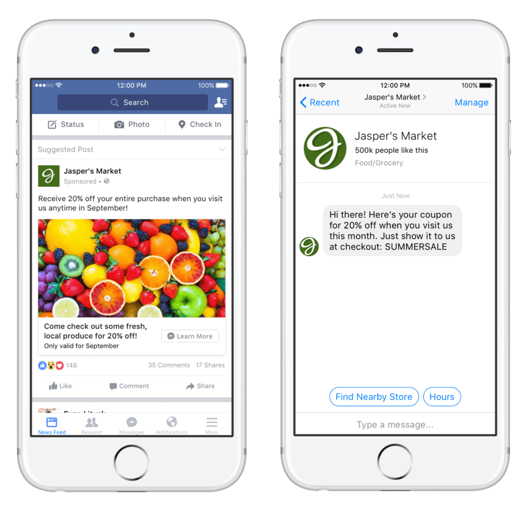
Facebook chatbots have come a long way since the original Facebook Messenger bots bots in 2016. These bots are easy for companies to create themselves to start conversations with customers, collect information, and answer common questions. There are two primary advantages of using Facebook Messenger bots to engage users and get advertising conversions:
1. Low barrier to entry for you and your target audience
Chatbots are a friendly, accessible way of connecting directly with users. A recent Nielsen survey found that people think messaging is the second-best way to talk to a business. People exchange 2 billion messages with businesses over Facebook Messenger every month. A recent Facebook research study uncovered these eye-opening stats:
- 81% of respondents message businesses to ask about products or services
- 75% of respondents message businesses for support
- 74% of respondents message business to make a purchase
2. Greater exposure—for less
The Facebook chatbot field is still wide open. Facebook has 10 million advertisers, with 92% of the social network’s advertising revenue generated via mobile, but only 400,000 chatbots. That’s a lot less competition—and a much more direct line to consumers driving leads, closing sales, scheduling appointments, recruiting talent to their teams, and saving money through automation. While custom apps can cost anywhere from $1,000 to $100,000 to develop, Facebook chatbots are accessible to “anyone with at least some technical prowess and about 10 minutes to spare.”
Although Facebook chatbots aren’t replacing email or customer service agents, they give you access to a unique, underused conversion goldmine.
Using these five best practices in your 2021 Facebook advertising strategy will help you generate a positive ROAS. And don’t forget the golden rule of Facebook ads success: Always connect each ad with a personalized, optimized post-click experience.
Pair these Facebook best practices with fully optimized post-click landing pages
With global digital ad spend expected to reach $579 billion in 2021, it’s imperative that you stay on top of each trend, understand the benchmarks and best practices of each advertising platform, and continue shifting toward new mediums and investing in advanced technologies to stay ahead of the curve. That includes creating personalized and optimized post-click landing pages, which deliver higher conversion rates at a lower cost.
Pair these Facebook best practices with unique landing pages that relate to each of your audience segments for ultimate success. Instapage can help by taking the stress out of building, optimizing, and converting. With three plans each priced accordingly, you’ll be one step closer to achieving your landing page goals. Schedule an Instapage demo here.
