
Today we’ll examine Lighter Capital post-click landing pages – however before we do that here’s a little background on why post-click landing pages are necessary.
Far too many advertisers fail to provide relevant post-click landing pages in their ad campaigns. They take the time to segment their ads to a target audience but don’t continue the same story narrative from ad to post-ad-click page.
This is paramount to earning conversions because a disjointed pre-click and post-click landing page confuse prospects. The expectations set with the ad are not met on the post-click page — and without this message relevancy, they don’t convert.
In fact, more than 95% of Google ad clicks don’t convert, largely due to poor post-click landing pages.
To inspire action, you must create both segmented ads and personalized, relevant post-click landing pages that share the same narrative.
Let’s see how Lighter Capital shows consistency from ad to post-click page.
An analysis of Lighter Capital Post-click landing pages and segmented ads
Example 1: Startup funding
When an online user conducts a Google search for “tech startup funding,” they see this Lighter Capital ad with two sitelink extensions:
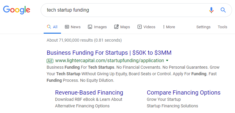
You can tell the ad is segmented based on a specific audience with how closely it’s related to the search query:
- The main headline includes “startup” and “funding” — two pieces of the search phrase
- The description repeats both “tech startup” and “funding” multiple times
- Both ad extensions continue to focus on the funding/financing topic
- The second ad extension uses “startup” two more times
Clicking the primary ad headline takes users to this page which continues the narrative:

- What the offer is for — The story starts with the headline, letting visitors know they’re in the right place and that the page offer is for tech startup funding — matching the user’s search query.
The subheadline reiterates the offer, “funding helps tech entrepreneurs get to the next level” — and highlights the UVP, “without giving up equity, board seats, or personal guarantees.”
-
- Why Lighter Capital is a great option — This part of the story tells more of the benefits people receive with Lighter Capital funding. They are highlighted to the left of the lead capture form with iconography, bold formatting, and minimal copy.
-
- Who else uses Lighter Capital? — Through video testimonials, Lighter Capital highlights other tech startup companies who chose their funding. Each testimonial explains why Lighter Capital was a better option than other financing companies.
- How visitors can take action — Prospects can connect with the Lighter Capital investment team by completing the form and clicking the blue “Submit” CTA button.
Example 2: Revenue-based financing
In the Google ad above, if users clicked the revenue-based financing extension, they’d be taken to this post-click page instead:

- What the new offer is — Again, the headline immediately lets visitors know that they’re in the right place and that the offer reflects what they just clicked. That and the subheadline indicate the offer is a guide that details why startups are increasingly turning to revenue-based financing options.
In addition, the product image reinforces the message further by demonstrating what the guide cover and inside pages look like.
-
- Why companies should download the guide — This part of the story is told through a small section of descriptive copy to the left of the lead capture form, along with bullet points beneath the form. Both of these components explain what exactly the guide entails and how it can benefit readers.
-
- Who is the guide for — The second paragraph lets visitors know that the report is intended for entrepreneurs, early-stage investors, startup board members, and industry observes.
- How visitors can redeem the offer — A short lead capture form asking for name, company, and email enables prospects to request the guide. The blue “Get the Guide” CTA button at the top of the page, along with the hyperlinked “Get the Guide” copy toward the bottom of the page, both serve as anchor tags, bringing visitors directly to the form.
Example 3: Startup financing solution options
Lastly from the Google ad above, clicking the “Compare Financing Options” extension takes prospects to this Lighter Capital post-click landing page:

- What the offer is — The headline is clear and descriptive. Telling visitors exactly what they can find on this page: Flexible financing solutions to help grow their startup company.
The subheadline goes into more detail. It informs prospects they can reach new milestones with Lighter Capital with up to $3MM in capital funding.
- Why companies should choose Lighter Capital funding — The story continues by showing visitors their options for startup financing: Revenue-based financing, lighter term loan, or lighter line of credit. To make this part of the story more engaging and understandable, the chart lets visitors compare financing solutions and select the best option.
This ‘why’ section continues toward the bottom of the page with the “Discover why Lighter Capital is the most trusted…” section, listing the four main benefits of using Lighter Capital.
-
- Who trusts the company? — There are two different sections in the story. First, the page highlights three impressive stats (300+ companies funded, $150MM+ invested, and 550+ rounds of funding). Second, the sliding customer testimonials serve as more social proof from other people who have had success with the brand.
- How visitors can apply — Concluding the story are multiple blue “Apply Now” CTA buttons, all of which direct prospects to the first post-click landing page we looked at in example 1.
Example 4: LinkedIn retargeting ad
After visiting all previous pages and Lighter Capital’s homepage, browsing on LinkedIn showed this retargeting ad:

The ad tells a story similar to those above, but instead goes to this post-click landing page:

-
- What’s the page offer — The headline and subheadline both remind prospects what they left behind. The opportunity to get startup funding with Lighter Capital’s growth capital and financial tools.
-
- Why prospects should convert — The section below the lead capture form tells visitors why they should finally take the leap and convert. They’ll have access to non-dilutive revenue-based funding and banking services designed for founders.
-
- Who the funding is for & who else uses it — Two different sections explain this part of the story. The first explains who Lighter Capital funding is for — bullet points that list who’s qualified for revenue-based financing. The second is social proof to highlight who else uses Lighter Capital for funding — a written and video testimonial from the Co-Founder & CEO at Waggl, along with company logos to show what other startups trust the brand.
- How to get started — There are multiple opportunities to convert visitors. Clicking any of the blue CTA button anchor tags, takes users to the form to submit their personal information.
The homepage tells a different story than the Lighter Capital post-click landing pages
Lighter Capital’s homepage combines several of the offers discussed above into one general page:

It includes The Rise of Revenue-Based Financing ebook offer from Lighter Capital post-click landing pages example 2. The video testimonial from example 4, and clicking any of the “Apply” CTA buttons leads back to example 1.
The page has generalized information on it for audiences who might be interested in Lighter Capital. Similar to other homepages, it’s meant for a browsing experience instead of a single product offering.
We see this through:
- A drop-down header navigation
- Customer login option
- Multiple links to other website pages throughout the content
- Contrasting CTAs
- Social media links
- Full-sized footer
Provide unique experiences and turn ad clicks into conversions
Segment audiences to deliver the most relevant, personalized ads and matching audiences with unique post-click landing pages.
To convert more than the average (4.4% of ad clicks), it’s important not to ignore the post-click landing page. Use inspiration from Lighter Capital to continue the story narrative from ad to page. Request an Instapage Personalization Demo today to start creating unique post-click landing pages and establish 1:1 page relevancy.

See the Instapage Enterprise Plan in Action.
Demo includes AdMap™, Personalization, AMP,
Global Blocks, heatmaps & more.
