Even after a landing page is published, its design is never done. There’s always an optimization that will lead to more conversions.
But finding it isn’t quick or easy. There are countless things to test and look for on a page, and no one of them will result in a big lift in conversion rate.
Instead, it’s smaller improvements that lead to sustainable lifts in conversion rate. The problem is: With so many elements to consider, what should you improve?
63 Tips for landing page optimization
The following 63 tips will seem like very small optimizations, but together, they can make an impact. If your landing page isn’t generating the conversions you expect, one of these may help the issue.
As you read, remember that these rules are not written in stone. There is no one-size-fits-all set of recommendations. The best optimizations come from tests based on your own data.
That said, many are widely applicable — like visual hierarchy, brand consistency, and 1:1 conversion ratio, among others. They’ve become convention, and testing them would be an inefficient use of resources.
So use your best judgement. Consult your data. Use these as a starting point for tests. These tips have worked for others, and they may also work for you.
Page design
1. Design for mobile first
It’s estimated that mobile traffic will account for 80% of all internet traffic in 2019. More searches are taking place on mobile, social networks are accessed primarily on mobile, and considering all this, you should be designing for mobile-first.
Even if most of your sales and conversions take place on desktop, the buyer’s journey takes place across many devices and touchpoints now. Desktop can’t be your primary mode of content delivery. Your content has to look good everywhere, on every screen.
2. Reduce page weight as much as possible
A page’s “weight” is its size in data. The heavier the page weight, the longer it takes to load. On mobile, it’s particularly important to reduce page weight, as research has shown that if a page takes longer than three seconds to load, 53% of visitors will abandon it. When 70% of mobile pages take longer than 7 seconds to load content just above the fold, there’s a lot of room for improvement:
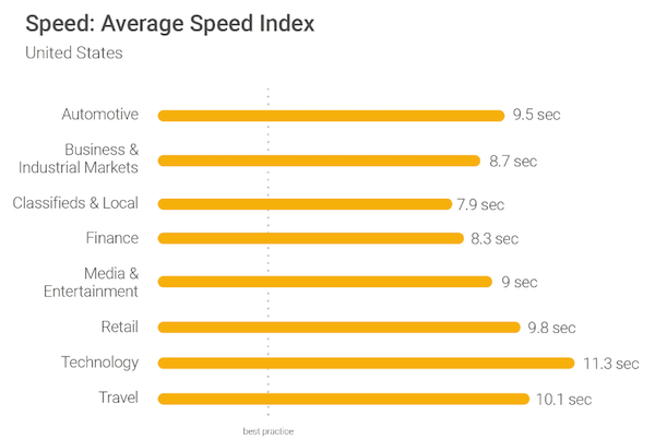
Images and unnecessary JavaScript are primarily to blame, which is why so many are turning to Accelerated Mobile Pages to speed up load times. Known as AMP, this framework started by Google allows advertisers to build high-speed pages without any JavaScript, and with a lightweight version of HTML. They were once only able to support static pages, but now they can be used to build interactive landing pages, entire websites, and progressive web apps.
3. Stay consistent with brand assets
It may seem like common sense, but some landing pages don’t identify themselves as belonging to the referring brand. This could be an obvious omission, like a logo or tagline, or something as small as an off-brand color scheme. Earning trust requires high brand consistency. Make sure your core branding is reflected the same way across all assets.
4. Create message match consistency
The same way branding should be consistent across assets, design should be consistent throughout the campaign. When a user clicks your ad, and the page design does not reflect the design of the ad — color, images, copy, etc. — they may think there’s something fishy afoot. People are highly cautious of advertisers, and they’ll look for any reason to mistrust you. To fulfill the promise you made in the ad, your landing page should include elements from your ad to inspire trust in the visitor.
5. Remove navigation and footer
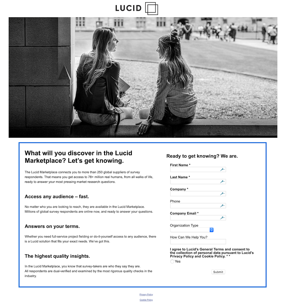
For a landing page to work, it needs to keep the visitor focused on conversion. Outbound links in the navigation and footer are distractions to the visitor through which they can escape to other pages. If your page still includes a navigation and footer, remove them to keep your visitors focused on evaluating your offer, the way this page from Lucid does:
6. Include a privacy policy
Privacy policies tell visitors what you’ll do with their information. They’re becoming increasingly required now that regulations like GDPR and others are being written into law. But even when they’re not required, they’re a good idea to have. They provide transparency, and to your visitor, transparency equals trust.
Xtivia combines a privacy policy and lets visitors know they use cookies to personalize content and ads:

7. Ensure copyright information is up to date
This is one of those small things that people will use as an indicator of how detail-oriented you are. When your copyright information is out of date, it not only makes you look lazy, but it raises questions about the validity of what’s on the page. If a website says Copyright 2010, is all the information recent?
8. Maintain a 1:1 conversion ratio
A 1:1 conversion ratio refers to the number of links on the page compared to the number of conversion goals. Every landing page should have only one link and one place visitors can click to leave your page: the call-to-action button. If you use a second call-to-action, it should be for the same goal. One goal per page.
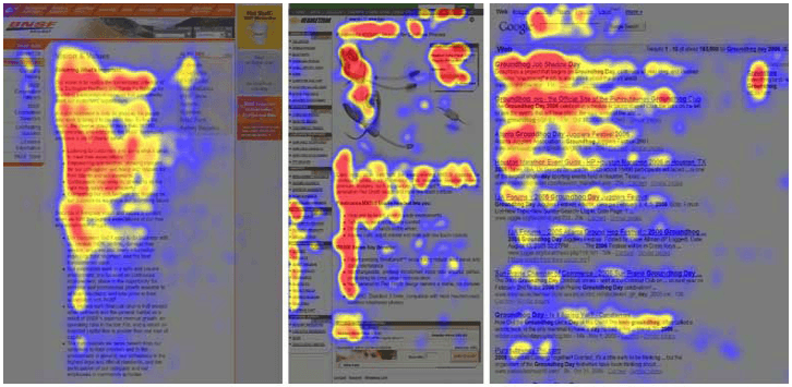
9. Arrange in the F-pattern on a text-heavy page
When users encounter a page of text, they read in an F-pattern. They start at the upper left, read the headline, and then go back to the left margin and scan the page for subheaders and bold words, then read across, creating an “F” or “E” pattern. Make sure your text is arranged to accommodate this pattern of reading:
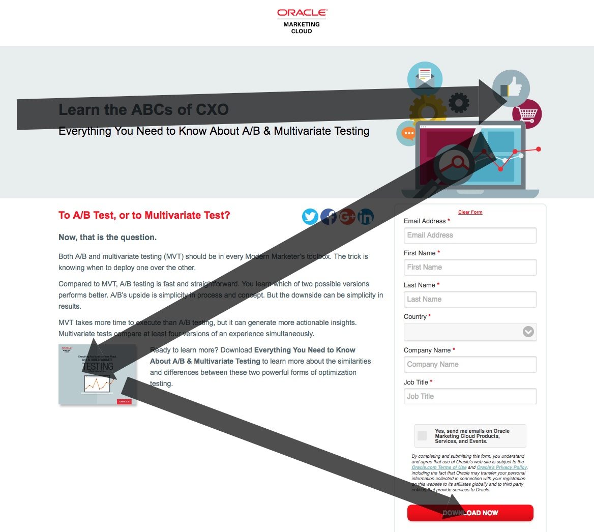
10. Arrange in the Z-pattern for a page with images and text
When users encounter a page with text and images, the pattern they read in is similar to the F. However, when an image comes after text, instead of going back to the left margin and starting over, visitors will stop to look at an image. If there’s an image below the headline, for example, they will start in the upper left, then read the headline, and then move diagonally back toward the left margin, stopping to view the image. If your page has text and images on it, it will be helpful to accommodate this habit:
11. Employ the use of visual hierarchy
Visual hierarchy is the order in which, visually, elements are attended to on a page. By manipulating certain elements, you can increase the likelihood that visitors view what you want them to view, when you want them to view it.
Headlines, for example, are at the top of the page, and they are crucial to getting visitors to scroll down and evaluate the rest of the content. This is because they’re the first thing that visitors see. The higher an element is on a page, the more important it is. The higher contrast an element is, the more noticeable it is, and therefore, the greater perceived importance. The bigger it is, the greater the perceived importance. There are other ways of directing attention with visual hierarchy. Learn more about them here.
12. Optimize for skimming
It’s highly unlikely visitors read your entire page. They’re there for one thing: to evaluate your offer. Therefore, it’s more likely they’ll skim. They’ll enter the page through the biggest element: usually an image or a headline. Then, they’ll look down the page for subheaders, bullets, and bolded content.
To optimize for skimming, make sure you place key persuaders in each of these formats. For example, your USP should be in your headline. Your benefits could be in the bulleted copy. Your hero image could be big and bold, above the fold, as the element that draws your users’ eye.
13. Increase page length
For newer or more expensive, or complicated offers, a page will need more persuasive content to get visitors to convert. Maybe more testimonials, media, copy, security badges. If your offer is in one of these categories and your page is short, you’re not likely providing the persuasive content that visitors need to trust your offer.
14. Decrease page length
On the other hand, if you’re offering a free ebook, you won’t need a long page. Since the risk is very minimal, the amount of persuasive content needed to get visitors to claim it is also very minimal. WIth a long page, you could be overwhelming your visitors. If your offer is low-risk, try simplifying your page.
Headlines
15. Achieve message match
Achieving message match involves coordinating several elements between the ad and landing page. However, none is more important than the headline. When your landing page headline matches the headline of your ad, you let your visitor know they’re going to get exactly what they came for. Longtail UX demonstrates this with their headline, “How to Beat Amazon in Search:”


16. Convey your USP
As the first thing your visitor is likely to read, it’s crucial your headline conveys the unique selling proposition of your offer. What is the biggest benefit your user will get by claiming the offer? Here’s where you tell them.
17. Create a curiosity gap
There’s nothing like a little mystery to get visitors reading the rest of your content. When you create a curiosity gap, you write a headline that divulges only a part of your USP, which triggers your audience’s curiosity. Wanting to learn more, they click through and scroll.
18. Add statistics to your headline
Statistics are a powerful, persuasive force. In the right place, like a headline, they can highlight why an offer is worth claiming. For example: “We built a million-dollar ad agency in just under a year. Get the framework we used to do it.”
See how Neudesic uses a percentage in their headline:

19. Share news
People like to stay up on the latest solutions because newer is assumed to be more advanced. If you have a new way to solve a problem, or simply a new product, don’t hesitate to try words and phrases like, “Finally, a solution to…” “Introducing…” or “The new way to…”
20. Teach people something
Of all the different ways you can write a headline, you can’t go wrong by starting with “How to.” When a visitor sees these two words, they immediately see value: They know they’re going to learn something, as they do in this headline from Outbrain:

21. Share a secret
When you share a secret, you imply you’re sharing something known by very few. If it’s the right secret, it’ll be hard to resist. Your visitors are competitive. They want to know things that other people don’t, especially if those things will set them on the path to success.
22. Ask a question
For a headline to be successful, it has to engage the reader. This is what makes question headlines so effective. They naturally prompt a response from the reader. They also do it in a way that gets the reader to reflect instead of commanding them to buy, read, download, etc. A question headline doesn’t presume to know what the visitor wants. Instead of, “Get the guide to doubling your app downloads,” consider, “How would you like to double your app downloads?”
Media
23. Make sure you’re not showing just to show
It’s tempting to add media to your page because you feel like it should be there. While media can break up text and make content more visually appealing, you shouldn’t add it arbitrarily. Make sure it adds value. Every offer can benefit from the right media, but adding an image or video comes at a cost to page speed. Be sure your media is worth it.
24. If you have impressive statistics, opt for an infographic
Infographics are great for their ability to put numbers in context visually. If your average return on ad spend is 5 times higher than the leading competition, don’t just say it. Show it. A bar graph, for example, could work very well for demonstrating this disparity:

25. Show all the angles
As much as your customers want to know about your product and how it works, they want to see it in action. They want to know all the angles, insides and outs, the pockets of a backpack, the fit of a shirt, the look of an analytics dashboard. Show them all the angles with informational product shots.
26. Showcase benefits with a hero shot
When writing copy, the rule is stress benefits over features. This is like the visual version of that. With landing page optimization, hero images show visitors what they can become with the help of your product. A pain relief product, for example, might use an image of a member of the target audience enjoying a fun, relaxing activity without any pain. Or a workout program might use someone in great shape, working out.
27. Make sure you’re not relying only on words
Copy is a valuable part of any landing page, but images are easier to process than words. To break up text and make concepts easier to understand, consider replacing some of your words with icons. When used correctly, these small images can convey ideas more quickly, while decluttering your page:
![]()
28. Try an introductory video if you’re unknown
The average person will recognize only a very few brands and figures. If your brand relies on the reputation of a particular figurehead, like a banker for an investment course, or a motivational speaker, consider using a video to introduce them and their expertise.
29. If your offer is complicated, try an explainer video
Improving the conversion rate of a landing page selling a complicated offer is often about simplifying how it’s explained. And, while copy can be explanatory, a short, animated video is often better. Show rather than tell. These short videos use simple language and plot to take users from pain point to solution, and in the process, describe the unique benefits of the offer.
Copy
30. Stress benefits over features
Product features are only valuable for what they can provide your customers. Never write features without benefits. They don’t care about your CRM’s new and improved lead scoring system, for example. They care that it means they can manage leads more effectively than ever before.
31. Be specific
Copy should not contain ambiguous words. They leave too much room for interpretation. “Quality,” for example, could be interpreted by some as meaning “good quality,” but to others as “good enough.” Try to be as descriptive as possible without being verbose.
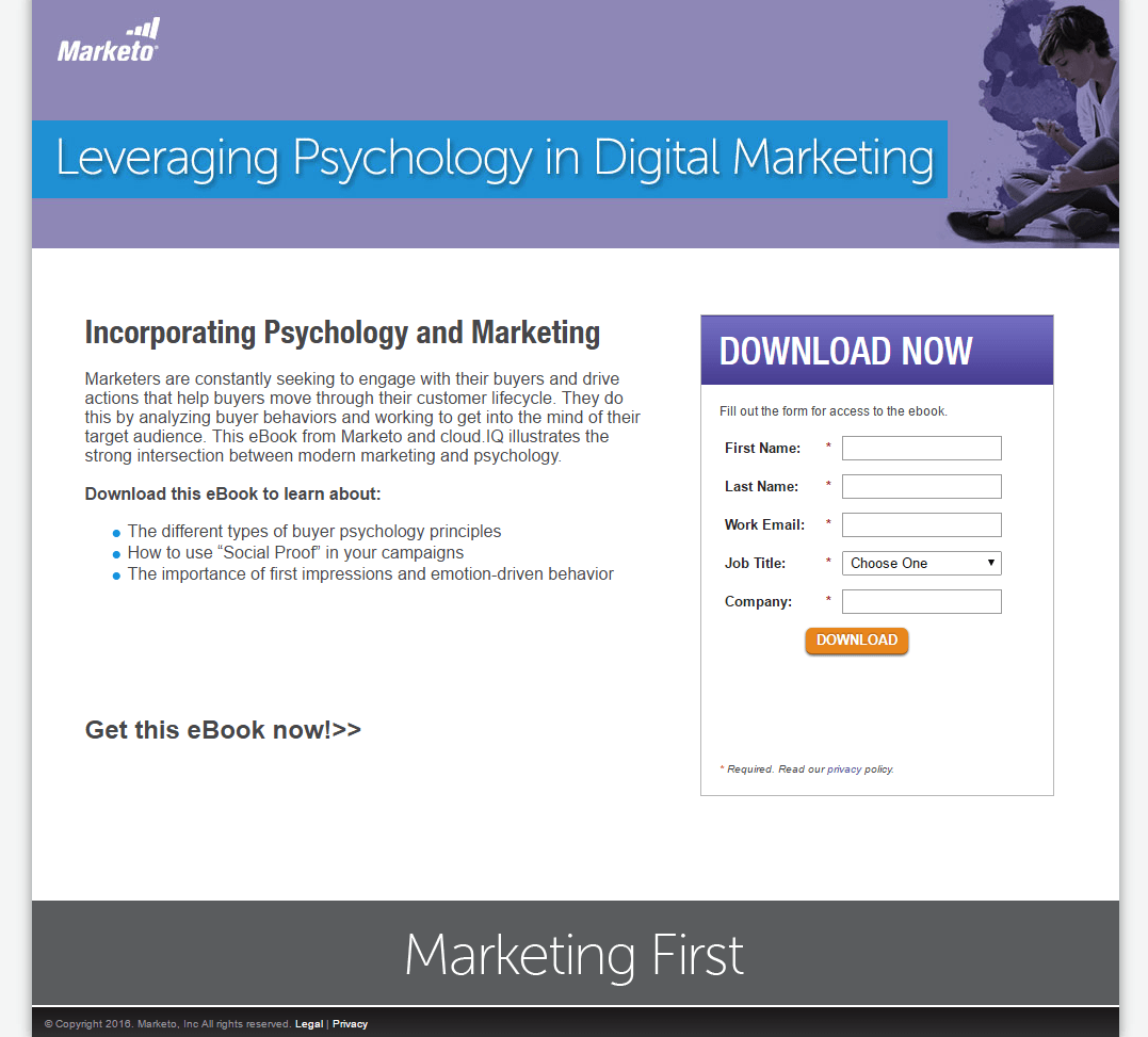
32. Break up longer content
Giant, long blocks of text are overwhelming. If you don’t separate your paragraphs into small chunks and bullet points, there’s a good chance they’ll be too intimidated by the appearance of your content to read it:
33. Use scarcity
Scarcity is a powerful tool for influencing conversions. If your product is rare or in high demand, like a course that’s running out of space, for example, you can use a phrase like, “limited seats available” to gently pressure your customers to convert before it’s too late.
34. Don’t use scarcity
Of course, scarcity isn’t always appropriate. If you’re already using the tactic and it’s not paying off, the reason could be that you’ve used it too many times or in the wrong context. The key to scarcity is that it has to be true to work. Your visitors have to believe that your product is scarce. Otherwise, you will only damage your credibility.
35. Use urgency
Urgency works like scarcity. Only, urgency is time related. “This offer expires at midnight tonight!” is an example of urgency in copy. It can capitalize on your visitors’ fear of missing out to get them to claim your offer before the deadline.
36. Don’t use urgency
Similarly to scarcity, urgency is often overused, or used incorrectly. If you’re sending weekly emails to people, saying “Claim your discount before it’s too late!” they’re not going to worry about missing out. They know the offer will come again next week. For urgency to work, it has to be real, and the offer has to be infrequent enough to inspire fear of passing up a valuable offer
37. Ensure your typeface is big enough
Before you unveil your persuasive copy, you should ensure that it’s actually legible. Since it’s the size we’re used to reading in books, no smaller than 16px is recommended:

38. Make your font color contrast the page
If your landing page is white and your font is gray, it will be hard to read. It won’t stand out from the background it’s on. For best readability, use a light color background and a darker font. The least problematic is black text on a white background.
39. Use decorative fonts only in titles
Decorative fonts should only be used in titles, where they’re big enough to be legible. At smaller sizes, their decorative details can make reading harder for visitors.
40. Pay attention to line length
Not every line of text is the same length. A newspaper column, for example, will have a much shorter line length than most blog posts. In the body copy of your landing page, there’s a sweet spot to aim for: between 50 and 75 characters. Below that, and the eye is frantically moving back and forth from margin to margin. Above it, and the endurance of the human eye is tested. If there’s text on your landing page, aim for optimal line length.
41. Space your lines well
Line spacing is another element that affects whether or not your visitors can read your page. Too close together, your letters are condensed and overlapping. Too far apart, and it becomes hard to tell where one word ends and another begins. Aim for a typeface with spacing that is 120%-140% of the type.
42. Optimize for comprehension
Ultimately, even if your lines are spaced correctly and they’re the perfect length and arranged on a grid, it doesn’t matter if they can’t be understood. Your copy should be optimized for comprehension. Find out how your audience talks about your product and the problem it solves, and use their language to guide them to conversion. Use small words and short sentences. Write like you talk. The best web writing for sales is like the best conversation: simple, light, and to the point.
43. Shorten your copy
Can that paragraph be eliminated? Can those super awesome fantastic adjectives be minimized? Your copy should be edited to the shortest it can be without detracting from its effectiveness.
44. Lengthen your copy
Sometimes your copy needs to be longer. Sometimes, a story is what most effectively sells your product. If it’s more expensive, or new, or complicated, a few bullet points will not do. If you’ve tried the shorter content, it might be wise to try something longer and more comprehensive to see if it has a positive impact on conversions.
Forms
45. Shorten your form
If you don’t have any leads, your form may be to blame. It may be asking too much of the visitor. A shorter form on a squeeze page, which typically only requests email address, will help you generate more leads. For lighter content, like ebooks and newsletters, shorter forms are very successful:

46. Lengthen your form
If you have too many leads, and your sales team is wasting their time with people who don’t convert, you may need to qualify your visitors better. Get your sales and marketing teams together and figure out what you need to know about your visitors to properly identify a likely buyer. Then, add those fields to your forms in the middle and bottom of your funnel. For more valuable offers, like reports, audits, or webinars, longer forms are highly useful.
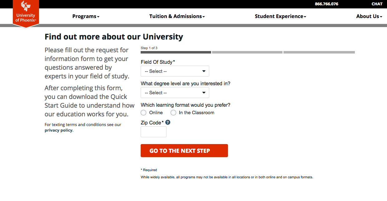
47. Consider a multi-step form
If it’s essential you collect a lot of information, consider doing it in steps to remove the friction involved with seeing and filling out a massive form all at once, like the University of Phoenix does here:
48. List form errors clearly
For a visitor, there’s hardly anything worse than trying to convert and not being able to. For a landing page designer, that’s true too. That’s why, when a user makes an error in your form, they should know why, and what they have to do to fix it. Make sure your errors are descriptive, and they’re specific to the incorrect field.
49. Label clearly
To prevent errors, it’s crucial to label clearly. On your form, make sure that labels are permanent and above the field they correspond to, and close enough so that they’re not mistaken as a label for another field. Here’s an example from Marketo:

50. Prepopulate when you can
To remove as much friction as much as possible, pre-populate the information you already have from a visitor. If your visitor is returning, and they’ve already claimed an asset from you, it’s likely you already have some of their personal information. Don’t make them input it again.
51. Use social autofill
If your form allows for integration with a social network, social autofill will give visitors the ability to share their information with a simple click. While users may be hesitant to trust a social network to share their personal information on their behalf, this could very well remove enough friction to earn a conversion. Here’s an example from Outbrain:

52. Don’t make users opt out
Automatic opt-ins don’t help anyone. If someone doesn’t want to opt into your offer, there’s little chance they’ll be receptive to it, and therefore little chance you’ll ever see ROI from it. Allow users to opt-in. Don’t make them opt-out. See how the checkbox on this Outbrain landing page is unchecked by default? This is how it should be:

Call-to-action
53. Write your CTA in first person
Instead of “Get your ebook,” a first-person alternative has been shown to generate more success. “Get my ebook” may be worth testing against this traditional original. Here’s an example from ConnectWise:

54. Get visitors excited to claim the offer
Words like “Submit” and “Register” don’t focus on the benefits of claiming an offer, like every other element on the landing page. Instead, they tell the visitor what they have to do to claim an offer. Instead of those phrases, try something specific to your offer. If you’re offering a weight loss program, for example, a good phrase to test on a CTA button might be, “Start shedding pounds!”
55. Write your CTA with a traditional phrase
Of course, while getting visitors excited to claim your offer can work, it can also confuse them. a“Submit” is a boring thing to put on a button, but it’s recognizable. And it’s what your visitors are familiar with. If you have data to show that people aren’t identifying your call-to-action button, a more traditional CTA might be worth testing.
56. Make your button look like a button
The problem with trying to make your button unique with a nontraditional CTA or shape is that it may end up not looking like a button. And if it doesn’t look like a button, users might scroll past. Make sure that when you design your button, your users can tell it’s a button. The button below, for example, looks a little too much like the search bar in the footer:

Trust indicators
57. Include security indicators
Security indicators let visitors know their information is safe. That includes sensitive information like credit card number, and basic info like first name and email address. Images of locks, and icons from Norton Antivirus, McAfee, or TRUSTe will signal to visitors that their data is safe. A Better Business Bureau logo will signal to them that the business is not only safe, but trustworthy:

58. Remove security indicators
Sometimes security indicators can have the opposite intended effect. Instead of assuring people of their safety, they can remind people who aren’t thinking about their safety that the internet is a dangerous place. It may be worth testing a page without them.
59. Include testimonials
Testimonials add credibility to any offer. They’re powerful because they’re not the words of the advertiser, but of someone who has had a positive experience with the product. They’re not necessary on low-risk, top-of-funnel offers, but in the middle and the bottom of the funnel, they can improve any page. Make sure yours come with as much detail about the testimonial author as possible: first and last name, position if its relevant, location, etc.
Here’s a great example from Spotify:

60. Make testimonials more detailed
If you do have testimonials, but they don’t feature headshots or even a last initial, there’s a good chance they appear fake to your visitors. Try adding detail to improve the credibility, and in turn, their persuasive power.
61. Remove testimonials if they’re not detailed enough
If you can’t get any more details about the people who gave your testimonials, don’t make them up. Get rid of them. It’s better they do not exist at all than appear fake. If your testimonials are missing key details, it may be worth testing this tactic.
62. Include authority indicators
Authority indicators prove that you know what you’re doing. These are worth including front and center on your landing page. Logos of big-name brands you’ve worked with, well-known publications you’ve been featured in, awards you’ve won, etc., are all great ways to prove that you are an authoritative business. Look how Zoho CRM showcases their awards:

63. Include a case study
A case study is like a testimonial, only a little more comprehensive. Instead of focusing on one subject, it focuses on the result that the product or service was responsible for. Instead of making the customer the focal point of the content, the case study makes the process and the result the main inclusion. It’s best included on your page in video form.
Invest in landing page automation
Today’s consumers expect meaningful personalization. And achieving that requires a landing page for every audience. But creating a page for every ad audience isn’t scalable. It puts too much strain on budgets, developers, and other page designers. Landing page automation, however, allows even small teams to create hundreds, thousands of pages without straining designers. To learn more about how to automate meaningful personalization, get an Instapage demo here.

See the Instapage Enterprise Plan in Action.
Demo includes AdMap™, Personalization, AMP,
Global Blocks, heatmaps & more.
